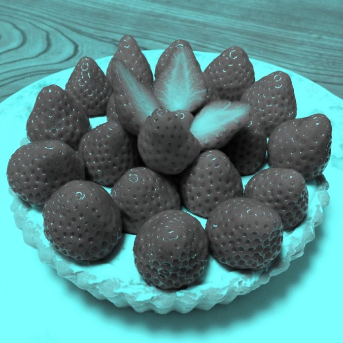
Three top-notch artists who are fascinated with color theory commented on some gray strawberries, and PleinAir Today wrote it all down.
This story started with a man named Akiyoshi Kitaoka, who manipulated a photo of strawberries to remove all the red pixels yet still suggest very definite redness. His Twitter post was shared near and wide, with arguments trailing its path in a manner similar to the “What color is the dress?” debacle of last year. This article sums up the discussion nicely.
Our readers and the artists we cover can surely make some good contributions to this conversation, right? We asked Peggi Kroll Roberts, Alex Schaefer, and David Boyd what they thought of these strange gray strawberries.
“Here’s how I see it as it relates to painting,” says Schaefer. “The image is saturated with blue/green. Strong color makes neutral colors appear to be the complement. The gray that is the lit areas of the strawberries is neutral, but it’s made to seem red because everything else surrounding it is saturated blue-green, whose complement is a cool red. If the blue-green area was instead made to appear saturated orange, then the same neutral grey would appear very blue, but then it would work better with blueberries instead!
“Try it yourself: Paint a swatch of burnt umber tinted with white to lighter than middle gray and cut it out as two 1” squares from the same swatch. Next paint a really bright patch of orange and a really bright patch of blue, each about 6” square. Put the burnt umber tint swatches in the middle of each patch and they will appear to be completely different colors. In the saturated orange field, the swatch will look blue, and in the saturated blue field, the same swatch will look orange. Strong color makes neutral colors appear to be the complement of itself. Amazing color magic! This also illustrates the power of the ‘ensemble’ of a piece … everything works together.”
Peggi Kroll Roberts has a problem with the premise the article puts forth. “The article cites the grays as achromatic,” she says. “They are not. They are chromatic grays, and just enough that our brain amazingly finishes the job through color interaction.”
David Boyd just finished leading a workshop on color theory. He says, “Yeah, relativity is everything. This is hard. Our brain recognizes those as strawberries and kinda projects that onto them already. Having the greenish gray around it is going to make the strawberries seem more red … that old adage about making green more green by putting red next to it. You can make red more red by surrounding it with green. It also reminds me of the way Zorn used black but it still read as blue because of where he used it and what he put around it.
“That afterburn effect may be worth looking at … where you project a yellow circle and stare at it for 30 seconds and then switch the screen to white, and where the yellow circle was turns violet from the afterburn on your cones,” Boyd adds.
What’s your take?


