

On Painting Values > Can anyone imagine doing a painting without using a number of values? Well, as an abstract design possibly, but it would be a weak design, depending solely on color for its strength. So strong are values in the painting process that the old adage is true that says: “In painting, values do all the work, but color takes all the credit.”
Color certainly attracts the eye of the viewer in a way that value could never do, but without values, no amount of color would be able to convey a sense of light in the making of a convincing landscape painting.
Values are indispensable to the landscape painter and are an essential tool in the design process. It might be well to think of values in the same way we think of the framework of a house, with color as the final paint job. As you can see, there would be no paint job without the frame, illustrating the fact that color is only right, when the value is right also… it’s a dependent relationship!
When it comes to designing, values serve three purposes: 1) Value is one of the properties of color. 2)Values in design are essential in creating compelling patterns. 3) Values need to be employed in conjunction with color and edge control, to create the illusion of light in nature. (Edge control, by the way, is the subject of this related article!)
You can use this understanding of values in design to study the work of others, as well as your own. If you study competent paintings from the standpoint of value distribution alone, you will discover some things that stand out as universal. Here is a list of points that are pertinent in the underlying value structure of a well-designed painting:
1) Value structure plays an important role in a painting’s effectiveness.
2) Good value structure can be grouped into value families that form patterns.
3) These value families are lights, mid-tones, and darks.
4) How light, how mid-tone, and how dark can vary.
5) These patterns need not physically connect, but the connection, or relevance to each other, must be felt.
6) The proportional sizes of these families are more effective when unequal. In other words, don’t paint them as 1/3-1/3-1/3 proportions; vary the amount of space allotted to each on the canvas.
7) One of these value families usually dominates, or stands out from the other two. It’s the lights and darks that do the heavy lifting here — the mid-tones are generally used as a foil for the other two.
8) A painting can be complex or have a simple theme, but the abstract underpinnings must be simply stated to be more effective.
I believe that these principles, if used correctly, will improve any artist’s work and propel them to a higher level of painting than they would have achieved without it. But it will only work if these ideas are put into practice.
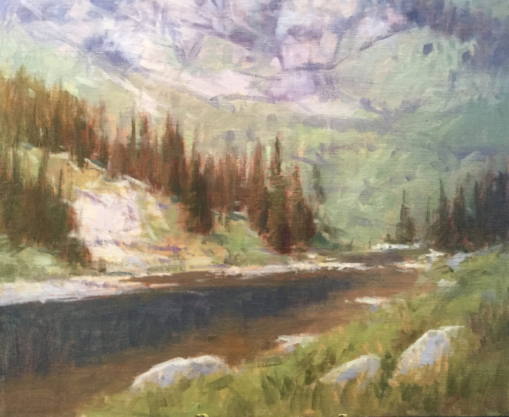
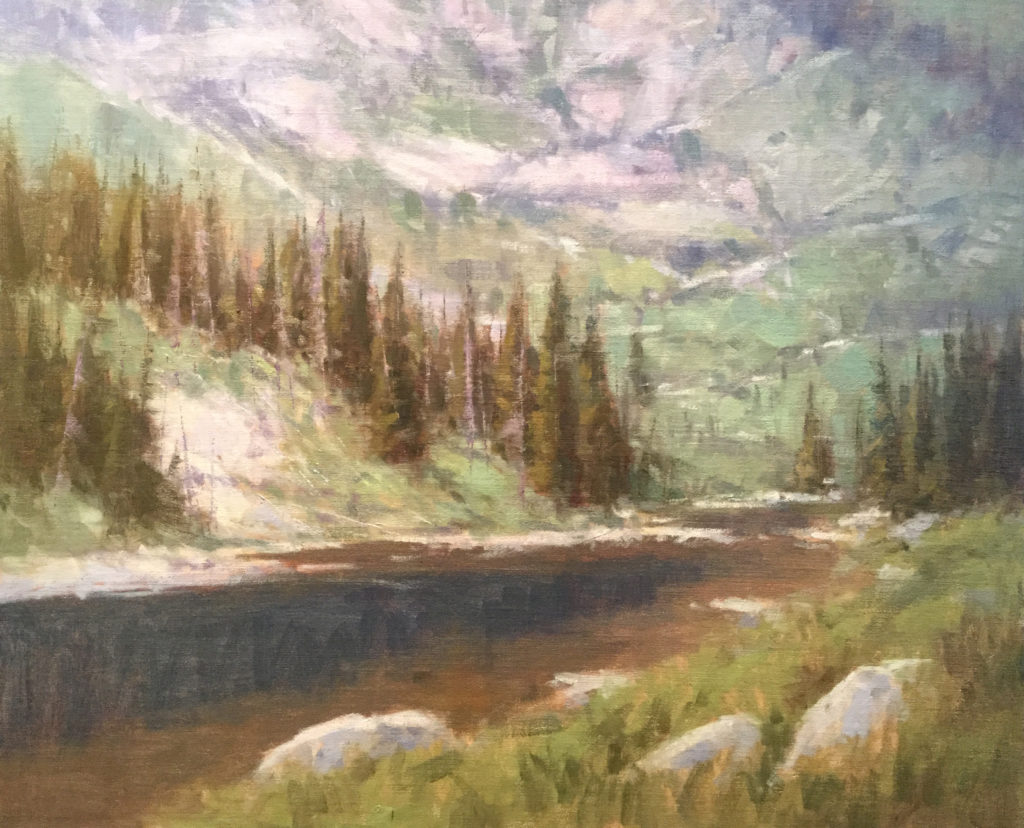
As an exercise, I would like to suggest a monochromatic block-in to understand these concepts. This can be done as an underpainting for a finished work, or a standalone exercise. One of the benefits of this type of start is that you only have to think about drawing and value, with the possible addition of edge control. Eliminating color and texture at this time will help you to think in a value mindset until you are ready to go further. The monochromatic block-in can have the added benefit of being a great underpainting for subsequent layers of rich color and thick paint.
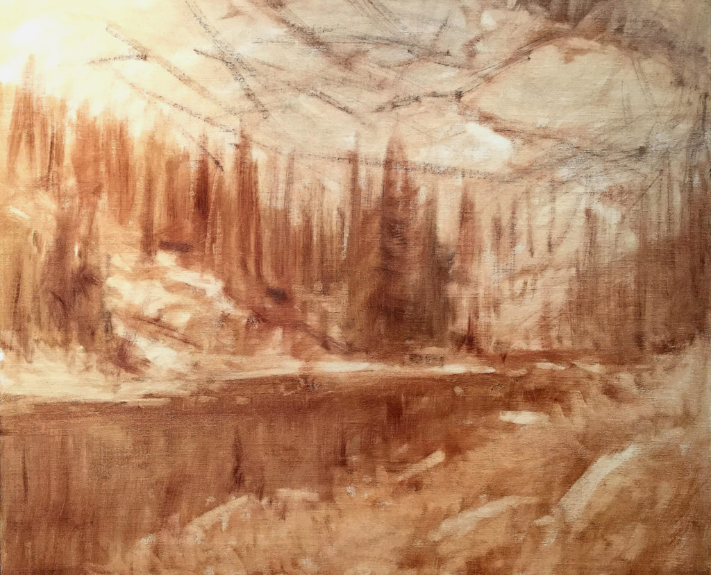
The process is straightforward. Place your overall mid-tone broadly on the canvas, and then start putting down darks while lifting out your lights. This can be done with a rag, either moistened with thinner or dry. Often this is accomplished with an earth tone or other muted combination of pigments. I prefer to keep these on the warm side, which imbues the final painting with a rich unifying undertone. (Please refer to my feature article in the 2014 August/September issue of PleinAir magazine, for a more in-depth explanation of “Warming the Colors of the Landscape.”)
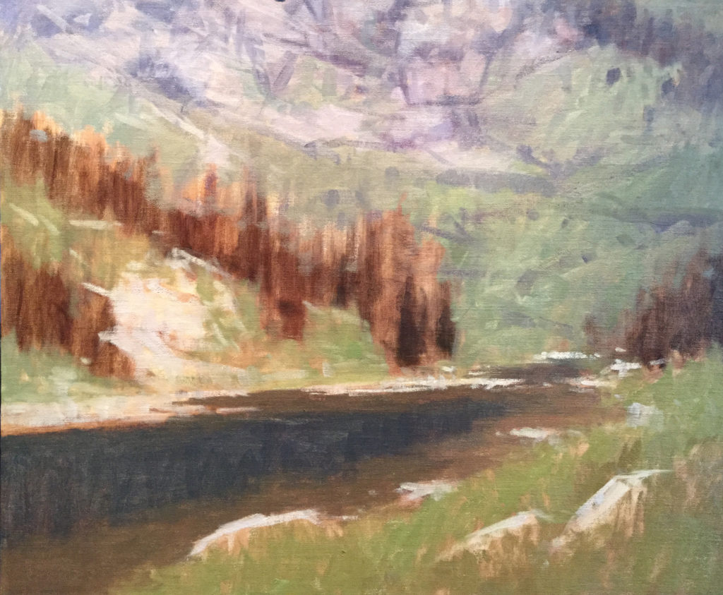
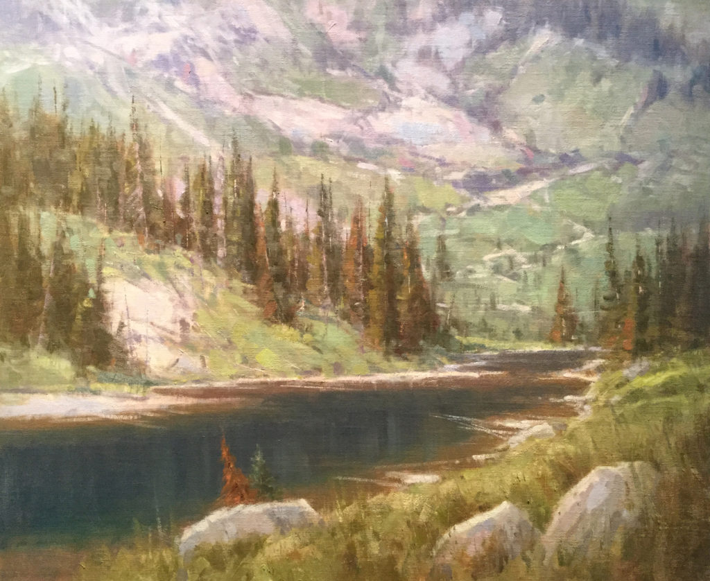
It’s important to mentally approach your subject as a series of lights, darks, and mid-tones, viewed as interlocking abstractions rather than details of the scene. In other words, don’t think trees or rocks, think shapes, size, direction, and the way these three value families form an abstract design. When placing these marks, various forms of the same general value can be connected into what is known as “super shapes.” An example of this could be the dark shape of a stand of pine trees, as well as the large shadow the trees cast. These marks will eventually become the trees or rocks, if you follow this approach — but it takes discipline to keep from falling into the “things” trap!
It’s important to keep the needs of the entire painting in mind at this stage, rather than getting derailed by details and single items that make up the whole. As the painting progresses, you can certainly re-orient your thinking to a “things approach,” but that is after the abstract hurdles have been jumped successfully!
Probably the biggest challenge of tackling your subject this way will be your own preconceived notions about what the painting process is all about. This is where a novice will try for technique, stippling a painting to death in a failed attempt to create leaves on a tree, rather than focusing on the important value shapes that will do more to give the look of a tree than any textural effects one can dream up.
That’s why we are not attempting to give any indication of texture at this stage of the game; working this way will help you to see that texture is part of the finishing process and should be postponed until the structure is firmly in place. When texture is attempted, it’s vitally important that these surface additions don’t disrupt the overall value relationships of the design and wind up fracturing the mass. (See “The Landscape Painter’s Learning Guide, Part 2” for a description of fracturing the mass.)
The key to this approach is just to make marks on the canvas, almost without regard to what they represent. Remember to squint and “Use the Force, Luke…” — you know what I’m saying? It’s a shift in thinking that not everyone gets. It seems that no matter what I say in classes to my students, out of about 20, maybe one or two will free their minds up enough to catch the vision; but once they do, it’s like a light suddenly comes on! Yeah, when you think like this, you are thinking like an artist! It may be a struggle at first, since new ideas are not always easy to assimilate, but the rewards will be great if you stick with it!
Now some final thoughts on scene selection. This was saved for last, but realistically, it will be the first thing you do as a landscape painter. I saved it for last because many of the abstract pattern considerations that were covered in the monochromatic block-in are the same things you need to look for in selecting a scene.
One thing to be stressed, though, is that there are few if any scenes that are perfectly arranged, ready-to-paint motifs that the artist can just copy! Nature doesn’t usually accommodate us in that fashion. So instead of trying to find the perfect scene, it is up to us to look for subject matter that has several artistic possibilities that will lend themselves to creative design. The scene itself will form the nucleus or idea, and it will almost always need to be rearranged to some extent by the artist.
Finding a great scene is rarely possible if the painter is primarily concerned with comfort. Serious artists will always take the time to walk around and find vantage points that have real merit, rather than setting up in a comfortable location, under a convenient palm tree, complete with hors d’oeuvres! Although tempting at times, personal comfort should take a back seat to finding compelling views. Creative painting material, in the form of designs, won’t just fall out of the sky, and adjustments to the main idea must be supplied by the imagination.
Designs, for our purposes, are defined as shapes and movements that flow, along with value contrasts and colors that work in a cohesive way. This keeps the eye of the beholder craving more, and that is the whole purpose of a good design in the first place.
Remember that too much unity will create stagnation and result in boredom, and too much contrast leads to visual chaos. There has to be a balance here, in order to excite the mind as well as provide a sense of well-being through some subtle repetition in the scene.
Cheers and good luck, until next time!
PS: As always, if you are enjoying this series, send me a note. I would love to hear your feedback.

Visit EricRhoads.com to find out all the amazing opportunities for artists through Streamline Publishing, including:
– Online art conferences such as Plein Air Live
– New video workshops for artists
– Incredible art retreats
– Educational and fun art conventions, and much more.

> Subscribe to Plein Air Today, a free newsletter for artists
> Subscribe to PleinAir Magazine so you never miss an issue


This was a great article. I am finally seeing values and shapes instead of things!
John, your discussion on the power of value inspired some thoughts on how to illustrate that in my head. Thanks for the reaffirmation and ideas.
One dominant direction, one dominant value, one dominant hue. I think students need to hear this over and over, and along with the repetition, they need to see how it (in this case value) works. It sounds simple, but it is complex since the painter has to keep these things in mind while mixing paint and chasing light and shadow. So, thanks very much for the lesson and the progressive studies. Do keep them coming.
I appreciate the feedback, thank you !
No matter how many times I hear in workshops, demos, over and over, harmonious ” Values ” are the illusive challenge. Thanks for reinforcing these tried and true secrets of successs in such a simple way.
Thank you Lynn!
This is an excellent, clarifying article on values, my biggest hurdle in outdoor oil painting. But when observing on a sunny day a scene perhaps like in your example, that poetic row of trees can have strong light on parts of it, fracturing that mass into 3 clunky shapes; the strong glints on the water will take away from the drama of the deep blue. But if I ignore that to keep the tone mass intact, I lose the sense of sunlight, don’t I? Not to mention the problem of a local dark mass in light, it makes for good pattern, but then how do you convey it’s in the light? I get stuck every single time on these points.
Good question Judy, I’ll try to answer you if I can. First does the scene you have selected, with all of these strong lights, have good design possibilities? If it does, great, then paint the darks and lights on the trees and water as separate value areas, or super shapes to begin with. But if these brightly lit areas of the scene actually detract from what would make a well designed painting, it might be that you need to select a different scene, or come back to this particular place during a different lighting situation. Some scenes look better in the morning or in the evening or on overcast days and if you try to paint them in a light that does not work, that creates a challenge. I hope that helps. John-
Thank you John, that helps a great deal! You are making me think quite differently than I usually do. I probably still have that beginner mentality: that any scene can be painted well and I must challenge myself to try. I am realizing that I don’t evaluate enough a scene first for super shapes, I see things; the pretty roses on the shrub, the bright sun. Yet they do not form a good design, they are just scattered items, and the sun is sparkling prettily on everything, fracturing any contrast. I am working on a painting like that right now, wondering why I am so confused. I work hard, but I never considered the work it takes to learn to properly choose a plein air scene. This also explains why I seldom have a problem with values in still life, yet in plein air it’s the devil. I appreciate your expertise in my realization of this!
Thank you Judy, I’m very glad this is making a difference. My next installment will be on edges.
I just love your series. I hope you continue writing as you are really helping us understand what’s important. I primarily paint watercolor, but I’m going over to acrylics and there were many helpful tips in this last article. Like adding texture at the end of the painting. I do not have much in texture with watercolor so this was very helpful for me as I was adding texture too early. It was fun to do, but now I know to hold off. Thank you for your article and helpful advice.
Thanks Val!
I believe the process is the same for any 2 dimensional artwork. Whatever the medium or subject matter.
Portrait, landscape, figure, abstract, whatever. The foundation of a positive result is the value and design being correct before color enters the picture.
Yes, Very good point. Thank you Dale!
Thank you so much for this series,it has been so helpful.
Ann, Thank you for your comment!
Thank you so much for the valuable instruction in this article, John! The design principles you explain here are the same ones I employed for over a quarter century as a graphic designer. But translating them to an image on a canvas or panel, as a fine art painter, is proving difficult for me. I’m currently struggling with a commission piece in which there is so much “scatter” in terms of values and shapes, I’ve been having a hard time pulling it all together into a solid design that visually “flows.” (Too many trees and leaves…) It’s a bit like laying out a double-page spread of classified ads, or a Macey’s grocery ad…if everything’s a feature, guess what? Nothing’s a feature. Your instruction is invaluable in helping me “weed out” some of the elements in the reference material I was supplied, and turn this piece around. I’m going to re-start this one, by doing the monochrome values rendering and getting the design nailed down before I start thinking about the colors. I think this time, it’s going to “click.” Thank you!!
Hi Gunther, I is so gratifying to hear that you and others are being positively affected by this series! Thank you so much for letting me know! I’m rooting for you on that commission!
Love, love love!!! Such clear and concise instruction. Thank you!
Thank you Craig!
One of my friends in our class posted this today. Our teacher keeps discussing these things over and over and reading them just reinforces everything. I am going to try the Mono chromatic sample first I suppose this can be used as an underpainting . Does it matter what color i use or just that I am using three values of the same color? Thanks for the detailed article which I will read and read again, with hopes that it will stick
Terry, Just saw this, sorry for the slow reply. No, you can use any tone you like. Best to use something like an earth color rather than a cold color. The warm undertones are just more inviting.