

Joe Gyurcsak is not afraid of color, as his paintings show. But his favorite quote is from Edgar Degas, who said that galleries wanted colorful paintings, “but if I could have had my own way, I would have confined myself to black and white.” The Plein Air Convention & Expo (PACE) instructor explains, below.
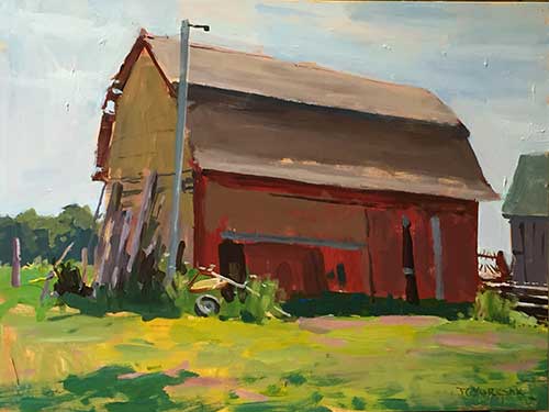
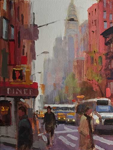
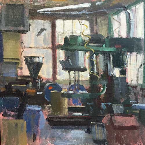
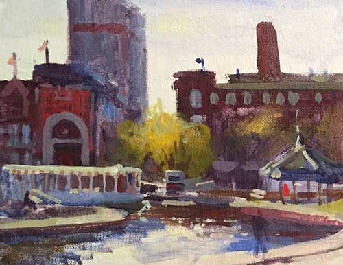
Gyurcsak isn’t advocating a monochromatic approach. He’s merely suggesting that more artists embrace muddy colors. “ I don’t think enough students realize the importance of neutral or nondescript colors in making a good painting,” he says. “Reserve your good strong color. People love color, but how you use neutral mixes sets the tone for the entire painting.”
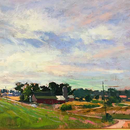
So what exactly is a neutral color? “It’s a mix that you can only say its temperature, but won’t be able to put your finger on its particular color,” says Gyurcsak. “People think of these colors as muddy, and bad. But you can embrace these beautiful nondescript colors and construct most of the painting with them, then use vibrant color derived from these muddy colors to create a very beautiful painting. Wyeth and Homer used a lot of neutral tones in their paintings. That neutrality helps bring out the pure tones much better, where you need them, where you want to accentuate the center of interest.”
Obviously, this isn’t an entirely new idea, and Gyurcsak points out that Scott Christensen — to name one notable artist — suggests similar thinking. It puts the emphasis back on value, another axiom of representational painting. “Value is the most important foundation of any painting,” Gyurcsak reminds us. “If you lose value structure, you lose the whole painting. Value cannot be lost, but colors and temps can be traded here and there.”
But what does it mean to make sure the intense colors come from the muddy mix? Not much, if you follow Gyurcsak’s color theory, entirely because his limited palette almost ensures that the vibrant color is represented somewhere in the nondescript mixes. Gyurcsak advocates a split-primary palette, with a warm and a cool of red, blue, and yellow. White and ivory black (or Payne’s gray) round it out.
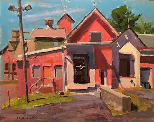
“I’ve been using Payne’s gray more,” says the artist. “It’s not as powerful as ivory black, but it’s an important component in introducing some of those neutral tones.” The only somewhat surprising color on his palette is cerulean blue hue as the cool blue, replacing the cobalt blue on many painters’ palettes. “Cerulean blue hue is phthalo blue green shade with some zinc white, so it doesn’t overpower like pure phthalo blue,” says Gyurcsak. “It makes more interesting greens, in my opinion.” It’s an opinion that is worth considering, as Gyurcsak is a Blick resident artist and the Utrecht brand manager. He knows his pigments.
“This palette has artistic value, but scientifically, it is put together with full explanation of how each color balances in terms of value and temperature and intensity,” says Gyurcsak. It has the added value of being simple. Yes, you need to learn color mixing to use it properly, but once that is done, the process is indeed simple. “I’m always trying to teach from a simplified path so students are freer to paint instead of considering all these other technical issues,” Gyurcsak says. “If we can get students to get freer without all this complication, then their expression goes way up. That’s the goal — to be really creative and free in their expression. With a simple path, they can really fly.”
Gyurcsak will be painting a demo and talking about this concept and more at the Plein Air Convention & Expo, which will be held this April in San Francisco, California. Have you seen the list of faculty members who will be instructing participants? Go here to learn more and to register for PACE.


