

How to paint landscapes > Quite frankly, these elements are the glue that holds every good painting together and is the reason some paintings fall apart!
When I started teaching others how to paint years ago, the first hurdle I had to jump was organizing my thoughts about creating art. In doing so, I felt that I would be in a better position to present this information in a clear and understandable format. Just that alone forced me to be a better painter, but more importantly, pointed me to the realization that I had gaps in my own learning that needed to be filled. As I taught, I learned, and as I learned, I taught, and so it goes to this day!
My first approach was to teach the tools of painting, (drawing, color, value edges, and brushwork), which I’ve written about extensively over the years and more recently in a series of articles that started on May 24, 2017, in OutdoorPainter.com, for PleinAir Today. As I grew artistically, along with my understanding of teaching I began to sense that teaching the tools by themselves was not enough; there was something missing. The missing part was light and design.
Yes, I had taught these in conjunction with the tools before, but it was always done as an incidental component, and I don’t feel that I gave these two huge concepts the attention they rightly deserve. Quite frankly, they are the glue that holds every good painting together and, conversely, is the reason some paintings fall apart! This summer I added two more elements to the painting process, because of discussions and thoughts that I had with my painting buddy, John Poon. These two important elements are concept and a solid painting procedure. So, my approach to painting and teaching how to paint are constantly growing, and that’s the way I like it.
The rubric of learning how to paint now looks like this:
1– Concept
2 – Light
3 – Design
4 – The Tools (drawing, color, value, edges, and brushwork)
5 – Painting Procedure
I’m always amazed when I see an artist who at a very young age grasps these concepts early, for whatever reason — great instruction, pure genius, or both? I could list a number of these folks by name, but you can fill in the blanks; you need only look at some of the many great artists out there to fill in the names of your choice, and chances are you will be right!
I recently had the privilege of attending a demo that was given through the Wilcox Gallery in Jackson Hole, Wyoming, which was being done by the very young virtuoso named Kyle Ma. (Kyle, by the way, for all his young knowledge and accomplishments, is a very humble guy with no pretensions or large ego that I could detect. He’s just a great kid who happens to be a great painter at a young age!) As I sat there with Jim Wilcox for part of the time, we would occasionally turn to each other, smile, and just shake our heads in astonishment at how much this young guy “gets it” at his age.
I don’t know about Jim, but at 18, I was a bit of a knucklehead who gave up painting for those brain-dead years I call high school! Anyway, what I heard from Kyle, and every other good painter I have ever known, breaks down in one way or another to the combination of concept, light, design, and tools, along with a good painting procedure. It always comes back to that. Even if they organize their process differently than the way I do, at its core it always goes back to these basic concepts.
So, today I would like to reiterate some facts about light by pointing out some of its characteristics as well as the things that influence the way it appears in nature.
How to Paint: Light
There are various types of light:
- Light side of an object
- Highlights
- Direct light
- Halftone
- Shadow side of an object
- Core shadow
- Reflected sky light
- Reflected light from the ground plane
- Dark accents
- Cast shadow
The following conditions all have an effect on the way light looks to the viewer:
- Weather
- Time of day
- Season
- Moisture and dust particles in the air
- Distance of objects from the viewer
- Materials that make up the objects, which in turn dictate how the light looks on them
- Speed of directional change within an object
- Local color
Directional change, by the way, is best illustrated in this reference photo below:
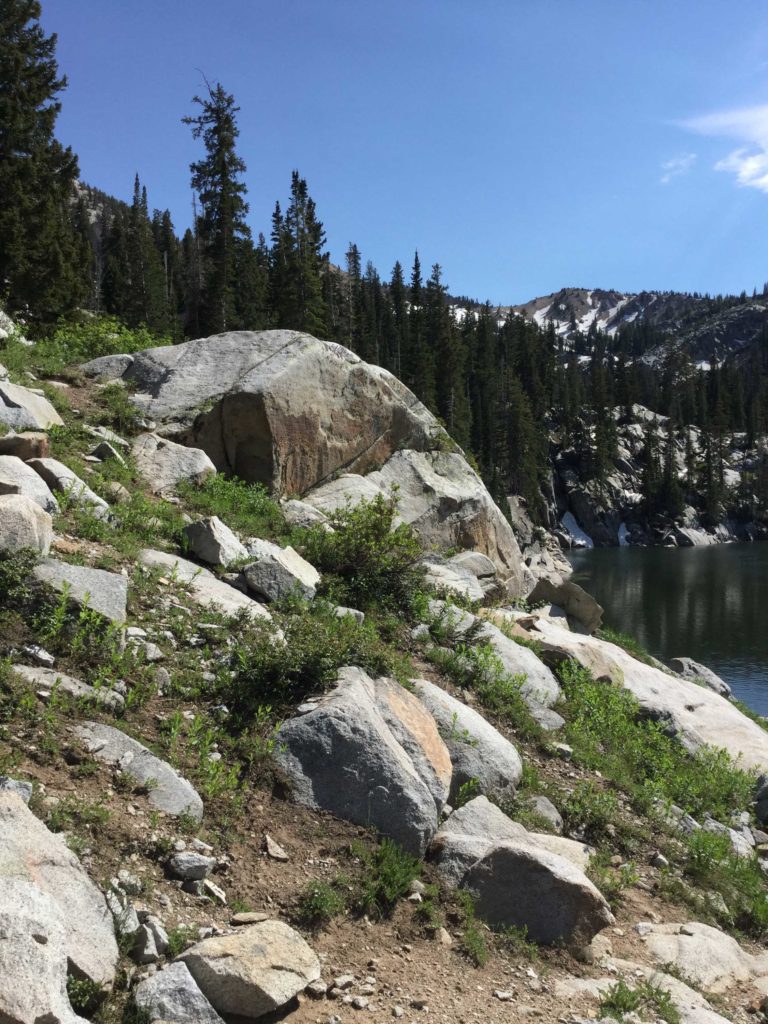
Notice the form shadow on the rock in the foreground center. It grades slowly from light to mid-tone to shadow, eventually becoming a cast shadow onto itself on the left side of the form, with a cast shadow’s characteristic hard edge. On the other hand, the large central rock above has a harder edge where it goes from light to shadow, due to the form itself taking a hard turn to a nearly 45-degree angle. They are both form shadows, but due to the individual characters of the rocks they are on, each has a different quality of edge. I could talk about this hillside all day, but you get where this is going! Just for fun, study the rest of the rocks in this photo and see what light and shadow relationships you come up with.
How to Paint > Let’s talk, one at a time, about the things that affect light.
Weather is variable. On a cloudy day for instance, the lighting effect will be more subtle, with lots of atmosphere, depending on how much moisture is in the air. All the aforementioned light characteristics are still there, but much more subtly because the light is cooler and much less intense.
Time of day will affect how the shadows look as well as the temperature of the light. These are all relationships that are better off observed and noted by the artist than by me just spouting off a few general formulas that sometimes cause more problems than they are worth!
Season, same thing, in some ways, with the added changes that take place in the foliage thus affecting their local color as well as the overall color harmony of the painting.
Moisture and dust particles in the air will have a large influence on the mood of your piece, and atmosphere is a compelling aspect of any painting when depicting light effects. The conditions that cause atmosphere in a scene are moisture, along with the amount of dust and other particles in the air, coupled with the distance of objects to the viewer. The way atmosphere is handled in a painting is by using every artistic tool at the artist’s disposal, namely, drawing, color, value, edges, and brushwork. The way this works is this — drawing could be as simple as reducing the size of objects to depict linear perspective. Also, strong diagonal lines, which would normally appear in the foreground, tend to compress and flatten out in the distance. As an example, this can readily be seen in the compression and flattening out of the linear trajectory of the bank of a river as it recedes into the distance. Using this drawing technique will greatly aid in rendering the feeling of atmosphere when coupled with these other tools.
Next comes color and value — lessening the saturation of a color along with making it lighter and cooler will almost always create a sense of atmosphere. Edges in the distance will also tend to merge and blur; the greater the atmosphere the greater these effects can be employed by using nuanced edges. Last but not least of the tools comes brushwork, which is one way to imply texture in a painting. The more atmospheric the day, the less textural effects are needed in the distance, so lightening up on the heavy brushwork in the background can go a long way in helping the atmosphere read in your painting.
The materials that make up an object will dictate to a large extent how the light affects them and how the artist paints them. A porous material or porous aggregate of materials such as grasses, sand, and dirt are going to look different in the light than a hard object such as a granite slab. Each has its own characteristic soft and hard edges, or more diffused light or highlights that indicates what they are. The speed of directional change within an object will also tell you how hard or soft to make an edge. A hard turn on a hard object will almost always call for a hard edge, except in the case of artistic selection, which can always overrule reality if it is done with wisdom! On the other hand, a gradual turn on a hard object will create a halftone edge that can give the artist an opportunity to punch up some color there.
Finally, local color will have its way with the color of the light. A shadow totally devoid of local color will not usually look right except in rare circumstances dealing with atmosphere.
I think this about sums up light for my purposes here. While not exhaustive in scope, my thoughts here are ever growing and influenced by study and observation. I’m always looking to add to my knowledge and love to bounce painting theory back and forth between myself and other great artists I know such as my good friends John Poon and Tom Howard.
If you would like to add to the discussion about how to paint, please do at the bottom of this article, and let’s add to the knowledge that’s out there just waiting to be plucked by all serious painters.
Related > How to Paint Landscapes
Here are several of the artists mentioned in this article and what they had to say about light and form.
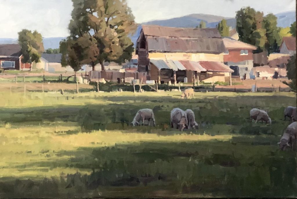
The local color of a subject is affected by, amongst other things, the color of light that it is exposed to. In this example, the grass, which begins with a local color of green, bends toward yellow green under the influence of a warm sunlight, and then blue green in the shadows under the ever present influence of the cooler light of the sky. Note that in both cases we do not lose in its entirety the subject’s local color to the light; rather they both contribute as elements to the final outcome of color. So in practical terms, the green of the grass plus the yellow of the sun produces an outcome of yellow green grass. On the shadow side, the green of the grass plus the cooler blues of the skylight combine to create a variation on blue green. This same principle applies as readily to the other subjects of the scene, including the architecture and surrounding trees.
Light is one of several elements that the artist should learn and master. For me, it is often a tool for seeing patterns and textures in relationship to each other. Light is what helps us differentiate forms in a painting. Of course, and more basically, color or the color of light should be understood as value first and color second. It’s light against dark, and dark against light that helps tell one of the first or more important visual stories of a painting. But it’s color that ends up getting all the attention and all the credit. Many of us know that familiar refrain, “Ooooh, look at all those pretty colors!”
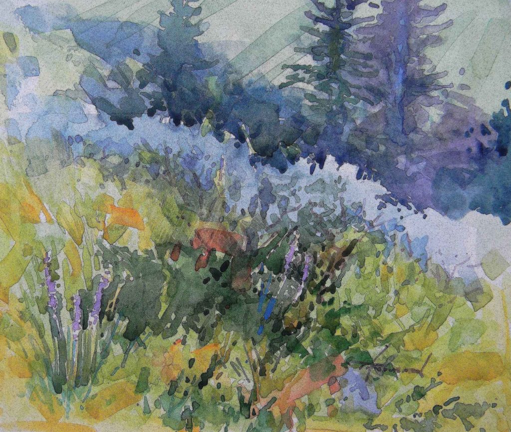
In my field sketch “Summer at the Forks,” a watercolor from the Manti Mountain Range of central Utah, I sought to couple the use of color with an understanding of value. In order to help that angular and very abstracted line of sagebrush to stand out against the trees behind, it was necessary to darken those tree elements. Of course in doing so, I was following the rules of planes and their consequent values, as spelled out by John F. Carlson. With trees being the most vertical elements of the scene, they are the darkest. Standard tree colors have given way to interpretation, using blues, greens, and violets. Thus color can be almost anything the artist wants, as long as the right value is in its proper place.

Kyle’s city scene breathes an evening light into the work that literally eats into the edges of buildings, giving a sense of its brightness and power. The light permeates the various objects that say “city” and culminates as a sort of halo that surrounds his center of interest, the cool, dark car. His skillful use of light creates a sense of place and time that lends great depth and charm to this work.
As Kyle pointed out in his demo, the brightest colors are usually found in the halftone areas. Even when an edge is soft, like two forms coming together in a shadow, you need to keep the shapes of the objects specific and not lose the form. And since form has a direct influence on light, this is good advice indeed!

Light — is it friend or foe? Light is necessary, of course. Without it we would be in total darkness. So, it is a gift beyond measure. But it can also be your enemy. There are many aspects to write about on the subject of light and painting, but I want to give a little glimpse of it being the villain from one perspective. I must be honest: Light is not the actual enemy. You’ve heard it said, “You are your worst enemy.” Well, it’s true in most cases, I would suggest. The sun is a constant source. It does not change. Other factors change, such as clouds, movement of the earth, or a tall person standing in the wrong spot. So, knowing how the sun’s light affects things “is on us,” you might say. We are to adjust to it because we know it won’t adjust to us.
I once participated in the Plein Air for the Parks in the Grand Tetons. I get so excited when I paint a beautiful painting on location. I put it in a frame. Fill out the paperwork. Put it up on the panel and turn on the lights. WHAT?! Who stole my color? Who lowered my values?
Well, it’s not the sun’s fault. I’m the culprit! Over the years of doing plein air I have struggled to keep my painting in the shade. I will start in the shade, but it doesn’t take long before I turn or move to get the sunlight on my canvas. It’s a mental thing I suppose, but I need to see the colors more clearly. But if I’m not careful, I will pay for it in values and color. The sun is the most brilliant light that our paintings will ever be exposed to. As I have painted and experienced this rich exposure on my painting, there’s something that I have learned: They generally don’t make indoor lighting as brilliant as the sun. My paintings become dull and a little darker than what I see in the sunlight. I must learn to paint in a higher key and punch up my colors more. That’s not so easy. So, whether it’s the sun or the lighting in your studio, you must learn what wattage your paintings work best with. If you can’t adjust the wattage, you have to adjust your approach when learning how to paint landscapes.
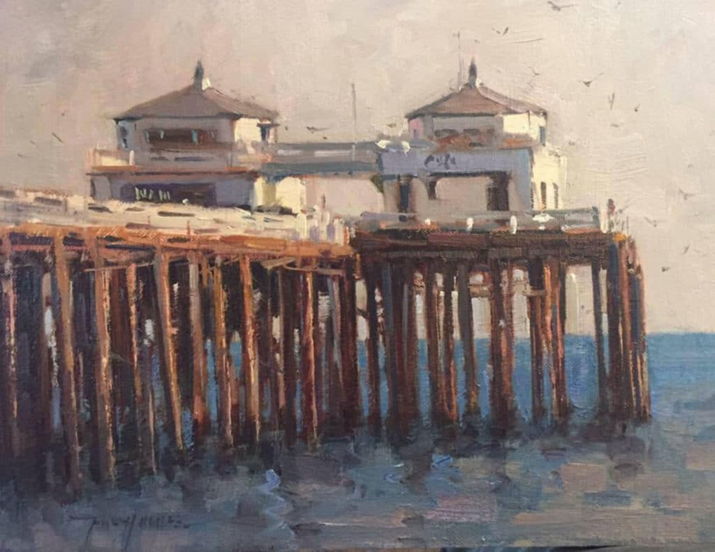
In this scene, which was a demo that I did for one of my classes teaching how to paint several years ago, the light is what gives interest and sparkle to the piece. There is just enough of it there, coupled with the shadows, to say “late afternoon light.” Notice how the light on the pilings that start in the lower left corner gets brighter and more substantial as they approach the middle of the painting, thus helping to keep the eye there and directing it further up to the structures. All in all, this painting was less about detail than the feeling of light that it conveys.
And browse more free articles on how to paint here at OutdoorPainter.com


I’m so impressed with your knowledge, paintings, and attitude!! I always print your articles to mull over many times….they are so full of gems/concepts! Thanks for sharing.
Thank you DA, I really appreciate you taking the time to give some feedback! John-
Great Article John. You really summed it all up and explained it nicely in a nutshell 🙂
Thank you I really enjoyed the read 🙂
Thanks Leon, I’m glad to know that it was helpful to you!
Thank you John for your insightful article no light in the landscape.Soo enlightening,pardon the pun! Happy painting!
Thank you Judi!
Please explain “the brightest colors are found in a half tone area”. Not sure what a half tone area is.
A half tone area would be one that’s in even light: not blasted out by bright light, which bleaches colour, but not in shade either, which would dull the colour.
Thanks for your explanation Michael, I could have stopped with that, but didn’t see it in time. Cheers, John-
Thanks , I was a little confused about that too. Hi
Hi Susan, Thank you for your question. When you look at an object in sunlight the part that gets the light directly can look a bit washed out due to the intense light. On the other hand, surfaces that slightly turn away from the sun, but are not yet in shadow, are known as half-tones and these tend to show off the local color of the object more than the former. I hope that helps.
Fantastic article, and loved reading ‘who stole my color? who lowered my values?’ That’s exactly what I complained about with my recent plein airs. James Gurney wrote a nice explanation for me, but how do you train yourself to go higher key, and more saturation? It’s tough enough to observe it, paint it, without ‘now I have to make it all higher key and exaggerate the color’, and make those mental adjustments. If I’m able, I get some paint down, then run indoors to see how the work reads, then run out again.
Hi Judy, I know what you are saying! Sometimes someone will ask me what I think about one of my field studies when I’m still out there and I just have to say, I won’t really know until I see it under a studio light. Sometimes you think you have a real zinger only to find out indoors that it’s mediocre. It’s really a pleasant surprise when the opposite happens though!
Some of the paintings used to illustrate this article are rather mediocre. The watercolor by Tom Howard, in particular, is not a very good painting. It lacks structure and form and especially when you back up from it, it becomes a senseless muddle of color.
I am just starting. I wish I were there so I could enroll as your student and learn from u. Your work is wonderful
Thank you Thanganila!
I love Tom Howards watercolor posted in this article. What do you mean the painting is mediocre???
I love your advice. Write your book.
Thanks
Thanks Christine for setting the record straight and Chuck, yes I’ve got to get that book done….winter is a good time for me to write!
I think we took a workshop together 23 or so years ago in Jackson..taught by Matt Smith or George Strickland..I recall you camped in the Gros Vente campground..I was very raw, you were accomplished…if it was not you, it was another Hughes. Like your work very much and wish geography was more favorable. I live in Maryland. Sorta coincidentally, I just acquired a Poon. Your article is very helpful. Thank you!
Hi Carroll,
Carroll, Yes that would have been me. Those were great workshops. So good to hear from you. I’d did camp at Gross Ventre for one of them, probably George’s. I still go up there once or twice a year to bring paintings to Mountain Trails Gallery and also to paint, sometimes with John Poon. I’ll tell him you have on of his paintings. Thanks for checking in! John-
Yes, please! We can talk about those painting points all day long, but for someone who can’t get around to workshops all over the country, I would love to read about “the actual painting process” , brush to canvas, in detail, after initial block in – they “why”s and so forth. Thanks for all you share – so very inspiring!
Hi Teri, Thank you! Absolutely, covering the nuts and bolts has been a large part of what I do for Outdoor Painter. I think my article count is close to 40 now and if you Google (John Hughes Author Outdoor Painter) you should be able to access all of them in one spot.
Happy Reading, John-