The unique challenge of painting forest landscapes is translating all that chaotic beauty into a coherent design. In scenes that include millions of leaves and needles, thousands of branches, hundreds of species of plants, and numberless blades of grass, where do we begin?
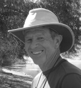
By Rick J. Delanty
Deep in the forest wilderness, it’s easy to be inspired. But set up to paint, and suddenly all you see are trees. Everything goes up and up, and it’s all so close. The scene looks the same in every direction, or is so complex that trying to capture it would be like painting a bowl of spaghetti. After a few minutes, you feel like you should just pack up and head back down the trail.
But wait. In the end, every painting comes down to line, shape, form, value, and color, right? The unique challenge of the forested landscape is translating all that chaotic beauty into a coherent design. In scenes that include millions of leaves and needles, thousands of branches, hundreds of species of plants, and numberless blades of grass, where do we begin?
Having found myself in the middle of American wilderness many times, I’ve asked myself that question often. After numerous starts and stops, I’ve learned to make forest painting more enjoyable — and more successful — both en plein air and in the studio, thanks to a few key principles.
Making Sense of the Chaos
As with any subject, my attitude toward a scene directly affects how I paint it. When it comes to painting the forested landscape, I’ve found that maintaining a balance between freedom and control allows me to reflect both the chaos of these spaces and the beauty and serenity I see within them.
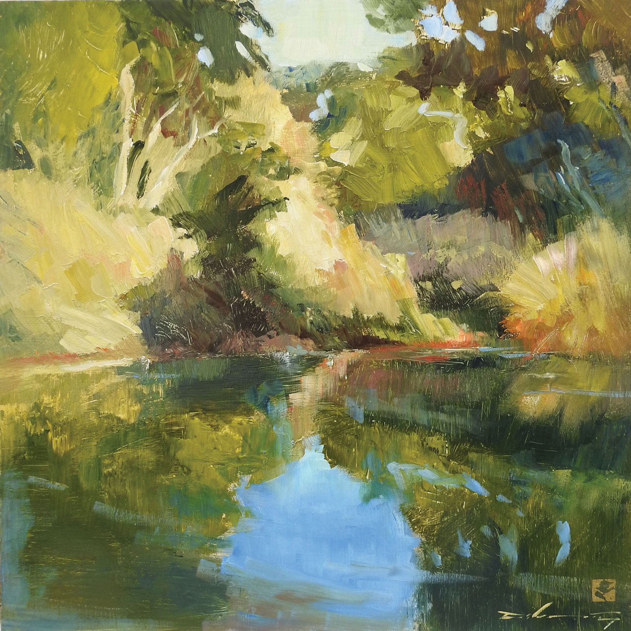
The key to dealing with a subject as complex as a forest interior is simplification. To make sense of the chaos, I rely on a hierarchy of elements — specifically composition, color, brushwork, and edges.
Composition
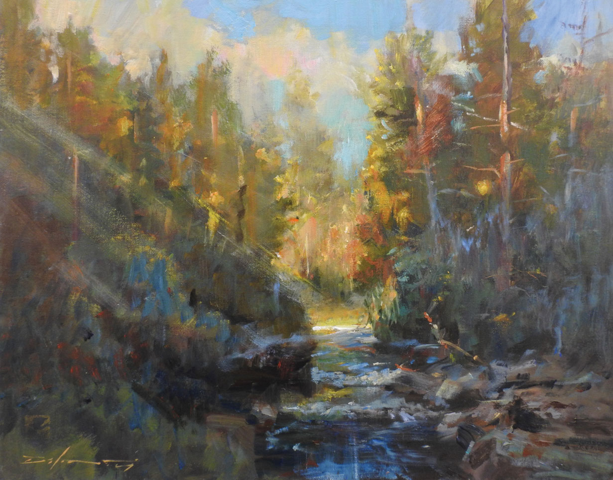
Shape and value: I start with a value sketch to determine the best format for my idea — rectangular, vertical, horizontal, or square. For example, a square format might be well-suited to focusing on a single tree within the forest. I also identify a strong pattern of light and dark shapes. Generally, I keep the values fairly close together, with the highest contrast located at the focal point. These shapes, and how they relate to and interweave with one another, will be the foundation of the finished work’s composition.
Perspective: I establish the horizon line (my eye level) and concentrate on perspective — am I looking up, down, or straight at my subject? To avoid that “claustrophobic” feeling that can occur with forest-scapes, I compose a way through the design.
To lead the viewer into the forest, I create diagonal pathways, using rocks, fallen branches, rivers, bushes, and flowers. To call attention to the focal point and maximize depth, I think in terms of color temperature, detail, and planes of space. I make objects and shadow shapes closest to me larger, warmer, and with greater clarity and sharpness than those farther away. For those areas in my peripheral vision (usually around the edges of the canvas), I make the colors grayer. I include curves in the trees to underline the idea of movement and growth.
Negative space: Employing negative spaces as “rest areas” in a crowded wilderness scene provides some visual relief and assists the viewer in zeroing in on the focal point. Sky holes in the trees can serve an important role in lightening up the painting and opening up solid walls of limbs and leaves. You can also make a clearing among the trees, leaving areas of undergrowth less detailed and untextured.
Grouping or isolating: One way to unify an effective forest composition is to group trees together, and to vary the spaces between individual specimens and those in groups. Think of the trees as “neighbors” rather than as individuals. You might include the surroundings around tree groups, such as an overarching mountain or open fields. Or by isolating one tree from its group, you can create a “portrait,” with other trees serving as “extras.”
Color
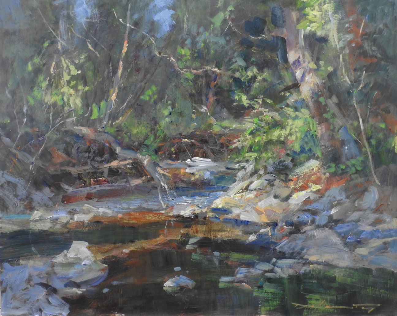
Despite how it may seem, not every tree in the forest is green, but knowing how to mix greens is an invaluable skill when it comes to painting forests. Some combinations I find helpful include lemon yellow plus black; ultramarine blue plus yellow ochre; cobalt blue plus Naples yellow; viridian plus cad red light; and burnt sienna plus sap green.
Note: You might be tempted to use sap green for every green to create color unity, but you do so at the expense of more interesting, natural varieties.
Speaking of “natural,” modifying greens with red or accenting them throughout the painting with violet — as many 19th-century French Impressionists did in their plein air paintings of the Fontainebleau Forest — may help to tone down all that green we see in a scene.
You may have noticed that the most natural-looking artificial turf lawns include blades that are reddish or yellow-ochre in color, like dead grass. Red, violet, magenta, ochre, or orange can all assist in taking the edge off a billiard-table-green forest painting.
Brushwork and Texture
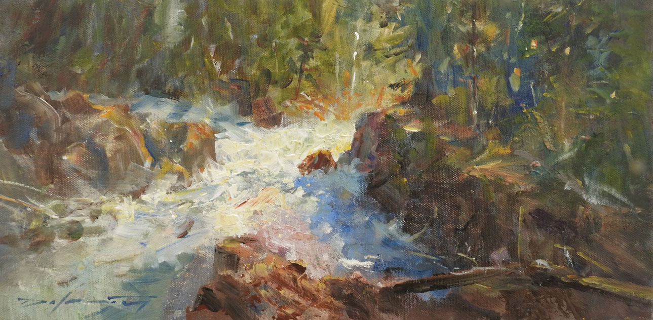
Nature doesn’t wait, picture-perfect, for a painter to walk up with his or her kit. The artist must edit the scene to yield a painting that reflects his or her vision. Of course, a representational painting requires the artist to incorporate at least some of the chaos that naturally exists in the wilderness.
To create an authentic response, the artist must use a variety of tools — imagination, certainly, but also practical instruments. I use knives, razor blades, credit cards, plastic shapers, window squeegees, wax crayons, and wooden skewers to simulate grass, rock rubble, pine needles, and streaming water. I also paint boldly with big brushes to create unexpected textures.
Edges
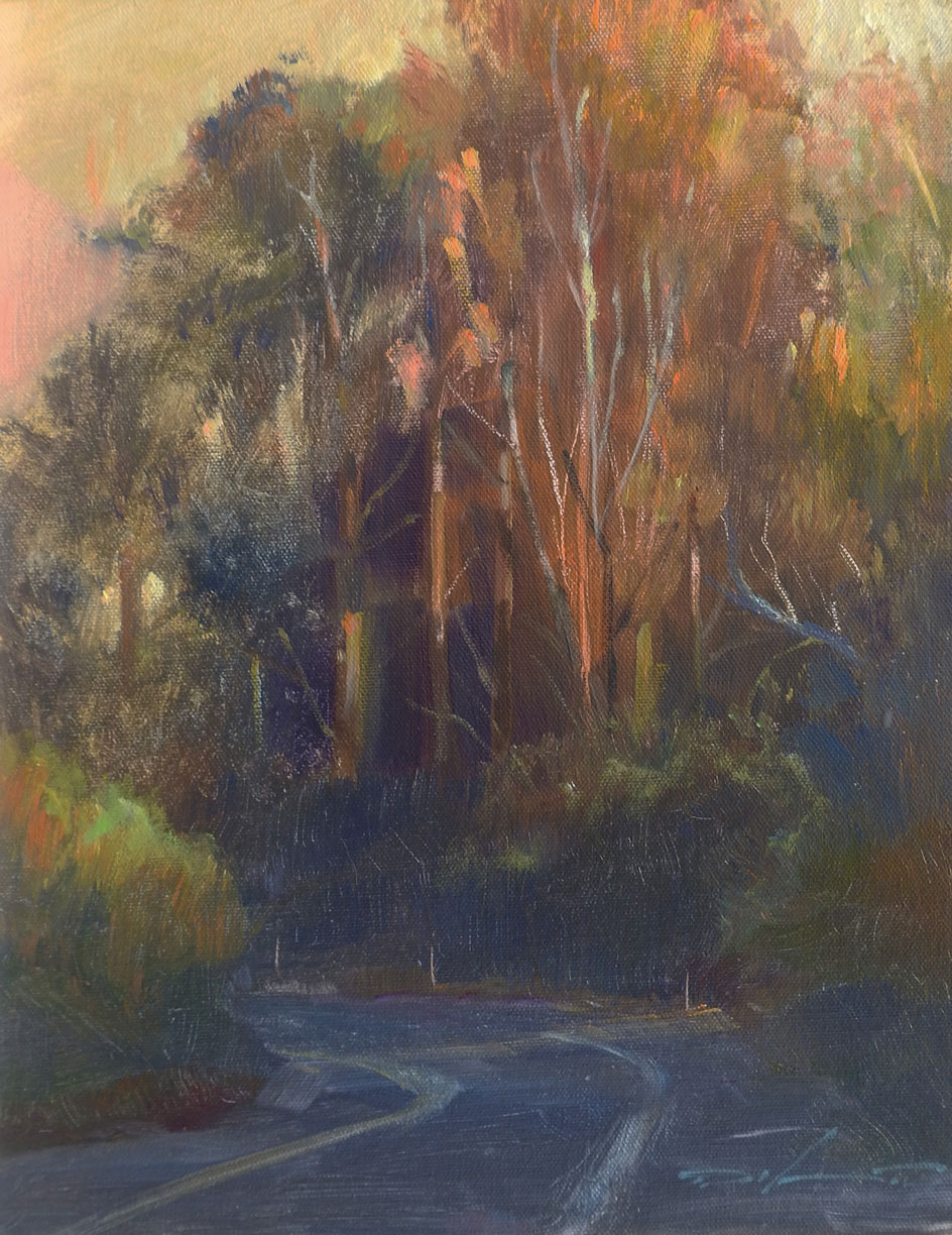
As with any painting, if all the edges of a forest landscape are hard, the flatness of the picture plane is emphasized, and the painting itself appears flat. The illusion of depth may be enhanced by softening or losing 90 percent of the edges, and sharpening only those where one intends the viewer’s eye to focus.
I’ve experimented with painting over a work I had previously scraped, which naturally softens all the edges, simply by adding highlights and accents. A similar — but methodically less drastic — effect can be achieved by glazing over the entire painting when it’s half finished, then strengthening shadows and highlights. This process works particularly well with acrylics or a fully dry oil painting. I’ve also used a wide housepainter’s brush to tap the surface of a still-wet oil painting to soften everything. In a forest painting, this helps to create the feeling of an atmospheric interior.
An Authentic Impression
In the end, my goal is to produce a painting of wilderness that feels authentic. As I walk through the forest, I’m not aware of the whole or its details as much as I am conscious of how I’m feeling: the forest has a calming, peace-inducing effect on me. When I experience it firsthand, I see it not so much as a conclave of trees, but as a beautiful blur of both variety and harmony. I don’t see details until I sit down and study it; I’ve painted entire forest scenes without painting a single leaf, emphasizing just trunks and branches. I’ve seen that trees can be told apart from one another not by their internal content — clusters of leaves, flowers, or needles — but by their silhouettes.
We’ve all heard the adage “You can’t see the forest for the trees.” In my paintings, I’ve found that if I don’t try to tell the story of the trees, only the forest, then I can express a more authentic impression of what I feel when I’m there than if I tried to paint everything I see.
Connect with Rick J. Delanty at delantyfineart.com.
The editorial above is part of a series that spotlights the work of an accomplished artist featured in PleinAir magazine.
Published bi-monthly, PleinAir magazine is focused on landscape paintings by historical and contemporary artists, art collections, events, and the process of creating plein air paintings. Beautifully designed with rich reproductions on high-quality paper, PleinAir features the top artists and artworks from around the world. Start your subscription here.
Story prepared for the web by Cherie Dawn Haas, Editor of Plein Air Today