

Editor’s Note: In this exclusive interview, John Hughes sits down with artist Kathryn Stats to explore color harmony in landscape painting. Learn her expert techniques for mastering values and utilizing complementary pairs to create stronger, more intentional compositions.

Kathryn Stats is an artist I have known for many years. Twenty-something years ago, we were among several artists who made a trek to Alaska to paint, and I can attest that she is the real deal! Her work is widely known and admired among landscape painters everywhere, and it’s a real pleasure to welcome my friend to answer a few questions for this mini-series, “Six Questions for Six Artists.”
1. John: Kathryn, I’m so glad that you accepted my invitation to talk about your art. Being that you are the niece of the late “Dean of Utah Landscape Painting,” Leconte Stewart, what effect did he have on you when you were first starting on this amazing art journey?
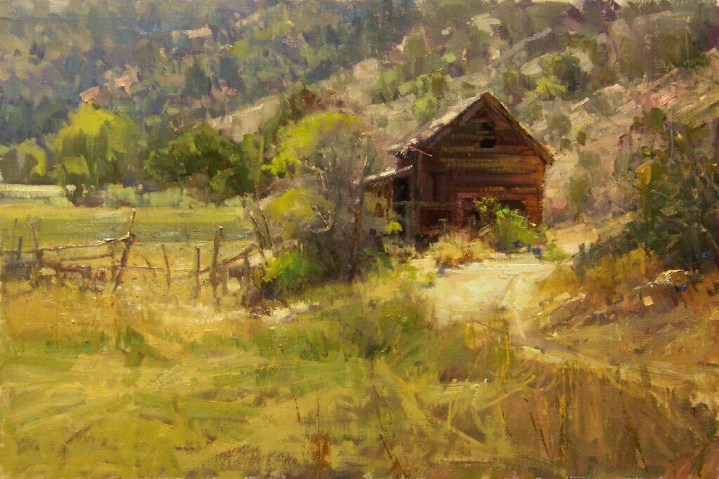
Kathryn: LeConte was my great-uncle by marriage, and we lived in Kaysville, Utah, where he lived and painted. As a young girl, I would ride my horse in the Kaysville countryside, experiencing rural life with its barns, outbuildings, barbed wire, and cedar post fences that sagged gracefully with age. At the time, I didn’t realize that I was experiencing the back roads of “LeConte Stewart Country.” Also, I have always been a visual learner, and our home was filled with his paintings of that very scenery that became the backdrop of my life up to that point.
2. Since we’re mainly talking to a plein air painting audience, what is it about the land, coupled with art, that you’ve always found so fascinating?
There was never a question that I would choose landscape over other subjects to satisfy my visual interest. Searching for material to paint is like treasure hunting, wondering what will appear around the next bend as I drive through the countryside.
The scenery that passes through the trees as you are driving serves as momentary snapshots that I want to better understand. But often when I stop the car to investigate, the movement that originally flashed by gets lost and then becomes static once I stop the car. When this happens, I’m faced with a scene that no longer holds my interest. If I do decide to paint, the design must convey the sense of discovery that was so fleeting and is now seen behind or through foreground material.
I’m usually drawn to color changes at different times of day. This affects the land, creating atmospheric perspective, which aids the ever-present linear perspective.
3. Concerning your painting process, what are some important things for younger landscape artists to understand and focus on, which might save them years of trial and error?
My advice is, don’t get faked out by the light! Our natural tendency is to be dazzled by the lightest elements first. If you put your lights in first (even on a darkly tinted canvas), you will run into trouble painting your darks after that point. The reason being, white paint will get into everything and make your canvas too slippery to go forward. In most cases, it is best to paint from dark (thin) to light (fat). Painting thin over fat can also lead to cracking of the paint. You can add a bit of thick oil medium to the paint to fatten it up as you lighten your values.
One of the many ways to stay on a wet canvas longer is to lay in your darks first, applying the paint thinly, but not thinned down. By using this approach, you can then put the next layer down with just a touch of thinner or light oil medium. Go right over the previous layer and the paint will sit on top and not pick up the original layer.
Save the lightest touches for the very last; you can also use them to cut back into the positive shapes as needed. (Like the sky cutting into the trees, which can create a painterly edge.)
Remember to use enough paint so you can avoid pushing too hard. Also, lay down your paint strokes, leave them, and move on. Leaving edges and touchups until later usually works best.
4. When painting out on location, what are some important considerations to be aware of?
First – Examine the various elements in a scene to figure out why they interest you. It’s important to identify the colors you see and the arrangement of dark, light, and midtone shapes.
Second – Anything you can do to increase distance and sense of space in the painting is welcome.
Third – Elements should not be boxed in. Beginners often think that everything they see must be contained within the frame. You can run cast shadows off the edge as well as other elements.
Fourth – Avoid painting minutiae unless it has a good reason to exist in your design.
Fifth – Work dark to light, warm to cool, and vary your textures throughout the painting for more interest.
Sixth – Divide your scenes into three to six large value shapes by combining close values into one.
Seventh – If a front-lit vertical happens to be the same value as the flat ground plane in front of it (like a cliff face), then a temperature shift will explain the difference. Sometimes plane changes can be explained with temperature rather than value shifts.
Eighth – Simplify everything down to its basic value, like puzzle pieces. The fewer the number of value shifts, the stronger the composition.
5. How do you approach color harmony in your paintings?
The following is a quote that I picked up from the Internet: “If you nail your values, you can commit crimes with color!” James Reynolds, one of my favorite artists of all time, would literally add fuchsia and turquoise to dark shadows, and it was magnificent because it did not jump out.
Of course, alizarin Crimson, yellow, ocher, and ultramarine blue, in varying combinations, can produce any number of colors. I always use a mixture of quinacridone violet, cobalt blue, plus white added to any local colors to gray them down; grays are key to color harmony in a painting.
Value trumps color, so don’t make your colors appear lighter or darker than the values they represent. You can put as many colors as you want in a single space of value, without poking holes in that space.
And I always ask myself questions like this for practice: What color and value would I use in a cast shadow on a yellow wall?
Another great procedure is to shoot a monochrome photo of my work to see if I am kidding myself about the values; it’s very telling.
6. Your brushwork is very confident and juicy. Any tips for artists who want to learn to loosen up more?
Try to say more with fewer strokes. Paint from your shoulders, not your fingers.
View your subject material with squinted eyes, then transfer that look to your canvas. That way, you will get just the facts and not the minutiae.
When viewing an impressionistically done painting, it should start to become clear from about 10 feet away. I find that when it looks great up close, it also tends to look too tight from a distance. My belief is that when things are left incomplete on the canvas, the eye of the viewer is allowed to complete the picture from a distance; this allows the person to be part of the creation. I am comparing this process to reading a book that overexplains something, rather than letting the reader conclude innuendo.
Don’t get precious. Put a stroke down, leave it alone, and move on; you can always mess with edges and other things later.
John F. Carlson wrote something like this: Get all your elements in place and then, if you must, do the smaller work to finish it off.
To keep it simple, stay within the concept of ”cooler than or warmer than” within each color family. For example, below is the breakdown for common red colors:
Warmish Reds:
Cadmium Red (light, medium, dark)
Venetian Red
Transparent Earth Red
Burnt Sienna
Napthol Scarlet
Indian Red
Perylene Red
Coolish Reds
Alizarin Crimson
Alizarin Permanent
Quinacridone Red
Radiant Magenta
Quinacridone Magenta
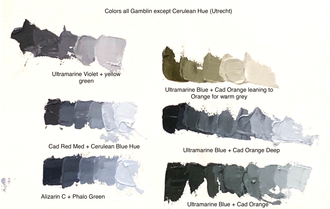
True Complementary Pairs
Complementary pairs are those colors which gray each other when combined (i.e., result in a true achromatic neutral). A true complement is directly across the color wheel, or somewhere in that area. Eventually, after using the same group of colors on your palette and graying them with the complement technique, you will naturally know the color needed to gray any color on your palette.
You now know that every red is NOT a complement to every green because you have already learned you must consider the color family, value, and saturation when determining a complementary pair.
Below are Kathryn’s examples in finding true complements for differing reds, greens, and even blue hues. Note that the very cool Phthalo Green by Gamblin turned out to be a correct complement for the Gamblin Alizarin Crimson.
It has been a real pleasure to hear from Kathryn Stats and get her thoughts on these questions, which are pertinent to many art students and professionals alike. Her thoughtful replies are a wealth of information and helpful to those who are searching for answers as they move forward in their artistic pursuits! I now have four more artists to interview for “Six Questions for Six Artists.” Who will be next?
Until next time,
John
See the first interview in this series, with Clyde Aspevig, here!
Story prepared for the web by Cherie Dawn Haas, Editor of Plein Air Today
Also of interest:

Thank you to Kathryn Stats for great useful info in a short concise article.
You were right. She is the real deal.
Thanks Becky!