

How to Fix Your Painting > This Art School Live critique session with Eric Rhoads covers composition, values, focal point, edge control, and warm vs cool balance, with practical fixes like checking in black and white and simplifying clutter.
Why Your Paintings Look Off and How to Fix Them
(an overview of the video above)
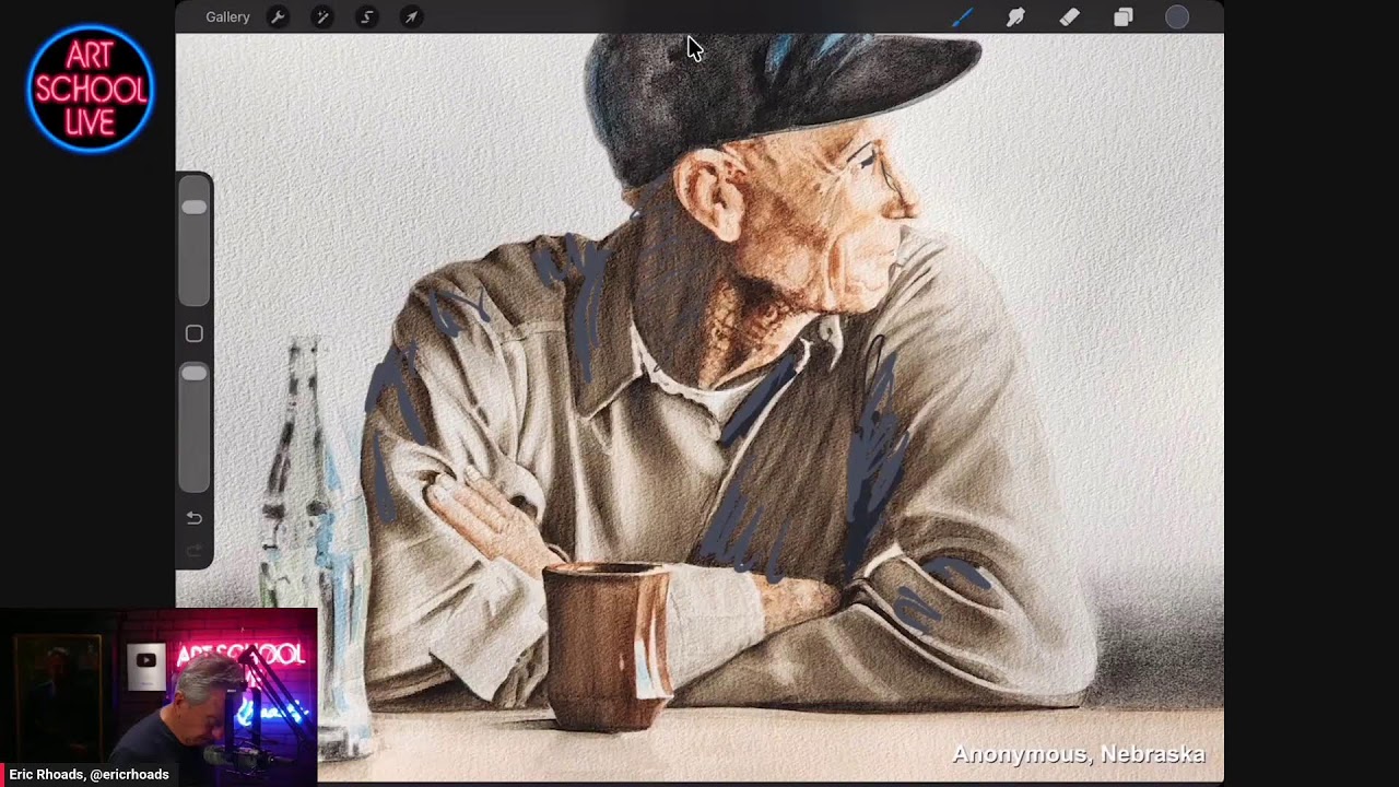
In this Art School Live critique session, host Eric Rhoads works through a simple but powerful question: when a painting feels off, what exactly is causing it, and how can it be improved?
His answer is refreshingly practical. Rather than chasing vague ideas about style, he looks at a few fundamentals first: composition, values, focal point, edge control, and warm versus cool color relationships. Across several submitted paintings, the same lesson keeps coming back. A strong painting guides the eye on purpose.
Start with black and white
One of Eric’s most useful habits is checking a painting in black and white before getting lost in color. That removes the distraction of pretty hues and reveals the real structure underneath.
He looks for a few things right away:
- Anything sitting dead center
- A horizon line splitting the picture too evenly
- Where the lightest light and darkest dark appear
- Whether the focal point lands near a strong compositional intersection
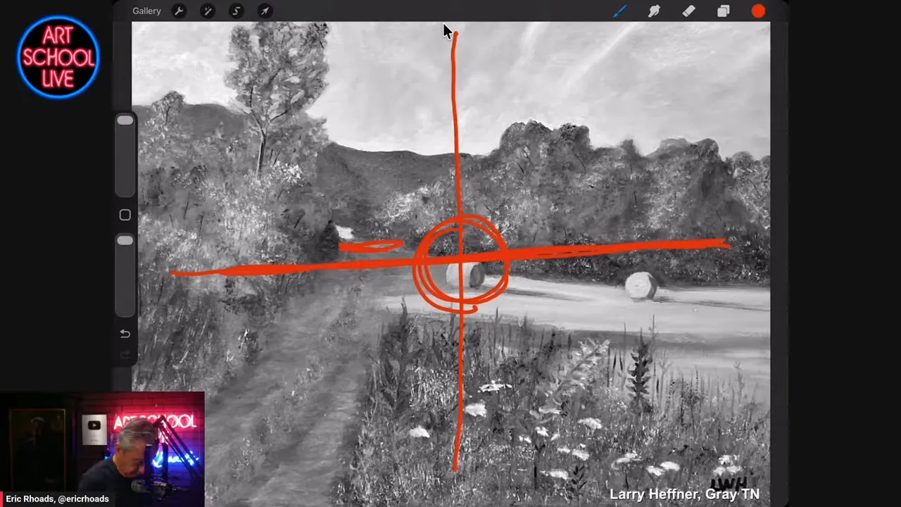
Using a farm scene as an example, he shows how a centered hay bale and unclear focal area weaken the design. Then he uses a simple thirds grid, what he calls a tic tac toe board, to test whether the important shapes are placed in stronger positions.
Values create depth
Again and again, Eric returns to value hierarchy. If foreground, middle ground, and background all share the same darkness, the image flattens out.
His fix is straightforward. Put the strongest darks closer to the front, then reduce the intensity as forms move back in space. Background trees should usually be lighter and less forceful than foreground trees. Distant mountains should recede, not compete.
He also warns against trusting photo references too much, especially with shadows. Cameras often make shadows look darker than they really appear in life. That can lead painters to overstate them and lose subtlety.
Warm scenes need cool notes
In a Tennessee farm painting example, Eric praises the warm atmosphere but points out that warmth becomes more convincing when it is balanced by cooler passages. If every shadow stays warm, the painting can feel monotone.
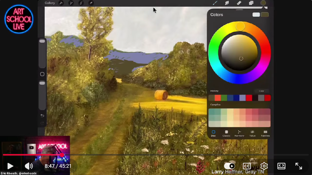
His suggestion is to cool the distant mountain and introduce bluer or more violet notes into shadow shapes. Even a small shift can create more air, more distance, and more color harmony.
That same principle shows up in other critiques too. A warm shirt needs cooler shadows. A golden animal needs cooler passages tucked into the mane. Temperature contrast helps light feel real.
Simplify busy paintings
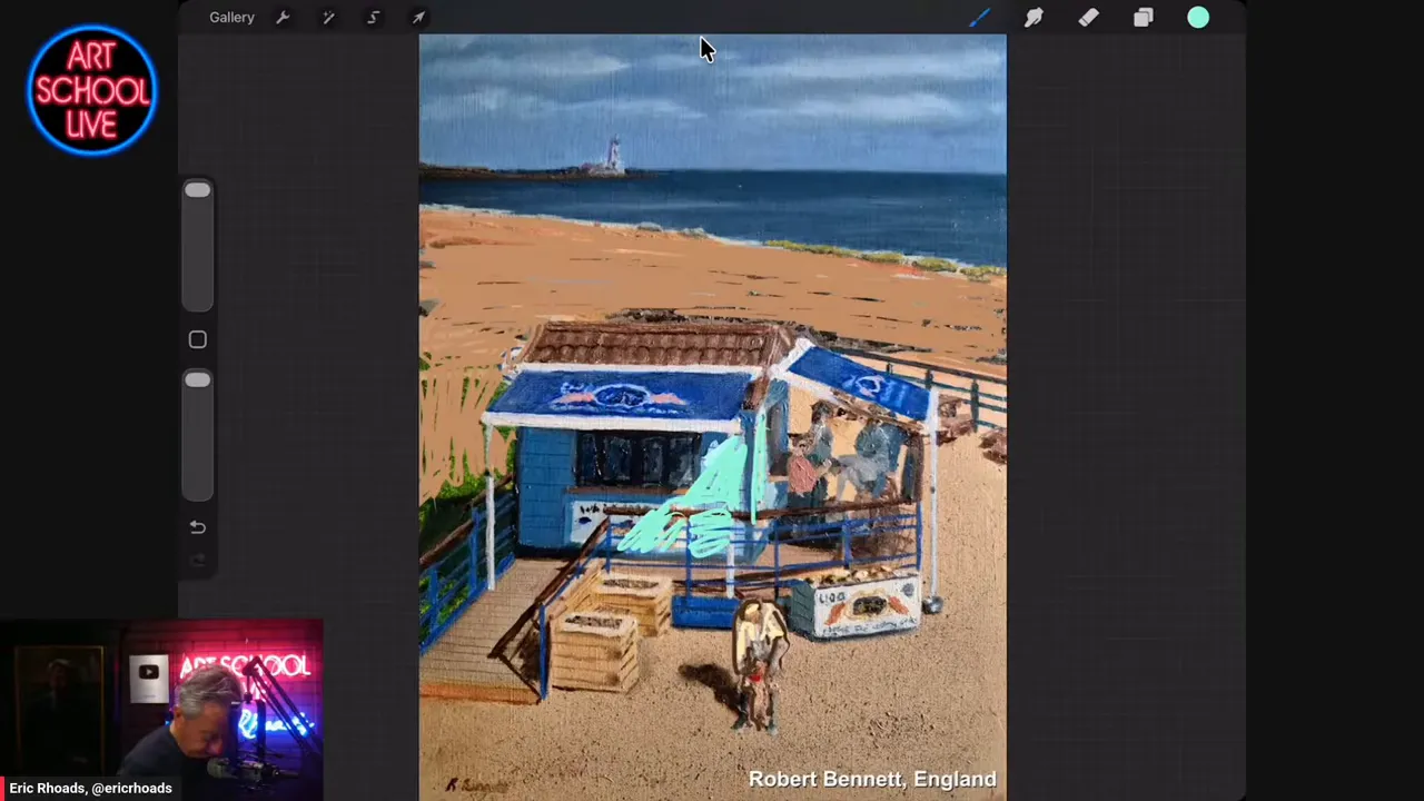
The beach scene critique makes this point especially well. There is a lot of charming information in the subject, figures, shack details, logos, rails, background activity, and bright sand. But too much detail everywhere gives the eye nowhere to rest.
Eric recommends removing unnecessary elements in the background, toning down the brightest whites, and giving more visual emphasis to a single figure. Once the clutter is reduced, the painting breathes.
His larger point is important. Detail is not automatically a virtue. In painting, too much information can be just as damaging as too little.
A note on the Suspended Steelyard
Eric also introduces a classic compositional idea from Edgar Payne: the steelyard and the suspended steelyard.
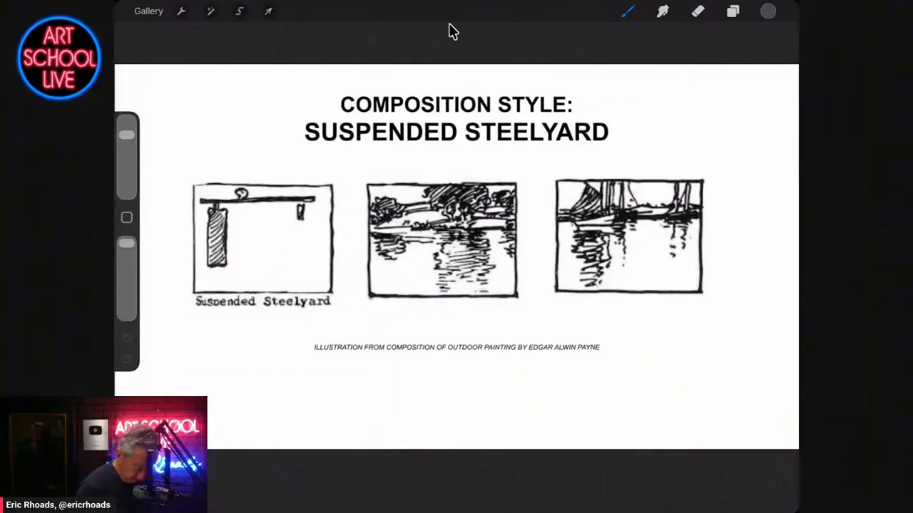
A standard steelyard creates balance with a large visual weight on one side and a smaller one on the other, like a lever. The suspended steelyard flips that feeling, creating a different kind of asymmetrical balance. He points out that some of the submitted paintings already hint at this structure, even if the artists did not consciously plan it.
The real takeaway is not memorizing jargon. It is learning to see how unequal shapes can still feel balanced when arranged well.
The big lesson
Across all these critiques, Eric makes the same case in different ways. Paintings usually look off for identifiable reasons:
- The focal point is unclear
- Values are too equal
- Backgrounds compete with the subject
- Color temperature lacks contrast
- Shapes and details create confusion instead of direction
The fix is not magic. It is observation, editing, and better design choices. Squint to simplify. Check values in black and white. Cool the distance. Save your strongest contrast for what matters most.
That is the heart of this session from Eric Rhoads: strong painting is often less about adding more and more about removing what gets in the way.
Looking for MORE ways to improve your skills?
Join us for the next Plein Air Live online art conference! Plein Air Live gives you invaluable insights and live demonstrations from some of the world’s best plein air artists. Over the course of 3-4 exciting days, they’ll reveal techniques to improve your use of color, light and shadow, giving you the confidence and skills to paint outdoors and create more amazing artwork than you ever have before. Learn more at PleinAirLive.com.
Browse more free articles here at OutdoorPainter.com
Blog post prepared for the web by Cherie Dawn Haas, Editor of Plein Air Today



Wonderful advice in all of this one! Simple thoughts if you really think about getting to the basic reasons of what might not be working. Thanks and I will be sharing this one on Facebook for people to read. Again… simple thoughts we should all remember to look at when viewing artwork.