

How to paint landscapes > Seeing, understanding, and learning how to use color temperature in your work can elevate a so-so painting into a work of art.
How to Paint Landscapes: Impressionism, Sorolla, and the Color of Light
By Thomas Jefferson Kitts
“I hate darkness. Claude Monet once said that painting in general did not have light enough in it. I agree with him. We painters, however, can never reproduce sunlight as it really is. I can only approach the truth of it.” — Joaquín Sorolla y Bastida
Color temperature and the color of light are often the worst-explained aspects of painting. Too often, the teacher doesn’t understand them himself, or she makes both sound more complicated than they are. Sadly, this leaves the student struggling to understand what color temperature is before giving up in frustration. Or worse, the bad explanation leads the student to conclude color temperature is not a real thing — that their teacher is just making it up. This is unfortunate, because seeing, understanding, and learning how to use color temperature in your work can elevate a so-so painting into a work of art.
If you are a painter who believes color temperature is bogus then please permit me to share an analogy. Until recently, anatomical science believed there were only four flavors the human tongue could taste: Sweet, Sour, Salt, and Bitterness. Now food science includes a fifth: Umami — the flavor found in grilled meat, mushrooms, and many other foods. Umami has always been present in the foods we eat, of course, but it remained overlooked and unremarked upon due to our western assumptions. Color temperature is similar in the sense that once you learn it is a real thing, you begin to see it everywhere. And when you do, you can’t stop seeing it.
Okay, fine, so color temperature exists. How can you start seeing it as you learn how to paint landscapes?
First, let’s talk about the kind of colors we can mix with paint and how it relates to the color temperatures we can see. Then, let’s get to the point of this article: how the color of light modifies or alters the colors we can see and mix with paint.
How to Paint Landscapes, Concept #1: Color Temperature is Determined by the Relationship Between Two or More Hues
Every color we can see and mix can be broken down into three separate components: hue, value, and chroma. And each one of these components can be individually modified without changing the other. However, what we will discuss from this point on will pertain to hue.
An individual hue does not have a temperature. A yellow, orange, red, purple, blue, or green by itself is not inherently warm or cool. Color temperature is the relationship between two or more hues, meaning one hue will always be warmer or cooler than another!
This can be seen in the relationship between a green and a blue hue (top left). Between an orange and a violet (middle). Even between two closely related hues, such as two reds (bottom left). In all cases, one hue will appear warmer or cooler than the other. To what degree they appear warmer or cooler depends on where they sit on the color wheel. Or, to be more precise, how close each hue is located to yellow or purple.
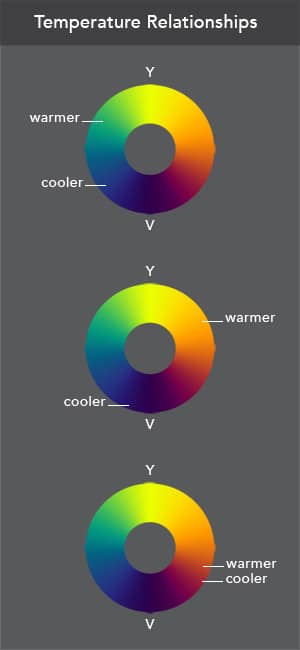
The French Impressionists discovered this principle when they went outside to paint snow in the winter. In their model, the hue that sits closest to yellow should be considered the warmer of the two. The hue that sits closest to purple is cooler. It really is that simple.
Note: Again, color temperature has nothing to do with Value (the equivalent gray of a color), or Chroma (the intensity of a color). Color temperature only pertains to the Hue of a color.
The Color of Light
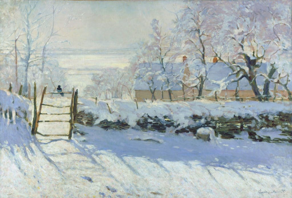
Let’s look more closely at what Pissarro, Monet, Renoir, and their brethren learned about light as they painted snow directly from life. They saw that the snow in the sunlight was not just a lighter value than the snow in the shadow, it was also warmer in hue.
They were painting the same snow, but different light, so the snow in the light and shadow contained different values and temperatures. The snow in the sun was warmer (yellowish), the snow in the shadows was cooler (bluish).
To reduce this observation into the most simplest terms:
sunlight = warm temperature
skylight filling the shadows = cool temperature
Pissaro, Monet, and Renoir then applied this warm/cool observation about light to everything they could see, and voila, Impressionism was born!
How to Paint Landscapes, Concept #2: How the Color of Light Modifies the Temperature of Local Color
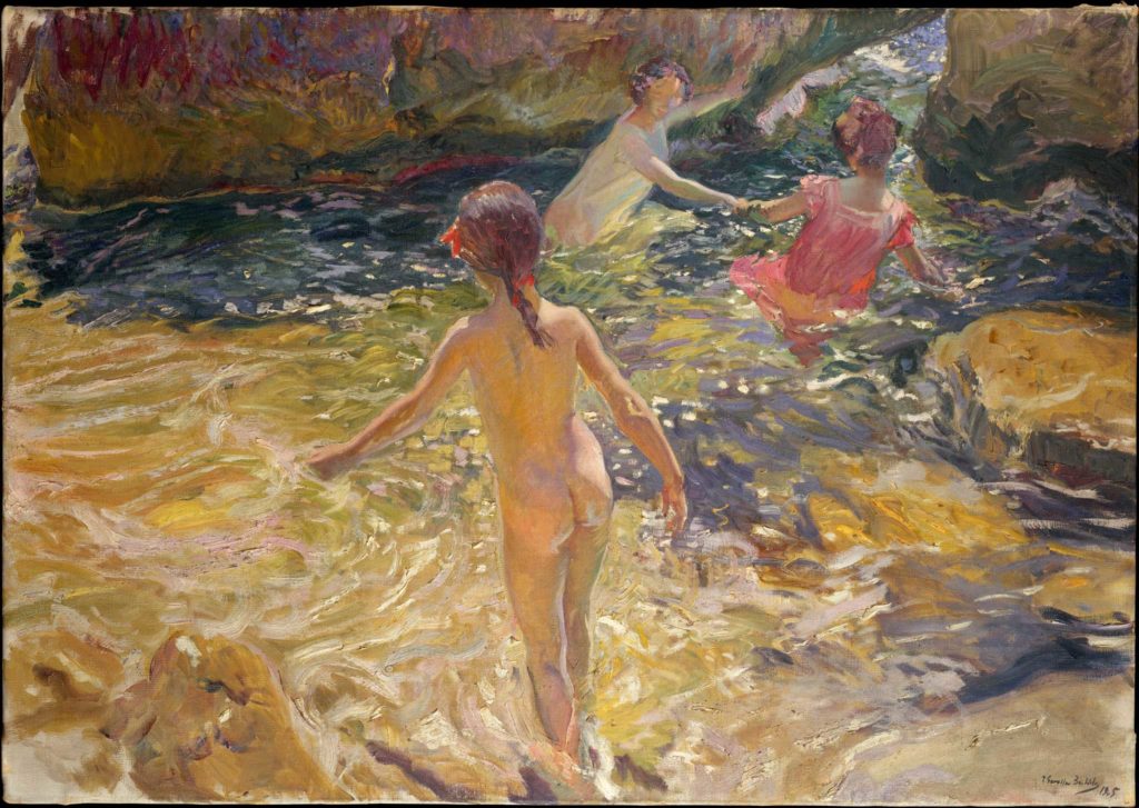
Beside the French Impressionists, other painters (such as Sorolla) observed that on a sunny day an area lit by the sun would appear warm if the shadows were being partially illuminated by a cool ambient light bouncing in from the sky. Thus, on a clear day the temperature differential between a local color lit up by the sun, and the same color in the shadow would be warm and cool. In essence, the different color of the two lights split the local color into two: a warm and a cool version.
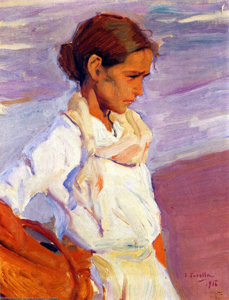
For example, in Sorolla’s intimate portrait of a young Valencian woman, “La Pescadora,” her white shirt and bronzed complexion goes from warm to cool as they cross from sunlight into shadow. In the light the shirt and skin are lighter in value, but they are also pushed towards the yellow and orange. The same white shirt and skin in the shadow drop in value and are pushed towards the blue and purple. (The shadows on the skin aren’t purple per se, the chroma has just been neutralized and the local hue has been pushed in that direction, which describes the effect of a cool light on the local color.)
This warm/cool temperature differential can be subtle, or it can be overt, but the relationship will be there regardless. If you maintain this warm light/cool shadow temperature relationship throughout your entire painting you will succeed at creating color harmony and a convincing sense of light.
If you study Sorolla’s outdoor work closely you will discover he often exaggerated the temperature differentials of his subject. He mixed his warms warmer, and his cools cooler. He pushed the local color in the light toward the yellow more than it was, and correspondingly, he pushed the local colors in his shadows more towards the blue or purple. He linked this warm/cool temperature division to his light and shadow masses, and that combination was largely responsible for creating the powerful illusion of intense sunlight on his canvas.
His exaggerated push also created a physiological optical vibration within the eye called “simultaneous contrast in hue,” an effect exploited to its fullest extent by the French Impressionists after advances in mid-nineteenth-century chemistry began producing new intense exciting hues to paint with, such as today’s cadmiums, chromiums, cobalts, and more. As a result, simultaneous contrast in hue became another founding principle for the Impressionists.
Related > Preview “Sorolla: Painting the Color of Light” here:
Painting the Planes, Broken Color, and Turning the Form with Color
On a related note, and quite apart from the discoveries made by the French Impressionists, many painters of the same era began to depict the color of light in a different way. Painters such as Sargent, Sorolla, and Zorn became interested in modeling the volume and form of their subjects, not just with gradations of light and dark values, but also with variations of warm and cool temperature contrasts.
They began describing how the surface planes of their subjects turned towards or away from the light by changing the local color. In essence, whenever they saw a shift in value they also looked for a shift in hue (temperature), since that was how light worked. This approach became known as “painting the planes” or “painting with broken color” since the change in hue occurred at the point two planes turned or ‘“broke.” Again, this is exactly how light works when there are multiple sources illuminating a scene.
Now It Gets a Little More Complicated
If you continue to survey Sorolla’s outdoor work for the application of warm lights/cool shadows you will come across many exceptions and overt violations. (Nothing about painting is ever simple, is it?) Yet, when you find them they turn out to be logical exceptions, easily explained by the color of light.
How to Paint Landscapes, Concept # 3: Not All Light that Bounces into a Shadow Comes from the Sky
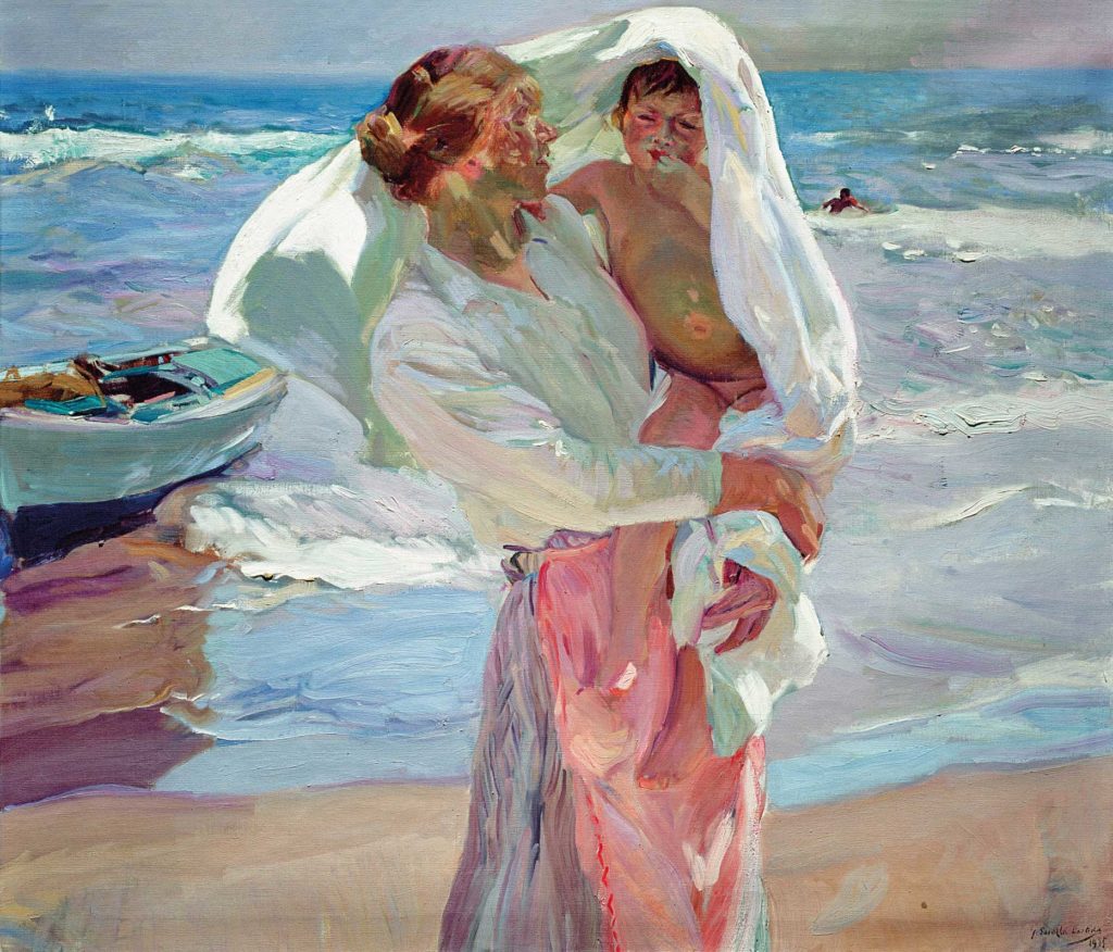
In the detail from Sorolla’s painting “After Bathing,” there is light reflecting up from the sandy beach below into the underside of a mother’s arm carrying her child. The temperature of that light was altered by the color of the beach below and it warms up the underside of her arm inside the cool shadow. (You can also see how the cool skylight from above is turning the top of her shoulder and arm as well.)
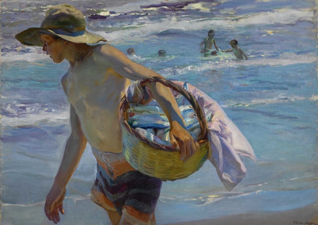
In “El Pescador” there is reflected light bouncing up from the beach below again, and there is light bouncing off the interior of a straw basket held tightly against the boy’s waist against his forearm (and yet more cool light filling the shadows). Again, the reflected light from the beach and basket is warmer than the sun and skylight coming from above.
In “The Bath, Jávea (El Bano),” there are multiple sources of light bouncing around the children — there is direct sunlight, reflected skylight, light bouncing off warm rocky cliffs cropped out of the painting, and yes, even light bouncing up from the sandy bottom below the water line. (A fantastic combination, yes?)
In these three examples, the various temperatures of the bouncing light is so strong they overpower the sun and ambient skylight. So exceptions to the principle of warm lights/cool shadows do exist. When this happens the area illuminated by direct sunlight may appear cooler. Again, this shows color temperature is a relationship; that no single local color viewed in isolation is inherently warm or cool.
How to Paint Landscapes, Concept #4: Reflected Light Inside a Shadow Will Never be as Bright as Direct Light
If your subject is illuminated by a single primary light source, such as the sun in the examples above, any warmer bounced light strong enough to modify the cooler colors within a shadow will always appear less bright than the area directly lit by the sun. (Every time light bounces off a surface some of it is absorbed and the reflection drops in lumens.) Thus, the warm/cool temperature shift you may find within a shadow will never be as bright as the primary light. Follow that principle and your light and shadow masses will maintain their separate integrity.
Tricky? Well, not really, once you start looking for such temperature contrasts in real life. (Don’t bother to look at photographs. Most of the time, unless great care is taken, or the conditions are perfect, a photograph will fail to capture the temperature shifts and end up substituting value shifts instead.) Once you start looking at life directly, you will start to see the color of light bouncing around in the shadows. And of course, if you include the temperature your see into your own painting it will imbue your work with a quality of light everyone will love.
How to Paint Landscapes:
Painting Exercise > How to See and Paint the Color of Light at Home
On a sunny day, choose three objects that are neutral in hue. They can be white, grayish, dark, or almost black. They don’t have to be the same value, or neutrality, just close. In fact, a little variation can be helpful. The key here is to choose objects that do not have a strong local color. (Also, for simplicity’s sake, avoid anything that has a shiny reflection. Incidental highlights can confuse you at this point.)
Arrange your three objects on a white tablecloth outside in direct sunlight. (The tablecloth will bounce a lot of light into the shadows.) Look at the juncture between the areas of light and the shadows. Begin mixing the colors you see on either side, knowing that the area lit by the sun will require a warmer version of the local color. Also assume the shadows will require a slight push towards the blue or purple. Not much, just a little.
Maintain this warm/cool, light/shadow temperature relationship everywhere in your painting, and also incorporate it in the twists and folds of the white table cloth, should there be any. Any time a surface plane turns towards the light it should be warm; any time a surface plane crosses into the shadow it should go cool.
It is not critical that you properly render the colors of your still life. What is important is to capture the warm/cool division between the light and shadow shapes.
The next step will be to introduce objects that have a stronger local hue and play with the different colors of light (temperatures) within the shadows. Have fun, and remember this is only an exercise to teach you how to recognize temperature. I guarantee what you learn from doing this a few times will apply to every other subject or painting you love — indoors or out.
My video, “Sorolla: Painting the Color of Light,” extensively covers the concept of painting the temperature of light. In truth, I began working on this video five years ago when I began traveling to view Sorolla’s masterworks and the places he painted. My demonstration is a stroke-by-stroke, fifteen-hour presentation, with some extras. It includes many detailed explanations of what I am about to do, and more information as I do it.
Nothing is left out or held back and nothing is dumbed down. Additional topics beyond color temperature are presented in detail. I discuss how Sorolla applied his paint in his mature years; how he altered, edited, and simplified his subjects; how he used his brush at the start of a painting; how he used it at the end; and so much more.
If, like me, you are in awe of Sorolla — or if Sorolla is a new artist to you — you can learn a lot about how he painted from my demonstration. Whether an experienced painter or someone new to the world of painting, you can learn how to see and manipulate color temperature to add vibrancy and life to your own work. [Order here]
ABOUT THE AUTHOR
Thomas Jefferson Kitts is inspired by the way light plays across his subjects and has devoted most of his life to traveling and capturing it in oil. Kitts prefers to work directly from life for its honesty and immediacy, incorporating many alla prima techniques developed by master artists such as Sargent, Sorolla, and Zorn.
Kitts has painted observationally, en plein air, for more than 33 years, first starting out in 1984 after graduating from the Kansas City Art Institute. His work is in the permanent collections of Maryhill Museum of Art, Booth Western Art Museum, Fleischer Museum, Kaiser Permanente, Marriott Corporation, and Paul Allen Foundation. His recent museum exhibitions include Booth Western Art Museum, Maryhill Museum of Art, Laguna Art Museum, Academy Museum of Art, and Curaçao Maritime Museum.
Kitts is a Signature Member of the California Plein Air Painters, Laguna Beach Plein Air Painters Association, and the American Impressionist Society, as well as an Artist Member of Oil Painters of America, and the celebrated California Art Club. He travels extensively and maintains a distinguished exhibition history that includes many professional art organizations such as the American Impressionist Society, Oil Painters of America, and the Arts for the Parks (Top 100). His work is actively collected throughout North America by both private and public institutions.
This article on how to paint landscapes was originally published in 2019; Updated December 2025
Check out the following amazing opportunities for learning how to paint landscapes and so much more with Streamline Publishing:
> Click here to subscribe to the free newsletter, Plein Air Today
> And click here to subscribe to PleinAir Magazine so you never miss an issue!


Thank you for this great explanation. As a developing painter, I’ve read about color temperature before but you described in a way that was easier to comprehend. Now I just have to apply it to what I see. Thanks for providing an exercise to practice the concept.
Thank you for providing interesting, informative and relaxing content. It seems like even the science outlets are slammed with politics and hate these days. I appreciate Plein Air Magazine’s research and imagery to aide the developing painters out there… Or just a person looking to relax before starting their day.
[…] Image Source […]
[…] Fuente de las imágenes (y detalles) […]