

Nocturnes aren’t always painted after dark. Jim Wodark, Bill Cramer, Joshua Been, James Gurney, and Michael Chesley Johnson explore the art of painting night scenes in broad daylight.
Whether you paint exclusively en plein air or split your time between indoors and out, we hope the tips shared here entice you to try your first day-to-night scene or help you make your next one that much more believable.
Painting Landscapes: Day-for-Night Nocturnes
BY MICHAEL CHESLEY JOHNSON
(michaelchesleyjohnson.com)
1. Choice of Colors: When I’m painting a day-for-night scene, I use mostly cool colors, such as blues and greens. For my oil palette, I use ultramarine blue and phthalo green. For the few warm colors I might use in a nocturne, I try to stick to cool versions, such as cadmium yellow light (a cool, greenish yellow) and alizarin crimson (a cool, purplish red). These colors are all very intense, so I make sure to reduce their chroma, either by adding a complement or a cool gray. My pastel palette is very similar.
2. Overall light must be decreased considerably. Even a full moon provides only 1/400,000th of the illumination of sunlight.
3. Contrast must be decreased within shadow areas. In a daylit scene, you can often see significant value shifts within the shadows. At night, however, less light bounces into shadows, so these value shifts are absent. Detail disappears and shadow shapes merge.
4. Highly reflective surfaces and light sources should appear lighter in relation to the rest of the scene than they do in daylight. Reflective surfaces include things like metal barn roofs and moonlit ponds. Light sources include candles and neon lights in store windows.
5. The sky must be made darker in relation to the land than it is during the day. During the day, a great deal of sunlight is scattered by the atmosphere, lightening the sky considerably. The moon and stars have much less light to scatter.
6. Warm colors must be minimized. Colors should be shifted more to blues and greens. Any warmth in the scene most likely appears in the foreground or in manmade light sources, such as incandescent lamps.
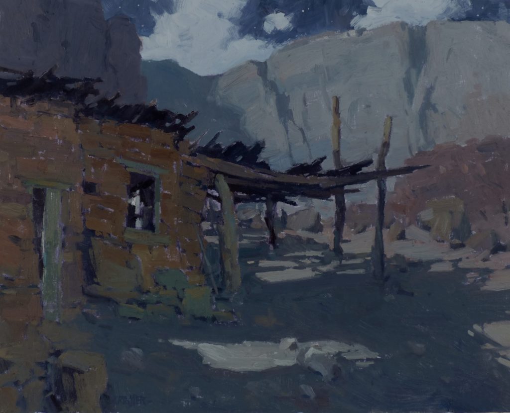
7. Look for contrast. Nocturnes are all about drama. Thus, the easiest daytime scenes to translate into nighttime ones have strong contrast.
Here are two easy-to-translate scenes:
8. Scenes with brilliant sunshine: The contrast between cast shadows and illuminated land will be great, and the shadow edges will be sharp — qualities one also finds in a moonlit scene. As for color, the moon casts a greenish light, so add this to lit areas. Even the sky can take a bit of cool green, especially near the moon, which does not need to be made up and placed in the scene; instead, it can be left offstage to provide strong light.
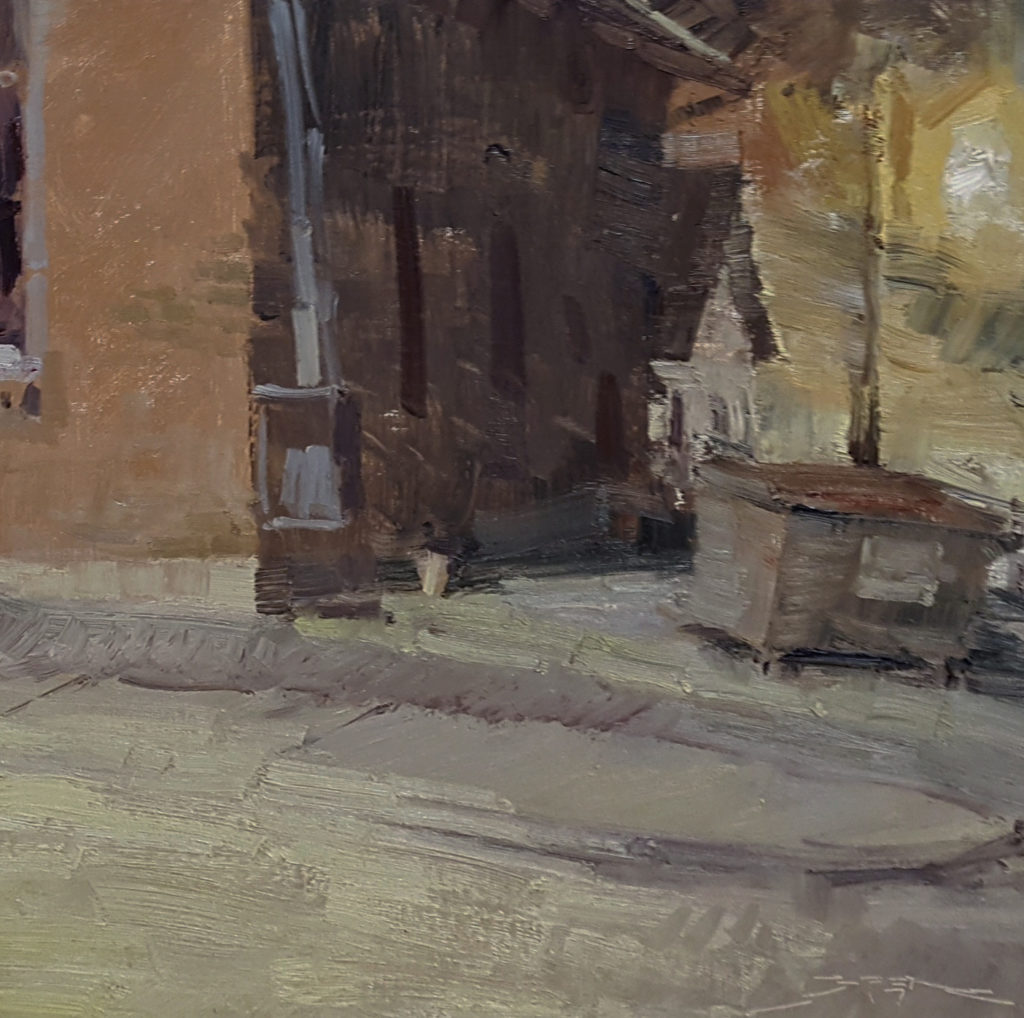
9. Scenes with buildings or manmade structures, such as roads: Buildings, especially on sunny days, cast deep, dramatic shadows. Roads, especially dirt or gravel roads, are often much brighter than the surrounding land; this is a quality that, when translated into a nocturne, can offer a strong lead-in for the viewer.
10. Take it to the Next Level: A Study in Light
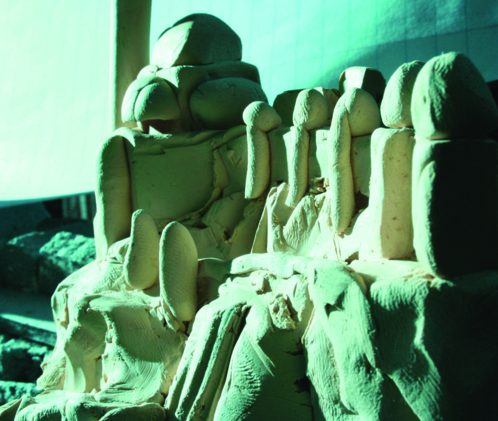
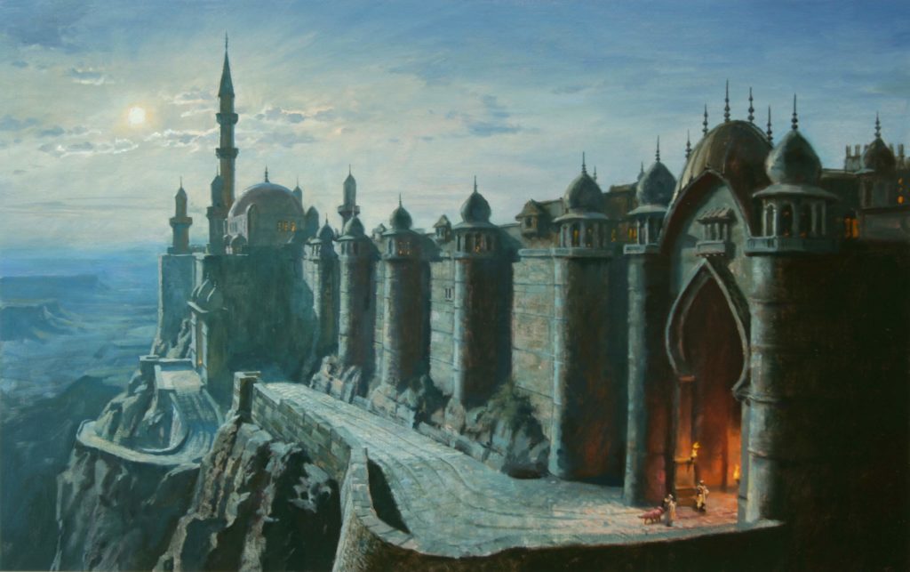
When you need to imagine the effects of light on your subject for a made-up night scene, James Gurney has a studio exercise that can help. “I made a little oil-based clay maquette in less than an hour to visualize the desert stronghold of Khasra,” says Gurney of his process for creating a nighttime illustration for his book Dinotopia: Journey to Chandara (Andrews McMeel Publishing, 2007).
“The maquette [below] is only about three inches tall. Even a quick and sketchy architectural maquette can still give you plenty of lighting information. For example, notice the warm light bouncing into the shadows of the gateway on the right side. The shadow side of the last tower on the extreme right is much darker because it lacks reflected light.”
More Tips from the Pros on Painting “Day-to-Night” Scenes
More difficult daytime scenes have low contrast. Here are a few hard-to-translate scenes.
11. Scenes with weak shadows: Softly lit, overcast days have little contrast. The natural landscape without buildings can be particularly trouble-some; the shadows are rarely strong enough to be effective design elements.
12. Scenes with streetlamps: Although street-lamps are often included in nocturnes, including them in day-for-night paintings can involve strenuous mental gymnastics; shadow patterns will be completely different from what they are in daylight, and unless you’ve actually seen the location at night firsthand, you probably won’t be able to pull it off — unless the streetlamps are turned off and you’re relying on the moon for light.
13. Scenes with sunlit clouds: Sunlit clouds can appear nearly incandescent. For a nocturne, you will need to lower their value more than you might expect. Unless you want the clouds to dominate the scene, make sure the light on them is weaker than the light falling on horizontal stretches of land and highly reflective objects like metal roofs.
14. Conduct field research. “If I get the chance, I go out at on a moonlit night and take notes on the colors and values of the scene,” says Jim Wodark. “With these notes, I then look at the scene in the daytime and give myself permission to make up color combinations and values. What I like most about this approach is that I don’t know what I’m doing until I figure it out. I’m not just looking at a color and replicating it but asking myself, What color would that red rock be in moonlight? Would it still read as red? How do I make it feel like it is night?”
15. Let cool colors dominate. “I don’t change my palette much for ‘day-turne’ paintings,” says Bill Cramer, “but I avoid cadmium reds and yellows, reaching instead for ultramarine blue, cobalt blue, cerulean blue, cadmium lemon yellow, and alizarin crimson, plus titanium white. This keeps things cooler and bluer…
16. “Any warm colors tend to be in the foreground and are pushed toward gray — reds are more violet or even dull orange, while yellows and greens are more deep ochre or teal…
17. And, “Imagination is key,” Cramer continued. “You can get away with a lot in these paintings because they are essentially made up. Some elements of the scene have to be revealed. If you painted it as a true-to-life night scene, there would be almost nothing to see!”
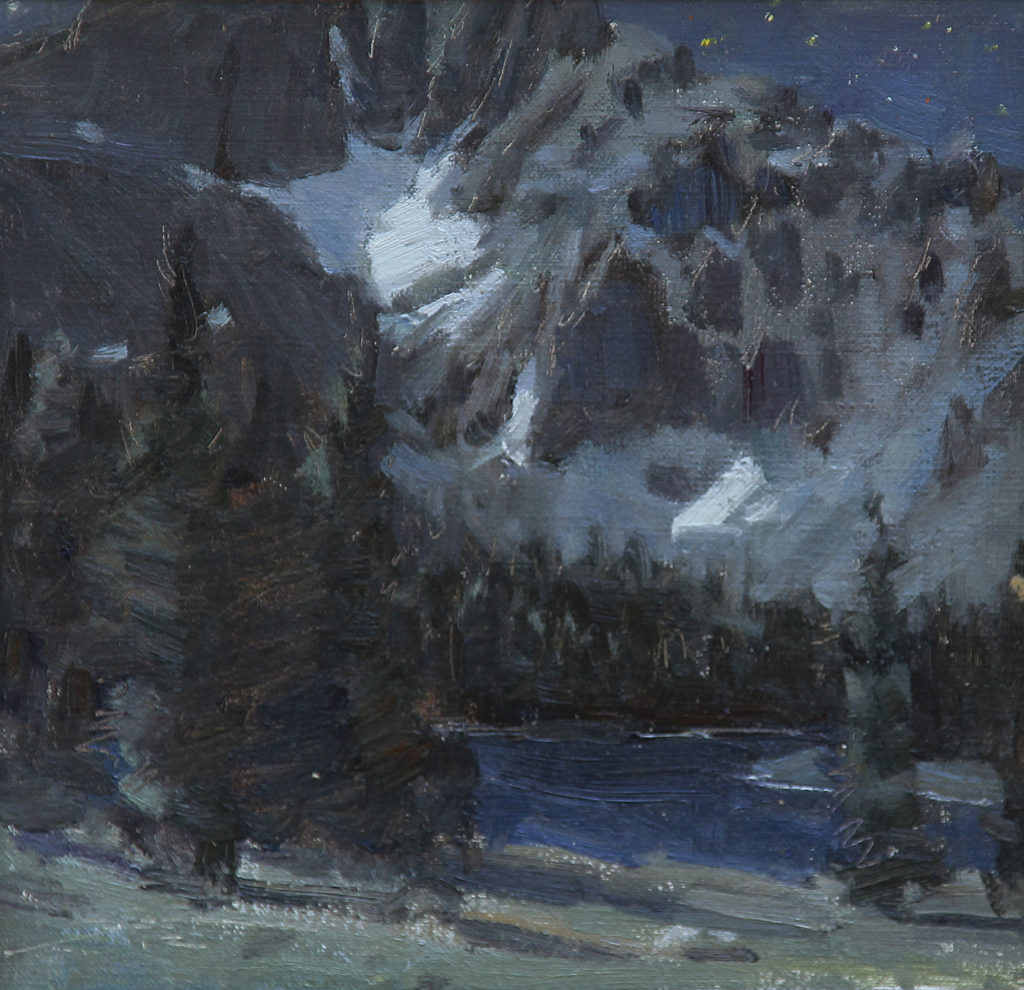
18. Focus on natural light. “With an understanding of light and shadow patterns, the artist needs to change the color harmony and lower the key of the painting to make a daytime scene look like a moonlit one,” says Joshua Been. “The catch is that it only works in a scene with no manmade sources of light. A lit window blasting secondary light into a moonlit scene might be what you want to paint, but it can’t be invented from daylight information alone. Scenes with artificial light must be painted on location.
“The outcome is much more manageable when exchanging sunlight information with moonlight, even while painting on location during the day. When analyzing nocturne paintings by Frederic Remington and Frank Tenney Johnson, there is often no other source of light, other than an occasional campfire. These scenes have a deliberate change of color harmony to create a feel of radiant moonlight. The light and shadow information from a sunlit scene can be replaced by moonlit color harmony, value, and color contrast to read convincingly as a scene drenched in moonlight, as I did in ‘Moonlit Lakes’.”
19. Keep values low key. “The palette of colors could be pretty much anything — either a full palette or a restricted one,” says James Gurney. “It’s the mixtures and the handling that count. For me, however, the painting probably ought to be almost monochromatic in color, slightly bluish, with softened edges and a suppression of detail in the shadow masses, as well as an overall low-key value range.”
> Click here to subscribe to the free newsletter, Plein Air Today
> And click here to subscribe to PleinAir Magazine so you never miss an issue!
> Looking ahead, join us in January for Watercolor Live!


Very informative and helpful!
I love all of this fantastic information. Thanks to all who shared their expertise.
Krystal
Thanks for this great article! I was working on one this week, and will not add thalo green to the mix 🙂
Typo! I meant to say “I will now add thalo green…”
[…] see 19 Tips for Painting Day-to-Night Nocturnes at […]