

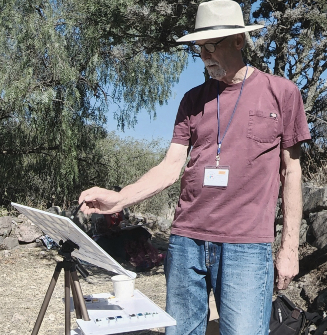
James Faecke shares the challenge and his solution to mixing greens with watercolor, his plein air palette, and his personalized set of primaries.
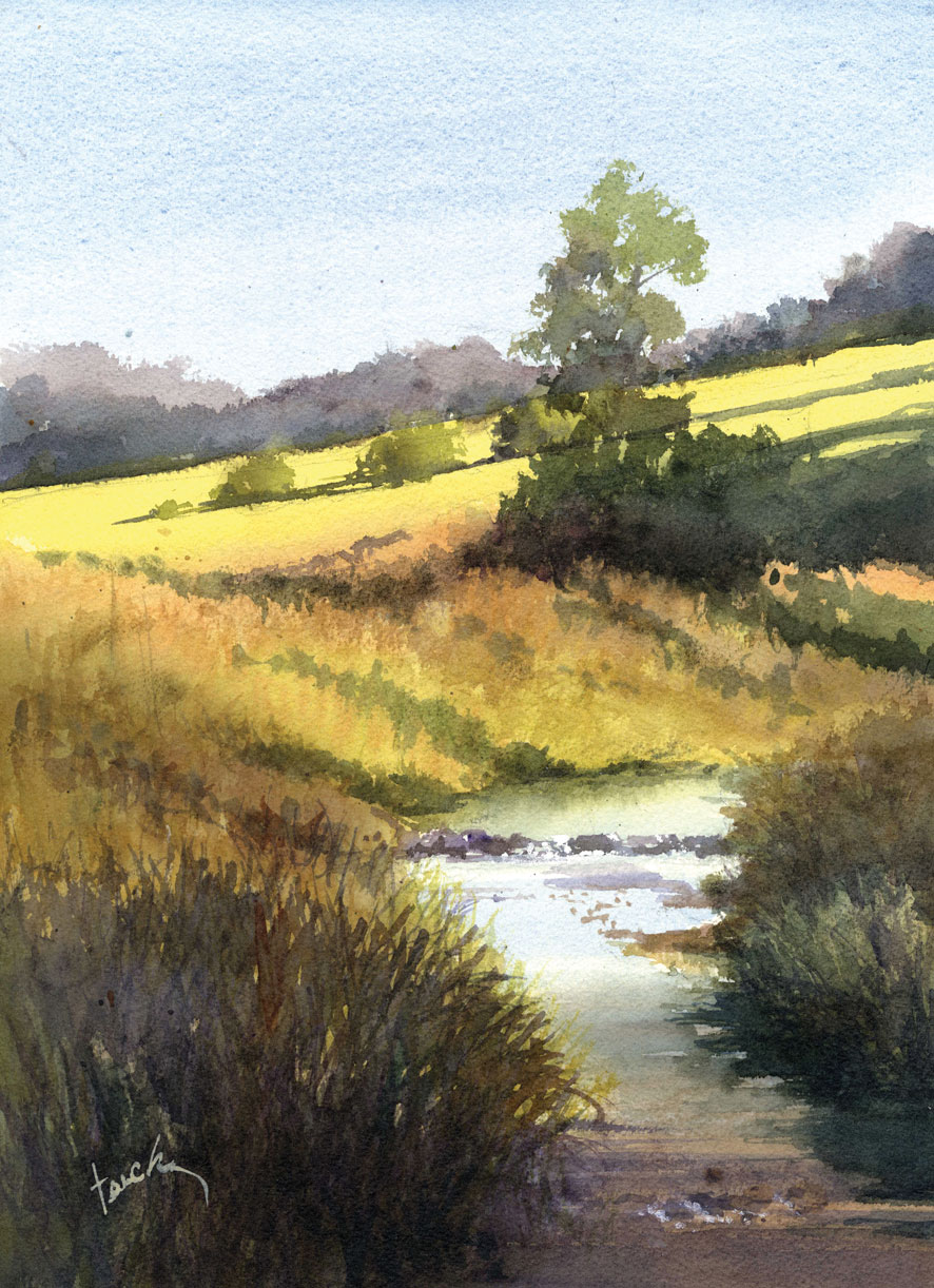
James Faecke grew up in the “desolate Southwest,” where the dominant colors are browns, golds, and sky blue. Moving to Wisconsin was, by his own account, a revelation. “The Midwest landscape is lush, dominated by greens and blues,” he says. And greens, as any watercolorist knows, are tricky.
“They can go flat on you,” as his friend watercolorist Richard Sneary once warned him. It’s a problem James has spent years solving. “I haven’t found any good out-of-the-tube greens,” he says, “so I always mix them myself.”
His most reliable green recipe came from fellow watercolorist Andy Evansen: Payne’s Gray mixed with Quinacridone Gold. The result is what James calls a beautiful “natural” green — one that reads as organic and complex rather than synthetic. The key, he notes, is brand specificity: “It’s important to use Winsor & Newton paint for your Payne’s Gray in this mixture because it has more blue in it than other brands.” He sometimes substitutes Indigo, which pushes the mix slightly bluer still. From there, the ratio does the work — more gold warms the green, more gray cools and deepens it. And to keep those greens alive on the paper, James drops blues and Quinacridone Burnt Orange into wet washes.
In addition, James’s must-have colors include Cobalt Blue, Carmine, and New Gamboge — essentially a personalized set of primaries. “I believe we all develop an affinity for our own personal color palette,” he says, “and we use these preferences to interpret local color in a way that expresses our individual vision. With this combination of colors, I can paint pretty much anything.”
Complementary colors play a central role in his work, particularly the interplay of oranges and blues — a pairing he returns to again and again. “I love to drop a complementary color into a wet wash,” he says. “Watching pigments disperse and bloom is one of the joys of watercolor. It’s simply magic.”
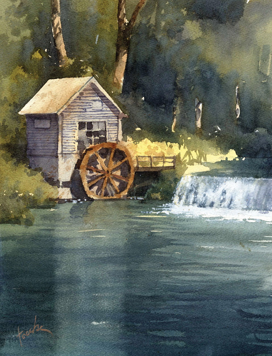
For water — a popular subject in the lake-rich Midwest — James turns to Cobalt Turquoise — not on its own, but as a mixing color that, combined with other pigments, creates a range of blues and greens.
For deep, clear water, he combines Indigo with Winsor Green, often adding this mixture at the bottom of a wash as it moves toward the foreground to deepen both color and value.
To create wave patterns and color variation on the surface, the artist applies thin washes of Winsor Green or Cobalt Turquoise and Winsor Violet wet-into-wet. He seldom uses blacks, but when he does he mixes Indigo with Carmine — sometimes dropping the combination into an existing wet or damp wash for richness and depth.
James uses Winsor & Newton paints for most of his palette, with the exception of his quinacridone colors, which he sources from Daniel Smith. His full outdoor palette runs left to right: New Gamboge, Quinacridone Gold, Cadmium Orange, Quinacridone Burnt Orange, Cadmium Yellow, Cadmium Red, Carmine, Neutral Tint, Winsor Violet, Payne’s Gray, Cerulean Blue, Ultramarine Blue, Cobalt Blue, Cobalt Turquoise, and Hooker’s Green. Four half pans are glued into one of the mixing wells for colors he uses in smaller amounts — Burnt Umber, Winsor Green, Indigo, and a warm black.
Connect with the artist at www.jamesfaecke.com.
The editorial above is part of a series that spotlights the work of an accomplished plein air artist featured in PleinAir magazine.
Published bi-monthly, PleinAir magazine is focused on landscape paintings by historical and contemporary artists, art collections, events, and the process of creating plein air paintings. Beautifully designed with rich reproductions on high-quality paper, PleinAir features the top artists and artworks from around the world. Start your subscription here.
Story prepared for the web by Cherie Dawn Haas, Editor of Plein Air Today


