

Learn how to add realistic perspective and depth to acrylic landscapes using Carla Bosch’s shape-first approach. Includes guidance on sketching, toned canvas, and leading the eye for an atmospheric Yosemite mountain scene.
NOTE: In the full-length art workshop “Perspective Made Easy: Boldly Paint Buildings in the Landscape,” Carla teaches you a simple, artist-friendly approach to perspective that makes structures feel solid, natural, and completely believable.
How to Create Perspective and Depth in a Landscape with Carla Bosch
Perspective in landscape painting is not only about drawing lines to a vanishing point. It is also about shape, color, brushwork, and focus. When those elements work together, a flat surface starts to feel spacious. A painting begins to breathe.
That is the heart of Carla Bosch’s approach to acrylic landscape painting. Rather than chasing every detail in a reference, she simplifies the scene into shapes, then uses those shapes to lead the eye inward. The result is a bold, impressionistic painting full of movement and atmosphere.
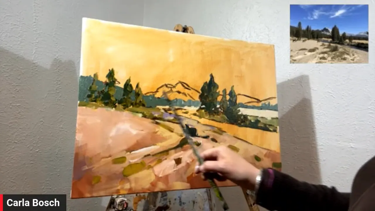
Her subject for this lesson (filmed in 2024 for Art School Live and hosted by Charlie Hunter) is a mountain landscape near Yosemite, with a winding river, distant trees, and dramatic cloud forms. It is a perfect setup for talking about depth because almost everything in the scene helps pull the eye back into space.
Start by Seeing Shapes, Not Objects
One of the most useful ideas in the lesson is also one of the simplest: before painting, study the landscape as a collection of shapes.
Carla had been outlining shapes in reference photos on her phone and found it incredibly helpful. Grass patches, tree masses, shadows, mountain edges, and cloud forms all become easier to understand when reduced to clear visual units.
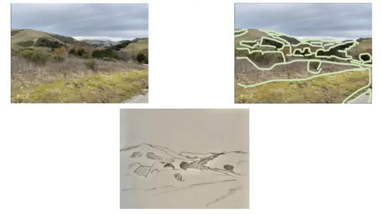
This matters because depth often reveals itself through the way shapes change:
- Shapes in the foreground are bigger.
- Shapes in the distance get smaller.
- Vertical elements can appear more compressed or flatter farther back.
- Clouds also follow perspective, growing larger as they come closer overhead.
That last point is easy to miss. Many painters understand perspective on the ground but forget the sky has perspective too. Cloud formations often widen and expand toward the top of the composition, while the farthest clouds sit lower and appear smaller. The sky and the land need to agree with each other.
For anyone struggling with composition, this shape exercise is worth repeating often. Grab a magazine, a landscape photo, or a personal snapshot and simply outline the major masses. It trains the eye to organize complexity.
Why Carla Doesn’t Depend Too Heavily on Photos
Carla is not a fan of copying directly from a photo for too long. In her experience, that can steal some of the painter’s creativity and authenticity. She prefers to study the scene carefully, understand what is happening, then put the reference aside enough to make fresh decisions.
That freedom matters. It removes the pressure to duplicate every color exactly and encourages a more personal response.
There is also a practical point here for plein air painters. A phone can be useful in the very beginning to test composition or crop a scene, but once the painting begins, the goal is to respond to what is actually present, not become locked into the device.
Sketch First, Especially with Acrylic
Because acrylic paint dries so quickly, Carla likes to begin with a charcoal sketch on a toned canvas. This allows easy adjustments before committing to paint.
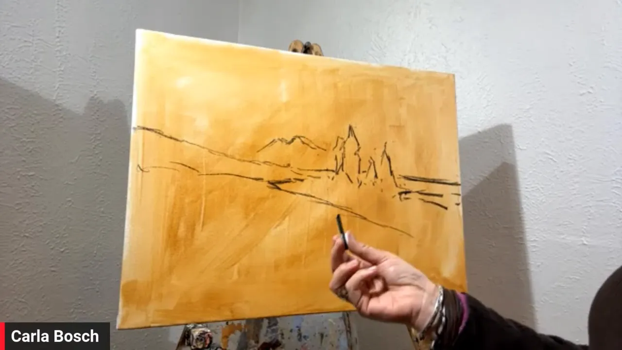
That is an important distinction between acrylic and oil painting. Oil painters can often move wet paint around during the early stages. Acrylic painters have less time to rethink placement once paint starts setting up. Charcoal creates a forgiving first draft.
Her support in this lesson is stretched canvas toned with a warm earth color, likely burnt sienna. That warm base serves two purposes:
- It kills the intimidating white of the canvas.
- It prevents tiny missed spots from flashing as bright white later.
That second point is especially useful for loose painters. If little gaps appear between strokes, a warm toned ground feels intentional. Raw white canvas often does not.
Lead the Eye with the Design
The chosen landscape already contains a natural path for the eye. The river bends through the scene, the foreground marks angle inward, and the mountain becomes a destination point in the distance.
Carla leans into that design rather than fighting it.
She notices how lines in the foreground almost create a zigzag movement. That kind of rhythm is gold in a landscape painting. It quietly guides the eye without feeling forced.
So perspective here is not only technical. It is also compositional. The painting works because the forms cooperate.
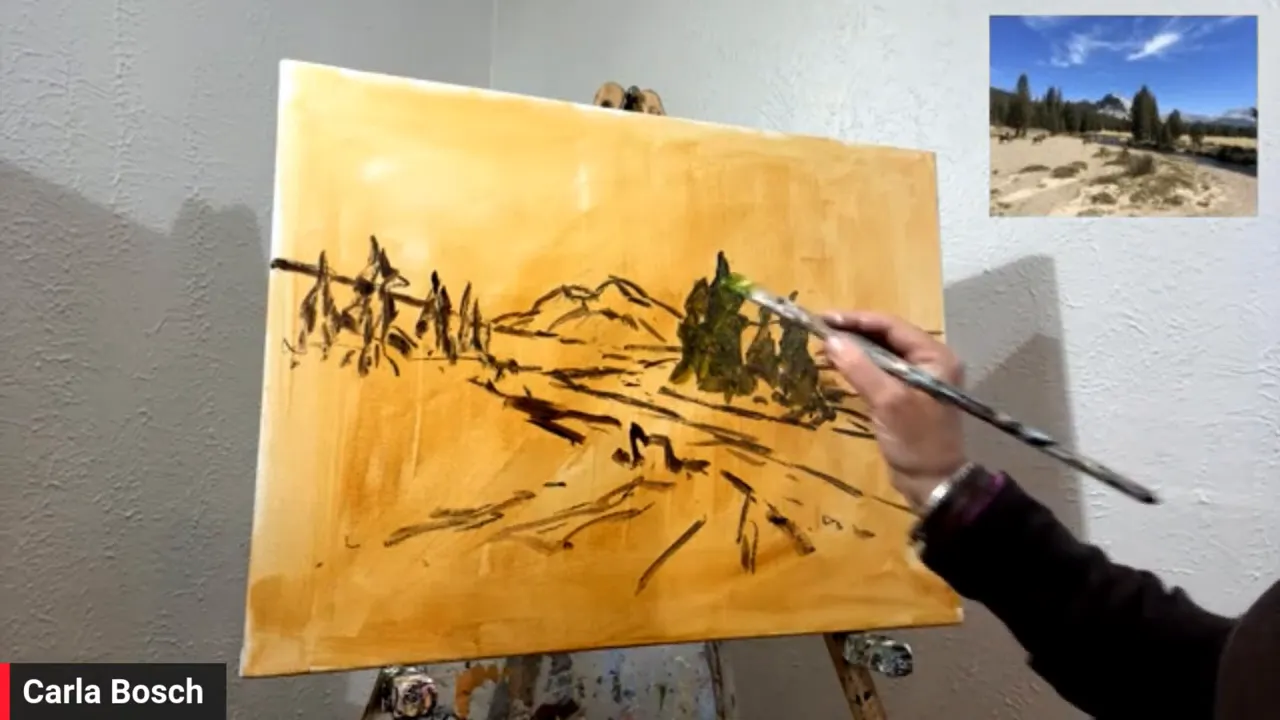
Paint the Foreground Trees First
One of Carla’s more unusual choices is to paint the larger foreground trees before the sky and background. Many painters do the opposite, building from back to front. She likes working front to back because it creates more interesting cut-in edges later and encourages looser, more lively brushwork.
Use Better Materials if You Can
Carla is direct about one thing: buy the best paint quality you can afford.
In acrylics, poor-quality paint can dry dull, feel weak, and become frustrating to use. Good heavy-body acrylic has body, texture, and stronger pigment. It lets the painter place bold strokes with confidence.
Foreground Brushwork Should Feel Bigger and Bolder
As Carla moves into the foreground grasses and earth, she emphasizes one of the key ideas of the entire lesson: brushstroke scale affects depth.
In the foreground, strokes are larger, rougher, and more textured. In the background, they become thinner, softer, and more controlled.
This is such an important concept. Painters often think only color perspective creates distance. It does help, but the character of the mark matters just as much.
Here is the general pattern she follows:
- Foreground: warmer color, stronger contrast, thicker paint, larger strokes, more texture.
- Middle ground: moderated color, slightly softer edges, reduced contrast.
- Background: cooler or lighter mixtures, softer shapes, thinner marks, less texture.
That shift in brush language tells the eye where to focus. If the whole painting is equally sharp and equally textured, it can feel flat.
Practice Fearlessness
Another memorable part of Carla’s teaching is her encouragement to work faster and with less hesitation. She wants painters to push past the habit of pecking at the canvas with tiny, timid marks.
Her suggestion is wonderfully practical: if a small painting usually takes an hour, try to finish one in half an hour. Not to produce a masterpiece every time, but to force more decisive brushwork and quiet the inner critic.
She returns again and again to the same principle: practice creates confidence. Not perfect conditions. Not the ideal brush. Not the ideal lighting. Practice.
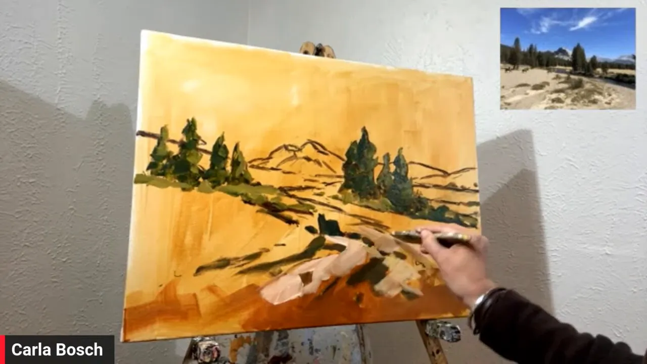
Change the Color to Improve Depth
Carla does not stay married to the exact colors in the reference. In fact, she deliberately changes them when necessary to strengthen the illusion of space.
For example, the distant tree masses in the reference are similar in value and color to the nearer trees. If painted exactly that way, they might jump forward too much. So she lightens and softens them to push them back.
This is a smart reminder that the job is not to copy what the camera recorded. The job is to make the painting work.
She also notes that because she uses heavy-body acrylic mostly straight from the tube, she deals with less color shift than acrylic painters who dilute heavily with water. Even so, she accepts a certain amount of adjustment as part of the process.
Clouds Need Perspective Just Like the Land
The cloud passage becomes a perfect demonstration of aerial perspective and shape perspective working together.
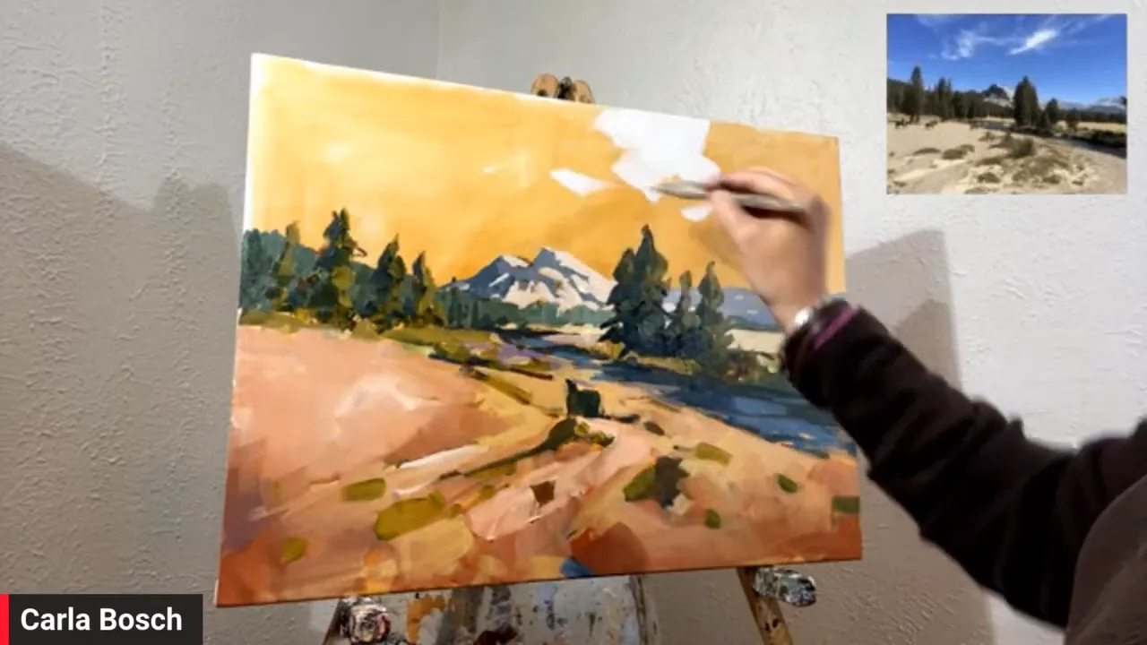
Carla starts with the cloud shapes first, using whites warmed slightly with yellow. Then she adds subtle shadow notes. After that, she cuts in the blue sky around them with ultramarine and white.
Again, the key is size and placement:
- Larger cloud masses sit higher and closer.
- Smaller, flatter cloud notes recede toward the distance.
- The lower sky often becomes lighter near the horizon.
She loves painting clouds because they invite freedom. They are always changing, which gives the painter permission to be expressive. In many ways, clouds are one of the best places to practice boldness without feeling trapped by detail.
The Real Goal: Pull the Eye into the Painting
By the end of the demonstration, the central lesson is clear. To create perspective and depth in a landscape, think beyond linear perspective alone.
Use everything available:
- Large shapes in front, smaller shapes in back
- Warmer, stronger color in the foreground
- Cooler, softer color in the distance
- Bolder texture and thicker strokes up front
- Thinner, quieter marks farther away
- Consistent light direction
- Compositional lines that guide the eye inward
Carla’s painting style is bold impressionism, but the principles apply to any representational landscape, whether painted in acrylic, oil, or another medium. The details may change. The structure does not.
And perhaps the best takeaway is this: depth is not something added at the end. It is built from the very first decisions about shape, value, color, and stroke.
Practice that daily, even in small ways, and space starts showing up naturally on the canvas.
REMEMBER: In the art workshop “Perspective Made Easy: Boldly Paint Buildings in the Landscape,” Carla Bosch teaches you a simple, artist-friendly approach to perspective that makes structures feel solid, natural, and completely believable. [learn more about painting perspective here]
Blog post prepared for the web by Cherie Dawn Haas, Editor of Plein Air Today


