

Keep your landscape painting compositions fresh and lively by applying the mantra “same same, bad bad.”
By Thomas Jefferson Kitts
When spoken aloud, “same same, bad bad” may sound silly, but it offers you a powerful way to evaluate your painting’s composition with little effort. I coined this axiom years ago, and once I began to share it with my students, it immediately improved their compositional skills.
But why is “same same” bad in a painting? Because when repetition unintentionally appears in a painting, it creates an unnatural, boring composition. Of course, we may find a degree of repetition in nature, but there is always some variation, and incorporating those variations keeps our paintings fresh and alive. The “same same, bad bad” adage assists us in finding and correcting compositional problems and helps us avoid dull, formulaic solutions. It also leads us to pleasing visual arrangements.
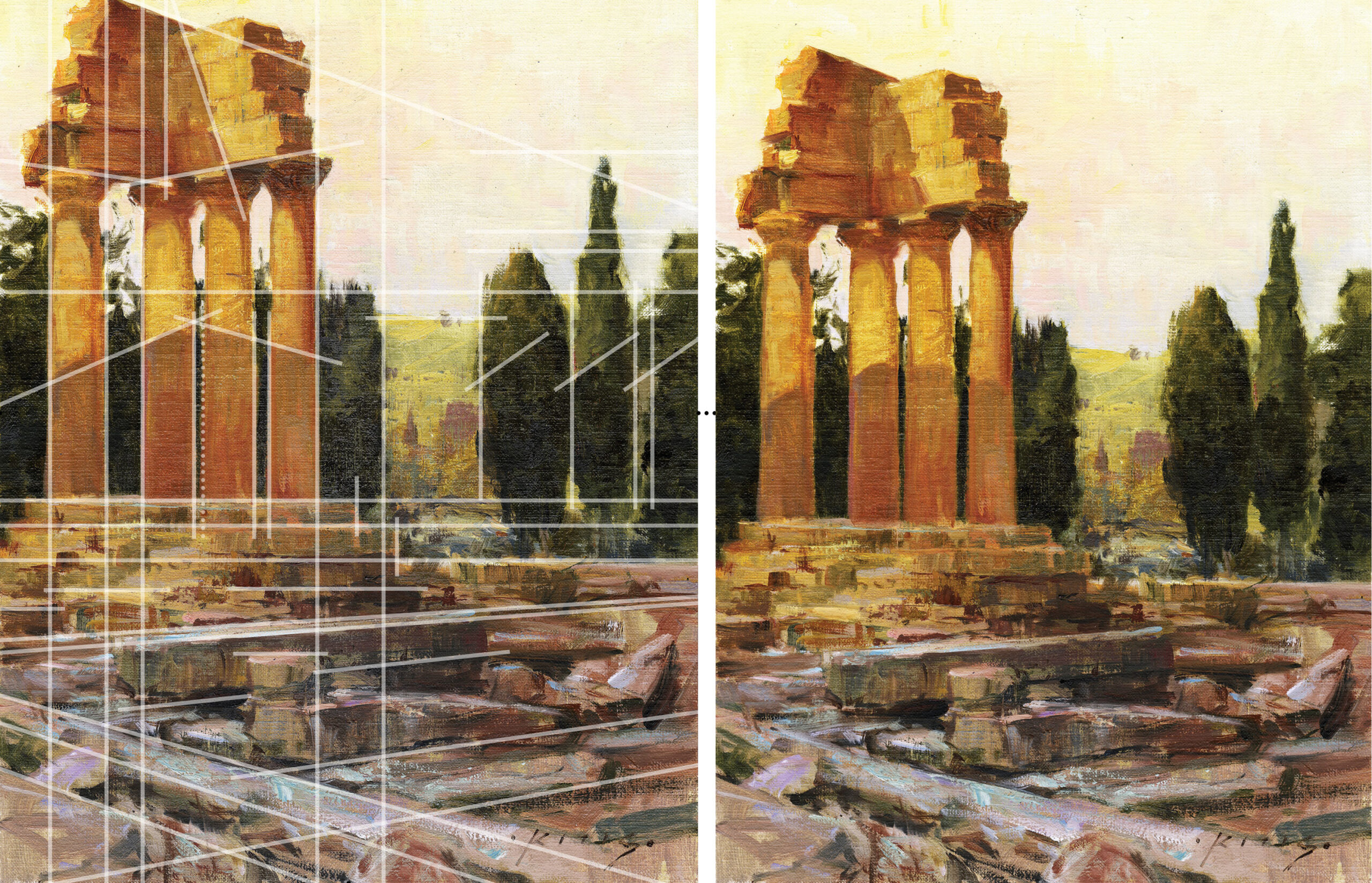
Above: The lines I’ve superimposed on this painting do not represent an underlying rational grid or any sacred geometry, but instead allow me to double-check my composition by applying the principle of “same same, bad bad” after the painting was finished. I didn’t sketch out the composition before picking up a brush, but I did consciously correct any duplications that appeared as I worked on the fly. You can learn to do this too, but only after you become more aware of the many compositional pitfalls addressed in this article.
How to Put the Principle to Work
When you start composing a new painting, pause frequently to see if you have duplicated any shapes, intervals, spacings, values, hues, angles, edges, or brushstrokes. At first glance you might believe your subject contains such duplications, but that’s not likely to be true. Nature does not repeat itself exactly, but we humans tend to invent repetitions the longer we work a painting.
There are many ways to bring variation into your painting in addition to varying shapes. Paint handling, hue, chroma, mass, and edges all work to bring the painting alive.
Let’s look at two compositional motifs — trees and the sky — to understand how “same same, bad bad” can work for you. As you start composing, try not to think about trees and skies. Instead, think more abstractly; see them as large masses to arrange in various ways. Look at how much of the tree mass is in light and how much of it is in shadow. Compare how much area the light and dark tree masses occupy versus how much space the sky and meadow occupy. Alter any similarly sized masses to make each one different from the others, perhaps by a little, perhaps by a lot.
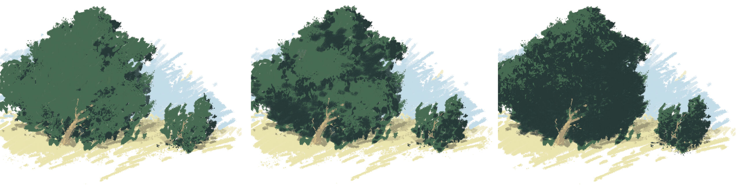
Middle: A 50-50 ratio of light to shadow
Right: A ratio of 10 percent in light to 90 percent in shadow
Light and Shadow Shapes
The examples above represent what you often find in natural foliage. The diagram at left presents a ratio of 90 percent light to 10 percent shadow. The middle diagram represents a near 50-50 ratio, or “same same, bad bad.” The diagram at right presents a ratio of 10 percent light to 90 percent shadow. That said, don’t get caught up on the actual percentages of the light and shadow masses; the angle of the sun determines the proportion, and that ratio will likely morph over time if you’re painting en plein air. Simply look for less shadow, more light, or more shadow, less light, and commit to it. Depending upon how expansive your view is, you may even encounter a situation where the foliage in different parts of your composition exhibit different ratios. If you see that, paint it.
What Makes a Mass or Shape?
Larger masses are often created by grouping smaller shapes that are close in value, with each group being perceptually different from the others. But conjoining similar values is not the only way to create a shape. You can also create (or reinforce) a mass by including common hue and chroma. You can mass reds with reds and blues with blues, or warms with warms and cools with cools to create temperature masses, which is actually how natural light works. But after you create your masses, if two or more of them end up too similar in size, consider modifying them until each looks unique. You may have to depart from reality to make this happen, but you are an artist, not a reporter, and you get to do that.
When you discover an undesirable duplication of any kind, vary it. The degree to which you alter something is up to you. Your modification can be understated or exaggerated. As an instructor I often encourage students to amplify the differences first because overstating relationships increases the viewer’s interest, while diminishing the differences will usually produce a dull and lifeless composition. Look for this type of exaggeration in the work of artists you venerate.
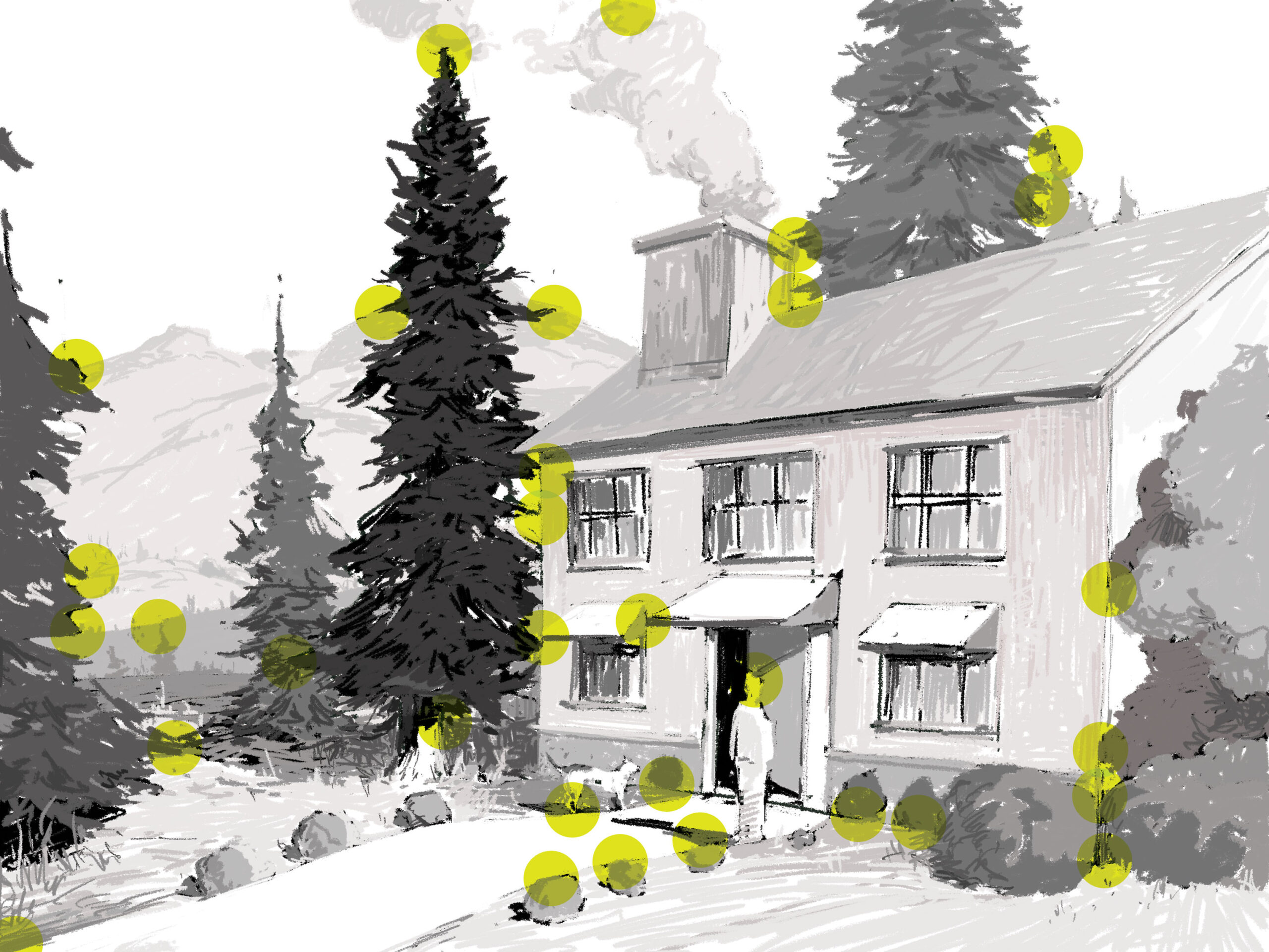
But don’t just alter your mass of trees; alter the shapes and intervals within it. Make some sky holes larger, some smaller, some lighter, some darker, some greener, and some bluer. Don’t carelessly make the width of a mass equal to the distance it lays from the edge of the canvas, which, by the way, can be easily fixed by changing your crop or moving the mass.
Consider varying the sizes and shapes of the trees within the mass even if they are of the same species and were planted at the same time. Make some trees lighter or darker. Vary the thickness of the trunks and the foliage. Vary how high or low the trunks enter the ground so they aren’t geometrically lined up. Use the trunks to inform the viewer about how the ground plane shifts. Often, Nature offers this variation to you clearly, but again, we humans tend to unconsciously edit and homogenize her artful arrangements until we end up with something dull. In fact, the longer we work on a painting, the more it seems we introduce “same same” into the work.
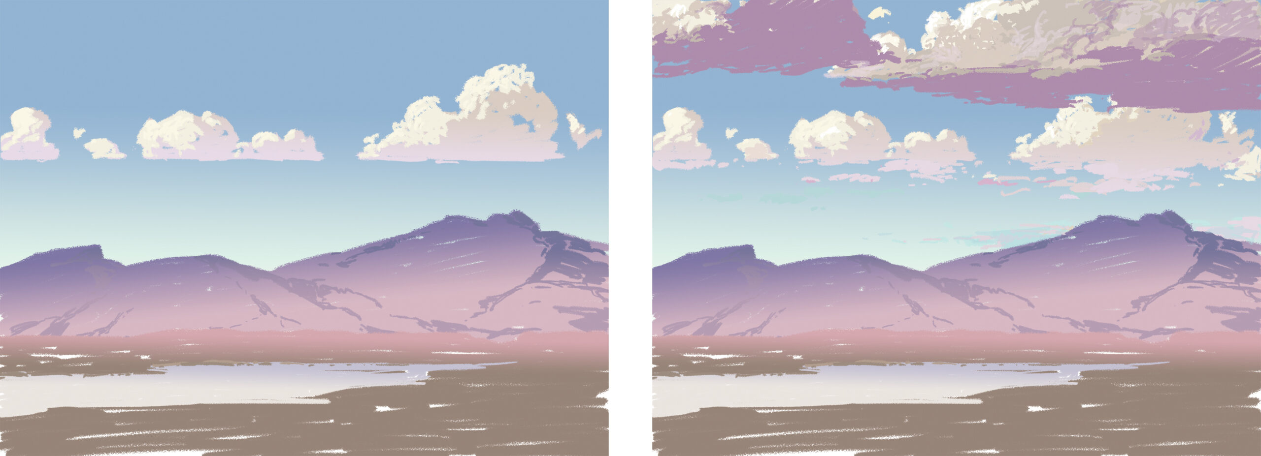
Right: A varied arrangement of the clouds produces a more dynamic image.
Next-Level “Same Same, Bad Bad”
“Same same, bad bad” can also be applied in a more nuanced way. We all know that placing the area of focus in the center of a painting is rarely a good idea unless it’s done for a reason. We also know about the Rule of Thirds, where we divide our canvas into six equal quadrants and place the center of focus at one of the four nodes the grid creates. But what if we want to be more subtle and emphasize two or even three areas in a painting, yet make each focus unique? We can do so by increasing the value and contrast in one area and diminishing the same in the others, thus creating a hierarchy of attention. This kind of thinking allows you to exploit the Rule of Thirds without limiting your creative options. I encourage you to evaluate every artistic rule you have been prescribed in the light of “same same, bad bad.”
If you start a painting by blocking in three or five broad masses of unequal size, you are more likely to end up with a pleasing arrangement. First, see if you can create such an unequal arrangement by cropping the subject. Then, when you start your second pass, develop your secondary shapes within those primary masses, but try to maintain the shapes’ integrity as you do so. An easy way to do this is to keep the values of your secondary shapes close to the value of the original mass. Unless we guard against doing so, we have a tendency to break down the larger masses into equally sized smaller ones, and our composition loses impact.
What About Architecture?
What we humans build often looks geometrical. Think of straight lines in parallel, such as telephone poles, street grids, buildings, cars, or even an orchard that is planted in rows. Yet, if you look long enough at such things, you will discover variations created by convergence, erosion, patina, and wear from heavy use.
Tangents
Tangents occur when the edges (or points) of two or more shapes align in such a way that they appear to touch or abut one another. If one shape is supposed to sit in the background and the other is supposed to sit in the foreground, and there is a tangent between the two, there is nothing you can do to make the viewer believe there is depth between them. You must remove the tangent by overlapping the shapes, or by separating them with a gap. In nature, we see tangents all the time, but since we are constantly moving around, they come and go without our becoming aware of them. Put a tangent into your fixed composition, however, and it will remain there forever.
I hope I’ve offered you a quick and easy way to evaluate your compositions and identify where improvements can be made, whether you tend to develop your designs on the fly en plein air or carefully plan them out in the studio before you load up the brush. By applying my “same same, bad bad” axiom to your work, you should experience an immediate improvement and discover new and interesting possibilities to explore.
Connect with the artist at thomaskitts.com.
Browse more free articles here at OutdoorPainter.com


