

Kathleen Dunphy, Linda Glover Gooch, John Poon, Dave Santillanes, Kathryn Stats, and Colley Whisson offer expert advice and plein air tips.
Painting outdoors in the open air can be a frustrating and even discouraging experience for the uninitiated. Today’s best plein air painters experienced those same overwhelming feelings when they first began painting outdoors. But what they’ve all discovered is that the struggles and initial failures are more than worth it.
Six outstanding plein air painters have agreed to share useful tips that helped them push through those early struggles. Learn how they assimilate landscape overload and use all the material gathered on-site when creating larger studio works.
What was the most difficult thing for you to overcome when you first began painting outdoors?
Linda: Simplifying the subject and not being overwhelmed by the vast view.
John: Seeing accurate values under extreme lighting conditions.
Dave: Not using enough paint.
Kathryn: Trying to paint the whole world on a single canvas. Choosing subject matter and defining the outside perimeters for the canvas.
What advice do you have for those just beginning this adventure?
Kathleen: Find a good workshop that will address your needs. Ask questions. Don’t be intimidated by people who are painting better than you. Practice, practice, and persevere.
Linda: Go easy on yourself. Work small and study plein air works of those you admire. Practice a lot.
John: To overcome the effect of a painting appearing darker when brought in from the outdoors, a trick that helped train my eye to see values more accurately when outdoors was to establish a key on my palette. I placed a patch of sky color to dry, which I had mixed while in the studio and knew to be accurate under gallery lights. On location, I carefully tried to match that value. This helped to make the paintings look more natural when brought indoors.
Dave: Don’t worry about the success or failure of the painting. Treat it as a “study” of color and atmosphere.
Kathryn: Look for the dark patterned shapes that define a composition. Choose high contrast compositions as opposed to close value situations. Think of light and dark patterns as abstract puzzle pieces. Use a viewfinder to focus in on your main subject.
Colley: First, start with drawing.
There’s a lot to deal with for the uninitiated plein air landscape painter. How do you suggest they assimilate all the information and translate that to canvas?
Kathleen: Don’t try to paint everything you see. Focus and concentrate on one clear intent per painting. Do several thumbnail sketches, cropping and enlarging, pulling back to focus or home in on smaller parts of the big scene. This exercise will help you determine what interests you most, and what not to paint.
Linda: Start with up-close and personal scenes. Don’t try to paint the whole Grand Canyon, just pick a small portion and learn from there.
John: Consign the entire scene to just three or four simplified masses. Group things together. The ground plane and hills, for example, can often combine to form a single large mass that separates from the lighter value of the sky. In this way, it helps organize the vast amount of detail, and keeps detail subordinate to the larger shapes of the design. Rather than painting every blade of grass, unify the area into a mass with broad brush strokes, then apply just a few details to define the subject.
Dave: Learn to see the “light family” and the “shadow family” independently in order to create an apples-to-apples comparison of color throughout a landscape. For example, if you can isolate your vision to only the shadows (or the darkest darks on each plane) and compare these dark shapes from background to foreground before painting them, you’ll have atmosphere figured out in very short order.
Kathryn: Paint all the darkest shapes first, then medium values, and finally, the lightest value patterns. Don’t get lost in minutia; for example, rather than draw every tree separately, find a way to group them as a mass into one large group. Limit detail. Hold off the most essential details until the last 1 percent of the painting.
Colley: Doing small thumbnail sketches is an ideal way to begin. Initially, it’s best to choose a subject that’s not too difficult and is within your skill level.
What’s the best way to use plein air work and photography in the studio?
Kathleen: When painting in the studio, plein air studies are used as reference, but I rarely just “size up” a successful study. For larger studio works, I will refer to my photos for a design idea, then use the studies for color reference and inspiration for the central theme of the painting. I try to look at the photo reference infrequently while I’m painting, relying mostly on the studies, sketches, and memory.
Linda: I use my plein air work mostly to note colors or the flavor of my palette and to identify the mood of the scene. The photo will assist me further in the detail of a larger painting and also in any compositional changes I might want to make. Both are a jumping off place for me. I don’t want to be married to the photo.
John: The outdoor sketch is quite useful for accurate color notes when working on a larger studio painting. The photo still falls short in accurately recording color and value, the main shifts occurring in the hue, saturation of the lights, and value of the shadows. An accurate field sketch serves as a reliable road map for me. Because our minds are so limited in creating unique and varied shapes, the photo is a good resource for capturing the subtlety and nuance of our subject. So, the color sketch and photo reference can both be combined to good effect when creating larger studio works.
Dave: Use a bad photo and a good plein air study. You can even convert the photo to black and white; this will keep you from chasing bad color information and help you rely instead on a true first-hand source for that information. Of special importance are the shadows. If you only get one thing right in a plein air study, make sure it’s the shadows.
Kathryn: I view variations of photos taken of the subject on my computer. Along with the plein air sketches, and material from these other sources, I try to design the most interesting composition. If I want to be true to the original plein air piece, I grid and size it up to a canvas of similar proportion in order to maintain the ratio of the original composition.
Colley: In recent years, I’ve used my outdoor work as research and development time. I look for something different, possibly a subject that I’ve never painted before. I take these concepts and ideas to fuel my studio work, believing that “Where I’m going is more important than where I’ve been.” Today, I tend to rely on my photographic reference more than ever. The camera has become my 35mm sketch book.
Artist Websites:
Dave Santillanes: www.dasanti.com
Kathleen Dunphy: www.kathleendunphy.com
Kathryn Stats: www.kathrynstats.com
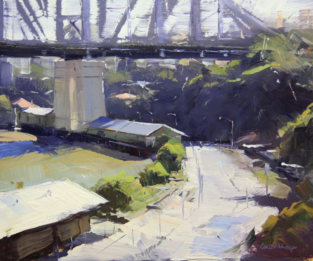
Colley Whisson: www.colleywhisson.com
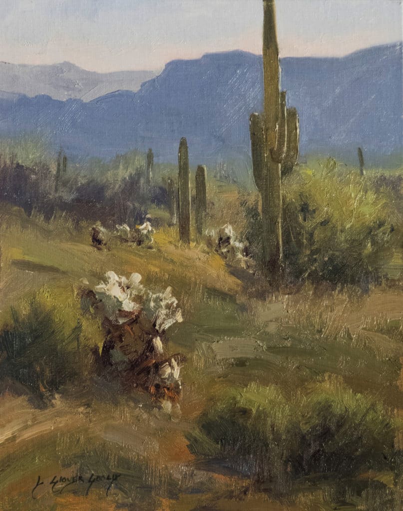
Linda Glover Gooch: www.goochstudio.com
John Poon: www.johnpoon.net
John Pototschnik: www.pototschnik.com
***
 Never has there been an instructional video or book that teaches a color system that is so effective that it can completely change the way you paint. You can create any mood, harmony, or flow in your artwork by using John’s color system.
The best part is that you can do all of this with just 3 colors + white. Even though you’ll be working with a limited palette, you’ll be painting with unlimited color. LEARN MORE ABOUT PAINTING WITH A LIMITED PALETTE WITH THIS SPECIAL OFFER.


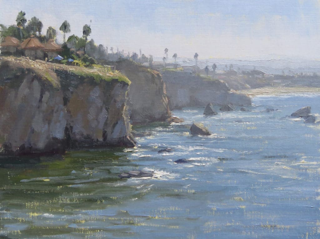
This is such an inspiring site. I find I look at these sample works in awe. They are all so clever showing a lot of field experience. I will watch out for work from this group in future. The green water Under the cliff in Kathleen Dunphy’s painting is just a treat to the eye. Aspects of a painting like that make me realize its not how much of a particular component you capture but its accuracy in the context of the scene. As a beginner when I find a nice color I tend to over represent it in my work. This site shows how experience moderates that. Thanks again for the great sharing by all artists here.
[…] and sketch outdoors, and choose one small area to depict, artists suggest in a valuable post from Outdoor Painter. The site is run by the publisher of Plain Air, a magazine and digital resource for artists and art […]
The most difficult thing for me is the weight of my equipment. I need a lighter easel!
Though not how I think of myself inwardly, the truth is I’m a city girl (feel weird putting the sentence together). I love nature. But … biggest obstacles I find to plein air are 1) nature’s bathrooms, 2) wind blowing the canvas over 3) light changing radically (sometimes accompanied by significant weather surprises) and 4) comfort (I really like chairs).
I used to do plein air studies in oil occasionally. Now I draw outdoors. I love neopastels (Caran d’Ache product) because they simulate many of the qualities of paint, and they’re the most portable medium imaginable. For landscape painting, I like to work from photographs and since I’m inventing lots of things and because I’m reliant on drawing chiefly (sometimes using arbitrary color), this method works well for me.
However, the plein air painters do make the direct, weather capricious outdoors seem very tempting. Any thoughts about my awkward qualms? We do have trees and sky in cities, yet often there’s a civilized bathroom nearby ….