

When it comes to the design aspect of painting landscapes, artists usually have their own approach to making their paintings work, but there are certain common threads worth noting. John Hughes explains.
Painting Landscapes
Designing a Field Study on Location
(A Walk Through the Process)
When it comes to designing landscapes, artists usually have their own approach to making their paintings work, but there are certain common threads which run throughout each one.
Design, while dependent on a number of tried and true principles, has so many moving parts, that to study it really takes most of us a lifetime. When you think about it, if it wasn’t for that, we would tire of it quickly and move onto something else.
One could say the same thing for any number of disciplines. And here is one of the beautiful principles of life: we have more than enough things in this world to keep us focused and engaged from our youth to old age, without ever running out of new things to learn.
Don Miles, an old painter friend of mine used to say, “There are no boring subjects, there are just boring people.” When I was younger I didn’t fully grasp the import of that statement, but I sure do now!
Like so many who are just starting out in painting landscapes, in my earlier years I might have thought that the mark of a good painter was the artist’s ability to make the painting look just like what they were seeing on location. While this is understandably a reasonable goal for a beginner, there really is a lot more to it than that.
In reality, most, if not all, scenes in nature do not come to us neatly packaged, as ready-made motifs that only need to be copied faithfully in order to create a work of art. On the contrary, nothing could be farther from the truth. This brings up another old saying used by many painting instructors: “Paint what you see.” How many times have you heard that and wondered how it really applies? I’d like to add my own twist to this statement, because I think it conveys a better interpretation of what we painters really do out there: “Paint what you see, in terms of color and values, but paint what you know when designing.”
Of course, our initial impulse as landscape painters is to convey the beauty and feel of a natural location, and to capture its essence in a way that reveals our excitement about this special place to others.
When a student is just starting out at painting landscapes, this creative drive is often squashed by the realization that the skills necessary to pull it off are often lacking. But with time and dedicated study the beginner gives way to a better understanding of the process, and finer results take the place of the earlier efforts.
This is always a great thing and is what keeps most artists striving for more understanding. The truth is, there is no end to this quest and that is something that we should all be grateful for! So where to begin?
“Ordered Beauty”
First of all, a well-designed landscape has more to do with its abstract qualities than it does with what is actually happening on the ground. That’s because we, as artists, are not copiers we’re interpreters, and as such, we need to make adjustments to natural scenes in order to enhance their innate beauty in such a way as to create a sense of order amid the randomness.
It’s this sense of ordered beauty, whether we realize it or not, that attracts most of us to a scene in the first place. I think that is because we humans have a built-in need to make sense out of the world around us. We order things, we build things and we create, it’s who we are, so let’s take advantage of that knowledge and put it to good use in our paintings.
There are a number of principles, and I do mean principles, not rules, that govern good taste when it comes to painting landscapes. Whether these are universal in nature or mere conventions I don’t really know, but I do know what attracts me to a work of art, and whenever I am drawn to a painting it always has elements of these principles.
What are they, you ask? Well, it seems that every time I attempt to organize them into a list, that list has a way of growing into many more bullet points than I had originally anticipated. Some lists contain 3 main things, some 12 and some 39 or 40; you get the idea. It really all depends on how you organize them and how some principles work more logically as sub-categories for other principles. It’s enough to make a sane person’s head spin!
Rather that swamping you with an endless and ever growing list of artistic terms, I’ll try and break it down into one simple principle: Patterns.
The way I see it, and as I previously stated, we artists all emphasize different things, but one overriding element is this concept of patterns in design. Let me explain…
A good design has to have certain areas that stand out from their surroundings, it is also important to get the viewer’s eye to move around the arrangement on a journey of discovery. The things that stand out are focal points, and the most important one is your center of interest. Patterns are attractive to us because they exhibit contrast along with movement, which provides interest, if these two are not overdone.
In order to be effective as a tool for landscape design, patterns need contrast of values, colors, and shapes along with a pinch of repetition to maintain stability. Edges and brushwork play a role in this equation as well, and the combining of these into a well-designed pattern is essential in creating pleasing works of art.
If you look at a natural scene and can identify the most salient contrasts and movements, and then embellish these somewhat, you will be well on your way to painting landscapes on a higher level.
Let me walk you through my thinking process as I execute a small painting from a scene that I pass by every morning as I start my day with a brisk walk. The scene, while not overly compelling, does have some interesting contrast where the distant trees in shadow nicely frame the smaller trees which are silhouetted by the morning light.
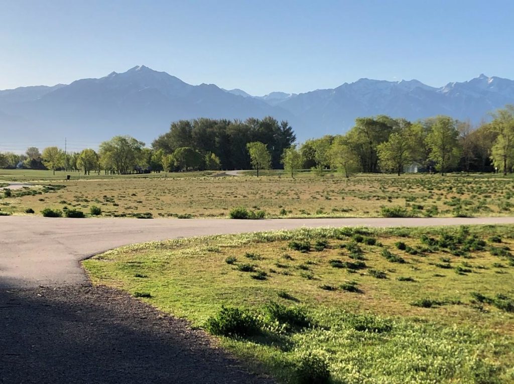
Photo 1 – The Location
The focal point alone has some good pattern interest, but the scene also needs some work in the foreground to make it more paintable.
The problem is the large and mostly uninteresting ground plane. Having said that, there are clumps of alfalfa in the foreground and middle distance which could be organized into an interesting pattern to lead the eye to its ultimate destination – the background trees. There is also this paved path, which gives the scene some value contrast, but in its present configuration does little for the design.
With some imagination and on-the-spot planning, this site just might be interesting enough to hold an artists’ attention!
This site is now a park, but I can remember a time when it was a working farm and all that land in the foreground had furrowed crops. That one feature created linear interest, which is sadly missing today. I thought about that as a design possibility, but finally settled on using the path to lead the eye into the painting, along with some fine tuning on the alfalfa clumps.
When designing, my first thought is always: Can I crop this scene for better advantage? I opted for this solution, since it’s the easiest one and most logical, due to the uninteresting foreground.
Luckily, I usually bring along a quiver of different panel ratios when I’m out hiking or walking, since I often need them in situations like this one. The two panels I had in my backpack were a 9 x 12 and an 8 x 12, I chose the latter; but before I got into the paint, I still had a few more design considerations to ponder!
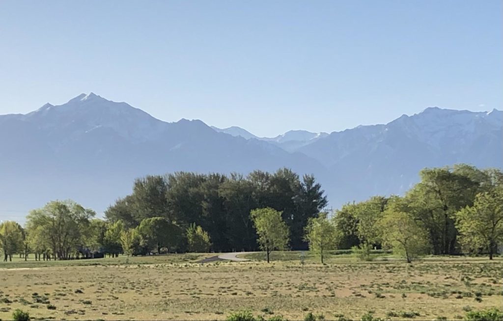
Photo 2 – Location after Cropping
In this photo I’ve pulled the main elements closer and cut off a lot of unnecessary foreground. By doing this I’ve also achieved a certain amount of interest, which is based solely on the wide ratio of the view. Keep in mind that in reality, these are all mental adjustments that I think about before painting a scene.
Photo 3 – Problem Areas Listed
At this point I took a closer look at the scene to make more mental notes as to what I wanted to change before getting into the field study. In this photo I’ve listed several of the things which still bothered me and I kept them in mind as I painted.
Identifying problem areas early always makes my job a lot easier as I set up to paint the scene with these changes in mind.
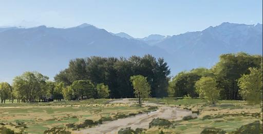
Photo 4 – My Thought Process Illustrated Digitally
In this photo, I’ve taken the image into Procreate, a digital editing program, and made some crude marks to illustrate what I was thinking while out there. As you can see, I’m no expert with iPad painting programs, but even rudimentary marks like these often help me in the studio to generate design ideas as well as illustrate what I’m talking about to my students.
So here’s what was going on in my mind. The actual panel I had on hand wasn’t a 1:2 ratio, but it was long enough to reflect what I was thinking in terms of design.
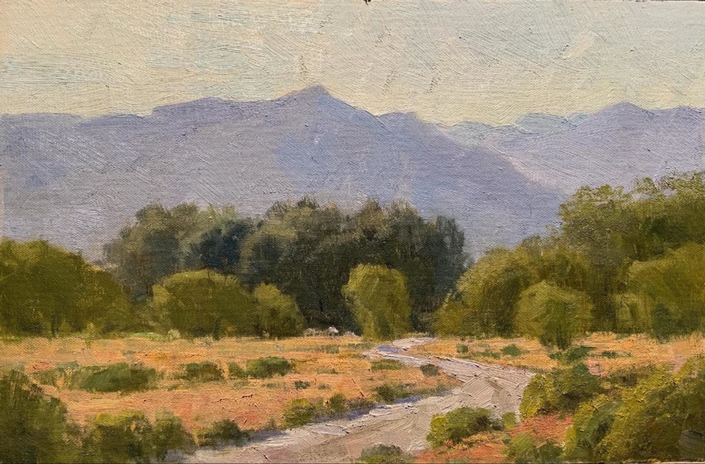
The Field Study for Painting Landscapes
In the study you can see how I pulled the alfalfa clumps together into patterns, which drew from the reality of the actual site, but organized the randomness into some artistic order. Along with that, the path is in a better location and now leads the eye to the subject, which is the background trees against the mountains. I also moved the main peak over to the right, but was careful not to center it too much.
As I set up to paint, I found a spot that was in the shade and somewhat secluded, so as not to be in the way of Frisbee Golfers who now inhabit this park alongside walkers and bicyclists. I was able to get in and out of there in an hour and 45 minutes while grabbing the essentials of this scene in a way that featured the morning light as a readable design.
I always enjoy these little outings to record a feeling about nature and most often come back to the studio more relaxed and focused for the day’s work.
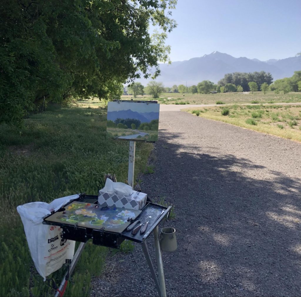
The Plein Air Set Up
On a final side note, I met a little five year old who was walking with her mom, and she was mesmerized by what she was seeing. She even came back for a second look, which thrilled me no end! You never know how an experience like that will affect the future of some small child, and I’m grateful for that thought.
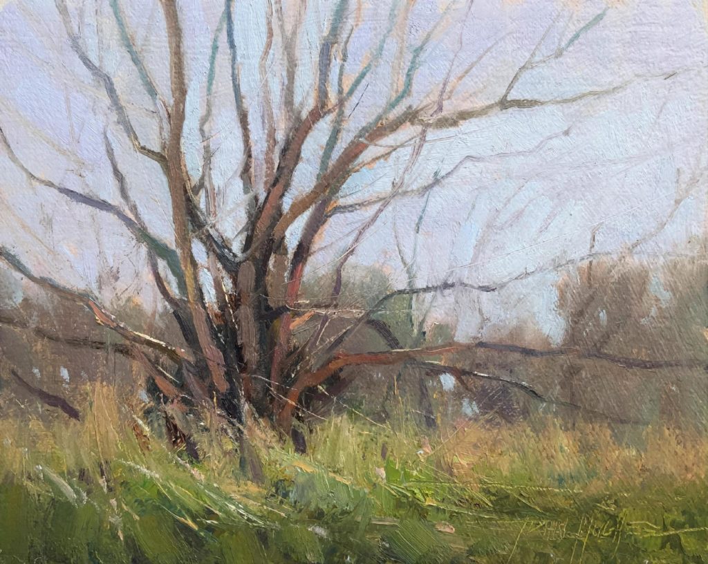
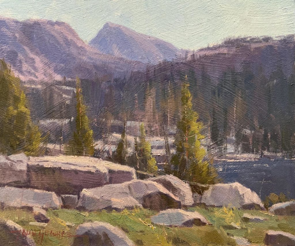
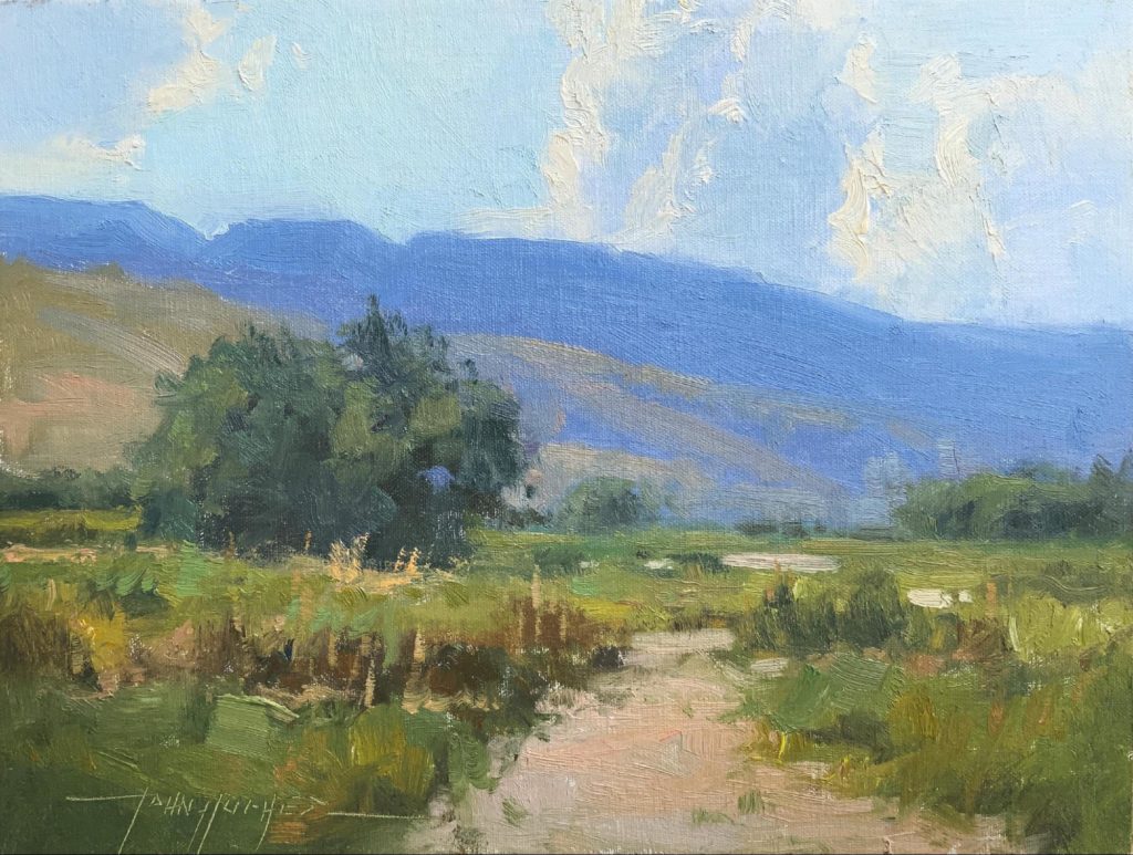
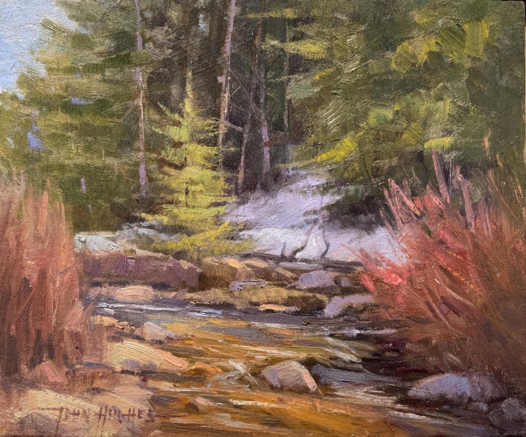
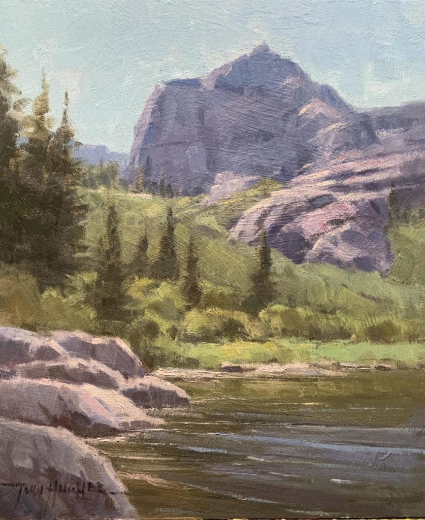
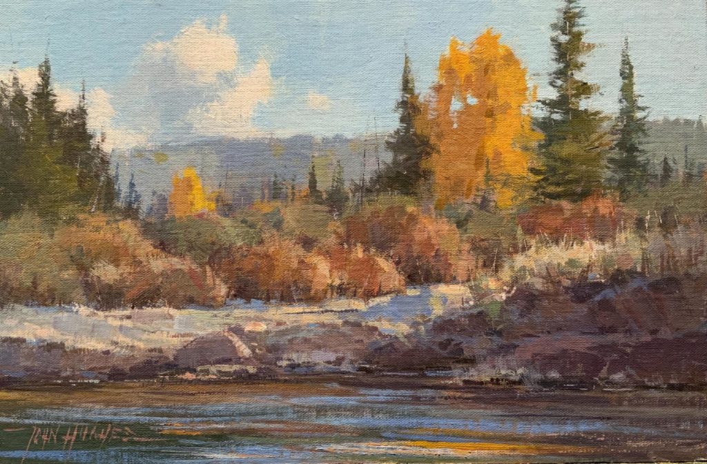
For reference, here are more of my field studies for painting landscapes:
> Subscribe to Plein Air Today, a free newsletter for artists
> Subscribe to PleinAir Magazine so you never miss an issue


Thank you for this article! I think it will help me organize my thoughts better as I look at what is front of me. I love your studies and now I think I will go outside and paint.😊
Hi Joyce, Thanks for your comment. Glad to hear! Sorry it took me so long to reply, unfortunately I don’t often check back on these articles, but glad I saw your comment.