

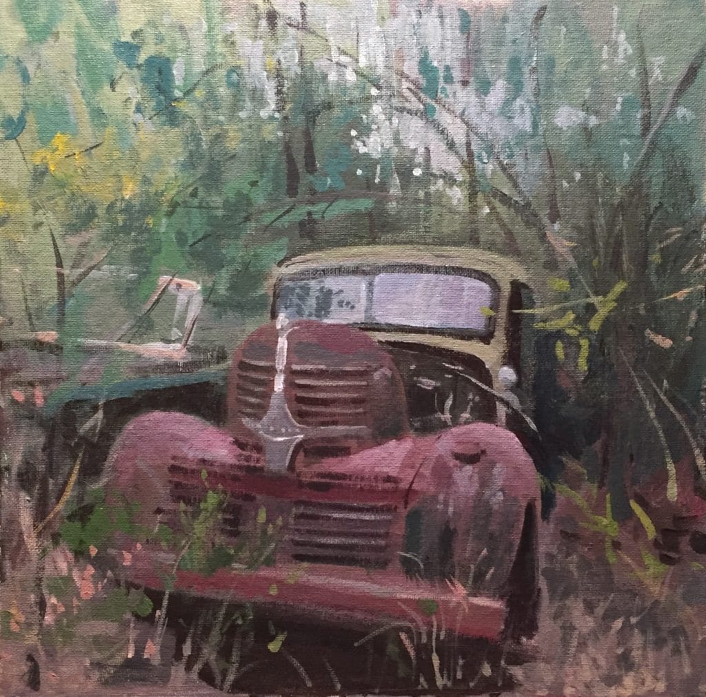
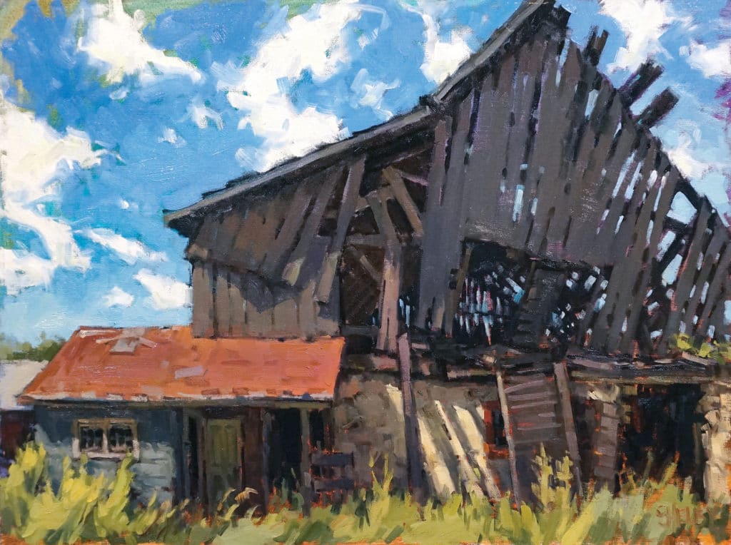
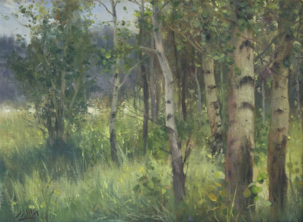
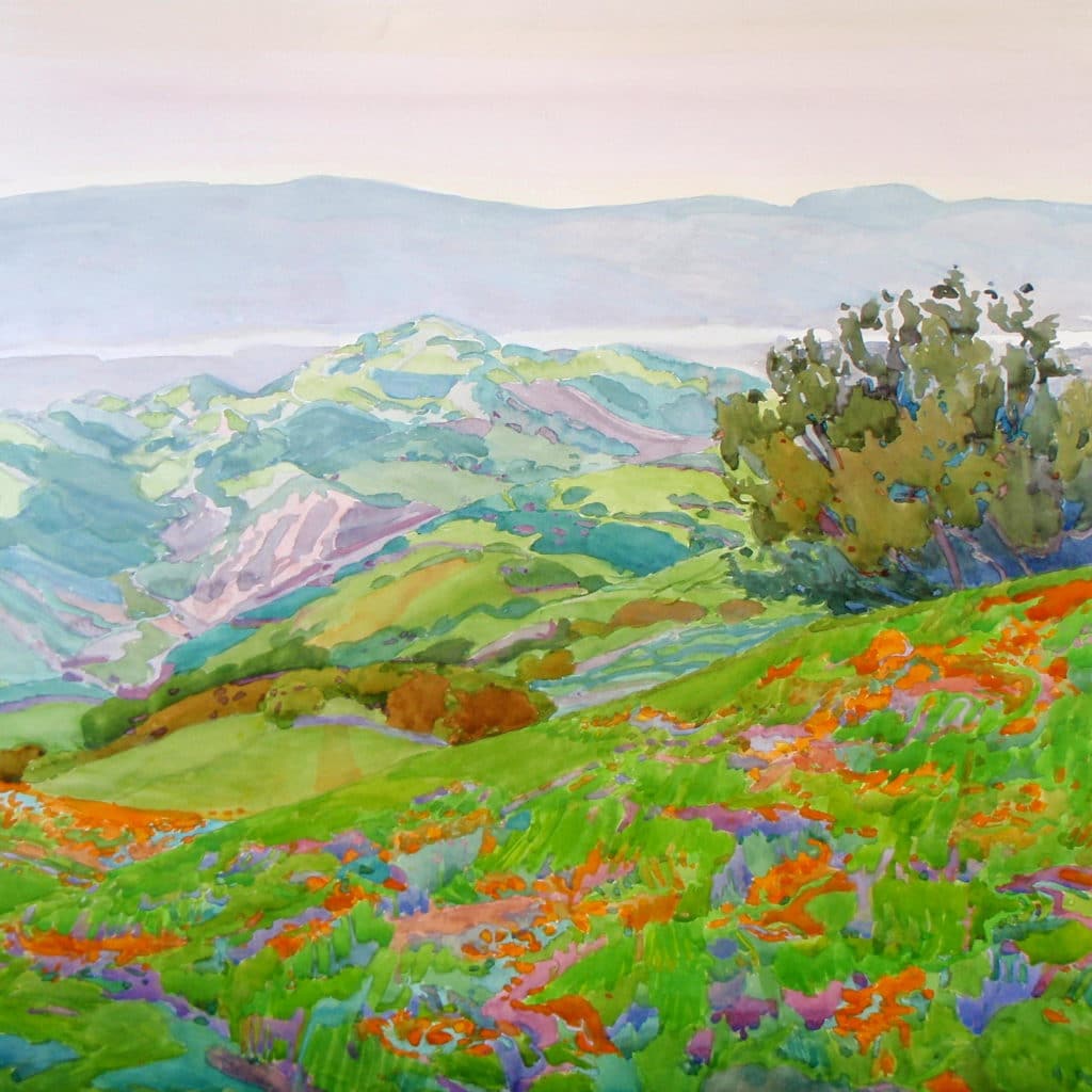
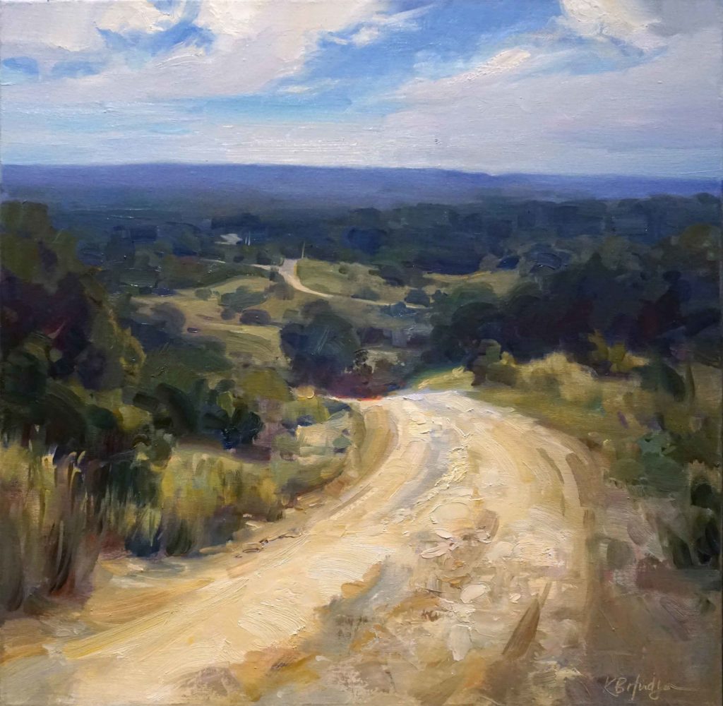
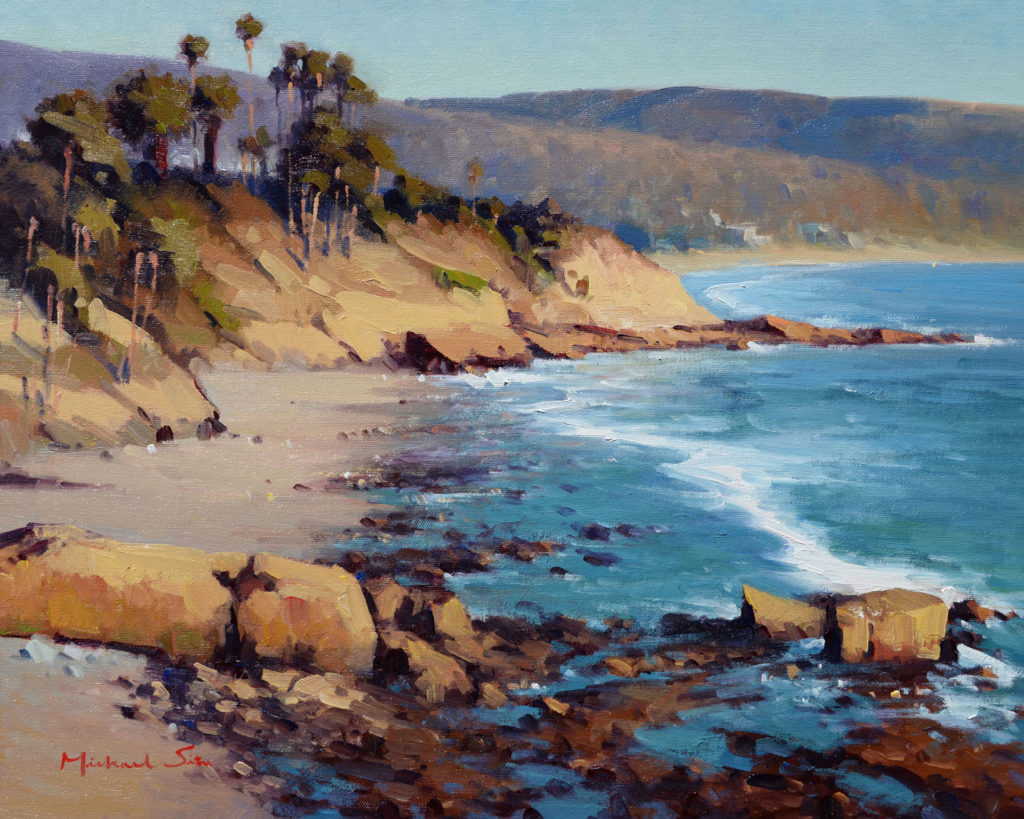
We asked some of your favorite plein air artists about their palettes and what colors — and brands — they use to create stunning landscapes. Some use a limited palette and some go all out with variety, but all show an impressive use of color. Be inspired!
1. Joe Gyurcsak: Lemon yellow, cadmium free yellow medium, cadmium free red light, quinacridone red, cerulean blue, ultramarine blue, burnt sienna, yellow ochre and black, half and half titanium white / flake white, Utrecht Artists Colors
2. Shelby Keefe: I use mostly Gamblin Artist Oils. My palette is definitely not limited (I use about 12 basic colors), but I don’t put out any green or black.
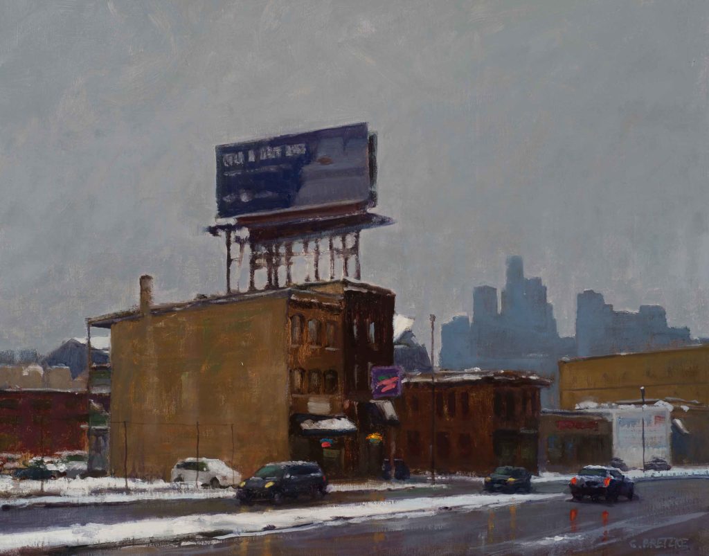
3. Carl Bretzke: My basic palette was taught to me by Joe Paquet, who was taught by John Osborne, who was taught by Frank DuMond, etc., etc. It’s called a prismatic palette and is essentially the colors of the rainbow in sequence. I use white, cadmium yellow light, cadmium yellow, cadmium scarlet, cadmium red alizarin crimson, manganese blue, cobalt, French ultramarine, ivory black, and phthalo green. I premix a middle green and a violet, and I’ve added a few earth tones to help mute colors. I am using paint from nearly all vendors but heavy on Winsor & Newton and Old Holland. I’m also trying some of the cadmium free Blick pigments.
Related Article > Color Mixing for Beginners
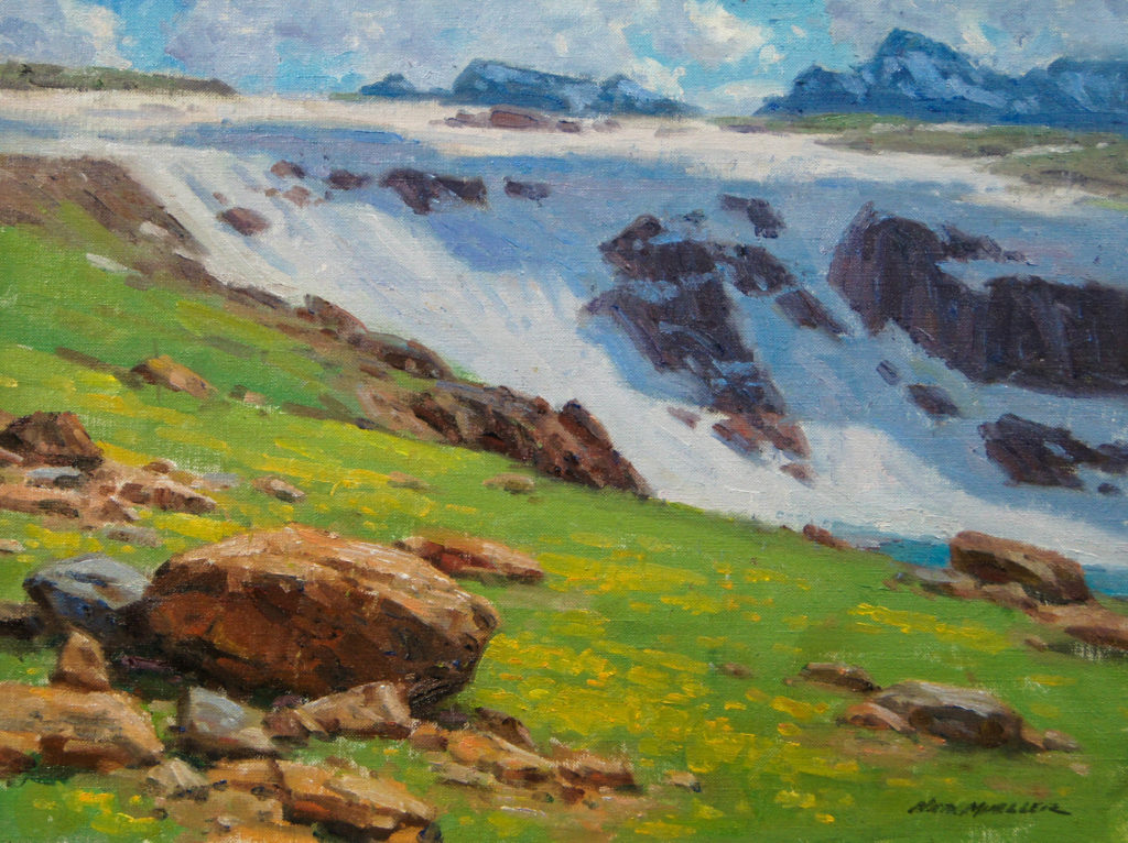
4. Ned Mueller: I use a pretty basic palette most of the time, as I do a lot of studio work and figure work. I pretty much keep my palette the same and will add a color such as permanent rose for brighter reds in a Mexican market scene or add a phthalo green and/or blue for a coastal water scene. My basic palette is generally a cool and warm tone of each primary color: titanium white, cadmium yellow lemon, cadmium yellow light or medium, cadmium orange, cadmium red light, alizarin crimson, transparent oxide brown (for dark rich warms), chrome oxide green, viridian, cobalt blue, ultramarine blue, ivory black.
5. Eleinne Basa: I use a warm and cool of the three primary colors plus additional colors that I have come to love.
Whites: titanium white (Gamblin) or Cremintz white (Michael Harding or Blue Ridge Oil Colors)
Yellows: cadmium yellow deep (Blue Ridge Oil Colors) and cadmium yellow lemon (Michael Harding), plus Indian yellow (Michael Harding) (used sparingly)
Reds: cadmium red (Rembrandt, Michael Harding, or Blue Ridge Oil Colors) and magenta (Michael Harding)
Blues: cobalt blue (Blue Ridge Oil Colors or Michael Harding ), ultramarine blue (Michael Harding), Prussian blue (Michael Harding), King’s blue deep (Michael Harding)
Other Colors: Earth and Greens: viridian (Rembrandt), transparent oxide brown (Michael Harding), golden ochre (Michael Harding)
Related Content:
.
6. Robin Purcell: I use mostly Winsor Newton paints on my palette, selecting only from pigments marked permanent or absolutely permanent. One of my favorite mixing colors is Holbein jaune brilliant, a semi-opaque pale peach color that mutes blues, greens, and purple and is used to create atmospheric perspective.
7. Kathleen Hudson: I use Michael Harding’s paint. I came upon the Harding ultramarine blue some years ago and have steadily been switching all of my palette to their line of pigments. I use a lot of transparent pigments so that I can mix rich darks and get some glazing effects over opaque paint. Here’s the full list; sometimes I don’t put out everything on the list, depending on what size I’m working with and what my subject is:
• titanium white no. 1 (blended with safflower oil; slow-drying) or warm white (lead alternative)
• cadmium yellow lemon
• Indian yellow (transparent, so it can be mixed without lightening deeper colors; fantastic for mixing greens)
• cadmium red light
• magenta (a great transparent tinting hue that is purer than alizarin, which has some brown)
• transparent oxide red (transparent; similar in hue to the opaque burnt sienna)
• yellow ochre
• phthalocyanine blue lake
• ultramarine blue
• cobalt blue
• raw umber
• ivory black
• neutral gray (I love using pre-mixed grays to save time and help control my value range.)
8. Michael Situ: I generally use 12 colors: cadmium red, Indian red, alizarin crimson, lemon yellow, cadmium yellow, yellow ochre, cerulean blue, cobalt blue, French ultramarine, titanium white, ivory black, permanent light green. The brand I use is Gambling or Winson & Newton.
9. Dave Santillanes: I use Rembrandt brand, a “warm” and “cool” of the three primaries plus transparent red oxide, titanium white, and cold gray. If I’m backpacking, I’ll use a limited palette of just the primaries (yellow ochre, alizarin crimson, ultramarine blue deep) plus transparent red oxide, titanium white, and cold gray).
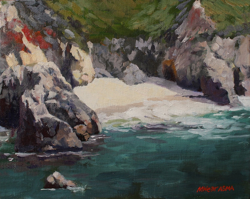
10. Marilyn Wear: My most recent palette that I’ve been using is what Kathleen Dunphy, one of my plein air heroes, uses. She was kind enough to share it on her blog. Rembrandt oil paint colors: permanent red, ultramarine blue deep, cool gray, and Naples yellow deep. Titanium white can be any brand, and for cadmium yellow lemon I use Gamblin. From these five colors, any color needed for a landscape or seascape can be mixed. I sometimes add yellow ochre, alizarin crimson, and burnt sienna and veridian to my palette since I’ve always used those colors and am used to how they mix with other colors.
Visit EricRhoads.com to find out all the amazing opportunities for artists through Streamline Publishing, including:
– Online art conferences such as Plein Air Live
– New video workshops for artists
– Incredible art retreats
– Educational and fun art conventions, and much more.

> Subscribe to Plein Air Today, a free newsletter for artists
> Subscribe to PleinAir Magazine so you never miss an issue


No watercolorists?
I am a watercolorist but they decided to cover my painting “poppies above the bay” with the related content video feed. But my color advice instill there at number 6
Hi Robin! Thanks for pointing out that yes, indeed, there should have been a spot for your beautiful watercolor! Thank you for understanding regarding the technical piece; it’s all fixed now. 🙂
Watercolor artist suggestions? Why are they all one medium?
Color palette for gouache would be helpful. I am an oil painter and am very interested in others palettes. I use Williamsburg oil paints and Gamblin. It would be interesting to know what medium they use. Thanks for sharing this info.
It is surprising that lead white is not really mentioned. Only titanium.
Looking forward to the same article featuring watercolor artists’ favorite paints.
I think taht less colors on pallete is better, like in the period of Rembrandt…
Would love if each artist shared all their colors rather than “I use 12 basic colors”). Fun to see how artists fall into their tried-and-trues, i.e. what works for them. As long as you know what you’re working with and are able to get the notes you want. For you watercolorists, check out Jane Blundell’s site (janeblundellart.com). She explains the nuances of all colors, almost all brands.
Unfortunately, almost as bad as the “speed paintings” on YouTube (entire painting condensed into 2-3 minutes), they have no desire to share any real knowledge. Unless you’re working privately with them, you’re better off just reading painting books and taking art classes.
Kristy, I don’t agree. You mention “they have no desire to share any real knowledge”. I have found that most artists and especially teaching artists (which I would bet most of these are) are more than willing to share their exact palettes. You can probably find free video or blog posts for most of these artists which detail exact pigments. Also, it looks like Shelby and Robin are the only ones who don’t have details in this short (free) article but if you do a search, you will find that this publisher (Streamline) has graciously offered you a 2+ hour free video where you can not only see Shelby’s palette but her slow and detailed approach to a painting as she demos live. https://www.youtube.com/watch?v=CUrMFysX9-8 I bet Robin would be happy to share her watercolor palette as well as she already chimed into this article above in order to clarify a point.