

Color mixing for artists > Achieving color harmony is one of the keys to creating a successful painting. Here are tips on color theory for artists.
Having taught many oil painting workshops over the past 30 years, color has been of primary interest to students . . . and . . . well, those other things — composition, drawing, and value — are just not as exciting or as high on the list of importance. I certainly understand. Usually color gets all the glory, but I strongly encourage you not to neglect the weightier aspects of painting.
But concerning color, let me say this: It is a wonderful blessing to have been created to perceive and experience color. Just imagine our world without it and the tremendously negative effect it would have on us. We would be a people devoid of the emotions that only color can stimulate; just imagine a sunset without color.
Nature’s light has a way of unifying, therefore harmonizing, all its colors. Its singular light source invades everything it illuminates and brings into harmony all that it touches with its unique color and quality of light.
As painters, we need to infuse our paintings with harmonious color as well. However, our job becomes somewhat more complicated because we are restricted to the use of pigment. Achieving beautiful color and color harmony is certainly one of the keys to creating a successful painting; without it our paintings will have the same effect on our audience as an orchestra that’s out of tune.
Painting with a Limited Palette
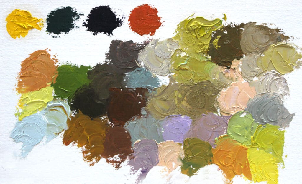
When I first began my fine art career many years ago, I typically had 11 to 15 tube colors on the palette. Through the influence of respected artists such as Kevin Macpherson, I reduced the palette to just three primaries: red, yellow, and blue, plus white. What I immediately discovered was many of the colors I thought I needed were not really necessary. Additionally, working with a limited palette made plein air painting more accessible and mobile. [Related: What is Plein Air Painting?]
Fewer colors to deal with greatly sped up my understanding of color, simplified color mixing, and immediately improved color harmony. Only three questions needed to be asked:
1) Is the color basically red, yellow, or blue?
2) Does it need to be darker or lighter?
3) Should it be warmer or cooler?
As artists, inspired by all that is around us, color has significant importance. Therefore, understanding light and its ways, and having the ability to recreate its effects is really important.
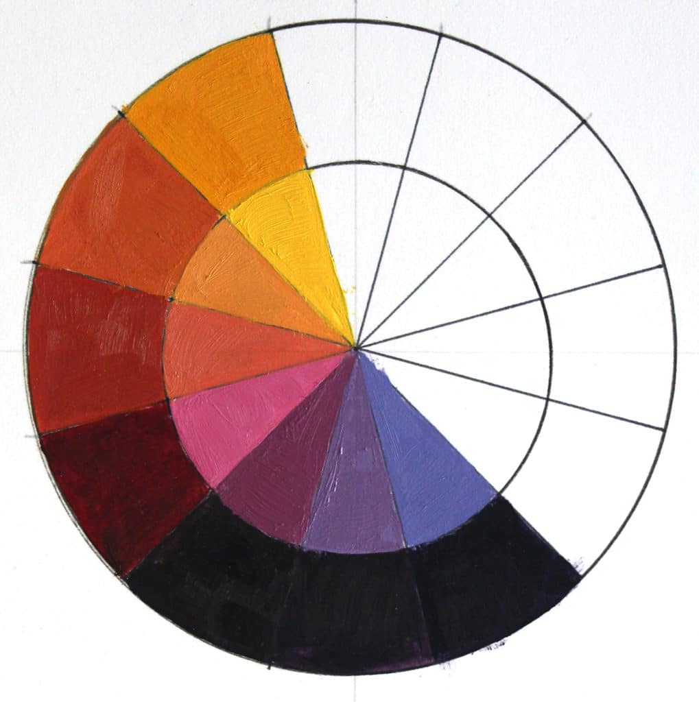
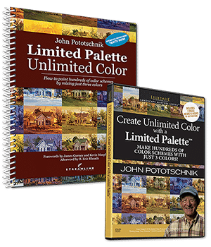
In my newly released video, “Create Unlimited Color with a Limited Palette,” and its accompanying workbook, “Limited Palette, Unlimited Color,” I thoroughly address the student’s interest in color in a concise, practical, and easily understandable way. Some of the topics discussed are: How using a limited palette of just three primaries will help simplify the process of choosing the most appropriate palette for a painting; how to mix the color you want; how to achieve color harmony; understanding the color wheel and its major divisions . . . and much, much more.
When I speak of the three primaries, I am not speaking of a specific red, yellow, or blue and recommending that you use only those colors. As you know, there are many variations of each of these available. What is important to distinguish among them is their relative warmth or coolness. Yes, all blues are cool and all reds and yellows are warm, but within each hue there are degrees of warm and cool; for example, it’s easy to see that a vermillion red is considerably warmer than an alizarin crimson. So, when I speak of selecting the appropriate primaries, I’m suggesting that three primaries be selected, which, when mixed in a variety of combinations, will yield the colors needed for your previously determined concept. Consider Anders Zorn’s palette of ivory black (blue), cadmium red and yellow ochre. The colors don’t need to be intense, they just need to represent red, yellow, and blue.
With a limited palette of just three primaries, mixing color is greatly simplified, and color harmony is achieved almost effortlessly, since all colors on the palette must be intermixed to varying degrees in order to achieve the desired color. Therefore, there is no color that is out of place.
The whole idea of using such a limited palette is probably anathema to most painters, but it makes total sense to me. Whenever I begin a painting, I always try to select the fewest colors possible. I remember Richard Schmid once saying something like, “Why have a trio when you can have a symphony?” No one can question the sensibility of Schmid’s comment, nor the quality of his work. Maybe I’m just a simple kind of guy, but I know that restricting my palette to three primaries made a huge difference in the quality of my work almost immediately, and many of my students have benefited also. Even after all these years, I continue to find the use of a restricted palette stimulating and challenging and find no need to add a bunch more color to the palette.
")
Using just three primaries also simplifies filling in the other nine spokes of the color wheel — all the complements and tertiary colors. That in turn more easily opens the door to understanding the major divisions of the color wheel, and how to use them to your advantage. I thoroughly enjoy experimenting with these major division: Complementary, Equilateral Triads, Isosceles Triads, Square and Rectangular Quadratics, Extended Analogous, and Primary Dominant. In my book, “Limited Palette, Unlimited Color,” I explain each in great detail and have created paintings to demonstrate each division.
One of the most surprising and exciting discoveries I’ve experienced since using a limited palette is recognizing the importance of color relationships — how colors affect one another. Depending on their relationship to surrounding colors, a color can be made to look significantly different from its original mixture.
If understanding color is mysterious to you and knowing how to mix the color you want even more so, I strongly recommend you begin by restricting your palette to just three primary colors, plus white. A good place to start would be to select one blue, red and yellow from the following: ultramarine blue, cobalt blue, cadmium red, alizarin crimson, cadmium yellow, and lemon yellow.
Hesitant? Seriously try it for one month. I believe your work will improve and it will change the way you look at color forever. I’ve heard from so many artists that have shared their enthusiasm after seeing improvement in their work. I hope you’ll give it a try.
Click here to read my previous articles on painting outdoors, using a limited palette, and more.
***
 NEW! Never has there been an instructional video or book that teaches a color system that is so effective that it can completely change the way you paint. You can create any mood, harmony, or flow in your artwork by using John’s color system.
The best part is that you can do all of this with just 3 colors + white. Even though you’ll be working with a limited palette, you’ll be painting with unlimited color. LEARN MORE ABOUT PAINTING WITH A LIMITED PALETTE WITH THIS SPECIAL OFFER.


Great info. I must get your book. Question…when selecting the three colors = should they all be warm or all cool? One of each?
Thanks!
Hi Charlotte, A double primary palette would be a warm and cool of each of the primaries. I have simplified the palette even further…just one of each. As taught in the book and video, one’s concept for a painting will help determine what 3 primary colors will be needed on the palette to accomplish the concept; it could be that ivory black (blue), burnt siena (red), and Indian Yellow may be what’s needed. I thoroughly explain how to make those selections in the book and video. The primaries don’t need to be what we typically think of as red, yellow and blue.
Thank you, John this is so important and necessary to keep reviewing. I have just started my young grandchildren, 11 to 5 years old on mixing and discovering what red, yellow and blue poster paints can do. They are having so much fun with this. Me too. Many thanks for all your inspiration and beautiful work.