

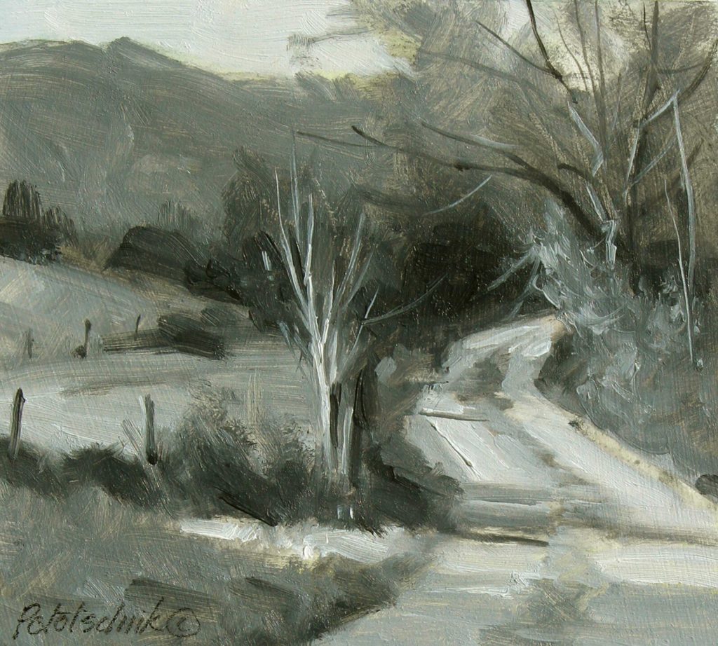
I like the clever title of this article because it expresses a dual truth for artists working with paint and drawing media. Black and white are values, but painting with them is also of great value.
The practice of painting in black and white helps us to see and understand how important clearly defined values are to the structure of a painting or drawing; in fact, effective use of values will largely determine the success of our creations.
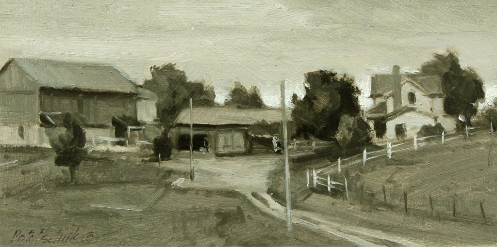
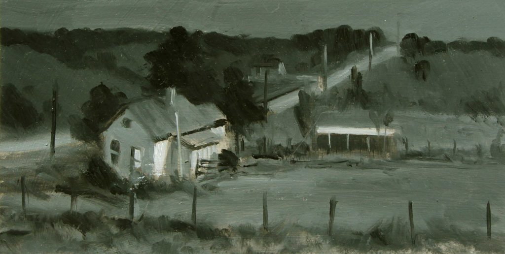
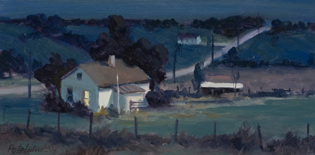
When speaking of value, however, we’re not considering only black and white but every discernable variation in between . . . and that number can be significant. However, it’s best to limit the number of gradations between these two extremes. Typically, that number is limited to nine, but many artists today are limiting their value range to just three or five distinct gradations. This small number of highly distilled and disproportionate value shapes create bold and powerful statements. Learning that value and color have an indispensable relationship to one another is also a valuable benefit gleaned from this exercise.
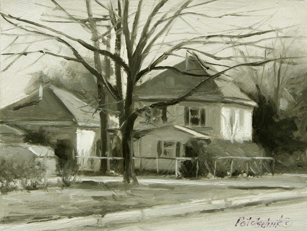
When I haven’t taken the time to do the important preliminary work but have impatiently dived into painting without giving it much thought, the process of painting can become so bogged down that feelings of doubt and uncertainty are magnified, making the situation even worse. When that happens, I’ve found it helpful to take a step back and analyze what went wrong and what’s needed to put the painting on a better path. Black and white studies help me do that. It’s there that clarity regarding concept, composition, drawing, and values is solidified. After all, they are the core of every painting, and 98.621% of the time that’s where the solution to the problem can be found. I use Ivory Black and Titanium White for these studies. Because all color is eliminated from the process, the exercise is simplified.
Andrew Loomis, in his great book Creative Illustration, says that many paintings are of poor quality because no attempt at a clear organization of values has been achieved. “It can be taken as a sound rule that the simpler the presentation of a subject, the better it will be pictorially,” he says. “A simple presentation technically resolves itself into a few simple organized areas of a few values.”
If we are unable to create a strong black-and-white painting, the possibility of creating a painting of any significance using color is slim to none. That’s a truth I unwaveringly uphold. As Loomis states, “If the value is right, it may almost be stated that the color will not look bad. It is values and tonal relationships that spoil more color than anything else.”
So, if you’re dissatisfied with your paintings, and that’s a good thing, look to painting in black and white to clarify the concept, composition, drawing, and values, and in turn, the color will also be better.
[Stay tuned! Pototschnik has a soon-to-be-published workshop, “Limited Palette, Unlimited Color” by Streamline Art Videos!]
To summarize the value of painting, using only black and white, here are some additional advantages:
1 – Much easier to see and develop very distinctive value patterns, since no color is involved.
2 – Helps to clarify and distinguish more easily the differences between value shapes and their relative size.
3 – Easier to establish a clear focal point and hierarchy of value shapes.
4 – Can more easily establish the dominant, unifying value of the painting.
5 – Can easily manipulate the composition by simply adjusting value shapes relative to one another.
6 – Becomes a very helpful value guide when moving into color application.
7 – Gives a clear indication if the desired mood of the painting has been achieved.
8 – Helps overcome mid-range gray paintings. Encourages the use of pure black and pure white.
9 – Only two tubes of paint to lay out; little mess, easy cleanup.
Have you already tried painting in only black and white? Tell us about it in the comments section below.
Visit my website at www.pototschnik.com,
Follow me on Facebook at https://www.facebook.com/john.pototschnik.fine.art,
And subscribe to my YouTube channel here.
***
 NEW! Never has there been an instructional video or book that teaches a color system that is so effective that it can completely change the way you paint. You can create any mood, harmony, or flow in your artwork by using John’s color system.
The best part is that you can do all of this with just 3 colors + white. Even though you’ll be working with a limited palette, you’ll be painting with unlimited color. LEARN MORE ABOUT PAINTING WITH A LIMITED PALETTE WITH THIS SPECIAL OFFER.


I have, mainly because of my age (been around a long time ) painted in black and white! One good trick I feel is not to use Payne’s grey. Doing so gives a whole new idea to the name of the hue! It is also really interesting in painting something that is black and white in a image of colour. I know finding something that is really black and white can be hard but they are out there! Great little article.
Peter, it’s about seeing the colors of nature and painting them in black and white, not looking for black and white subjects. We will learn very quickly if we understand each color has a value when we attempt painting outdoors using only Ivory Black and Titanium White.
I love painting in black and white, which did for awhile as got tired of ‘oh I like the work, but it not match my sofa colors’, but I miss the colors, so am doing both…..
I view painting in black and white as a way to improve my color. Good values contribute greatly to good color.
I love colours but I find doing a Notan such a valuable asset to the final painting. Nice article. I enjoyed reading it.
Yes, the Notan is a great exercise in simplifying the subject. Glad you liked the article, Chammi.
If one wishes to grasp the importance of values take a look at the fine art photography of Ansel Adams or Edward Weston. They employed a “zone system” in calculating camera exposure and in developing negatives and prints. I dabbled in fine art b/w photography for a number of years and understanding values translated very well into my adventure in oil painting.
Good advice, James. Thanks.
Wonderful article, John! I’ve always enjoyed creating monochromatic underpaintings to work out the value structure but it took me years to realize that vibrant color relationships only work when colors are close in value. It’s all about values!
You would know, John. Your work proves it. Thanks for writing.
Interesting and helpful.
Glad it was helpful, Valerie. Thanks.
This post beautifully captures the essence of black and white in outdoor painting! I love how the absence of color can highlight shapes, contrasts, and textures in nature. It’s a refreshing reminder to appreciate the subtleties that sometimes get lost in vibrant hues. Thank you for sharing these insights!
Painting a thumbnail sketch, or even an underpainting in grayscale/ black and white, is a powerful tool for assessing the strength of my composition and a good exercise that helps me get focused. Proves to be a fun warm up too.
Thanks for sharing your knowledge and experience painting in black and white.
Cheers!
I really enjoyed this post! It’s fascinating to see how black and white can evoke such strong emotions and focus on composition. I appreciate the tips on practicing with monochrome to enhance our understanding of light and shadow. Can’t wait to try out some of these techniques in my own outdoor paintings!
This post beautifully captures the essence of black and white photography in painting. I love how you emphasize the play of light and shadow, and how it can evoke such powerful emotions. It’s a refreshing reminder of the timelessness and depth that monochrome can bring to outdoor scenes. Thank you for inspiring us to look at our surroundings in a new light!
I absolutely loved this post! The appreciation for black and white photography really resonates with me. It’s fascinating how it emphasizes light, shadow, and texture, allowing the viewer to focus on the essence of the subject. Can’t wait to try some of the tips shared here during my next outdoor painting session!
This post really made me appreciate the nuances of black and white art! It’s fascinating how the absence of color can highlight light, shadow, and texture in such a powerful way. I loved the examples you shared; they truly showcase the emotional depth that monochrome can evoke. Looking forward to seeing more content like this!