

On color value > “All of us, beginners and experienced painters alike, can benefit from a refresher course in the bedrock principles of value and color.” John MacDonald explains more in this overview.
By John MacDonald
(www.jmacdonald.com)
Let’s review the fundamental principles of value — what it does and how to work with it. Without a thorough understanding of some of the basic principles of value, working in value or color keys becomes unnecessarily difficult.
I make no apologies beginning at the beginning. All of us, beginners and experienced painters alike, can benefit from a refresher course in the bedrock principles of both value and color.
[Announcing John MacDonald’s NEW art video workshop, “Poetic Landscapes.” Preview it here!]
The Value of Values
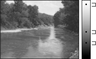
It is value, not color, that creates the illusion of form, light, and space. Below left is the painting “Lake Tahoe” by Albert Bierstadt, shown in value only and then in color only.
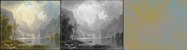
Middle: Values only
Right: Color only
Without color, the painting can still be read as a realistic landscape with depth, light, and atmosphere. Without value, there is nothing but a flat field of hues, proof that the cliché regarding value and color is true: value does all the work and color gets all the credit.
Value and Composition: The Value Structure
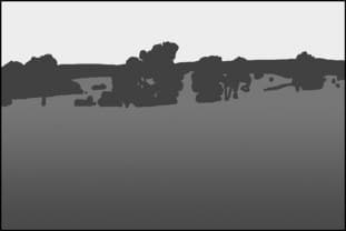
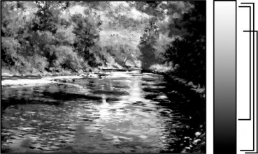
The composition is the most important element in a painting, yet we often think of, and create, compositions as outlined, empty shapes. But until those shapes are assigned a value, there’s no knowing if the composition will work. For example, here’s a painting by Curt Hanson, the original (left) and its value structure (right). It works beautifully.
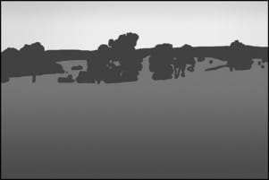
Below is the same composition with different values assigned to the shapes. There are thousands of possible combinations of values but only a few will work.
We can judge the quality of a composition only after it’s been expressed in values. The value structure and composition of a painting are mutually dependent.
The Foundation of Values
The foundation (or primary) values are the two to five major value shapes that create the value structure and express the composition. They are the building blocks of the painting. If the value structure and composition of your painting do not work, the painting will fail regardless of how well you handle color, edges, or details. When my paintings fail, it’s nearly always because of a faulty or weak composition and value structure.
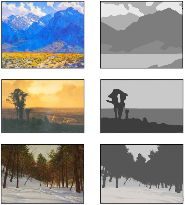
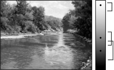
Below are several examples of landscape paintings and their foundation values. Every painting — landscape, still life, portrait, etc. — needs a value structure that works.
Seeing and Painting the Foundation Values
In order to work with the foundation values of the landscape, we must first see them.
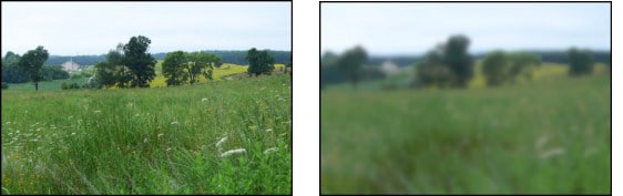
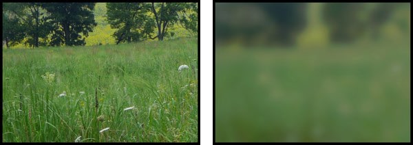
Squinting. This is the most important tool to use in looking for the foundation values. Squinting eliminates details and small shapes, blends subtle values into one value, and most importantly, helps us see the three-dimensional objects in the landscape as simple, flat shapes.
It’s worth noting that squinting will slightly darken all the values in a scene and so, when squinting, look for the shapes and the value relationships between the shapes rather than the absolute value of a single, isolated shape.
Related:
Massing Values. Nature presents us with multitudes of values. We need to sort them into two to five distinct value shapes. All values that are close can be combined into a single, average value. But remember that values don’t respect the boundaries of objects. For example, the light side of a foreground tree may be the same value as a distant mountain behind it, so these values should be combined into one value shape. Go by the values you see, not the objects you identify. We’re looking for shapes, not things!
Then, as we block in the value shapes on our canvas, we need to design them to ensure the composition is working. This is the time to add, subtract, and edit the shapes and their values to create an interesting composition and a clear value structure. The painting must work at this stage before we move on to color and the subtleties of details, edges, and secondary values.
Foundation values are determined by the intrinsic value of the object (snow is light, leaves are mid-toned, conifers are dark, etc.), the light in the landscape (ambient, reflected, or direct sunlight), and by the value key of the scene (all values in a night scene tend to be dark; those in a brightly lit beach scene are light). Additionally, one or more of the foundation values may contain a gradient (see below).
Blocking in Foundation Values in a Painting
Once the foundation values are seen, paint them in loosely (but with sensitivity toward the shapes) with large brushes, in one value for each foundation value. Ignore all details and subtle changes in value. Think only of flat, interlocking shapes. Forget all the labels that your mind slaps on the objects in the landscape. You are NOT painting trees, a sky, or fields — it’s all just visual information. You are painting specific shapes with a single, specific value. If creating an underpainting, the values are painted monochromatically, usually in an earth tone such as burnt sienna or burnt umber.
The Edges Between Foundation Values
As you paint in the foundation values, begin noticing the differences in edges between the shapes. However, at this stage it’s best to keep all the edges rather soft. The hardest edges can be added toward the end of the painting process, which nearly always coincides with the establishment of a focal point of the painting.
Gradients
Gradients are a subtle shift of value within a foundation value. Nearly every large area of a landscape (sky, foreground, mass of hills, etc.) will have a gradient. A gradient enhances the illusion of space and depth and prevents a foundation area from appearing as a flat area on the surface of the canvas. They are always found, and are especially important, in large planes in the foreground that recede into the distance. Look for them! But be careful. The gradient may be shift in color saturation or hue rather than value.
In this image (above), both the sky and ground contain a gradient. In most cases, the value shift in the gradient must be restrained in order to preserve the shape of the foundation value.
Underpaintings
Most importantly, underpaintings allow us to focus solely on the composition and value structure without having to consider the color, details, edges, etc. It simplifies the painting process. If an underpainting works, you will have a good chance of creating a successful painting.
When beginning an underpainting, I’ve found it extremely helpful to first identify and then mix on my palette the two to five values of the value structure. It’s much easier to compare the value relationships of the pigments on the palette than on the canvas. Before touching the canvas, I will spend whatever time I need to tweak the values of the paints until I am satisfied that their value relationships are as accurate as possible.

Even when creating a more finished underpainting, the focus is still on foundation values.
Evenly Spaced Foundation Values
It’s only within the last several years that I’ve become aware of a subtle but important consideration when working with foundation values: avoiding a value structure that consists of values evenly spaced along the value scale. Without exception, a painting whose foundation values are evenly spaced from each other will be weaker than one in which the relationships between the values vary. Consider the two versions of the painting below:
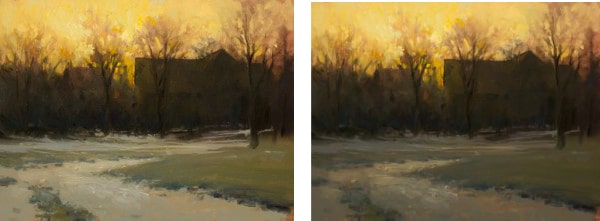
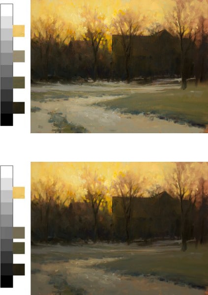
In the top painting, the values are equally spaced along the value scale. Without the other painting to compare it to, it may appear to be a perfectly adequate painting. But now compare it with the painting below, in which the value relationships on the scale differ. In the bottom painting, the eye is eventually drawn to the horizon, where the sky meets the silhouetted buildings and trees. In the top image, the eye doesn’t know whether to settle on the horizon or on the ground below the buildings. There are two focal points.
When the foundation values are spaced evenly on the value scale, the contrasts between them are equal — no contrast will stand out greater than any other. Multiple focal points are created. In the bottom painting, the greatest contrast is clearly between the sky and background objects, creating a single focal point. The eye knows where to go.
Value Complexity
The complexity of values in a scene can vary dramatically. In some landscapes, the value structure is unambiguous; it’s easily determined. In others, the values may be broken and scattered throughout. If, at the beginning, you struggle with identifying and painting the foundation values, stick with scenes in which it is easy to see the foundation values. Then, as your skills develop, move on to tackle more complex scenes.
Secondary Values
Secondary values are those varied and numerous values that lie within each foundation value. These values usually describe, not the overall value structure of the landscape, but the textures, details, and nuances of light on the objects within the landscape.
Secondary values are determined by, and must always be related to, the foundation value. Generally, the closer the secondary values are to the foundation value, the more evident will be the value structure of the painting.
The Range (and Contrast) of Secondary Values
Secondary values may remain close to their foundation value with little contrast between them or they may contrast greatly from their foundation value. Contrasting secondary values will hurt the painting when the contrast becomes so great that the foundation values are lost. Generally, it’s best to keep most of the secondary values close to the foundation value, with perhaps one foundation area featuring greater contrast in its secondary values for the sake of visual interest and variety.
Narrow Range ~ Low Contrast
In this example, the secondary values in each foundation value are very close to the foundation value. Each lies within a narrow range. This can make a painting appear lifeless and flat.
There are exceptions to this rule. The Impressionists, with their concern for color rather than value contrasts, were masters at using close secondary values to create a sense of luminosity and vibrant color contrast. Their paintings are about color, not value.
Extreme Range ~ High Contrast
Here, the secondary values in each area runs from nearly white to black, overlapping so much that the foundation values are lost and the structure of the painting falls apart.
There are exceptions to this rule, too. John Constable was able to work well with high contrasts, varying the ranges of his secondary values but without ever allowing the range to completely destroy the structure provided by the foundation values.
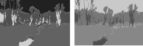
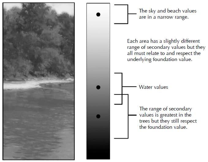
Varied Yet Unified Range
In this last example, the foundation values provide the structure while the secondary values create form, texture, and visual interest. The range of secondary values within each foundation value differs: narrow in the sky, moderate in the water, and greatest in the trees.
How can we find that balance? In most cases, it already exists in nature. We only need to train our eyes to see it so we can then paint it.
Seeing the Secondary Values
Again, squinting is the best technique for determining secondary values. If a small area of value disappears into the value of a larger, surrounding area, it’s a secondary value.
When squinting, secondary values tend to blend into a foundation value.
Beware of Tunnel Vision!
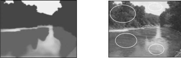
Much of the difficulty of working with secondary values and finding the proper balance of variety and unity in our paintings can be blamed on a physiological fact: the eye always exaggerates contrasts within the area in which it’s focusing.
For example, if you look only at the sky, there will appear to be a much greater value difference between white clouds and blue sky than actually exists. When looking at a group of trees, the value differences between the leaves in light and the leaves in shadow will appear to be much greater than they really are. The same is true with the value contrasts found in shadows across snow, value changes in water, shadows in a meadow, etc.
To compensate for the natural tendency for the brain to exaggerate contrast, you will need to constantly compare the value that you’re working with to other values within the landscape and your painting. Doing so will help you see the range of secondary values much more accurately and will make it much easier to preserve the underlying foundation value. Don’t focus solely on the trees to the detriment of the forest!
Establishing Secondary Values in a Painting
In the beginning, it’s best to keep the secondary values close in value to the foundation value. This preserves the value structure as the painting progresses. (It’s also wise to keep edges between the secondary values and foundation values soft, at least in the beginning).
When painting in the secondary values, first put a brush stroke on the canvas and then look at the landscape and the painting, moving your eye back and forth repeatedly. Is your choice of secondary value accurate? Is it too light or dark? Too close to the foundation value or too far away? Ignore details and forget about objects. Think flat shapes of value.
At the beginning, avoid any values that lie between the foundation values. Too many of these will break up the foundation values, and the structure of the painting will be lost.
Atmosphere and Contrast
Wrapping up, let’s look at the relationship between value contrast and the illusion of atmospheric, deep space in a landscape. The rule is straightforward:
High contrast creates dramatic lighting but minimizes the sense of atmosphere.
Low contrast minimizes the drama of light but enhances the illusion of atmosphere.
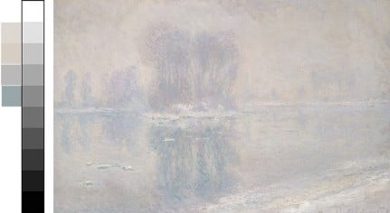
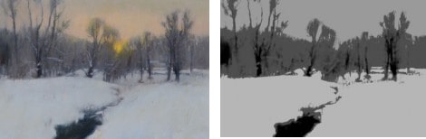
In the original version of Monet’s painting (above), the illusion of a dense, misty atmosphere is created solely by the extreme compression of the value range. Color has nothing to do with it. The darkest and lightest values are close on the value scale. Narrowing the range of values softens edges, limits the value contrasts, and creates mist.
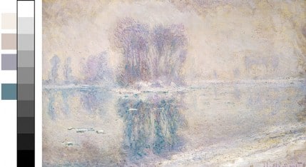
Here, I’ve increased the contrast in Photoshop, pulling the values apart and enlarging their range on the value scale. The mist is lifting, the air is clearer, and objects begin to appear sharper and more clearly defined. All of this happens simply by creating slightly more contrast in the values.
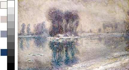
As the values approach full contrast — spanning the entire length of the value scale from black to white — much of the illusion of a misty, dense atmosphere is lost. Notice, however, that the focal point and the strength of the light are enhanced. It’s a trade-off. Both approaches work equally well. The choice is yours.
Too Much Analysis? Too Much Thinking?
In my painting workshops, I always point out that the acquisition of any painting skill is a three-step process: we must first be able to understand intellectually the principles behind a skill, then we must be able to see these principles in the landscape and in the paintings of other artists, and finally we must be able to apply them in our own paintings. Each step requires time and dedication to master, and the acquisition of each step is sequential. You can’t paint something you can’t see, and you can’t see anything without first knowing intellectually what it is and how to look for it. Thinking is our most valuable tool.
In this article, it may seem that there’s far too much analysis and thinking. Where’s the intuition, spontaneity, and feeling in the act of painting? I would be the first to say that those are the qualities that make painting a joyful, meaningful, and even spiritual activity. They are the ends — the art — of painting. But the analysis and intellectual understanding of the craft of painting is the means. It is equally important as the ends. If you can’t draw, then creating paintings in which the drawing is crude and childlike is not an option — it’s all you can do. But if you master the craft of drawing, then creating a painting in which the drawing is primitive is an option, a choice based on creativity and intuition and spontaneity rather than necessity.
Learning to work with values is worth every effort, with the greatest effort necessary only at the beginning. Once you learn what values are and how to see and paint them, perception and decision take place almost unconsciously. With fewer frustrations and greater options open to you, painting becomes a more joyful activity.
About John MacDonald:
• Visit his website at http://jmacdonald.com.
• Learn about his painting workshop video, “Creating Dynamic Landscapes” here
• And, discover his newest art video workshop, “Poetic Landscapes:”


This is fantastic!
Explanations are easily understood and the visual examples are spot on.
Really well done.
Thank you so much!
this is an absolutely precise, clarifying explanation of the use, and importance of value! Even more terrific is that you are helping us see this for ourselves, so that we can analyze, and apply this to our own work. If we can’t hone our eye to these principles, all the practice in the world won’t help- thank you!
To see value and masses, no squinting necessary for those of us nearsighted, just take off your glasses! There is the ‘pre conceived idea’ of what is before you and Joe’s thinking and analysis of what is perceived, a whole lot of difference there. This was very clear, enjoyable and informative. thank you Joe and out door painter!
whoops, sorry John, there goes one of those pre conceived ideas
John, Excellent article! Being a person who understands visually, Your examples were easy to comprehend made sense to me. Thanks for all the advice, Melissa
John, I’m a new painter stumbling my way around. Your article is EXCELLENT because it breaks down a principle and illustrates it clearly for application. THANK YOU and keep writing!
The analysis is based on the premise of local color constancy in which foundation values derive from object color. In reality objects have no local color property and only reflect some light while absorbing others.