

On Painting Composition > The very idea of how we approach our own art and feel about the art of others, keeps the “spice of art” alive. Now, I will be the first to confess that … (keep reading below)
Variety: The Spice of Art
BY MITCH BAIRD
I am sure that when English poet William Cowper crafted this phrase in his 1785 poem “The Task,” he did not intend for it to become a modern day cliché. But, if we really take a moment to think about this truth, it is not only relevant among individuals but it is a powerful statement regarding our surrounding environment and approach to life. How many of us approach daily tasks in exactly the same way? How about our thoughts and speech patterns? What about our reactions to stimuli, whether emotional or physical?
Everyone does everything differently, and gladly I can say it is the same with ART. The very idea of how we approach our own art and feel about the art of others, keeps the “spice of art” alive. Now, I will be the first to confess that I have very strong opinions on what art is, as I am sure you do, but VARIETY is something we can all be thankful for, otherwise our walls would be full of a “lackluster of sameness.”
For me, the spice of art is not in the differences in styles, approaches or painting “isms,” but in the variety inherent in an individual work. When I think of a great work of art of the past or present, the things that scream out to me are design, perception, and the fact that it is an interesting creation to look at. These elements are used as the means of communication, and the ways of keeping the viewer engaged, which I believe is our ultimate goal as artists. I have always viewed art as a means to share the reality in the world around us in a positive, uplifting way. As my understanding increases about how the optics of our eyes work, I find myself more and more interested in searching for DIFFERENT ways of expressing the shapes and forms that are in our visual field of reality.
“Different” is another word for variation, and variation is one of the stronger tools we can use from our arsenal to keep the viewer engaged in our painting. Variation is born out of the opposing principle of repetition, and neither can exist without the other. Again, the two are in every act, occurrence, decision, and experience in our physical existence, as well as in art. This concept of variation runs through the whole gamut of design principles. It is at the root of design as well as the application of design.
An example of the root of design is that our prime shapes of circle, square, and triangle are only three deep, and can get quite boring unless we manipulate them to keep things interesting. The application of design is in the manipulation or variation through the acts of alternation, rotation, subordination, gradation, contrast, dominance, radiation, movement, etc. We continue on by incorporating the concept of opposites: straight versus crooked, long versus short, neat versus messy, big versus little, rough versus smooth, simple versus complex, bright versus dim; and the list goes on endlessly.
These examples of application happen to be our vocabulary as creators. We use them in composition, drawing, values, color, edges, shapes, surface quality and even brushstrokes. Our choices in the application of these elements result in the overall look, feel, and communication of the work. This is something to consider when approaching a blank canvas. I have found that I like my work to be more and more complex in its application and surface as I evolve. I have found that the once-interesting “same all over” approach is now not only boring to me, and my process, but to the viewer as well.
Was Sargent Wrong in His Composition?
I look at John Singer Sargent’s earlier work and the way in which the sameness in his portrait work seemed formal and without surprise no matter how perfect his color tone or bravura brushstrokes. In his later work, and especially in his landscape work, you see the variation of application and concept. It is as if he broke out of his portraiture “imprisonment” and could finally express his freedom in pigment.
One particular Sargent painting changed my whole perspective on how to apply variation as a principle. As I walked along the walls of the 2001 Sargent exhibition at the Seattle Art Museum, I arrived at his painting “The Chess Game.” I was taken by how simple and refined certain parts of the canvas were when compared with other unresolved areas that were torn up and complex.
I reveled in the accuracy of the figures and their translucent flesh in the light (one of his best), until I was hit by the brash, raw and textural application of paint in the subordinate background river. I was quite dissatisfied at his attempt to capture the water’s reflective surface and even considered the painting a failure because of the lack of beauty in this watery area.
I studied the painting over and over again trying to interpret and understand his choice of application in the reflections on the water’s surface and why the area was so “wrong.” Without resolution, I moved on down the wall to find something more profound. It wasn’t until I was about 30 feet away, when I turned back to see how far my wife was trailing behind, that I saw the true effect of the masterpiece. It struck me with a paralyzing impact and I couldn’t move from the epiphany of visual stimulation.
It was only from quite a distance that all that “wrong” variation made sense. The value shifts, color, edges, and broken surface radiated into an amazing sunlit river. It was only then that I realized that the reflective surface was not “reflecting” at all, but was translucent, showing the bottom of the riverbed lit up with dappling sunlight! Of course, with this “Aha” moment, I went back and spent much more time re-analyzing Sargent’s masterful approach and contemplating the effects of opposition and variation in his design.
Now when I approach a blank canvas, I find that if I think ahead I can use these variables to enhance a particular part of a painting. I begin by asking myself questions about opposites to find variation. For example, I may ask about the surface quality of an object in my subject, and what type of surface quality I want to use on the canvas for that object. I then find the opposite of that object’s surface quality somewhere else in my subject and take the opportunity to facilitate it in the painting.
I continue to do this through each of the factors of composition, drawing, value, color, and edges. This dance between opposites not only keeps me engaged, but I feel that in the end the onlooker has something to sink their teeth into. Opposites only reinforce the message of each other. A straight line cannot be at full character without a crooked line countering it.
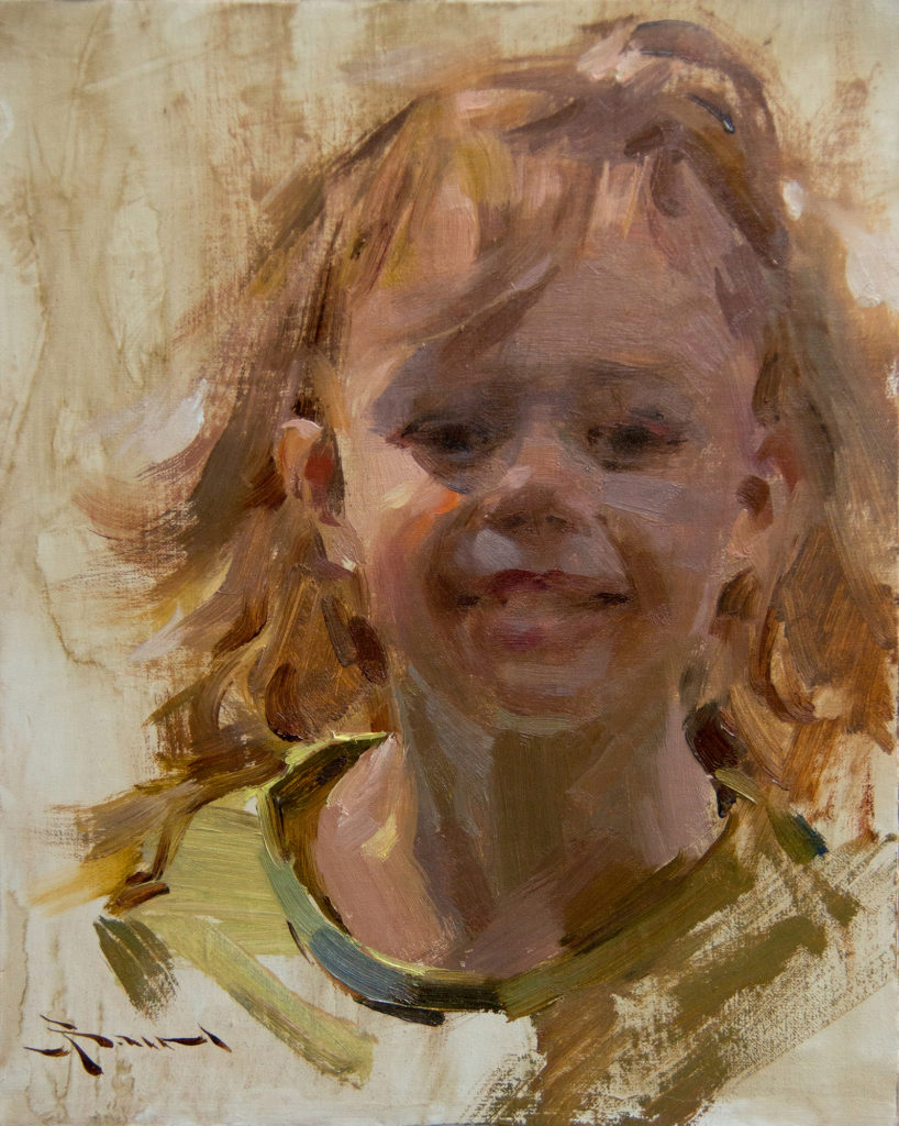
With each new painting comes a new set of problems, and hence “variables.” I try to anchor the painting on one core principle and then play to its opposition as much as I can. For example, “Vivien” was all about edge quality. With this in mind I tried to play to the extremes by pushing and pulling edges to identify the subject without rendering or over-playing the modeling.
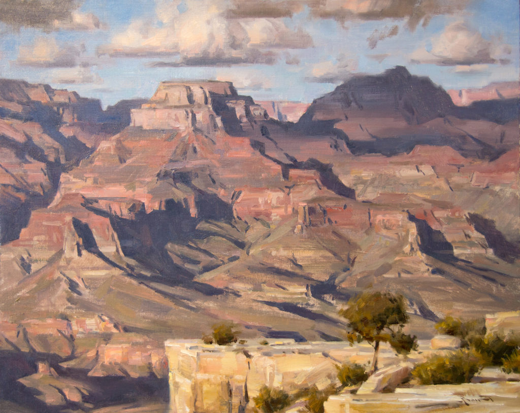
In “A Grand View,” I was aware of the simple value structure and that most of the color was in the halftone sunlit background. So, the variation came by way of color changes as well as in the opacity and transparency of paint in the light and shadow. You can see the broken and opaque abstract application in the detailed view of the work.
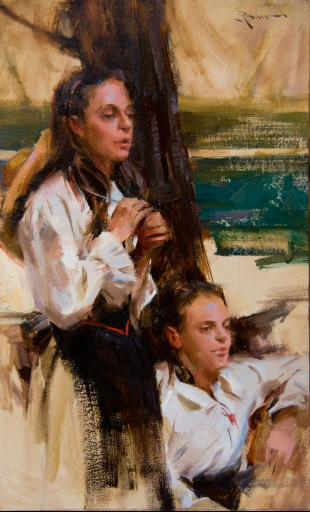
The Lucignano Dancers sketch was not about “dancing” but about the pattern that these two teenagers created as they watched from the sidelines. I purposely dissolved much of the surroundings into a crisp abstract statement to counter their soft and subtle portraits. I again played the opaque and transparent by pushing the background away with washes of color and building up the foreground with sculpted paint even in the deep dark tree trunk behind them. These opposites enhanced their position in space from the viewer.
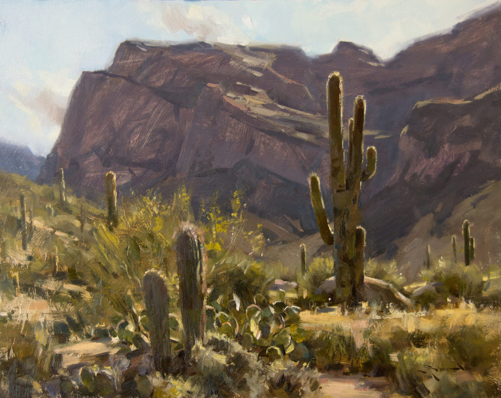
“Catalina Back Light” is about just that—the rim-lit desert. The challenge here was to have variation in the transparent and opaque paint to enhance the effects of light in such a stark value pattern. The shadows are nothing but transparent washes against the opaque pigment in the positive areas of light. I was also keen on letting the drag of the brush be part of the textural effect of light.
I am sure that by this same time next year, I will have moved onto another design principle and be exploiting it as much as possible. The great thing about being an artist is the never-ending search for knowledge, and subsequent evolution as we grow. For now, I am concerned with variation and keeping out that “lackluster of sameness” in a painting.
No matter how important or elaborate the message may be in a painting, if I don’t respond to the uniqueness of its creation, I will move on down the gallery or museum wall looking for something more exciting. The principle of variation is vital to our craft and luckily so diverse that it can be reused in an infinite variety of ways, giving each of us our own individual voice in art.
This article on composition, design, and painting, was originally published in 2015
Learn more about Mitch at: www.mitchbaird.com
> Subscribe to Plein Air Today, a free newsletter for artists
> Subscribe to PleinAir Magazine so you never miss an issue


