
How and you improve a landscape painting design when you’re en plein air and time is of the essence? John Hughes offers these tips on considering your masses:
Achieving Better Plein Air Design Through Simpler Masses
What actually makes a plein air study, or any painting work as a design? One thing for sure – clear and readable masses. That’s why scene selection is so important to the plein air artist. Since there is very little time on location to plan and implement design strategies, picking a scene which already has good design possibilities is a great way to start.
If you are concerned with becoming a better designer in the field as well as in the studio, the ability to recognize the large masses of a scene will go a long way in helping you to paint more compelling landscapes. Couple that awareness with the creative skill to rearrange a “not so perfect motif” and you have a winning combination.
All too often artists will beat themselves over the head trying to figure out why a painting just doesn’t seem to do the job, and is not very appealing. The artist may possess the skills necessary to depict forms in space, as well as painting the effects of light along with juicy brushwork to boot, but still some pesky study is causing them heartburn.
What to do? After making a promising scene selection, the answer might just lie in simplification of the larger masses, before trying to add more unnecessary detail.
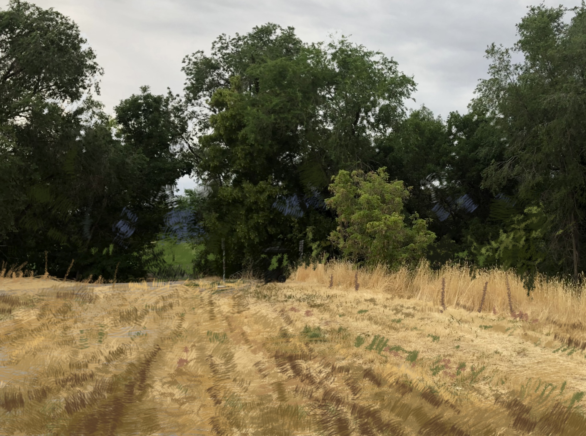
Let’s take a look at a scene that I came upon today as I was taking my early morning walk.
While this scene is not hugely compelling, nevertheless, it does have certain aspects that might work well for a field study. Here’s what I would do to make it work on the spot.
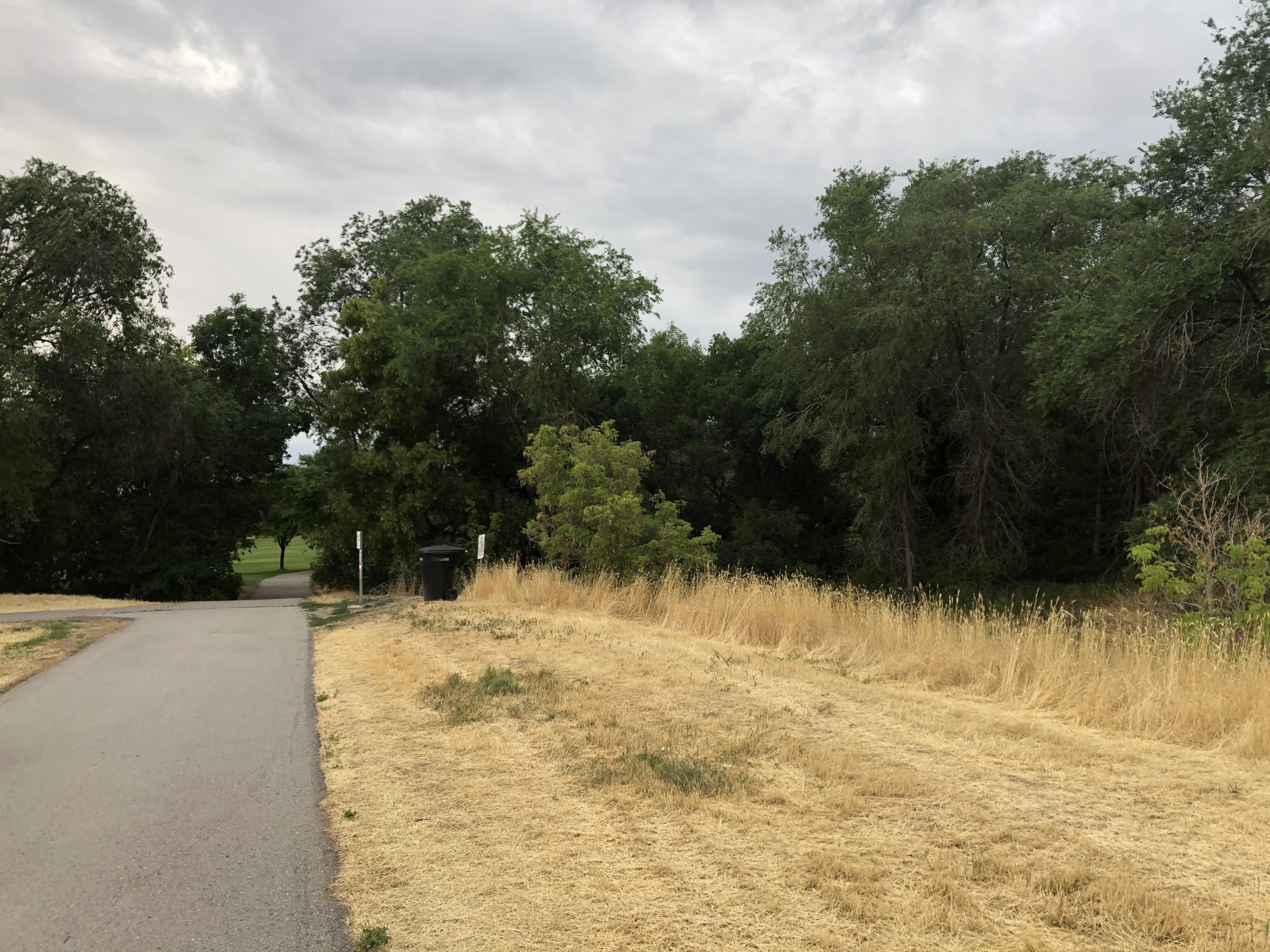
In the photo above, I was taken by the contrast between the large masses of the light foreground, the dark mass of middle-ground trees and the sky. There is also that small, lighter tree in the center which works well against the larger tree mass. So right off the bat, there is simplicity which lends power to the scene – (three major value masses, which will serve as an easy to read design).
***
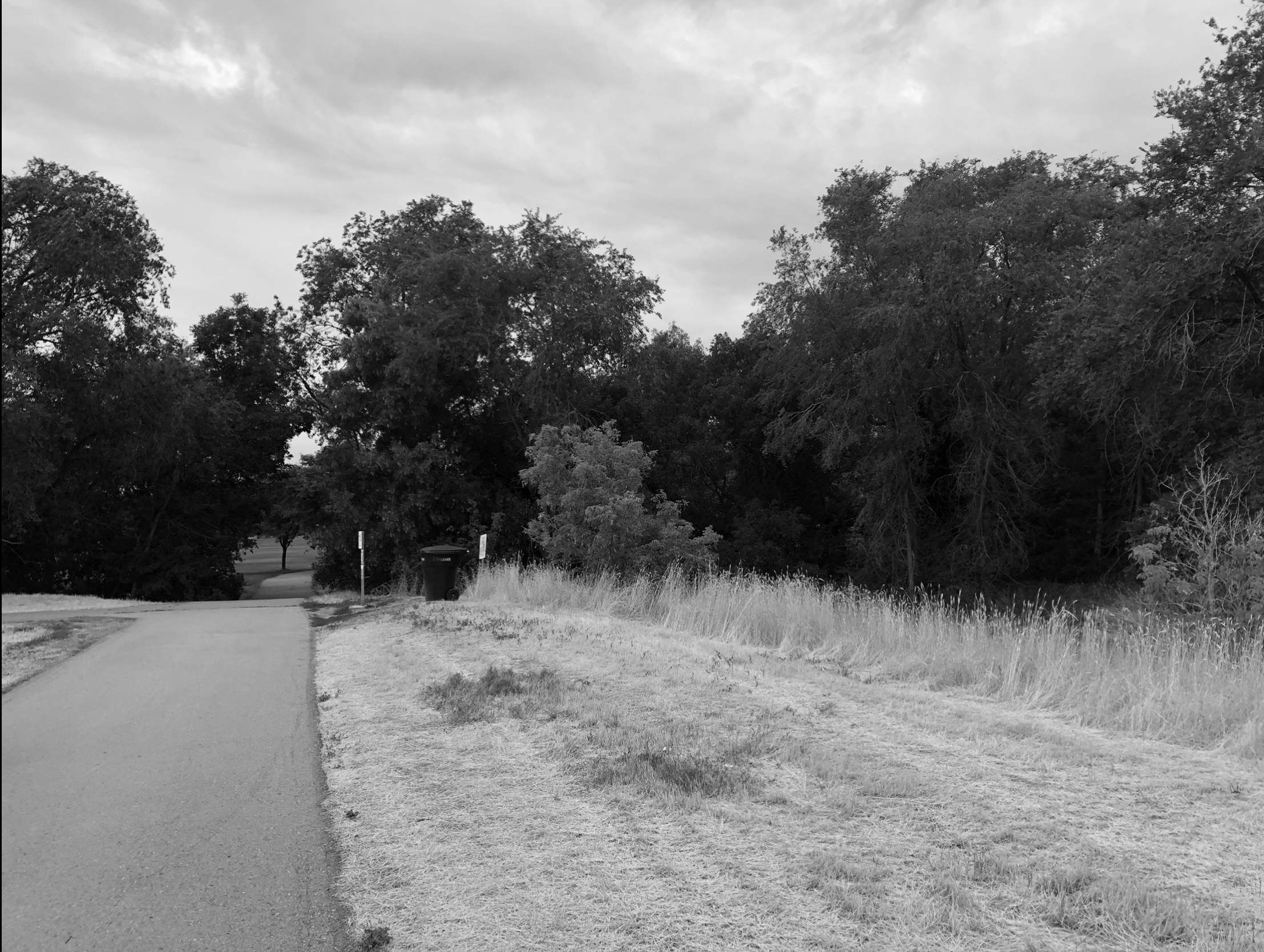
You can see this even more clearly when the color is desaturated in the photo. Out in the field one has to learn to see this in their mind.
Also, what I am not attracted to, is the pavement with its abrupt linear movement that shoots you like an arrow into the trees. The contrast is so sharp in relation to its surroundings, that I consider it more of a distraction than a help.
Of course I could lessen that distraction by adjusting values, edges, and drawing, but I decided to eliminate the road altogether in favor of a more natural farm look.
***
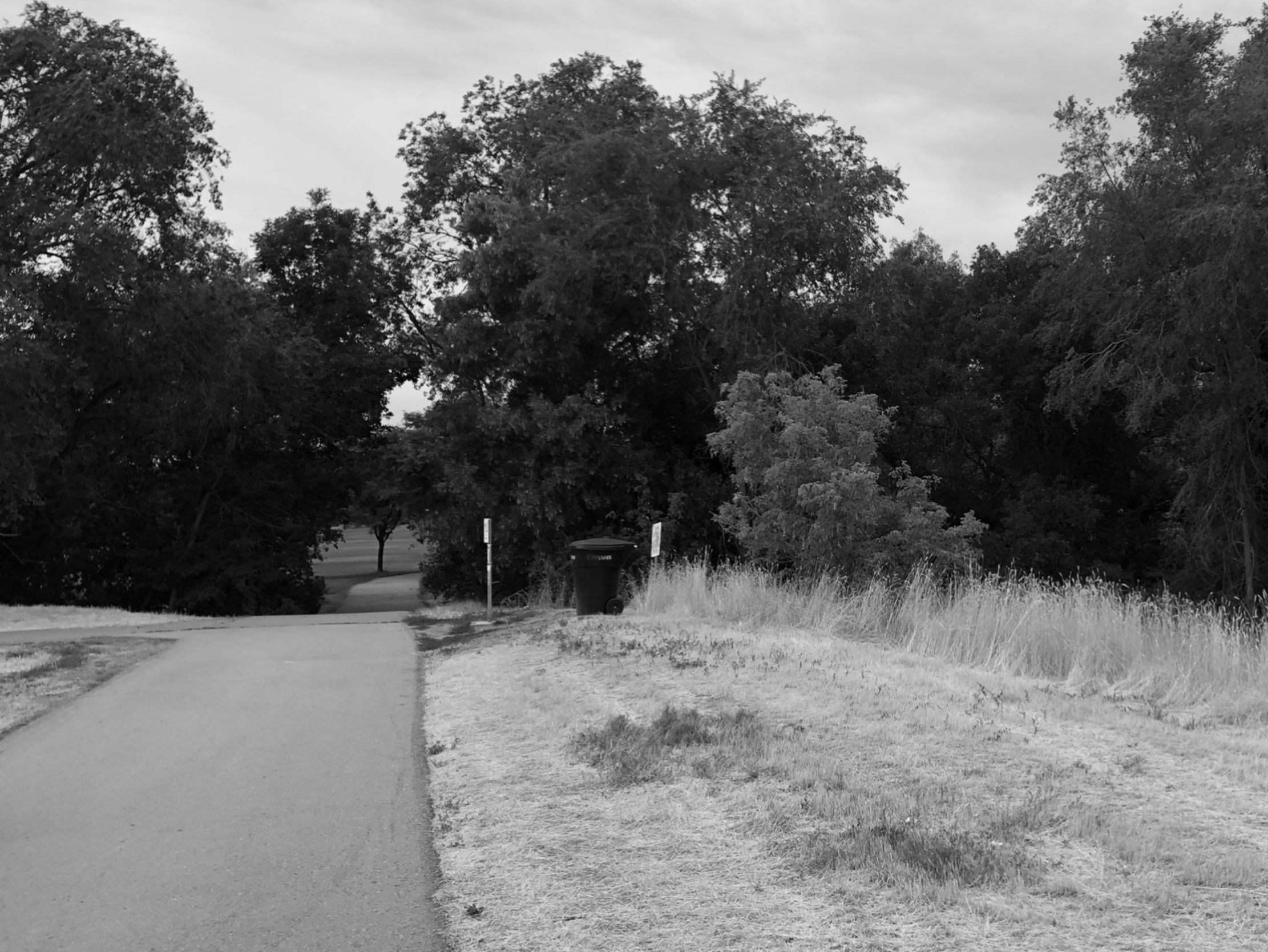
The process starts with my first design move, as I crop from the bottom and right what I’m not interested in. This also has the added benefit of moving the smaller tree to the right and getting it out of dead center.
Although the larger tree behind it is inadvertently more centered now, by moving the smaller one it offsets the feeling of a bullseye. Besides, in the final painting I can also make more adjustments. This view appeals to me more than the first, which had too much unnecessary foreground that seemed to start at my feet.
***
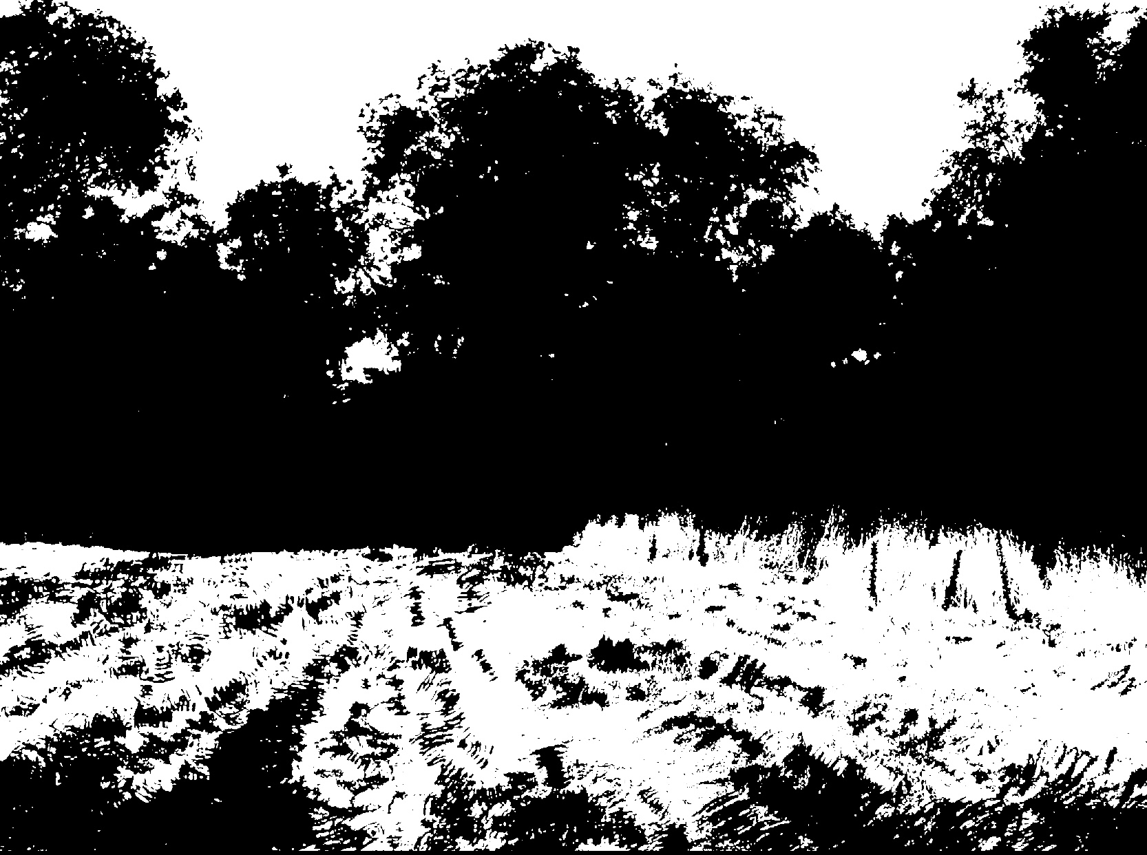
This photo represents my ultimate objective as a notan representation.
***
In the final photo you can see this idea, as I envisioned it and as I would probably paint it out on location. I’ve also made adjustments to the background with an imaginary mountain, or hills to spice things up. I might even put a figure, or some cows, if I really wanted to take this idea further. For my illustration I am using the Procreate app on my I-Pad.
Again, while painting outdoors, this is an exercise for the mind and the brush, but doing these exercises in your spare time, will sharpen your skills when the crucial moment arises.
***
So the next time you are out in the field scratching your head, trying to figure out why a design lacks power, consider some creative rearrangement and simplification of your masses to achieve a better design.
Don’t miss your opportunity to create lifetime memories at the Plein Air Convention & Expo! All training sessions are indoors on giant, high-def screens, with plein air paint-outs in the afternoons. Beginners and pros feel right at home, so register at PleinAirConvention.com to join us.
Browse more free articles here at OutdoorPainter.com
Blog post prepared for the web by Cherie Dawn Haas, Editor of Plein Air Today


Very helpful article thank you!