

Welcome to the PleinAir Podcast with Eric Rhoads. In this episode Eric interviews Dr. Dan Hill, CEO of Sensory Logic, facial decoder, and author of “First Blush: People’s Intuitive Reactions to Famous Art” and several other titles. In this podcast, discover how you can use the knowledge of eye tracking to get the strongest effects in your next painting.
Listen as Dan Hill shares the following:
• How the Mona Lisa was informed by da Vinci’s studies of facial anatomy
• The “secret sauce” of facial coding that can help painters elevate their game
• Design tips for creating an effective ad for marketing your art, and more
Bonus! Eric Rhoads, author of Make More Money Selling Your Art, shares advice on how to make your social media posts more interesting than others, and smart ways to get your work into an art gallery, in this Art Marketing Minute Podcast.
Listen to the PleinAir Podcast with Eric Rhoads and Dan Hill here:
Related Images:
Related Links:
– Dan Hill online: https://www.sensorylogic.com/
– Eric Rhoads on Instagram: https://www.instagram.com/ericrhoads/
– Eric Rhoads on Facebook: https://www.facebook.com/eric.rhoads
– Sunday Coffee: https://coffeewitheric.com/
– Plein Air Convention & Expo: https://pleinairconvention.com/
– Plein Air Salon: https://pleinairsalon.com/
– Publisher’s Invitational: https://publishersinvitational.com/
– Value Specs for Artists: https://streamlineartvideo.com/products/paint-by-note-red-glasses
– Paint by Note: https://paintbynote.com/
– The Great Outdoor Painting Challenge TV Show: https://thegreatoutdoorpaintingchallenge.com/casting-call
– Figurative Art Convention & Expo: https://figurativeartconvention.com/
Plein Air Today covers artists and products we think you’ll love. Linked products are independently selected and linked to for your convenience. If you buy something using a link on this page, Streamline Publishing may receive a small share of that sale.
FULL TRANSCRIPT of this PleinAir Podcast
DISCLAIMER: The following is the output of a transcription from an audio recording of the PleinAir Podcast. Although the transcription is mostly correct, in some cases it is slightly inaccurate due to the recording and/or software transcription.
Eric Rhoads 0:00
This is episode number 171. Today we’re featuring a man you probably don’t know but who could revolutionize the way you paint. His name is Dan Hill. Stay tuned for this.
Announcer 0:23
This is the plein air podcast with Eric Rhoads, publisher and founder of Plein Air magazine. In the Plein Air podcast, we cover the world of outdoor painting called plein air. The French coined the term which means open air or outdoors. The French pronounce it plenn air. Others say plein air, no matter how you say it. There is a huge movement of artists around the world who are going outdoors to paint and this show is about that movement. Now, here’s your host, author, publisher and painter. Eric Rhoads.
Eric Rhoads 1:01
Thank you Jim Kipping. And welcome to the plein air podcast. My name is Eric Rhoads. I’m glad to be here with you today. I’m glad to be anywhere. Of course, most of us are staying at home in spite of the staying home part of life and the bad news that surrounds it. I’m enjoying all my extra time, lots going on getting a little painting done. And I’ve been doing a lot of free art instruction training on video every day at 3pm. Eastern on our various Facebook accounts. We have over 400 artists we’ve been featuring. And I’ve been doing daily updates every noon, at Facebook noon Eastern and that’s on my personal page and at the Eric Rhoads publisher page. So that’s a way to kind of stay in touch and if you want to join us, we hope you will. We’ll continue that throughout. However long the quarantines lasts hopefully not much longer. Anyway, we’re having fun giving stuff away and keeping your heads in the game. If you’re into learning the game, meaning plein air painting, we have a free book for you called 240 plein air tips and you can find it for free at pleinairtips.com. Of course, we are moving forward with the Plein Air Convention. We did not do it in Denver, which is next week, if you’re listening to this when it was first coming up, and they had snow so it all worked out actually. So we’ve moved into August in Santa Fe and they have a stellar faculty in Santa Fe or we have a stellar faculty and it’s our first summertime convention ever so if you’re one of these people who has not been able to attend because you’re a school teacher or student or you just can’t go because it’s not summertime, come and visit in August at the Plein Air Convention learn more pleinairconvention.com after the interview. I’m going to be answering some art marketing questions in the marketing minute. And we remember I remember that the art marketing minute now has its own podcast called Art Marketing Minute for those of you who want it. Today’s interview will have you riveted. This is a man who has studied how people view art What draws them in and what repels them? He’s gone to museums. He’s studied these people how they react. He’s used eye tracking. He’s got all kinds of information, and he consults some of the top agencies in the world, and has really some information I think you’re going to find valuable. So let’s get right to the interview with author Dan Hill. Well, Dan Hill, welcome to the Plein Air Podcast.
Dan Hill 3:25
Well, thank you so much.
Eric Rhoads 3:26
I’m really excited about today because this is a rapid departure from what we normally do. we’re interviewing mostly artists, sometimes art historians, but I want everybody to know that that Dan has a completely different take on things and I think you’re gonna get a lot out of this. Dan is an author of over eight books. He’s the CEO of a company called sensory logic, which is all about market research and eye tracking and so on. And he’s spoken in over 20 countries and today we are fortunate To have Dan on the Plein Air Podcast. So welcome.
Dan Hill 4:03
Thank you so much.
Eric Rhoads 4:04
So Dan, the reason that I invited you onto the podcast is because you know, what works in terms of visuals. And you can help us formulate what might help our works resonate better with people and we’ll get we’re gonna get into that. But first, I want to kind of know how this all began. How did you start kind of trying to understand artwork?
Dan Hill 4:32
Well, it’s a lifelong interest. When I was a six year old boy, we moved to Italy, I did not know the language at first I had to read nonverbals Italians have more than just a little bit of those. But probably from an art perspective, the key moment is on our way back to the States. We stopped in Amsterdam at the Rights Museum, and I fell in love with Rembrandt, the power of the portraits the expressiveness of the faces, the psychological penetration of his work. Absolutely captivated me even as a seven year old boy never forgot it. And although I took many years to become a facial coder, I think it really started with Rembrandt.
Eric Rhoads 5:08
What is a facial coder?
Dan Hill 5:10
A facial coder uses the fact that Charles Darwin came to realize that in your face you best reflect and communicate your emotions. Your expressions are universal. They are hardwired into the brain, we have the face of the only place in the body where the muscles attach right to the skin. So it’s quick real time data. And we have more facial muscles than any other species on the planet. So there’s an absolute wealth of information as to how people are feeling. The first person that took advantage of this honestly, was none other than Leonardo da Vinci. When he did the Mona Lisa that was informed by his studies of anatomy to try to understand how people express their emotions and that’s why the paging is to my mind so rich is that she has multiple expressions on her face. It’s not Just the smile, by any stretch of the imagination There is also sadness and anger and contempt on that face.
Eric Rhoads 6:07
how do you know that? I mean, do you? Did he write about that? Is that that he was intentionally doing that? Or did Is this something you’re assuming?
Dan Hill 6:15
No, no, no. There is evidence that actually both him and Michelangelo were obsessively interested in anatomy and what it could reveal in Michelangelo’s clays case, he really went toward the direction of the body. But the notebooks would eventually show that he was really interested in the face, and its expressive qualities who which emotions, so there’s nothing to say that he was aiming or realize he’d captured certain emotions on Mona Lisa’s face, but his fascination with that as such, and as documentation as such, there was another 200 years before anyone even came close to understanding the face as well as Da Vinci did. My ability to know what she’s showing her face comes from a different gentleman named Paul Ekman. He is one of the top 20 psychologists in the World he’s a person I learned facial coding from Paul’s up in the Bay Area. And over the course of about 15 years, he systematically figured out which muscle activities correspond to which emotions,
Eric Rhoads 7:12
really. So you can go to that kind of depth.
Dan Hill 7:14
You can. there are seven emotions 23 expressions, so there’s kind of a secret sauce. And once you learn it, I mean as a painter, particularly obviously, if you do portrait work, it is just a completely new another opportunity to lift your game elevate into places you’ve probably never expected that intuitively, probably we’re already capturing someone.
Eric Rhoads 7:36
Well, I think that you know, most of the people listening to this are landscape painters or plein air painters, but a lot of them do portraits, a lot of them do figures. So we’re going to tie it back in a couple other ways in terms of you know, your social media presence and your advertising as well. But I’m curious Dan, are these expressions universal across all cultures or do some expressions change by culture?
Dan Hill 8:05
Well, it’s really they are universal. I’ve actually traveled to over 60 countries and believe me in every instance, I look carefully to see what I’m picking up on the face. The difference in culture is what’s called the display rules. Particularly in Asia, for instance, it can be rather subtle and brief. I once when I was a student at Oxford, it was, it was a poetry festival and someone made fun of the Haiku form and said, only problem with Haiku form, just as you’re about to say something you otherwise run out of space. The Japanese emote like a high like a haiku. It is subtle, and it’s quick. My father was an executive, the three companies said yes, I would go to Japan or a business meeting. And, you know, I’d hear all these yeses, and I knew that 97% of them were actually no’s. And the difficulty was figuring it out, you know, kind of the gradations of know that we’re going on.
Eric Rhoads 9:00
Well, but you know, I’m going to kind of veer off of paintings a little bit because I’m fascinated by this I can instinctively tell and it is purely instinctive in that if I meet somebody for the first time, I get an instant read on that person, the the way they shake my hand, if they look down or the way they look at me or do they look me straight in the eye. So, obviously, this plays into this so, you can, I can tell at least I feel like I can tell if somebody is confident, or if somebody lacks confidence or somebody feels embarrassed to be there. Is this all part of this?
Dan Hill 9:49
Oh absolutely. People have patterns we are habitual creatures. George Orwell has a wonderful comedy said, By the time a man is 50 has the face he deserves We have muscle memory. And so there are what I call signature expressions, or to bring it back a little more in the artistic realm. Oscar Wilde said only shallow people don’t judge others based on appearances. There really is a wealth of information. So it’s the ways you describe. But in my case, yes, it’s so often true that within three to five seconds, I’ve seen the flicker of some expression on their face. And it really tends to, you know, hold up over time as I get to know that person that really was the first window into their soul so to speak.
Eric Rhoads 10:32
So is this something that actors study for instance, so that actors can mimic the expressions that are going to make people evoke certain emotions? So is this something that can be learned? Can you trick the system?
Dan Hill 10:48
Um, you could try to trick the system, but the way that expressions work is kind of like a way that gathers has a peak and breaks on the shore. It’s rather quick and so when the politicians for instance, because I’ve always Use this for CNN, The New York Times. You know, analyzing watching presidential debates, a politician might try to throw the smile on too quickly. It lingers too long it leads to abruptly. Someone else you know, in a poker game might try to mask their expression. If the expression is asymmetrical kind of pulled onto the face, that is something of a giveaway. So we try to manipulate and work these things, but the rhythm of the expression is really the thing to hold on to.
Eric Rhoads 11:31
Interesting. So is there a “right way” for instance, to approach someone? So I’ll put this into an art setting an artist is at an art show a 10th show? Plein Air Show and they are interacting with collectors who are potentially buying their artwork is the way that they express themselves going to impact the sale of their artwork.
Dan Hill 11:59
Oh, Absolutely I’ve done research for 20 years for more than half the world’s top 100 companies. And I can tell you that all that people like to think it’s the words, the script, it’s not the talking points is the feeling points. Emotions are hugely contagious, and how we feel will we reverberate off the other person and vice versa? So yes, if you are a little afraid, if you’re lacking confidence, those things will come out in the course of those interactions, and people will, I think intuitively pick up on it, even if it’s not a conscious recognition. do go back to your question about actors for a moment. here in the Twin Cities where I live, the Guthrie theaters, one of the great theaters in the country. But what I discovered when I talked to the people there is the actors really aren’t trained in this what they try to do is instead immerse themselves in what the role is and how they project the person would feel the circumstance. So they are trying to tap into the intuitive but they just like painters, just like All sorts of people would have the opportunity to take this secret sauce and I think lift their game to another level potentially.
Eric Rhoads 13:06
So if I’m a painter, let’s talk about portrait painting for a minute even though this is a plein air podcast. If I’m a portrait painter, I then need to learn these various instructed these various emotion emotions, and what they look like. Do you have for instance, in your books do you exhibit what a different emotion looks like what the muscles look like? So that I get let’s say, I’m, trying to create someone who draws me in you know that that what’s that term they use to use bedroom eyes. Now someone that draws me in or makes me curious and wants to come in and, you know, they’re examples of paintings throughout history that the eyes follow you. Because they’re dead straight ahead and you know, that they’re there. They’re serious or they’re sending it over. Can I learn that?
Dan Hill 14:03
Oh absolutely. So in my book, which is called First Blush, for instance, I show Frida Kahlo. That’s one of the 88 artworks that I studied or analyze people’s reaction to, and she’s posing with a monkey. And she’s showing anger on her face, the eyebrows are are lowered and pinch together, the lips are pressed together. Anger is an emotion is really about I want to be in control of my circumstances, I want to make progress but under my own terms, I want to break through barriers that are unfair. If I had to boil anger down to a single word, it’s hit as into potentially hit out. So it’s like a snake coiling to strike. And that is what your Kahlo’s face shows. They’re one very determined painter.
Eric Rhoads 14:48
So if I want to create something that Forgive me artists, friends, you’re gonna hate me for saying this because so many people are required When I say things like this, but if I if I want to manipulate the painting so that it sells, what’s going to sell best?
Dan Hill 15:09
You want some edginess to it. One of the interesting projects I did for my company is I met with a company that helps decide who’s going to become the host for TV shows, and particularly the 5:30 local news. And what they found that which makes a lot of sense to me from my own studies, where we’ve also looked at casting for for TV commercials, is you want to have some edginess to it, it is important to be liked. But if they don’t, if you don’t capture people’s attention, first and foremost, you have no chance to move on to being liked and trusted and so forth. You have to have a window in so I think some degree of anger, but actually some complexity to it is even better. One of the findings from my book, which holds ups from my studies of celebrities and everything else over all these years, is another seven core emotions. That facial coding can think capture about human nature, happiness and anger, take the lion’s share. They’re about 70% of people’s emoting. And they were about 70% of people’s emotional response overall, to the artworks in my study. So anger is very common, but almost too common. So if you can spice it up and add in little touches of disgust or contempt or sadness, again, going back to Mona Lisa, that’s why it’s emotionally rich. It’s true that the lower eyelid and one of her eyes is straight, it’s taught that’s reliable sign of anger, but she’s also got a smirk at the corner of her mouth. It’s lifting up in a way. She’s got a little faint smile, and the chin is pulling up, which is a sign of anger, sadness and disgust. So that emotional richness I think, is what helps pull us in and it’s far better than being monochromatic and going with a you know, a single emotion. But the great thing is just like you’ve got primary colors You just got seven emotions and you can work your magic with them. You don’t need more than that. It’s just the way you blend and work them and tease them out.
Eric Rhoads 17:09
So yeah. Do you think that was the Mona Lisa’s natural expression? Or did he combine different expressions to confuse the viewer?
Dan Hill 17:19
Well, I don’t know. I can’t say for sure. But I have a couple interesting surmises about it. One is just rooted in history. You know, even though he toiled with the painting until his very last days, the basic work was done in four years, but let’s put it in context. Four years is how long Michelangelo took to pay the entire ceiling of the Sistine Chapel. So the guy was utterly painstaking. And I have to wonder if the anger we see a Mona Lisa’s face might just possibly be because she was getting really frustrated with this guy being such a perfectionist. On the other hand, that contempt could be interesting from a social point of view. I mean, she was the wife of A fairly wealthy merchant, you have Da Vinci who was born a legitimate a painter at a time when we didn’t yet have the celebrated paintings painters today with their brand recognition. So he was of a lower social status than she was. And one of the meanings of contempt is that you feel that you are above the other party above the other person. And maybe just maybe that feeds into that expression. You know, when I when I first learned portrait painting, the one of the things I learned was that the slightest accidental brush Mark changed the expression very, very, very slight. And so I think one thing that a lot of us who are, are painting portraits, probably don’t even realize is how just a tiny little flick of the brush could change what what the message is or signal you’re sending. I have no doubt about that. I mean, I was going to when we were talking about intuition, I mean, we see with a lot of acuity, the way the brain is oriented, the seeing part of the brain is probably about 450 million years old. And the emotional part of the brain is about 250 million years old. And the more rational your hand, your part of the brain is merely 2.5 million years old. That’s the estimation. So we are really heavily seeing and feeling creatures. And the the cognitive part of us isn’t nearly where the actions at. I mean, sorry, yeah, I don’t mean to put down Rodin’s the Thinker, but we are less thinkers that we are sealing seers and feelers. And I think the little brushstroke can take us in a different direction because the seeing and feeling go together so strongly and so naturally.
Eric Rhoads 19:46
So talk to me about eye tracking, because I think that’s got to be part of this. I remember reading that in some countries, when they’re doing business they wear sunglasses because they don’t want their eyes To be able to be read, you know, and I’ve heard about things like Iris reading and things of that, do you get into that sort of thing? Or what? What are the eyes have to do with everything?
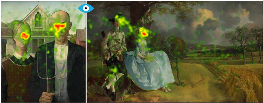
Dan Hill 20:11
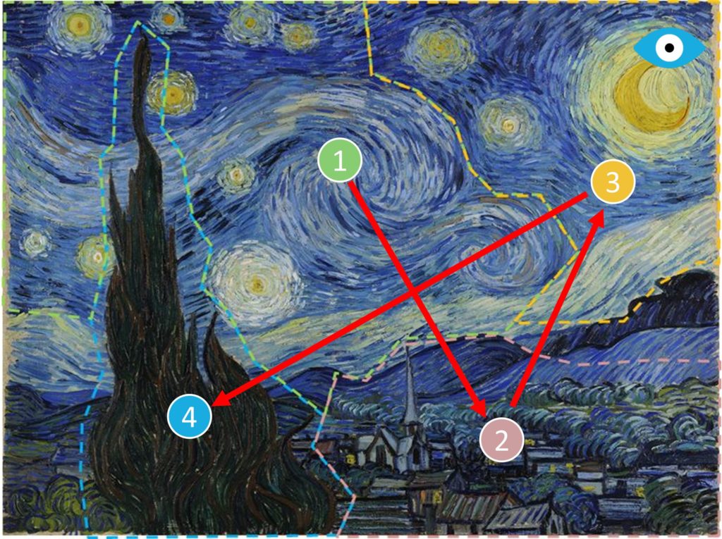
Oh, they have a lot to do with. So in this book, I do use facial coding to get at that emotional response of the participants who saw these artworks. But I also use an eye tracking machine. So they saw the works, which were paintings, they were some photographs, sculpture pieces, some ready made art installations. They saw them on the eye tracking screen, which is a natural, obviously, but it’s an apples to apples opportunity. And the way that eye tracking works is that the machinery the technology is looking for what’s called an eye fixation. If you stay with a detail in a work of art for at least one sixth of a second, then you have the opportunity for you to mentally hold on to it. If your eye kind of scans and scattered around too quickly, and it doesn’t get to that threshold, that fixation threshold. Basically, it hasn’t registered for you. So eye tracking started in the very same year that Gustav Klimt painted the kiss, but it’s gotten a lot easier. So there’s nothing attached to the person. They’re just looking at it. And it also captures, besides his fixations, which are shown as heat maps, like if you’re really looking at something for a long time, it’s in red than yellow, it’s less so and creative, it’s even less so. So you do get those heat maps with the fixations, but you can also capture the order in which someone is looking at artwork. And so you know, one of the things in my book, for instance, to kind of take it to the outdoors and plain art would be you know, there’s a starry night by Van Gogh in the study. So in that case, people go right up into the sky, and they’re looking at the swirling stars and the wind and so forth. They don’t get to the village in the lower right corner or the cypress tree in the lower left corner, and on upward because the cypress tree is you know, quite vertical They don’t get to that till later in this case, because they’re just pulled in by the energy of what’s in the sky. But what my studies showed is that typically, you actually do come in from the lower foreground into an artwork more times than not. I mean, there’s no absolute hard and fast rules that are right.
Eric Rhoads 22:18
So is it a right or left side?
Dan Hill 22:20
it is more to just up through the middle, and then you will go up to the top right typically,
Eric Rhoads 22:28
a lot of artists that I know will design design their painting with a path leading in sometimes to the left sometimes to the right, but they lead in and then they try to design it so it draws the eye around through the painting and does not drive the eye off the edges. You know, for instance, if the, if there’s a line, let’s say it’s a road that’s going off towards the edge, they’ll put a tree there so that your eye then bounces off to kind of like a pool table into another area. And so, Are you, are you saying that certain colors will draw the eye in? effectively we have. We have a number of painters that we know for instance, who will they have a theory where they have a focal point. Usually the focal point is in, you know, one of four spots on a grid kind of the rule of thirds, I suppose, and they will put a focal point in where they’ll have their darkest dark, their lightest light or the brightest, bright, their most highest Chroma, most color and their sharpest edge and then everything outside of that will get fuzzier and fuzzier and softer and, so on. Is, is that kind of what you’re talking about, or is there something different in this that I’m missing?
Dan Hill 23:54
I’m one of several aspects to what you’re bringing up here. Let me run with the color piece and I’ll go back to the game pattern. So one of things I’m really excited about doing in this book. My mom was an interior designer for one thing. So I’ve always been interested in visuals and, and color schemes and so forth. So I really wanted to know what colors performed well, based on the two tools that I had. So let’s start with the eye tracking. In terms of the greatest number of fixations being driven by a color, it’s blue, blue was the most effective at creating those little moments where you hold on to a detail. Green was the most effective at prolonging the gaze activity, really staying with a detail. I always wonder if it’s a part and this is you know, goes into plein air and being outdoors in nature. We were hunter gatherers. We had to make our way through the forest, the jungle, we have all these shades of green and we’re trying to decipher you know what’s going on around us to play it safe and have an opportunity to capture something for dinner. When you move over emotionally. The answer is somewhat different. The most engaging color which To say the color that made that created the most elicited the most emotional response through facial muscle activity on people’s faces was read, read, cut through, turn people on the most emotionally, the blue was the most appealing. So for instance, you know, we had a one of Monet’s water lily paintings in the study. And you know, blue is a very calming, pleasing color, it’s the sky on a nice sunny day, it’s water that we need for nourishment to stay alive. Blue is a very appealing color. So those are the ones that work well. They kind of the brown tones, and black and gray and so forth, tend to default back by comparison. If we switch over in your question to kind of on gaze activity just a little bit further, so they do tend to come up through the middle. Sure, there are things that could pull them one way or the other, but probably because we’re a culture that reads left to right. That pattern seemed to be that they would come up through the middle, jump to the GOP kind of gravitate to the top right, and they jump back to the top left, maybe the artist has done something that makes them you know, hip hop over there and pick up some extra details. So they almost like going back to see if I miss something. And then they finally get to the to lower corners left and right. But those are almost like outer Mongolia, because you may not have a chance to pull someone in unless they’re really staying with the artwork. And the reason I say that is that one of the inspirations for the book was that I read a quote that says people typically in a museum will look at an artwork for about 20 seconds and my instinct was, no, that’s not true. That’s too long, too long. too long. So the next time I was in New York, I went to Brooklyn Museum, I was at the Guggenheim and the frick. And I spent a good part of the day just watching how long people looked at an artwork, and it turned out to be four seconds. Then they looked at the title and you know, the explanation about that Are worked for about five seconds, and one second, often back to the artwork itself, but about four seconds. So when I set up my test, I allowed for the artwork to be on screen for 15 seconds. So I was being generous, not all the way up to the 20, but up to 15. And yet it held just like what happened in the art museum 70% of the gaze activity, and 70% of the emotional response happened in the first four seconds, even though I gave them another 11 seconds to take it in. So you really as an artist, it’s almost like trying to land. It’s almost like trying to land a airplane on a helicopter pad. You don’t have a lot of time. If you get them intrigued. They’ll stay with it. Obviously that’s what you’re hoping for. But all those little things that you’re talking about little tricks of the trade and getting them to move around the campus, the canvas just remember that you possibly especially in a museum, it might be four seconds, that’s your chance to make that first vital impression.
Eric Rhoads 27:56
Well, I think that, it’s exactly right, because I come out of an advertising background and we used to design billboards and, some people put 300 things on a billboard and I say, No, you’re going 70 miles an hour, you’re gonna get literally a one second glance at it, maybe two seconds, they’re not going to be able to read anything. And paintings are very much the same way. You walk into a room, a museum or an art gallery, and there’s 300 paintings on the wall, you’re gonna scan that gallery and get drawn to one more than another for some reason.
Dan Hill 28:29
Absolutely. And we also even looked at museum fatigue. So in my study, there was almost 100 subjects, we put into the three tranches, so no one saw more than 30 artworks. And yet, even just in the course of 30 artworks, their degree of emoting went down about 4%. That doesn’t sound like a lot, but imagine you’re in a bigger museum with hundreds of pieces. By the time you get to the later rooms, you’re really going to have to work to grab their eye and their heart.
Eric Rhoads 28:56
So in that four second museum scenario, you know, the typical painting He’s getting four seconds of view. Did you see outliers that broke through that four seconds where then people hung there longer or were interested longer? And if so, what did those paintings have that were different?
Dan Hill 29:15
Sure. I was intrigued by that question. And so the answer is Hieronymus Bosch is the Garden of Earthly Delights. It’s got a triptych, so that helps it but it’s got so much going on. I remember the first time I saw that in the product, I was blown away, you know, by all the intriguing, fanciful imagery that’s in there, but also how contemporary it felt, actually. I mean, I said to myself, my God, if the Las Vegas Chamber of Commerce wanted some new thing to use for its, you know, slogan, yeah, what’s happens in Vegas stays in Vegas. I said to myself, this painting could do it. It just felt so rich, so vibrant, and of all the artworks in this study. That was the one that actually gained emotional momentum. I told you that it was front loaded. But most of the action happened early. This is the really the strongest exception, where the last five seconds the thing was still building for people.
Eric Rhoads 30:10
And have you found that? Have you studied the differences in reactions to traditional art versus say abstract art or modern art?
Dan Hill 30:19
Oh, absolutely. I looked at it by both medium and by era to see what was going to be effective. So modern art, regardless of the genre, tended to do well in terms of engagement. But because modern art is often a more challenging, I would say maybe more severe, a harsher look at the world. It has less emotional appeal for people. So it certainly grabs the eye, it grabs the hard turns of attention, but I’d say emotionally, people tend to back away from a bit. Someone wants said that the Victorians looked at the world through rose colored glasses and by the time 20th century looked at the world through jaundice yellow glasses. And that seems to be a little bit true in terms of how people responded. Painting did quite well. Actually, to my surprise the readymade installations, if you had to choose a, you know, genre was the most effective. It really took things that people knew from real day life and threw them for a spin. And that worked for people in my study, I should mention, I didn’t just take college students or something I really wanted match both American demographics and who goes to museums. I have people from the age of eight to the age of 80. So really varied backgrounds, by age by rat race, ethnicity, knowledge and interest in art, but everyone in the study had to have at least some interest otherwise they weren’t a participant.
Eric Rhoads 31:52
So down if if I owned a museum, which I will one day, or or an art gallery, And I decided to call you and have your company come in to design my museum for optimum effectiveness and whatever that means, you know, get them to the gift shop or get them interested or get them to buy the poster or whatever they decide is the optimum thing that they’re looking for. Is that something that you would go in, test all the artworks and then say, okay, lay this put this painting here on this side, because this is where they’re going to see it first. This is where the eye goes first. And then you know, put a break in between don’t try don’t put too challenging paintings next to each other. Is there any advice like that?
Dan Hill 32:42
Um, you’ve actually teed up the afterword or the epilogue to my book. I really was curious to see if those kinds of applications were possible for you know, museum exhibitors, for people who own galleries. So first of all, I would say a couple of things. One is it’s really a Fact of the human brain works really well with contrast. So to to put two pieces that have some kind of thematic similarity or treatment similarity next to each other. And yet there’s something disparate about them. We’re really fascinated, we just go back to night and day cold and warm. We like to work with contrast, it’s a really good way to activate the brain easily and trigger us and pull us in. Another thing I would say is that I actually, once I had the results, I showed some of them to high school students because they’re the next generation of art lovers. And I have a tennis buddy who is an art teacher in high school, here in the Twin Cities, and I spent a day where I came up with all these suggestions, and what can be used to kind of live in the museum going experience for students, and even these options that I had them vote on them. And their number one choice was mood rooms. They would love to have room that a museum was actually organized least in part around, maybe there’s a color scheme that really dominates a certain room. Maybe it’s you know, red tones or whatever. You could go that direction. It could be that everything gives off a certain vibe, including from the facial expressions of the people in the portraits, but there’s something that really takes you into a certain mood or direction. it saturates you in that kind of experience. They love that they also loved it if you gave them some sort of historical context, not just the usual. You know, here’s the nameplate and when they were born, and when they died, they would love as I’ve seen in the Cincinnati Art Museum, when they start to have now these kind of iPad digital videos that you can play and give you a little bit more background or context. They were looking for something more that gave them a feel to the artist, the era what they were pushing off from some interesting quotes, but something they could take in visually as opposed to reading it. Because if they got five seconds to read it They’re only going to read about 20 words in five seconds. That’s not nearly enough to give them a rich context that compels them forward to spend more time.
Eric Rhoads 35:08
I’ve got so many questions for you, you’re doing a great job. Thank you so much the you mentioned warm cool. We as painters, oftentimes are looking for ways to see a dominant theme in our painting, for instance, a painting that feels really warm with majority of the color, or light being warm light versus some sometimes a painting is really cold, you know, you’re trying to create a different feel or emotion or mood, if you will, did you study the warm and cool aspects?
Dan Hill 35:46
Um, in a matter of speaking, I look to see if illumination worked, and what I’ve, you know, shadows versus light sources and which ones and how powerful it could be. So that’s probably my closest approximation to that. What I found is that the masters of that were the Spanish painters like Goya and Picasso, for instance, they were the most effective at making use of that, where I might go with your question in terms of ways to kind of help give leverage for the artists, kind of little tips that might give them better odds of breaking through. I was really curious about orientation. You know, it was a vertical orientation, a horizontal orientation, a diagonal orientation. Could one of them play better than the other for people? And I went in kind of thinking it’d be diagonal, and I was wrong. vertical orientation, kind of north south, was the most powerful in terms of creating the eye fixations and the emotional engagement.
Eric Rhoads 36:46
And then I was also curious, let me just stop you there because I want to make sure I understand that are you talking where the painting let’s say it’s in an eight by 10…the size, the shape of a book vertically versus the shape of a painting horizontal? Are you talking about that? Are you talking about a vertical orientation in your composition?
Dan Hill 37:11
In the composition itself? actually in the composition, so not the the canvas and the dimensions of the canvas. But, you know, in terms of what were the dominant, I guess I’ll say, lines that your you know, the eye is traveling, you know, based on geometric forms based on, you know, figures who were standing up versus reclining.
Eric Rhoads 37:32
Whatever the case may be. I have to believe I’m sitting here staring while we’re talking about your your page on Amazon with all the millions of books that you’ve written. And I have to believe that you go so far as to utilize this in the creation of book covers. And this also applies to the creation of things like advertising. Is that is that pretty much the case?
Dan Hill 37:57
Oh, yeah, I was stop shopping. When I got into market research that the people weren’t very visually oriented. I mean, I was an art history minor. My first father in law was an environment scholar that grew up in the same fishing village that moved kind of retired to or chose to live in after he came back from Paris and Berlin. So I’ve always been fascinated by the power of visuals, and they’re they’re so important to make it work. So for instance, you have dollar a lot of work in advertising, or to the agencies tend to put the logo for their client who’s paying the bill in the lower right hand corner my research show that that’s the last place people go to you run a tremendous risk of leaving your your advertising unbranded, if you put the client’s logo there, when I created my covers, yes, I thought in terms of you mentioned it earlier billboards, you know, five words, and yeah, one image and Over and out. So I found a wonderful company in San Francisco that I thought after I checked out all the boxes, abilities was really the best at creating captivating covers, and particularly for the art book, which I think is the best of all the covers I’ve ever had. I was delighted with what they came back with because it had that powerful visual and they used, you know, kind of a hot pink right in the middle to pull in the eye. And it just did exactly what my lessons from studying advertising all these years have suggested.
Eric Rhoads 39:23
You know, I’m one of those guys who’s always said, Look, put the logo in the bottom right hand corner, where does it supposed to go?
Dan Hill 39:30
It should go much closer to what’s the heat of the action. If there is a face, it should actually go pretty close to the most powerful face. I just looked through the other day at the seven denominations of US currency. the liveliest face is Benjamin Franklin’s go back and look at your $50 bill. It’s a really lively face in terms of what he’s showing as lively as Mona Lisa. So if there is a face that is the most expressive you absolutely want the logo within striking range of that, because if there is a face in a composition, it will attract 70% of the gaze activity and 70 of the emoting will be elicited by it. If there is action, it should be close to the action mode, even better than action is implied or pending action, the anticipation of action. So putting it close to where the narrative, the story of something is gonna unfold. Otherwise, I would say red is a good choice, because red is the most engaging color. If you want a softer feel to it, then blue is the most appealing color. So we could be through all of these things, or when I looked at geometric forms, triangles outperformed circles and squares. So maybe as close to a triangle if by chance, a fuller kind of implied triangle is part of the composition. There are lots of possibilities, but those are much better ones than that lower right hand corner.
Eric Rhoads 40:58
All right, so we’re bringing For a landing because I think I think it’s really fascinating. I’m going to ask you to quiz three questions. First question is, I’m a portrait painter. And I want you to tell me how to create the ideal portrait what should be happening in that portrait to get the most positive effect.
Dan Hill 41:26
You want the face to be medium size, not as large as close. And you know, Chuck Close painting, not too small, you want that you need to have some chance to really vibrate for people, but not be overwhelming. You want the face to be expressive. I actually went through and took a bunch of variables looking at the size, the number of faces that could be shown on the canvas, and how expressive was the person’s face, and the most, the truest highest performing variables, both involved in precedents, either very expressive or mildly expressive, and unexpressive sank to the bottom of everything. The third most important variable was that medium size face.
Eric Rhoads 42:11
All right, so we have a we sell art instruction videos and and our top selling video is a face You know, it’s pretty taken up a lot of it but those eyes are looking directly at you. And I had a friend of mine who’s a pretty well known designer in the advertising business. And every time she talks to me, she says, you know, make those eyes penetrating make them look at you is how important is that?
Dan Hill 42:41
Oh, absolutely. You know, when they say that the eyes are the window to the soul. They’re certainly on to something. The 25 richest square inches of visual territory on earth is in the middle of the face, and it’s involves the features of the eyes, the nose and the mouth. And there are people who, you know, didn’t think That was true that may be the other parts of the face for more important it’s really right down the middle. But it certainly starts with the eyes.
Eric Rhoads 43:08
So if you had a choice between I know this is probably just crazy talk but okay so one is the the head is looking straight on the other is the head is kind of looking down to the right over the shoulder. One as the eyes are glancing up at you, the other is the eyes are looking down and kind of a pensive, which is going to get the attention the most.
Dan Hill 43:33
you’re much more likely with the eyes looking towards you than looking down sadness as an emotion that human nature’s we kind of shy away from situations that we think are going to call on our resources and a sad person is asking for us to to hug them to step in to console them. Human Nature is kind of to back off from that. It’s just like if you’re out in nature. Do you see an animal that’s limping, the rest of the herd doesn’t wait for it. It either is going to pay have escaped and rejoin the herd on its own powers or it falls back. So that’s, that’s not my personal feelings. I like to think I’m an emotions expert and quite generous in my feelings. But that is kind of human nature. So the eyes looking down is not going to be it. But I do like the idea that they are looking at you maybe over the shoulder a little bit of entry to it. The slightly sideways glance rather than this, the straight traditional, you know, face to face can work as well or better, just don’t lose too much of the face, we want to see at least about 60-70% of the face. Because as we see less than the face, our tendency is to be less emotionally engaged. So Rembrandt obviously had these really, really dark shadows, you know, the the right side of the face blended into that dark background. Is that creating intrigue? Well, I think he did create intrigue to make us wonder how we’re going to complete The pitcher. But I think that what he did give us was very powerful. But I’ll throw in an interesting detail. So when I looked at how people responded to the nightwatch, part of the success of it was indeed the the face of people go into the face. What helped the face so much wear the hats that the men wore. Because we live in a different era, men often don’t wear hats anymore. They didn’t wear hats as interesting as those hats. If you you know, we moved to the face first if it’s there, typically. But we’re also interested in certainly the body and the clothing. But if the clothing is more unique, it’s a great benefit. So it It brought people into the realm of the head and the face and expression, and then it kind of gave you a little bit more to play with. So it was effective on that basis. And, you know, a lot of times, you know, obviously he’s telling a story or implied story. So where they’re looking what’s the interaction of the expressions between the people end You only get half of one person’s face and half another person’s face. You’re playing to what’s the, what’s the dynamic going to be? How do you think the situation plays out? What were the triggers for what’s going on for people those those are where the mystery is. And you know, human nature, we like a mystery.
Eric Rhoads 46:16
Well in the nightwatch also has a lot of expressions, different expressions in those faces. Okay, so that that’s kind of giving me an idea of portraits and figures. I like that. Now. Let’s move to the landscape, you’re creating the ideal landscape, what’s that look like?
Dan Hill 46:37
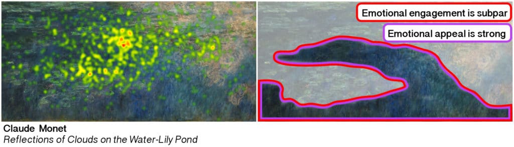
Think that you have to be careful with the color green. As I said, it gets a lot of gaze activity in terms of duration, but it actually was the weakest performer. Emotionally green was. So you have to I think you have to find I’m not a painter, but from my analysis from the results that we’ve captured from people. I will suggests that you need to break up the green, intersperse the green, do something unusual with it. So it’s not quite a landscape. But then again, it kind of is, in my study was Chagall’s I in the village. And so you have the village peasants, and then moving around. But this is one of the rare instances where green, which is fairly prominent in that piece worked, but you also had triangles, you had faces of people moving around in this natural landscape. You had an unusual instrument, one of the people is carrying a sight. And so that’s, you know, can be a good instrument of harvesting, you could also be potentially, I suppose, a deadly weapon that really got people’s attention. Something was upside down. So even though most of the landscape in the village and so forth was shown, I guess we call it semi natural. One of the elements was was just categorically upside down, that caught people’s attention. So there has to be some out there. element of surprise and all of this. One of my favorite quotes is from the poet Robert Frost who said, No surprise for the writer, no surprise for the reader. So I think as an artist, if you can allow yourself maybe it’s that almost accidental brushstroke that you mentioned earlier in doing a portrait, but something that just isn’t what you expected going in, I can live in it and take it someplace else. So I’m not sure I can give you something more prescriptive than that. But I think the color green which is gonna be so instrumental often in a landscape has to has an upside in terms of eye tracking and has a downside emotional
Eric Rhoads 48:36
you know, it’d be interesting to study this next time you do this if you ever do and that is that the painters that tend to be the most sophisticated and I know I’m gonna make somebody mad here because it’s not 100% true. But a lot of painters especially if you go through historically, what they would do is they’d really mute their greens You know, I’m standing out looking at the bright suns slamming a bright yard that that green is glowing yellow, green, chartreuse. And if you paint it like you see it, it just doesn’t feel very pleasing to the eye. So a lot of those those painters back in the day and a lot of painters even today, will that really mute that down, they’ll gray it down, they’ll make it so that it’s not a garish green. Versus, you know what, what we see, it feels a little bit more elegant when you look at it, but I don’t know if that would play into the same thing or not, you know, because you were testing a modern painting shaycarl did I think you said Chicago versus a traditional painting, you know, if you were to test like, say an old Rembrandt Lynn landscape, which was mostly Brown, or a, you know, something else from the past, I wonder what what the results would be?
Dan Hill 49:56
Um, well, we also looked at Christina’s world, which is, you know, Brown and golden tones and so forth, as well as you know, much older artwork, we really went for the study across the years, you know, from from essentially the Renaissance. There was King Tut’s death mask in there, but essentially it started from the Renaissance up to the current era. But I think you’re on something with with green I think you need because it just seems like it does take the eye, but it doesn’t bring the heart with it very effectively, either in terms of engagement or in terms of it being appealing. So I think working the green maybe in some of the fashions that you just suggested, is a pretty good idea.
Eric Rhoads 50:37
I studied under a fella by the name of Heidi Hartwig many, many many years ago. And he said the key to making greens work is that he would put little tiny pinpoint brush, just he take his brush and little pinpoints of bright cadmium red, and he put them just don’t lay two or three of them in random places and he said that read just was enough of that red was so strong that it counteracted the green.
Dan Hill 51:04
Yeah, I think that’s definitely a possibility. Some way to some way to play it, tease it out a bit further.
Eric Rhoads 51:12
Okay, I want to ask you, I’ve got two more questions. And then I think we’re done unless you have questions for me. But one thing we didn’t talk about is nudes. And nudes, oftentimes are really difficult for artists to sell, but it’s one of the most engaging and pleasing things to do, because it’s one of the most challenging to be able to do an effective nude. Any thoughts on that? You know, I know some people automatically recoil because, you know, maybe they’re just not used to seeing that, or something is, there any thoughts about using nudes?
Dan Hill 51:49
Overall, emotionally, portraits did well male and female, and there’s certainly more than a few dudes involved like men as well. Libya, for instance. You know, we were in a study where there might have been a little bit of artificiality in that they’re looking at an Iraqi machine. And it’s like a public setting, although that would be true of the museum, as well. So they did have me and my assistant there, and maybe that caused them to shy away a bit. They didn’t actually look at what Monty Python used to call the naughty parts on a nude body quite as much as I expected. The the grandest example of that was in the birth of Adam. Obviously, Adam is naked, but he did not look so much at Adams nakedness or at the fingers touching as they did it God’s face because Michelangelo was so bold as to show us God’s face. Normally in a painting you might see the Virgin Mary or Jesus depicted, but I’ve gone through a lot of things racking my brain to books I’ve got on the shelf. I can’t find another artists who dared to do what Michelangelo didn’t show the face. But if it goes Back to the matinee, they did look at the face, they did look at what her hand was, you know, discreetly covering what they didn’t get around to because there’s some other elements thrown in. Of course, there’s kind of a naughty joke, where the cat the black cat on the far right side has a, I guess I can’t describe it any other way than erect tail. And because the cat is so far to the side in the time that people took it in, they didn’t really go there because they wanted to look at her face. They wanted to look at the made space. They did look at the body some. What I found was that in female nudes, the limbs do not perform nearly as well you probably gonna have a better chance with the torso. But the limbs do not attract as much activity response as the face did certainly proportionally because they’re harder to pay.
Eric Rhoads 53:56
Then that’s good news.
Dan Hill 53:57
Indeed.
Eric Rhoads 53:57
Yeah. Okay, so One of the other things I want to translate this to is we have a lot of artists who are, are running ads. And I’m always saying to artists don’t do what everybody else does you want to stand out. And the typical ad is a picture of a painting with their name at the top, and which is, which is a branding thing. And then you know, maybe a little bit of copy and a logo in the lower right hand corner. But if they’re trying to sell a piece of art, how would you do it in a, in an advertisement?
Dan Hill 54:34
I would actually think about trying to find some way that there’s a signature expression on the artists face itself, or him or herself. I would also try to think about some detail. It may be in the artwork, it may be a prop that’s actually in their studio, but something that’s going to draw us in that arresting detail. That is the platform and opportunity. Yes. Many of these, you know, my wife is an artist. And, you know, I go to a lot of art shows and galleries and so forth. You know, too often they’re done in a pretty conventional fashion. I think you want to find the unusual detail that tells the story. You know, when you pitch a movie in Hollywood, what they say to you is that what’s the story? People are interested in the story, and I think this is an opportunity. Yes, you’re selling the painting, but you’re selling the brand as well. And what makes you stand out what is some arresting unusual detail that you can convey rather readily the brand to you in a distinct fashion?
Eric Rhoads 55:40
This has been absolutely fascinating. I’ve learned so much. I probably learned more today than I’ve learned all year in terms of this kind of thing. It’s it’s absolutely fascinating to me, and I really thank you I’m glad that we hooked up and had a chance to get together on this and learn from you. You’re book is called First Blush by Dan Hill. You can find it on Amazon or any other place and you’ve got a bunch of other books, where can I find in which of your books Am I going to find something that shows me examples of the different different expressions, so I can cut them out, put them up on the wall of my studio and, and kind of use those as a guide?
Dan Hill 56:23
Sure, it’s called Famous Faces Decoded a Guidebook for Reading Others. And I go through the secret sauce of these 23 expressions, but I do it using celebrity examples, so it’s more fun. So I drew people who are from the music world rock stars, Hollywood stars, media moguls, CEOs, famous politicians, professional athletes and the like. And then if you’re an artist trying to market yourself, I wrote a book called about face the secrets of emotionally effective advertising. So both of those may be helpful in a different way than I’m hoping first blush can be fulfilling.
Eric Rhoads 57:00
Outstanding. Well, I encourage everybody to get these books. I certainly know I’m going to this first thing I’m going to do When, when, when we get off of this interview. So thank you so much, and I really appreciate your time today.
Dan Hill 57:12
Well, thank you, Eric. I had a blast.
Eric Rhoads 57:14
Well, thanks again to Dan Hill. I took lots of notes. It’s gonna change how I do a lot of things and maybe it’ll change how you do things. I’m rethinking certain colors. Are you ready for some marketing ideas?
Announcer 57:25
This is the marketing minute with Eric Rhoads, author of the number one Amazon bestseller Make More Money Selling Your Art: Proven Techniques to Turn Your Passion Into Profit.
Eric Rhoads 57:36
In the Art Marketing Minute I answer your art marketing questions email them to me, [email protected] By the way, that’s a good place to go for lots of art marketing tips. So here’s a question from Justin in Eclair Wisconsin, who says I’m pretty active on Facebook, especially in artists groups. I also have Twitter and Instagram, which I barely use, but My question is, how do I make my posts more interesting than anyone else’s?
Eric Rhoads 58:04
Well, Justin, congratulations. That’s a brilliant question you should be asking yourself, we all should. But first, let me ask you why you care. Now, I know you’re not here to answer. But you could get noticed by yelling fire in a movie theater, which by the way isn’t legal. But getting attention isn’t always what you want. You know, it’s the old thing that you know, you put in a print ad sex now that I’ve got your attention, well let people get turned off by that kind of thing. So first, you need a strategy. What are you trying to accomplish? Why do you want people to pay attention to you? What do you what do you hope to have happen? Do you want them to look at your artwork? Do you want them to know your name? Do you want them to buy art? And if it’s about branding, that’s one thing. But keep in mind that the people you’re talking to is kind of like singing to the choir. Right? Most artists have most of their followers, friends etc. are not necessarily people are going to buy paintings from them, which is a big problem if that’s what you’re trying to do. If it’s not what you’re trying to do, it’s a great, great situation. So know what you’re trying to do. And then make sure you have an audience of the people you need, which is a little tougher. So here’s another way to answer the question, though, or here’s answering your question. First, the most important thing in any communication, any speech, any ad, any email and a subject line, the most important thing in anything, is the first thing out of your mouth. If I walk onto a stage, and I say, Hello, my name is Eric Rhoads. I’ve already lost him. But if I say, today, I’m going to tell you how you can take. I’m going to tell you how you can put $50,000 in your pocket by the end of next week. I’m gonna have everybody’s attention right now. I got to live up to that. I got to tell them the truth. I got to tell them something is get their attention. But you’ve got to have something compelling. So we call that a headline and a headline is used to draw people in. And if you don’t have a headline, they’re not going to get drawn in headlines make up about 80% of the success of an ad of an email of a subject line opening the email. And that is everything. So I have spent years reading books, studying headlines, go into webinars, going to seminars, working with consultants, I have worked with some of the best headline people in the world to learn and grow and teach you and I can I can teach you some of that stuff. Probably at the plein air convention. I could do that. Anyway, you’ve got to grab attention and curiosity, but you got to do it in a in a way that is appropriate is tasteful is ethical. And also you’ve got to get their attention fast. After the headline, what’s the next most important thing? Well, it’s the next most important thing you talk about or say So you draw them in with a headline, then you ask you have a sentence or you ask a question that draws them in further, then you go a little further and a little further and a little further. Now there’s other ways you can do it. Like in my Sunday coffee, I do a little different approach. It’s a much softer approach. But I’m I’m trying to create a much softer approach in that environment. So I don’t do these, these real big time attention getting headlines there. Sometimes I do, but not often. So anyway, great images also make a great difference. You know, people are drawn to really, really good, interesting, compelling images. And of course, what we just learned in the plein air podcast about how the eye is drawn to certain things. That is something that in the Dan Hill podcast, that’s something you’d really like, that will help you.
Eric Rhoads 1:01:50
Okay, this next question comes from Todd who says, You said that reaching out to galleries is a bad idea to make you look desperate.
Eric Rhoads 1:02:09
I agree. Being a Canadian trying to gain a foothold in the USA market. How do I go about gaining gallery representation and gaining an audience? If nobody knows me? Well, by the way, Todd is really good painter. So hi, Todd. Here’s what I would tell you. First off, it doesn’t matter if you’re a US citizen or from New Zealand or from Canada. Getting into a gallery is tough no matter how you slice it, and it’s not going to be necessarily a disadvantage for you one way or the other. The number one question I devote most of my time to in art marketing is this gallery question. How do I get in? You see galleries are inundated with artists submissions. So my rule is to Zig when others zag you know, everybody is emailing galleries, they hate that most of them, not all of them. They they’re getting emails. They’re getting up unsolicited packages, sometimes they’re getting unsolicited paintings in the mail, they got to open them up, they got to look at them, they got to put them back. They got to mail them back. They hate that. That’s really annoying. So what can you do that’s different, you know, just showing up to the door with a handful of paintings. That’s annoying. You know, you’re there in the middle of their day. They’re busy, maybe not right now, but normally, and so be different, do something else no one else is doing now I believe the best way is to be introduced in or get somebody to recommend you. But I also think that you want them to follow you and be tracking you without them knowing that you’ve made them do that. Now that’s a very stealth kind of thing. I talk a lot about that in some of my books and videos. But essentially, one of the ways to do that is by leaving intelligent comments on their social media. If they’re posting something, don’t go Hey, look at me, hey, look at me, call me do this with me. You know, just write a nice intelligent comment and it If they see you on there enough, don’t go too much. It’s it’d be the equivalent over over texting somebody, just, you know, being there on occasion and say something smart. And then eventually somebody go, Hmm, this person smart. I wonder who they are. And they click on your thing. And they go, Oh, I think I’ll follow them. Oh, nice artwork. Well, I think I’ll keep track of it. Scott Jones told me one time that he has a dummy email address, and he uses it to keep track of artists and to see what they’re up to. And you know, usually when you first tune in that, you know, they don’t have a good portfolio, they maybe do one out of 10 good paintings. And so you keep an eye on these artists over the three, four or five years to see if they get better, they get consistent and so on. And then if they do, you know, they might be tracking you quietly and secretly. So that’s something. Remember people want to do business with successful people. It’s the old rule of you know, how do I get successful? How do they wanted me to be successful, but how do I get successful and the answer is easier than most realized. galleries You’re drawn to big names, they want the best artists, they want the artists with the big names who are going to sell the most art, the ones who are in the most demand. And the best way to get a big name is to advertise. Now you can spend a lifetime doing shows and getting recognition and and all of that other stuff, getting articles about you. And that’s really important, you should do that. But the problem is that even if you let’s say there were five art magazines, you probably can’t get in all five of them in the same year, because they don’t want to do the same thing everybody else did. And they’re not going to get one story a year. You’re not going to get one story sometimes every two or three years, unless it’s paid for play. And that’s when when magazines are selling their articles, which is a no no as far as I’m concerned. But people do it all the time. Anyway, the idea here is you want to be seen and recognized and so buy ads, and you could buy ads and we have found and research has supported the fact that people think that ad campaigns content in an art magazine is equally as good as article content because they’re there to look at beautiful paintings. And so your ad is getting you seen more and more and more and more, the more you repeat it, the more you’re seeing, the more your name grows, the more that other people start talking about you, the more you get invited into other places. And so advertising is fast, editorial is slow. So I think that this is a really great strategy. I’ve used it my whole life and it’s very effective. And it’s a great way to get noticed a lot and get things done fast. And of course, galleries will be drawn to people who are supporting themselves in advertising because they’re going hey, this, this person believes in themselves. I’m going to watch what they do and plus they’re seeing your work and they’re starting to like your work. Next thing you know you get invited in. Also once you’ve built your brand, you can command higher prices and that just continues to grow, the more your brand grows. Hope this helps. Anyway, that was the art marketing minute.
Announcer 1:06:56
This has been a marketing minute with Eric Rhoads. You can learn more at Artmarketing.com
Eric Rhoads 1:07:02
remember to check out my updated faculty at the pleinairconvention.com website. And if you’ve not seen my blog where I talk about life and philosophy and stuff and things and some more stuff, check it out. It’s called Sunday coffee and it comes every Sunday morning for free but you have to go to coffeewithEric.com to get your subscription. It’s always fun doing this. We’ll do it again sometime like next week. I’ll see you then God willing, I’m Eric Rhoads, publisher and founder of Plein Air magazine. And remember it is a big world out there. Go paint it we’ll see you goodbye.
Announcer 1:07:44
This has been the Plein Air podcast with Plein Air magazine’s Eric Rhoads. You can help spread the word about plein air painting by sharing this podcast with your friends. And you can leave a review or subscribe on iTunes. So it comes to you every week. You can even reach Eric by email [email protected]. Be sure to pick up our free ebook 240 plein air painting tips by some of America’s top painters. It’s free at pleinairtips.com. Tune in next week for more great interviews. Thanks for listening.
- Click here to subscribe to the free newsletter, Plein Air Today
- And click here to subscribe to PleinAir Magazine so you never miss an issue!


So much great information. Wow, how do I employ all this before my painting days are over? I am 76 years old and have been painting since I was in my late 30s and I am realizing that I should have started much earlier. This was wonderful and very inspiring, thank you for sharing this.