

When learned and absorbed, this knowledge can bring dramatic changes to your work. See how in this guest blog post from John Pototschnik, who just released an exciting new video/book combination on how to create unlimited color with a limited palette.
I remember it very clearly. It was in a painting class at Art Center College in Pasadena, CA, that I was taught values. No, not moral values, but rather the kind we use in painting. Sometimes they’re referred to as “tone,” but most of us painters are more familiar with the term “value.”
The dramatic revelation for me was that painters basically have nine values to work with — white through black — and every color fits somewhere within that range. In other words, every color has a value. You would think I would have been taught such an important principle during four years of “art instruction” in college but, no, it was never mentioned.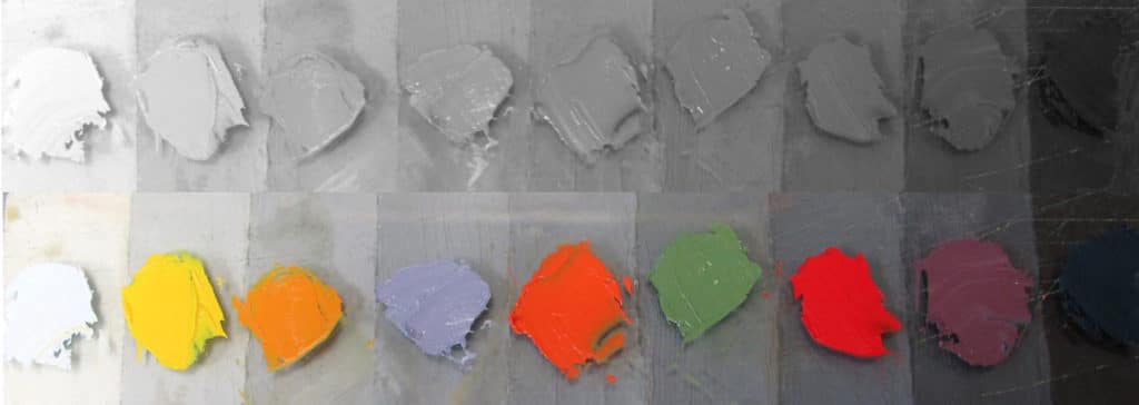
When learned and absorbed, that knowledge brought dramatic changes to my work, and until an art student grasps and masters that concept, their art is going nowhere.
Once a mark is made on canvas, a value and a degree of contrast has been established. Whether that mark is made with a pencil, a stick of charcoal, or a brush loaded with paint, it should be carefully considered.
The debate over which is more important, value or color, has been going on since the 1800s, and probably even before that.
For me, there’s no contest. The value structure within a painting is significantly more important than color. It is value that defines the quality of light; for example, on a bright, sunny day, the values will cover a broader range and reveal more contrast. Conversely, in low light or on cloudy days, the opposite is true.
Value defines the separation between light and shadow, and it’s the value of underlying abstract shapes in a painting that give it substance — that powerful visual effect. When the values are incorrect, out of place, or not clearly representing the desired mood, an inferior painting will be the result . . . guaranteed.
When speaking of painting, “values” refers to the degree of lightness or darkness of a color. All paintings have a range of values, but accurate values are those that record accurately the lightness or darkness of a color relative to all other values and colors within the painting.
Since I’m primarily a landscape painter, I will speak to that, but the principle of values applies regardless of the chosen subject.
Nature with all its varied moods is a wonderful and marvelous thing, and all those varied moods — bright sunlight, fog, rain, snow, mist, haze, smoke, clouds, sunrises, sunsets, midday, twilight, nighttime, spring, summer, fall, and winter — all demand a unique group of values. If the values established on our canvas do not accurately represent the mood we’re desiring to create, then we’ve failed. Instead, we’ve created a different mood.
What young artists often fail to realize is that it’s the value that determines mood, not color. However, color is important. My new book, Limited Palette, Unlimited Color, and its accompanying video, Paint Unlimited Color with a Limited Palette, are a testament to how important an understanding of color is to producing a successful work.
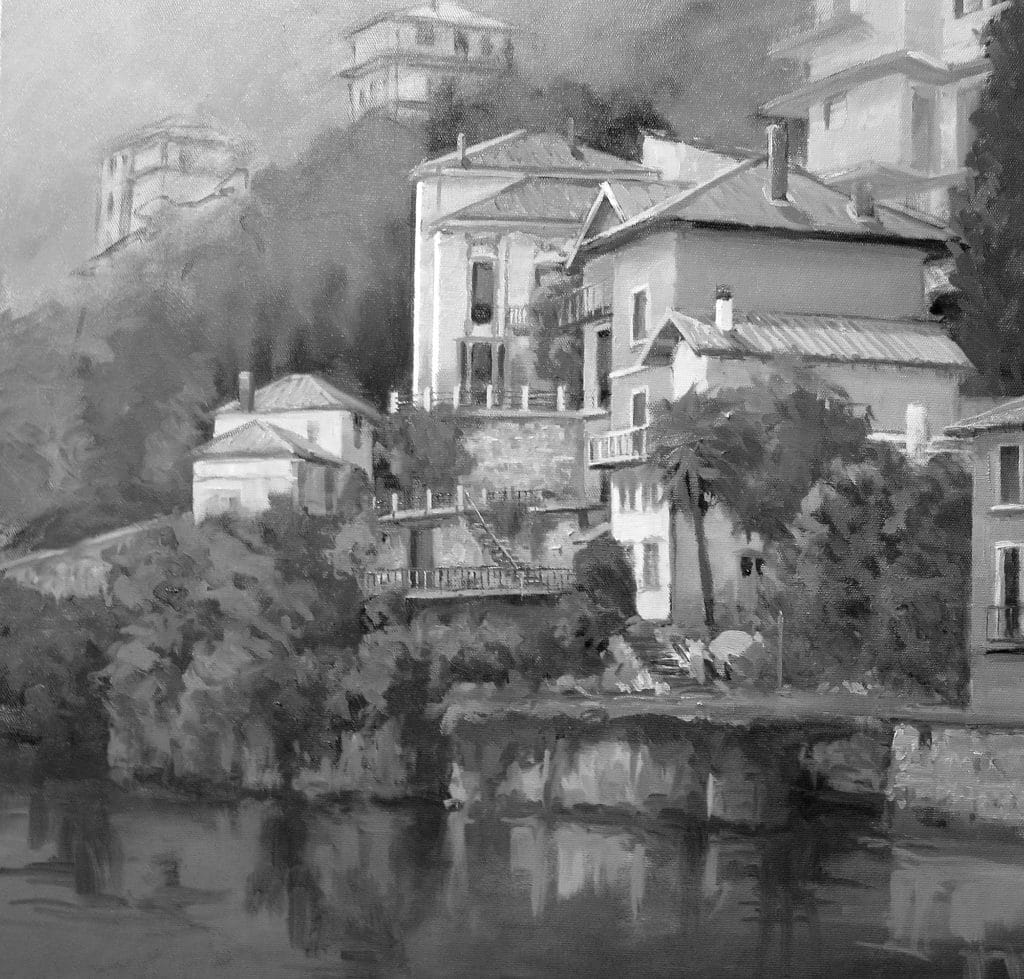
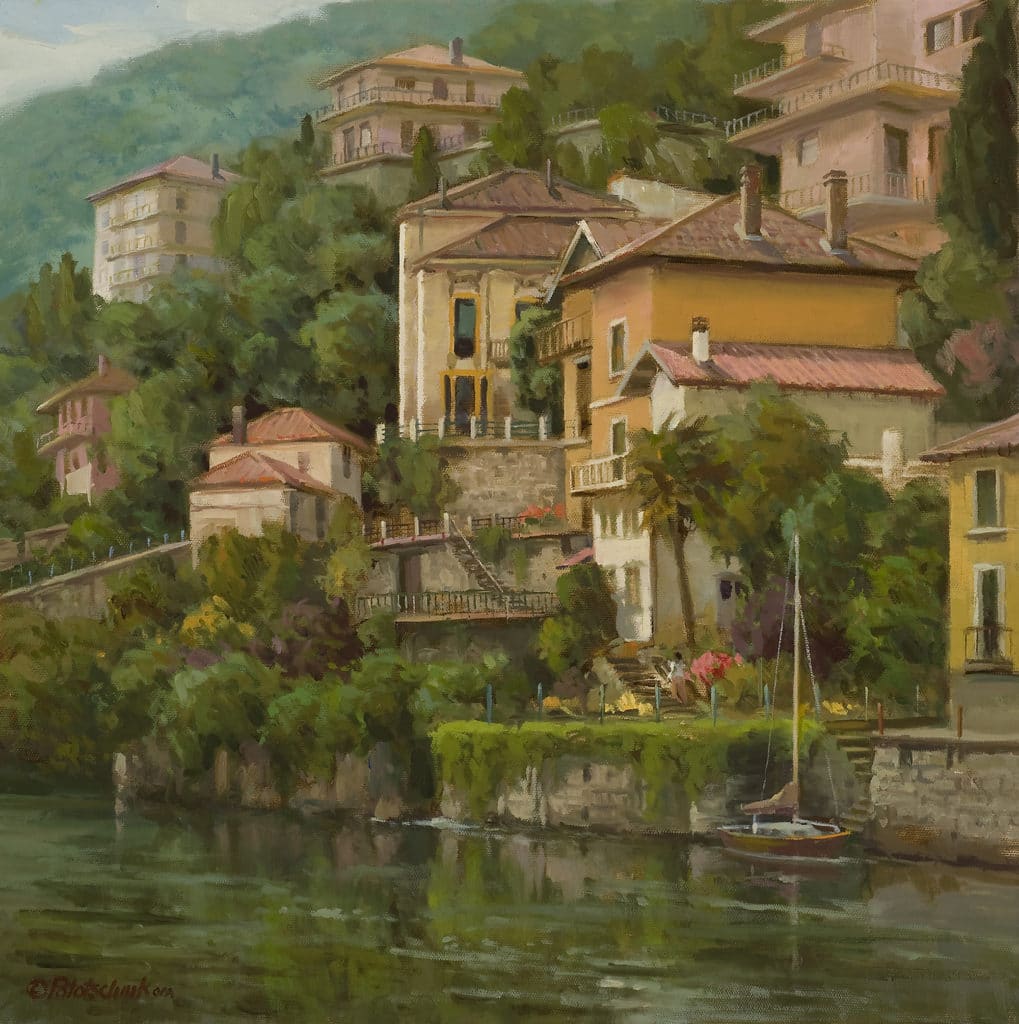
Color enhances the mood; it does not create it. This truth can be easily demonstrated by observing black-and-white photos of the landscape. One can often determine the mood, and in some cases, the approximate time of day.


It is value that creates form . . . a sense of the three-dimensional. Combined with hard and soft edges — and correct values — a real sense of depth and light can be created. Understanding value is foundational to good painting.
Part of value is understanding and using a variety of edges. The type of edges plays a key role in the mood one wishes to create. For example, hard/sharp edges are not compatible with rendering fog. So, don’t neglect their consideration.
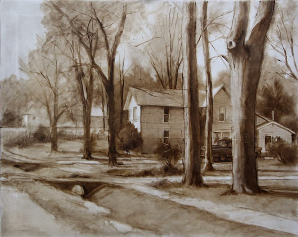
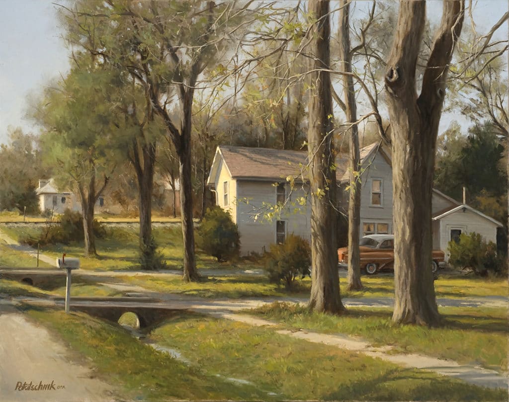
Typically, I begin paintings with a raw umber monochromatic block-in. The concern at this stage is to clearly establish the value structure of the painting. This is where the mood of the painting is established. Once that is set, an appropriate palette of colors is chosen, mixed, and applied to support the already established mood. This technique has really helped my work. By eliminating color from this stage, emphasis can be placed solely on drawing, composition, and value. It’s a good way to work. One technique is to squint. Richard Schmid says to squint only at the subject you’re working from, not the painting.
Squinting helps one not only simplify but also clarify value relationships. It is a good practice when painting to first establish the darkest dark and lightest light of the painting. After that it’s a matter of accurately relating each succeeding value to those two. Additionally, when drawing the abstract value shapes, it’s important to create variety . . . variety of shape, size, and distribution of values; in other words, avoid an equal amount of light, middle, and dark tones.
A dominant shape and value are always preferred. This can be achieved in at least three ways: 1) Crop the subject in different ways until variety is achieved. 2) Redraw while emphasizing some shapes and values over others. 3) Reduce or increase some values in the subject in order to create the desired contrast and importance.
I’ve been privileged to teach many painting workshops over the years. One commonality among all students is that they love color, but they do not consider the value of each color. As a result, their paintings end up basically gray in value and inharmonious in color.
I prefer clarity. In painting that means values that are accurately placed, correct for the subject, and for the intended mood. A great way to see if your paintings will hold up under the scrutinizing eye of the “value inspector” is to photograph them in black and white. Weaknesses will be very evident.
I’m sure many of you are familiar with the name and works of Andrew Loomis (1892–1959). If you’re a former commercial illustrator, as I was, you most likely have some of his books on your bookshelf: Fun With a Pencil, Figure Drawing For All It’s Worth, Drawing the Head and Hands, Successful Drawing, and Creative Illustration, and possibly others I don’t know about. He was a very successful illustrator, having his own studio in Chicago, but he was an even more successful author and teacher. His books are comprehensive and clearly written and sold in the hundreds of thousands. He studied under the tutelage of George Bridgman and Frank DuMond at the Art Students League of New York. His book Creative Illustration is one of my favorites. His chapter on tone is a powerful confirmation and reminder of its importance for us painters. Loomis describes tone as “the degree of value between white and black — the lightness or darkness of a value in relationship to other values.”
He describes four essential properties of tone:
1 – Intensity of light in relation to shadow. “All light and shadow bears relationship. The brighter the light, the darker the shadow appears, by contrast. The lower the light, the more nearly the shadow approaches the value appearing in the light. In a diffused light, the lights and shadows become diffused also. In a dim, hazy light, the lights and shadows are very close in value. So, we find that the relationship of light to shadow depends entirely upon the intensity of the light.”
2 – Relationship of value to all adjacent tones. “The ‘patterns’ or areas within a picture bear a relationship to one another. If one area, for example, is two tones darker than another, it has a two-tone-darker relationship. It is this relationship that must be held. We can then place them anywhere in the scale so long as we keep them two tones apart. Thus, we can key all the values high or low and still maintain the relationship.”
3 – Identification of the nature and quality of light. “By the kind and relationship of values, the picture takes on the kind and quality of light. If the values are right, the subject will appear to be in sunlight, daylight, or nightlight. One part of a picture with wrong values may suggest a strong light — another part, a diffused light. This sets up an inconsistency with nature and makes a hodgepodge of your picture. All lighting must be consistent throughout, which means all values must fall within one of the intensities described and be consistent, for only with true values can we paint light.”
4 – Incorporation of the influence of reflected light. “Shadows, besides having an intensity relationship to light, which puts them so many tones below, are also subject to another influence. Everything upon which the light shines gives off some of that light in reflected light. So, shadows cannot be made to fit any rule entirely. If light is shining on a white background, naturally some of that light will reflect into the shadows of objects nearby. Nearly all shadows contain some reflected light in any daytime or natural light. Reflected light is really luminosity within the shadow.”
***
 NEW! Never has there been an instructional video or book that teaches a color system that is so effective that it can completely change the way you paint. You can create any mood, harmony, or flow in your artwork by using John’s color system.
The best part is that you can do all of this with just 3 colors + white. Even though you’ll be working with a limited palette, you’ll be painting with unlimited color. LEARN MORE ABOUT PAINTING WITH A LIMITED PALETTE WITH THIS SPECIAL OFFER.


Kudos John! Glad to see a fellow Art Center Alum and Loomis fan from my era (late 60’s) that advocates the principles of primaries and white as the true path to successful painting.
Thanks, Mary.