

Do you remember how I mentioned a few weeks ago that I’ve been “eaten” by the plein air bug? Well, since my attendance at the Plein Air Convention & Expo in San Diego and with some sage advice from a good friend, I decided to give this plein air thing a try. How did it turn out?
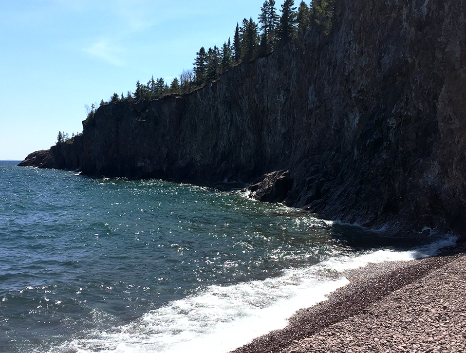
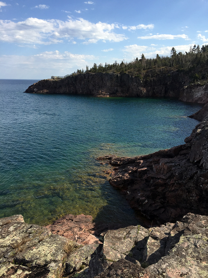
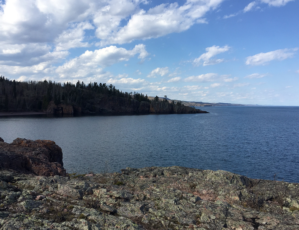
Can any of you remember the first time you ever painted? What about that first plein air experience? What if they were both the same? That was the case for me last weekend at Tettegouche State Park along the North Shore of Lake Superior in Minnesota. With the help of my good friend and PACE17 faculty member Dan Mondloch, along with the incredible demonstrations I witnessed in San Diego (more on this soon), I took the plunge during my most recent backpacking trip to the North Shore. “What better way to start,” I thought, “than at one of the most beautiful places in my home state?”
Full disclosure, I do have an artistic background and some formal training, but my focus has been on three-dimensional work through pottery. Perhaps surprisingly, I have never tried painting before. In school, I focused my efforts on drawing, ceramics, and sculpture, but never painting. I think it was an intimidating process to me — the color, composition, atmosphere, depth, etc. In contrast, however, I’ve always felt that I had a good understanding of painting considering that I research, teach, write, and talk about it for a living. I’m hoping that the following brief account of my experience and how I approached plein air painting as a first-timer might be of some use for our readers, from the beginner to the experienced.
My setup was inexpensive and minimal. I had a small notebook of 8 x 8-inch 140 lb. cold-press watercolor paper, a $5 set of brushes, a $3 watercolor set of just value tones, and a larger $5 watercolor set of about 22 colors. I also made myself a small viewfinder set to the dimensions of my notebook, divided into a grid. No easel, no chair, just raw materials to give painting a try with little investment. Oh, and a little plastic cup for water.
As I teach my students in Art Appreciation, color has three dominant properties: its name (hue), the amount of light or shade (value), and amount of pure color (saturation or intensity). One could also add temperature as well, either warm or cool. “Start with just the values,” Dan advised. “Behind every good painting is a good value pattern or study.” This was how I first approached my painting — devoid of color, just focusing on the changes in value. The topic of starting with value sketches was a popular one at the PACE17 demos, and almost every artist attested to its effectiveness, but added that one doesn’t necessarily need to execute one every time. I felt very strongly that gaining a good understanding of value was vital before I even tried adding color.
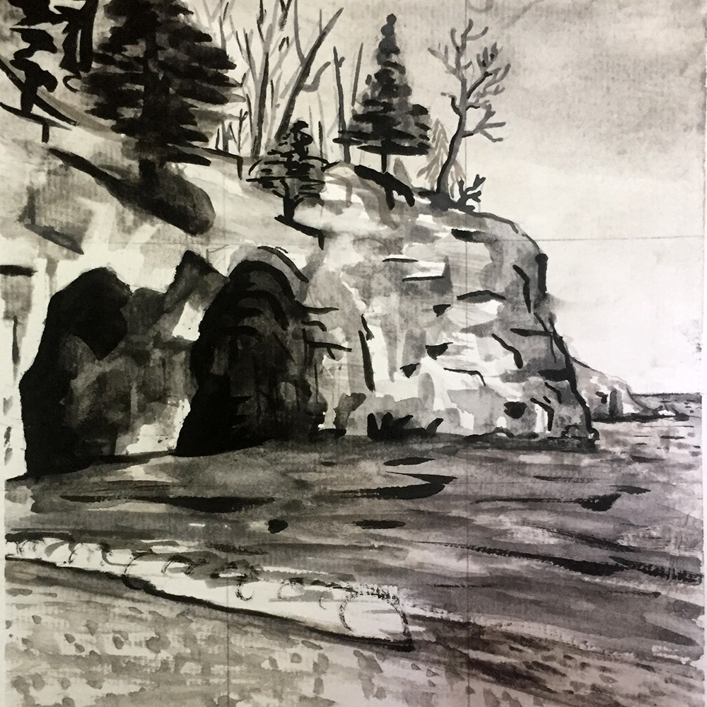
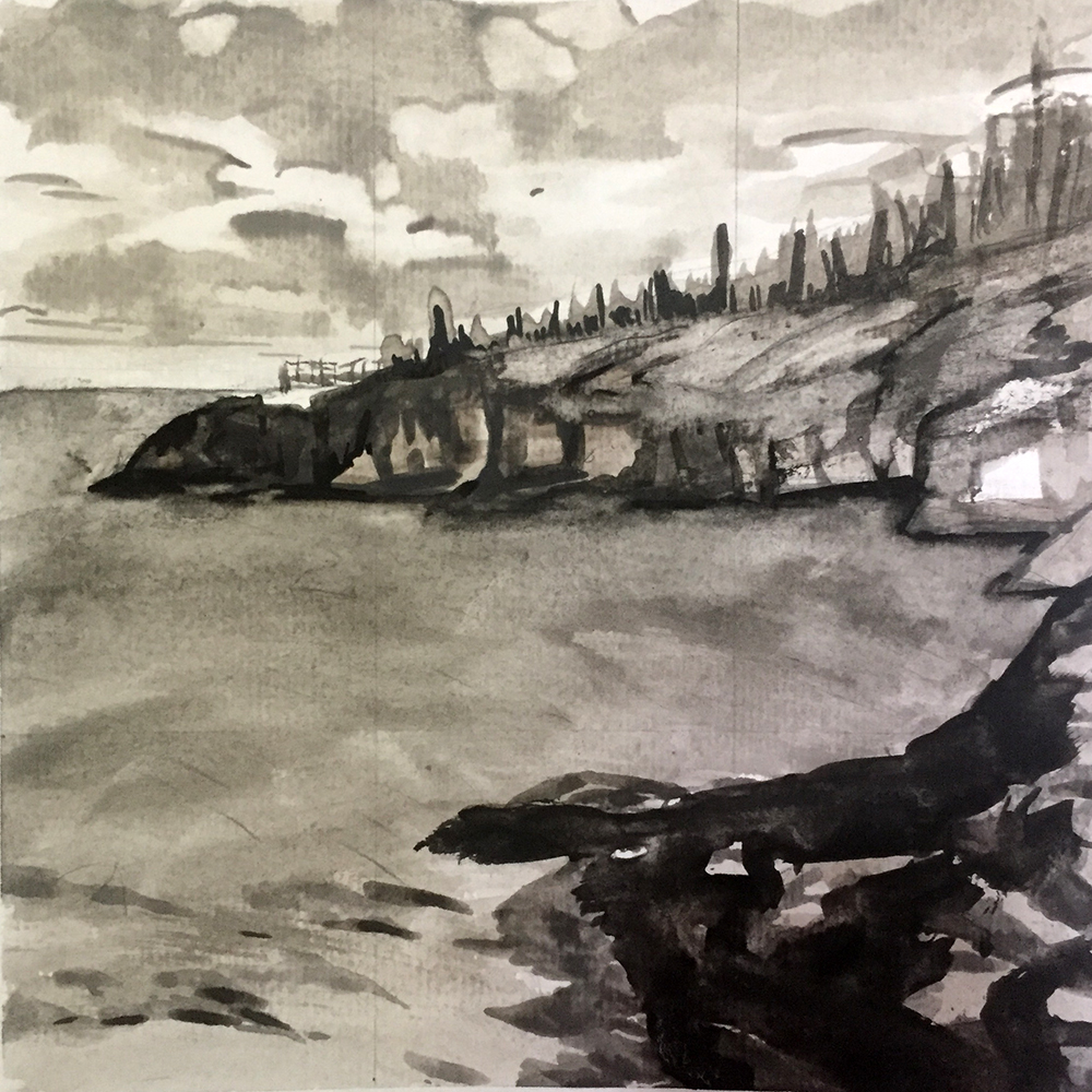
I found that painting in just value tones to be rather difficult — it must be right. The addition of color, even if the value is off, can help the eye distinguish between objects in space. With a value study, one doesn’t have that luxury; it is simply the intensity of light as it falls on objects in space.
The second thing that really stuck out in my mind and was extremely helpful was John Burton’s demonstration at PACE17, in which he executed quick, 15-minute gouache paintings. The overarching message was finding simplicity through shape. “Find the shapes,” he would say. (I’m paraphrasing here). “Start with the larger, simpler shapes before meddling in detail.” I found the process of squinting/blurring my vision to be helpful in locating both contrast in value and larger shapes in my composition. I tended to start focusing too much on detail right away. I kept telling myself to “simplify, simplify, simplify.” It was a lot of fun training myself to see the world in a different way, trying to flatten and streamline everything I saw while also appreciating the scene in all its complexity and intricacies.
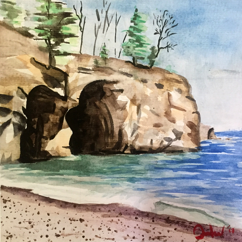
After completing a decent value sketch, I felt a good understanding of my scene and was then eager to repaint it using color. Surprisingly, I found the addition of color to be relatively easy after the difficulty of value painting. Color is very important and tricky, to be sure, but it seemed a little more forgiving. I chose and mixed a color that I liked and made sure its value matched the value study — that was it!
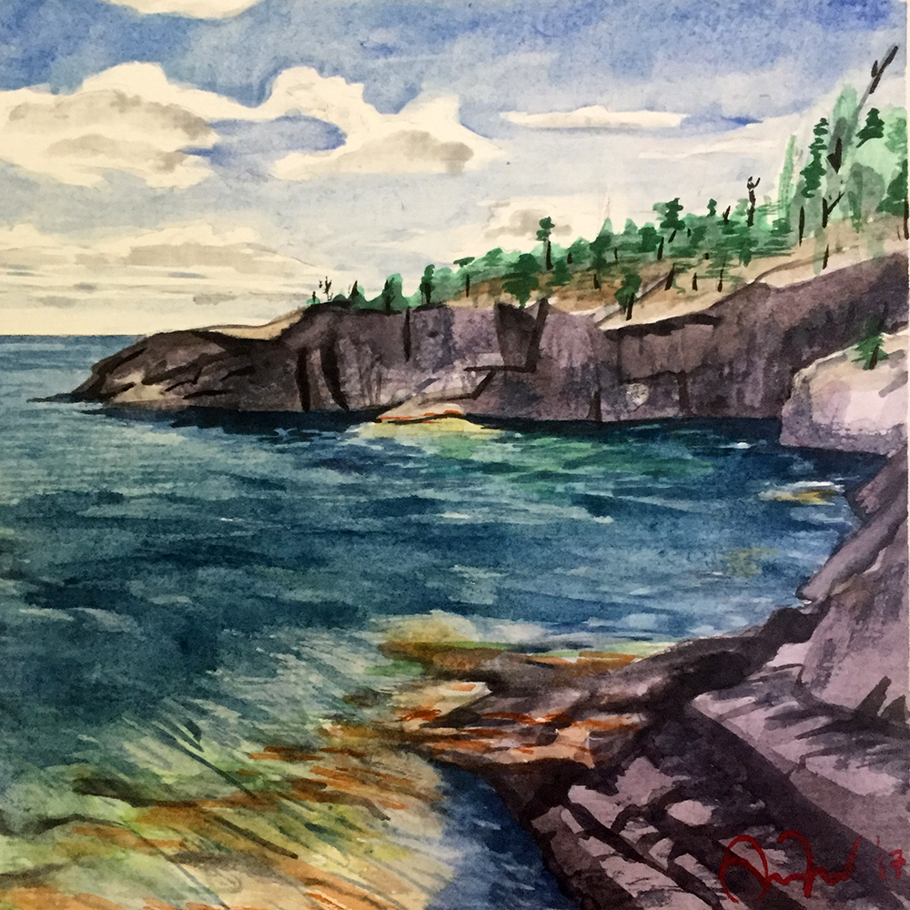
In conclusion, I was quite surprised and happy with my first-time results. With a very structured, basic approach and some (really) good tips from the professionals, painting seems less intimidating and more possible than ever before — it’s quite exciting! I find myself constantly seeing the world in a new way, noticing the shapes, value, and wondering, “How would I paint that object?” I was also struck by the connection I felt with Crystal Bay Beach and Shovel Point (the two places I painted at Tettegouche). The process of painting slowed my observation and thinking. It’s incredible how much you miss in passing.
My first plein air experience also gave me insight, albeit brief, into what makes all of you tick. I kind of “get it” now, but just a little. It was exhilarating and fun, and I can’t wait to do it again, and again. Thank you!
I would love to hear your thoughts about my experience and if this description was helpful (or entertaining) in any way.


Dang, Andrew! You really got it, and how great that you liked it, and don’t feel intimidated, like some of the rest of us! Go, go, go—keep us posted on your progress. Thanks for sharing.
Yes, it was interesting, entertaining and motivating! I haven’t had a brush in my hand in several weeks, and no plein air since last fall (other than a few rudimentary sketches a couple weeks ago as we walked thru the Nashville Zoo). I am chomping at the bit to get back out. If only I could MAKE the time to paint at least 1/2 hour a day. Sounds so easy, but it is not. This much of a gap at my level makes me feel like I’m starting over every time. Thanks for sharing your experience!
You chose well going out with Dan. Value studies are valuable allow you to edit and design your painting as well. I always refer to my sketch where I freeze shadows and time.
Thanks for writing about your wonderful experience. I too am wanting to get out there and paint. I’ve been purchasing some equipment all winter and have everything I need, but I’ve sort of been waiting for the weather to get warmer. Mostly I think it is just getting my nerves up to taking the plunge. Reading your story of simplifying and taking some watercolors out for quick value sketches and color studies has given me more incentive. Thanks again.
Great job, Andrew. I enjoyed Burton’s demos as well, and his advice about finding the big shapes first is spot on. Best of luck with your continuing plein air painting journey!
Thank you. I read through your narrative,remembering how I struggle even years later with similar thoughts. Your reflection that doing the later sketch in color was faster after the value study, has reminded me that the exercise of the value sketch is worth the time. And I too find how attached I become to places after investing the time to paint plain air. Choose your location carefully. It’s with you for a long time. I hope you save these sketches. They are priceless. Cristine from Alaska
Lovely work! I think I may try some value studies – I’d always approached it straight on, blocking out a quick sketch and filling in value and color at the same time (I use watercolors too) but this seems like a bit of a better way to work with a landscape. Good little article to read before the long memorial day holiday when I’ll make time to paint landscapes.
Great work, and very helpful. I agree that value studies are paramount and should be emphasized before ne tries to get too deep into color studies. Once you’ve gotten your values, you’ve got your painting. Your article has inspired me to get out there and paint.
Thank you for all of the comments! Another strategy that was extremely helpful was knowing the process of applying watercolor to the paper, which I’ve witnessed a few times in Dan Mondloch’s demonstrations. Thomas Schaller’s and Dan Marshall’s demons at PACE17 were similar as well. They always start at the top of the page, working down towards the bottom. Also, building layers from the lightest value to the darkest works beautifully. The last parts of the painting (black or super-dark hues), really bring the entire scene to life.
Andrew, I lived in Minnesota a number of years and knew immediately where your location was. Capturing the feeling of a plein air site is the thrill that plein air painters strive for. Painting in nature is the best teacher ever and it is exciting to hear you now view the world with a different set of eyes. As you begin your new found love affair with capturing the outdoors, each painting will teach you more. Happy painting times to you.
Check out our SKB Foundation artist David Rankin’s Gray scale studies. It will be most helpful to you in doing and understanding the value of Gray studies.
Well done Andrew. You got a great foundation to build on and it shows in your first efforts. Welcome to the plein air world.