

This South Carolina oil painter’s work stresses high contrast and a high key. Here’s why and how he does it without going overboard with saturated color.
Creating Chroma Without Going Garish
Artists tread carefully when it comes to saturated color. Although they can point to plenty of their heroes who have successfully used vibrant, deep hues, most every painter has steered a painting off the rails at one point or another by using too much or too many deep or bright colors.
Representational painters, in particular, tend to tamp down colors as a matter of course. One school of thought urges using grayed, subdued tones throughout the picture, with only small spots of saturated color to draw the eye and serve as accents. Trey Finney, on the other hand, can’t wait to make a significant statement with saturated colors in a piece.
A look at Finney’s recent work shows how he pulls it off — and in a tasteful way. First, he adheres to the rule that if the values are right, any color will work. Second, he typically uses a complementary palette. This means gearing the painting to a pair of colors that sit opposite each other on the color wheel — for example, purple and yellow, red and green, or orange and blue.
He finesses this approach by imagining an oval perimeter resting on top of the color wheel, with the two ends centered on his complements. Colors away from these two complements are used only slightly in the painting, if at all. This arrangement creates both harmony and tension in the color scheme. The harmony comes from the simplicity of the system. The tension comes from the complements, which can seem to visually “buzz” if they sit next to each other on the canvas.
“I try to minimize one of the primary colors, and I work across the color wheel,” Finney explains. “So if I am working with blue and orange, I use fewer reds (and less of red’s complement, green). In fact, the only red I’ll use may be the red in the orange. By eliminating some parts of the color wheel, I can push the chroma.”
COLOR CLARITY
Although the artist appears to be using a split-complementary palette (one base color and the two colors adjacent to its complement), he describes it in a slightly different way. “I try to use just a section of the color wheel,” he says.
“Sometimes, the local, or natural, color obviously suggests the primary that I’ll be emphasizing. For example, on an overcast day with subdued color, I will go with blues and minimize a big part of the rest of the color wheel.”
Describing the thought process behind the color scheme in “Early Snow,” Finney says, “The scene dictated warm colors, so I pushed the reds and oranges, using warm greens as the complement.” He points out that he did use some blue — or at least bluish black — in the background. In this instance, he mainly was avoiding purple, not blue. For that reason, he grayed the greens in the piece so they had less yellow (the complement of purple) in them.
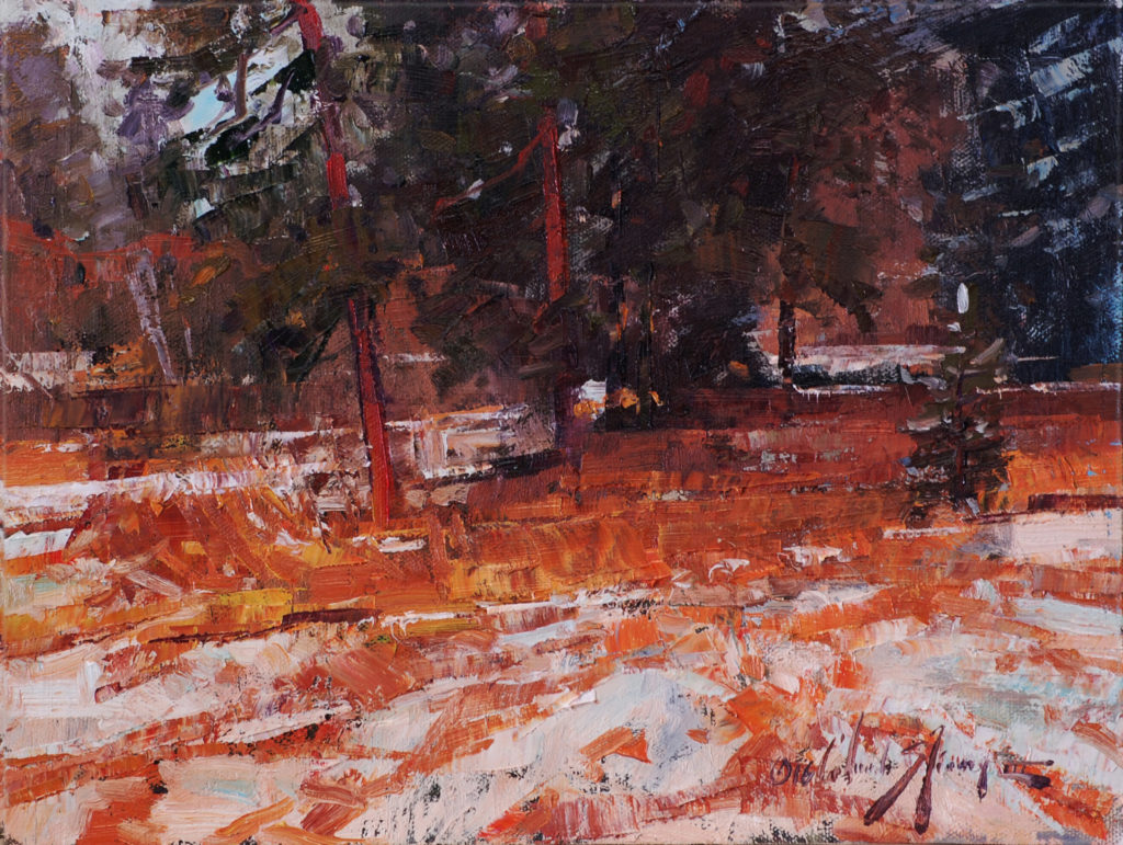
Finney says he started the painting outdoors, but “the weather ran us out of there” — an outcome that didn’t cause him distress. Indeed, Finney’s normal working method is to start a piece on location and finish a good chunk of it in the studio. “I began this painting in 2012 and finished it in 2016, when it finally struck me one day,” says Finney. “I put it on the easel and finished it. Looking at it again, I think I now want to do it bigger.”
‘PLUSSING’ THE SCENE
Finney spent 15 years as an animator at Disney, a stint that not only sharpened his skills, but introduced him to some concepts regarding process that he integrated into his painting method. “In ‘Early Snow,’ I started with a dark shape in the foreground, but I scumbled over that and pushed the grasses a bit more,” says Finney. “The grasses were there; I just took them further.
In general, I wanted to take the entire scene further, to make it better somehow. At Disney, we called it ‘plussing’ the scene.”
The artist’s comment about the large dark shape in “Early Snow” points to another key aspect of his work — the importance of an abstract design. For all his ability to render perspective and to place key details (which serve to anchor a painting in veracity and reassure viewers that they are in good hands), Finney’s paintings generally lean on big shapes that play off each other in dynamic fashion. He starts with the notion of notan, a simple design of dark and light, and keeps this concept in mind throughout.
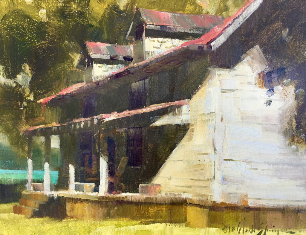
“At the start, I think about what’s in light and what’s in shadow,” says Finney. In Hillside Cache, for example, the barn roof melds into the sky color to form a large light shape. Similarly, in “Country Relic,” the vegetation at the left side of the house blends into the building in shadow to make one dark shape. “In that piece, I also wanted to exaggerate the sunlit, white shape on the right, so I pushed it from a value of 5 to a value of 8,” says Finney. “I thought it created an interesting light and dark contrast. Andrew Wyeth liked high contrast and abstract shapes — and I’m a fan of Wyeth.”
BRIGHT LIGHTS, BIG SHADOWS
For Finney, this aesthetic is also a function of where he lives. “I’m in the South, and I like the strong color and high contrast of the bright, sunny days here,” he says. “As a result, most of my paintings are high key, high contrast — but with a difference. I don’t slide the entire value system up the scale, just the lights. I only portray the sunlit parts in an exaggerated high key. The darks remain just as dark — thus, high contrast and high key. Then it’s about chroma. Sometimes the main shadow shape is dominant in terms of its size, but the focal point is almost always high chroma.”
He continues, “Big shadows allow for an abstract design, so I spend some time searching for smaller shapes to combine and abstract. As artists we tend to separate local color within combined shadow shapes, and yes, when you really look into the shadows, you see the separate shapes. But, in fact, it’s all one thing, value-wise. I’ve learned to take several elements and make them all one abstract shape, even if it means combining a house and a bush, if both are in shadow. In the light areas, you can then get really realistic or representational.” In this way, Finney is choosing to see more like a camera than a human eye.
CREATING, NOT COPYING
Finney plays with the scenes in front of him in other ways as well. In “Country Relic,” the sunlit side of the house was the biggest story of the scene, but the dormers provided the eye-catching detail. “That white shape on the right is like a figure, a person, something alive,” Finney says.
“So I asked myself, what supports that? The answer: the dormers, which allowed me to bring some realism in. In general, the drawing of the house was pretty close to what I was looking at — with just a few alterations. The shapes of the light hitting the supports on the porch were true to the scene, although more delineated in real life.”
It was the soybean field in the background, with its blue-green leaves, that got the full saturation treatment. “I put some cobalt turquoise there for the bean field, and I decided it would be the most bluish-green bean field you had ever seen,” he recalls. “I was more worried about the chroma than the hue, as it violated my rules.”
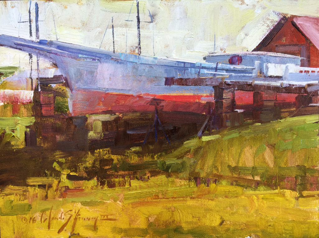
What about the bluish-purple smudge that breaks up and sets off the large white shape in “Country Relic”? A happy accident — something Finney always welcomes in his paintings. Consider how the red of the roof in Barn Mosaic seems to shimmer in the sun, smudging up into the dark vegetation behind it. “That was one of those subconscious accidents that became conscious,” Finney says.
“I was just moving paint around, and the red sort of bled into the dark, and I thought it was kind of cool. I’m not going to mess with that. You have to get out of your own way. If I had finished this on location, such a happy accident would probably have been eliminated. I am trying to let go of things, to let go of thinking that they have to be a certain way.”
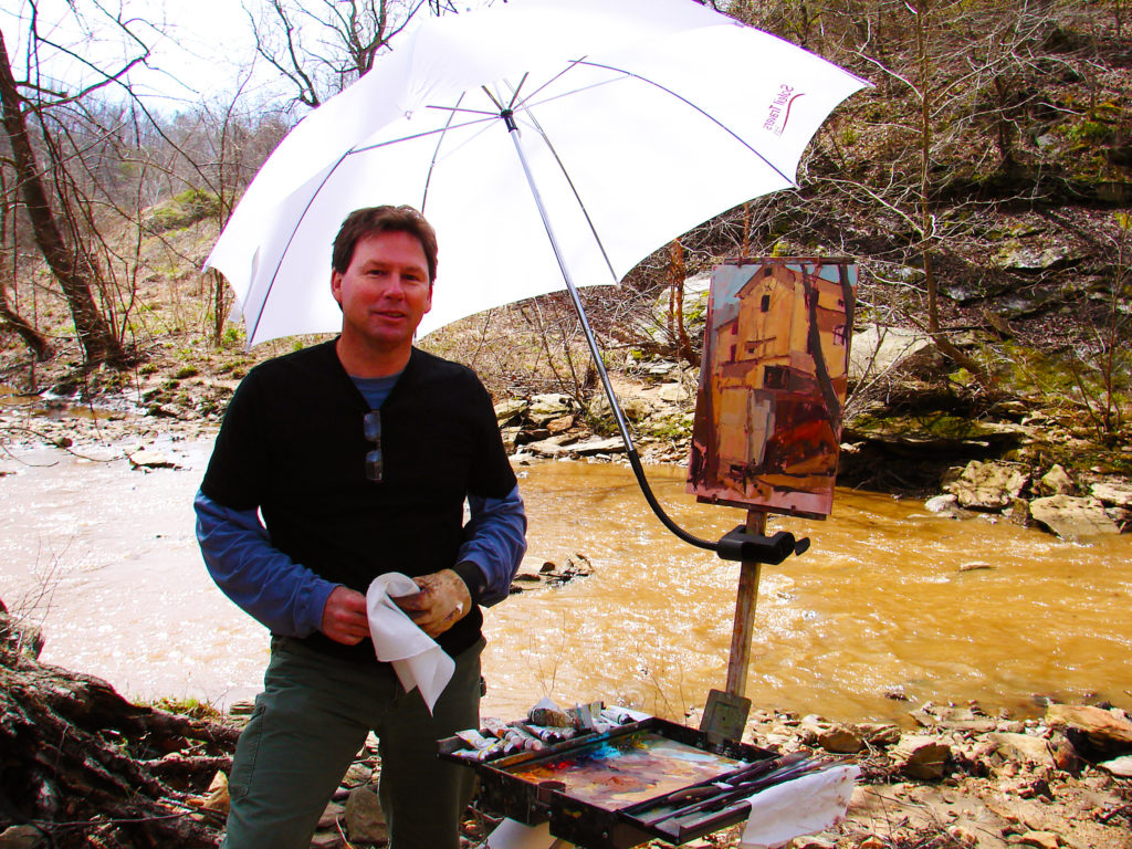
Finney is a committed plein air painter who spends most of his painting time in the studio. It appears that at some point in his process, it doesn’t matter if he’s on location or in the studio. Most of the colors, shapes, and ideas are coming from Finney’s head. “I like to start a piece en plein air, get some color notes and a block-in, then take it inside,” he says. “I used to wait for that perfect scene, but that perfect scene would show up for only a fleeting second. Now I just concentrate on getting that fleeting second on location.”
The artist does use photo reference in the studio, but in a limited fashion. “I realized the reference was sometimes hindering a very nice painting because I was lingering on it too long,” he says. “Because of technology, I can now put my iPad on sleep mode after 15 minutes of no activity. The reference image then goes away, off the screen, but I continue to paint. Even outdoors, I sometimes turn my easel around and paint the subject without looking at it very often at all.”
Finney says, “Painting for me is about creating, not copying the scene. I don’t worry about what the thing is. I just paint from knowledge, experience, and intuition. I can always go back to the reference and make it correct — although I’m not sure if that means anything in art,” he says with a chuckle.
Connect with Trey Finney at treyfinney.com.
> Subscribe to Plein Air Today, a free newsletter for artists
> Subscribe to PleinAir Magazine so you never miss an issue


