

It seems to me one of the most difficult things to do as an artist is to come up with a good concept, especially when learning how to paint landscapes. It’s not that difficult to copy, but to have something to communicate, and to do it effectively . . . well, that’s not so easy.
When creating a list of the basic building blocks that I believe must be present for a painting to be successful, I list concept as number one. Concept is like an outline for a speech; it’s having a clear, focused direction in the way you want your painting to go. What you desire to communicate to the viewer is a good way to look at it. It may be the bitterly cold, desolate mood of a Bruce Crane; the quiet, calm, tranquil mood of a Corot; or the spirited, playful, colorful, brilliant sunlit mood of a Joaquin Sorolla.
The concept does not need to be complex; it just needs to be clear to us and to those with whom we share our work. I know that statement will certainly raise some eyebrows, because we can’t really expect every individual to feel and experience each work as we would want them to. However, as artists we are visual communicators, so in that sense, it seems to me we have a responsibility to our audience that they understand, as much as possible, what we’re trying to communicate. Otherwise don’t bother showing the work to others. That’s not a popular opinion in this age of believing that the process of creating is more important than the result. I have difficulty with that belief; it has a tinge of selfishness to it that I don’t care for.
The reason I take issue with that attitude is because I believe everything that exists, visible or invisible, perceived or not, began with an idea, was created intentionally, and is designed to serve a purpose. All the luxuries and conveniences we so enjoy today are examples of that. I really don’t see objects that we create as being any different.
Because I believe we are visual communicators, thought must be given to what we wish to communicate. Think about it — would you rather listen to a speaker who is disorganized and rambles on and on about anything and nothing, or would you prefer a speaker who is organized, logical, clear, and focused in his presentation? I look at painting in the same way.
As artists we must decide what we want the viewer to take away from our creations and determine how best to communicate it. That decision affects every other decision made throughout the creative process: the composition, drawing, values . . . and the color. Answering that question will give direction for everything that follows: how the subject is composed and drawn, what values will best represent what we want to communicate, and, if a painter, what colors to lay out on the palette. In my first video, “Limited Palette Landscapes,” produced by Liliedahl Art Instruction Videos, I speak at length about all these important aspects of painting. Having a clear concept is certainly one of them.
So, how does the concept for a painting affect everything that follows? Let me illustrate what I mean by using a couple of paintings as examples.
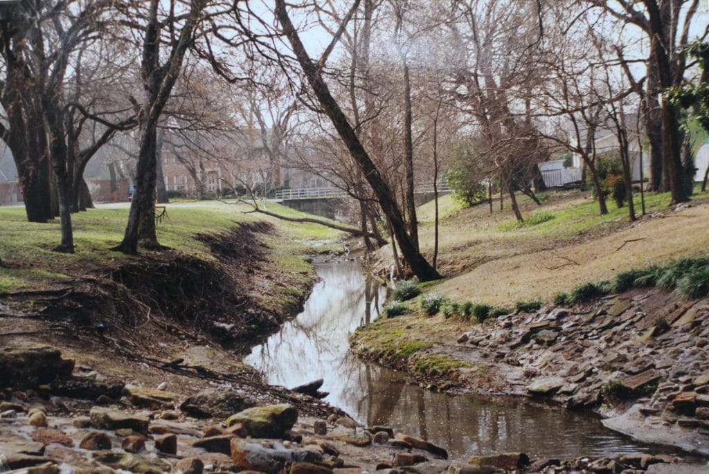
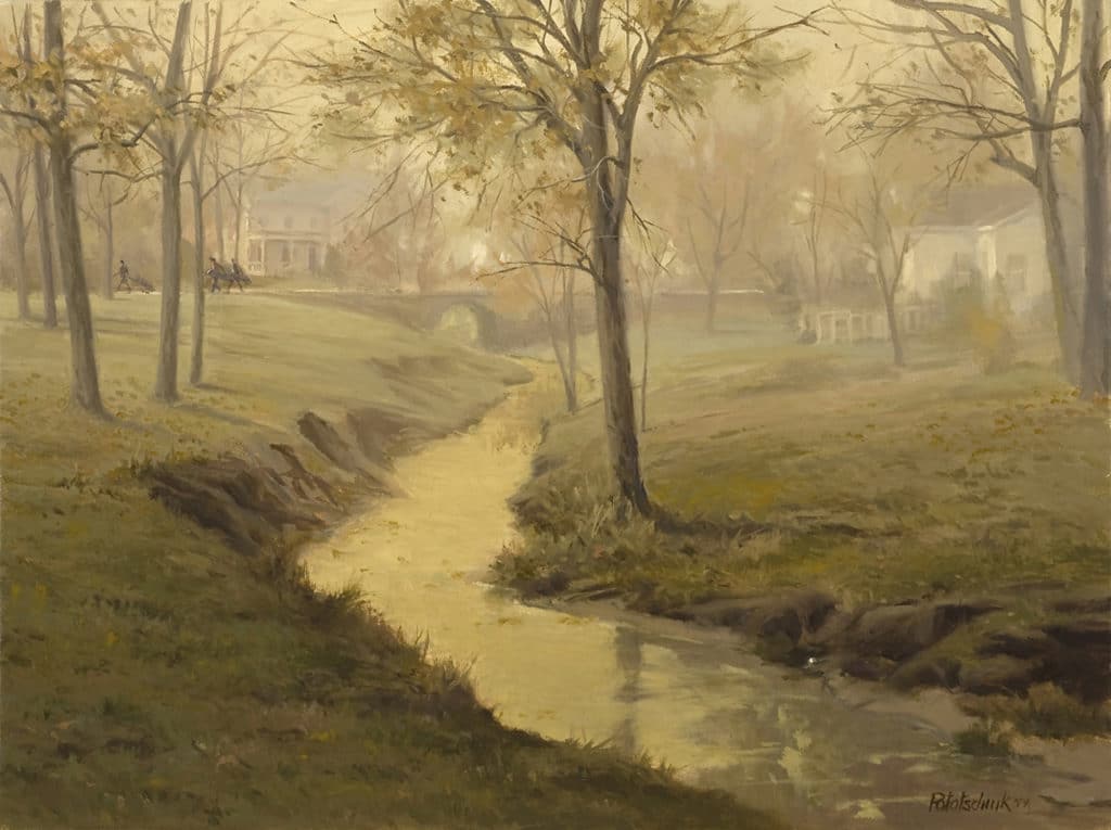
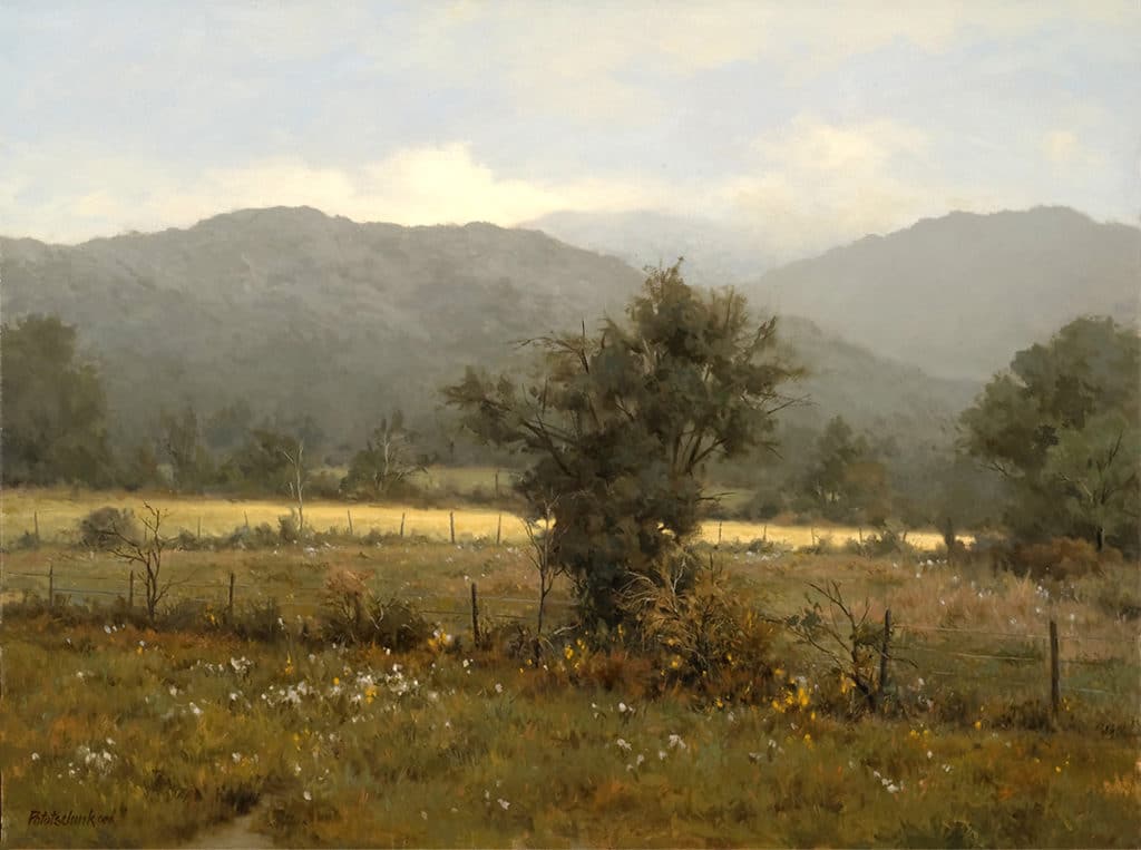
How to Paint Landscapes: “Out of Bounds”
The concept was “quietness of an early morning fog.” When studying my photo reference, I sensed a subtle suggestion of haze/fog, so I took that idea and enhanced it. I have said many times that I admire those who can visualize their painting as finished even before they begin. I do not have that ability, it seems. My works begin with the selection of a subject; next comes the decision as to the mood I wish to communicate — sunny, cloudy, rainy, autumn, spring, etc. — then the appropriate palette selection to accomplish the desired mood, and finally, the composition.
All other details that contribute to or enhance the mood/narrative are added as the painting unfolds. As this painting began to develop, the mood reminded me of the time, while staying with relatives, that I walked the golf course behind their house when the fog over the course was heavy, and peaceful, and one’s whisper was almost too loud. It was then that I envisioned golfing buddies, with their muffled voices, bags in tow, heading out for a day of golf. The golf ball in the ravine was an afterthought. When it came into my mind, I broke out laughing. It pulled the whole painting together and completed the narrative.
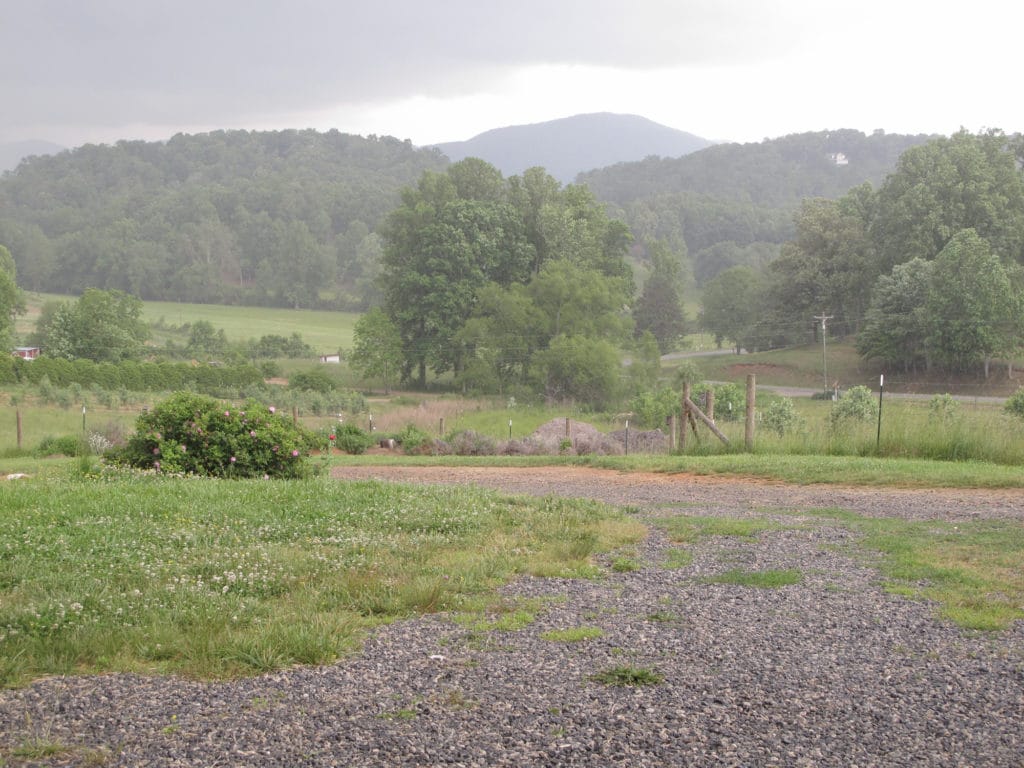
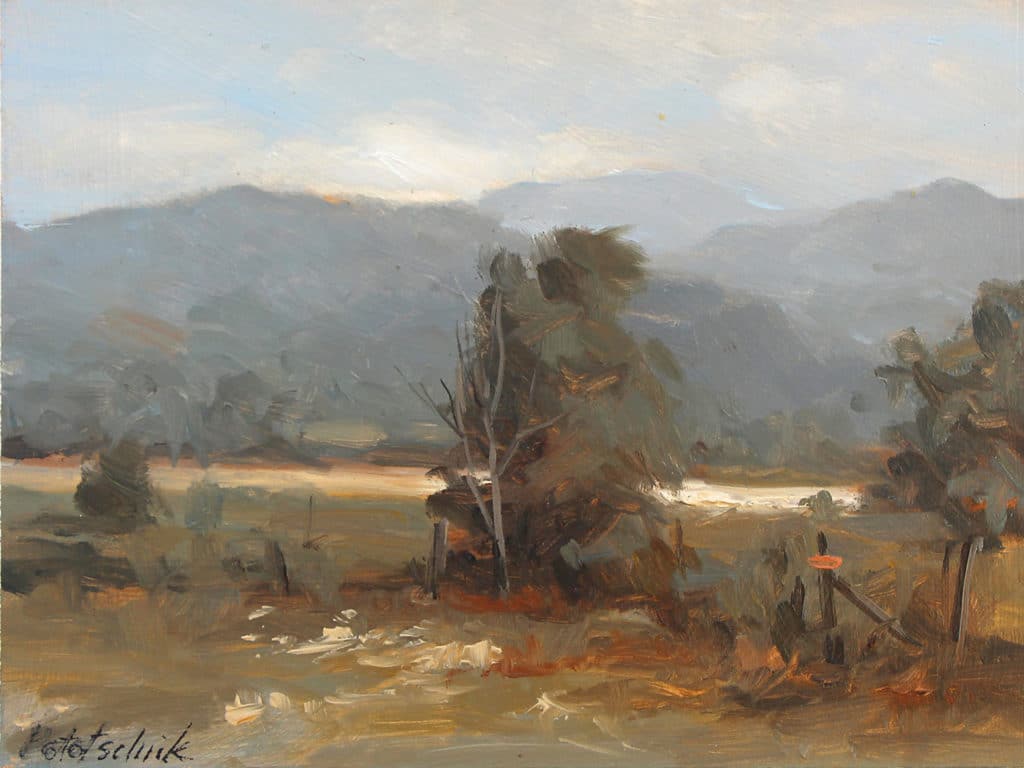
How to Paint Landscapes: “Be Still My Soul”
The mood of this painting, as it evolved, put me in the open country and gave me a feeling of stillness and calm. The process of painting it certainly didn’t give me those feelings — usually it’s just the opposite — but the mood of the painting did. The title came naturally out of those feelings.
Selecting a painting title can be quite difficult at times, particularly if you want it to be meaningful. I use titles to verbalize something of what I want communicated about the painting. It adds to the painting’s narrative. I do not like thoughtless titles. Usually a word or phrase will come to me after a painting is completed, while it is being studied for possible refinements. Sometimes, as in this case, a title comes during the painting process. Never have I started with a title and created a painting to fit.
I can understand if you’re wondering why in the world this reference photo was selected, and secondly, how and why I interpreted it the way I did — all reasonable questions, but difficult to answer. Here are some reasoned responses:
1) I like vistas and the veils of atmosphere they reveal.
2) The photo clearly shows a foreground, middle ground, and background.
3) Light is soft and gray.
4) Basic design of the subject is good and yet provides enough information to aid in simplifying the design even more.
5) The light-colored field in the middle ground is used as an accent, to add contrast to a basically gray scene, and to highlight the focal point.
I hope this clearly shows how the concept affected every stage of these paintings: the way they were drawn, how the elements were organized on the canvas, the range of values selected being compatible with the quality of light . . . and the color scheme.
Click here to read my previous articles on painting outdoors, using a limited palette, and more.
***
 NEW! Never has there been an instructional video or book that teaches a color system that is so effective that it can completely change the way you paint. You can create any mood, harmony, or flow in your artwork by using John’s color system.
The best part is that you can do all of this with just 3 colors + white. Even though you’ll be working with a limited palette, you’ll be painting with unlimited color. LEARN MORE ABOUT PAINTING WITH A LIMITED PALETTE WITH THIS SPECIAL OFFER.


For me it is very valuable to be able to see your reference photo. Thank you. I use pastels.
What a difference from reference photo to study to studio piece. Seeing this will liberate my own artwork!
I love seeing the process of the painting, from the reference photo (and remembering the feelings in the space), to the colorstudy, and then the final large piece of art. I never thought to make changes instead of trying to replicate what I’m seeing. I think this will help free me up a bit.
Glad it was helpful, Kristine.
You are great artist.
I like your all works.
I am from india.
I am artist and follow your work aidia.