

William Schneider on 4 Common Mistakes Artists Make
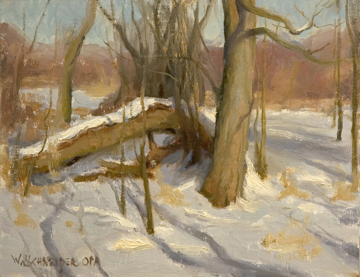
1. Ignoring atmospheric perspective. As the subject moves off into the distance, values get lighter and colors become grayer and cooler. Before I learned this, my ground plane wouldn’t “lay down.” You might not notice this at first but if you bend over and look at the field upside down, the value and temperature shift suddenly becomes obvious! The late Ken Auster once showed me a trick: he mixed up a color to match the grass at our feet. Then he kept adding white to that grass color as the field moved away into the distance. It’s a trick, but it’s a great trick!
2. Misjudging values. We need to remember to keep comparing the values of all the elements in our painting. The darkest elements are closest to us (atmosphere again). The great teacher and author John Carlson described four planes in his book Carlson’s Guide to Landscape Painting:
The dome of the sky is usually the light source.
The ground plane is the second lightest.
Sloping planes are third.
Finally, vertical planes (like tree trunks) are the darkest.
Remember to squint and compare the values. It also helps to hold something dark like a black glove or white like a paper towel in front of the scene.
3. Composition trumps everything else! At its heart, composition is the distribution of light, middle, and dark masses on the picture plane. In the words of master painter David Leffel, “A painting comprised of a number of small value masses will look small and petty.” For centuries artists have made small (2 or 3 inch) “thumbnail” drawings in three or four values to test out possible compositions. Masters like Scott Christensen and Matt Smith do this for every piece! It only takes a few minutes and can save hours of rework. Now, there’s even an app for this. Notanizer is available through the app store and can convert a picture into a notan (2 values – black and white), or three or four-value desaturated images. In seconds you can find a winning composition.
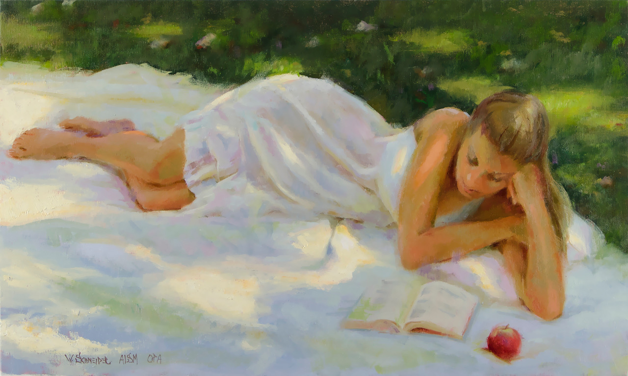
4. Too much chroma. The world is much grayer than we think it is. Those “brilliant” fall colors are all shades of gray. Again, put something with saturated color in your scene (hang a red or yellow bandana on a bush) to see how unsaturated the colors in nature really are.
The above is part of a series that features the best artists who are teaching others how to paint through online workshops at PaintTube.tv, where William Schneider has a variety of art workshops available (browse here).
Connect with the artist: www.schneiderart.com.
Looking for MORE ways to improve your painting skills?
Don’t miss your opportunity to create lifetime memories at the Plein Air Convention & Expo! All training sessions are indoors on giant, high-def screens, with incredible paint-outs in the afternoons. Beginners and pros feel right at home, so register at PleinAirConvention.com to join us.
Browse more free articles here at OutdoorPainter.com
Blog post prepared for the web by Cherie Dawn Haas, Editor of Plein Air Today


