

Color temperature refers to the relative warmness or coolness of a hue. Warming up or cooling down areas of your painting to adjust the temperature dominance can provide unity and balance in your work.
Using Color Temperature to Create Harmony in the Landscape
BY MARK MEHAFFEY
Mark Mehaffey is the author of En Plein Air: Acrylic, from which this article was excerpted.
Color temperature refers to the relative warmness or coolness of a hue. Typically, yellows, oranges, and reds are considered warm, whereas greens, blues, and purples are considered cool. When used in a painting, warm colors appear to advance toward the viewer, while cool colors recede.
In general, it’s best to have one or the other temperature dominate your painting — and not just by a little bit. An even split (or even a near-even split) between warm and cool colors can result in an unsettling visual vibration. A 70-30 or, better yet, an 80-20 ratio between the warm and cool colors is a better balance for the painting and the viewer.
If you find you’ve used too many different colors, which can make a painting look fractured or visually chaotic, glazing over the work will add unity to the scene. In “Light From the Right,” I glazed over the painting with a warm, transparent red wash at the end (which also added a bit of drama). I avoided painting over the blue on the horizon to make sure the area stayed cool in contrast to the warm glaze.
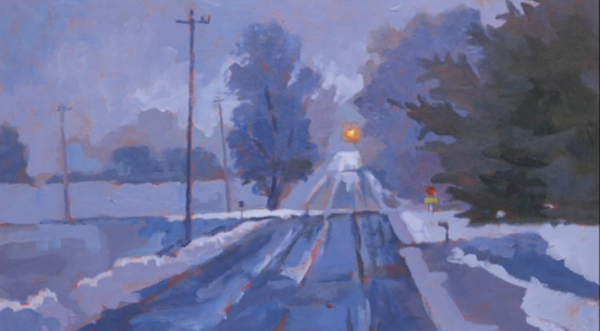
The scene below depicts a corner about three miles from my house. It had just snowed, and the sunlight was starting to lighten the eastern sky. Everything had that blue, pre-dawn glow to it. The blinking light at the intersection, the stop sign, and the small amounts of my red ground peeking through are the only hints of warmth in the entire painting.
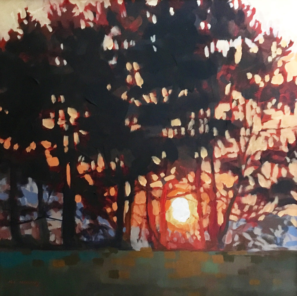
In “Morning Glow,” the greens are warm, pushing toward a neutralized orange. The sky is warm and gets even warmer as you move toward the light, where red and red-orange enter the picture. All this warmth holds together that strip of blue that runs along the horizon. A complement to the orange and red-orange, the blue acts as a foil to set off the sunrise.
Painting Demo: Creating Harmony
Occasionally, I may skip creating a pencil sketch and start painting directly because I’m anxious to capture the light before it changes. If I make a mistake in terms of value (how light or dark one shape is compared to another), hue (the actual color used), or color temperature, I can correct it because I know how fast acrylics dry.
In this case, it was a rare January day in Michigan with temperatures in the high 40s. The accumulated snow had melted, and the afternoon light was coming in at a low angle from left to right, causing the red dogwood bush to glow. By the time I got set up in my front yard, I had to work fast to capture the remaining light, so I got right to work — no preliminary value plan this time. My easel was loaded with my usual eight colors: cobalt blue, phthalo blue, ultramarine blue, alizarin crimson, cadmium red light, cadmium yellow deep, cadmium yellow light, and titanium white.
My setup includes my easel, brushes, paint tubes, and prepared painting panel. I also have with me water, a paint palette, a collapsible water container, and paper towels. It is not my lightest setup, but it is my most self-contained easel.
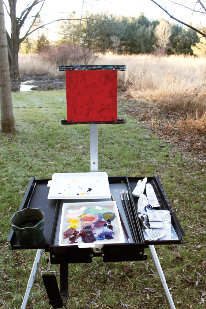
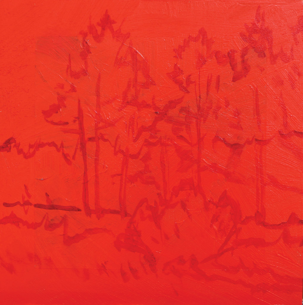
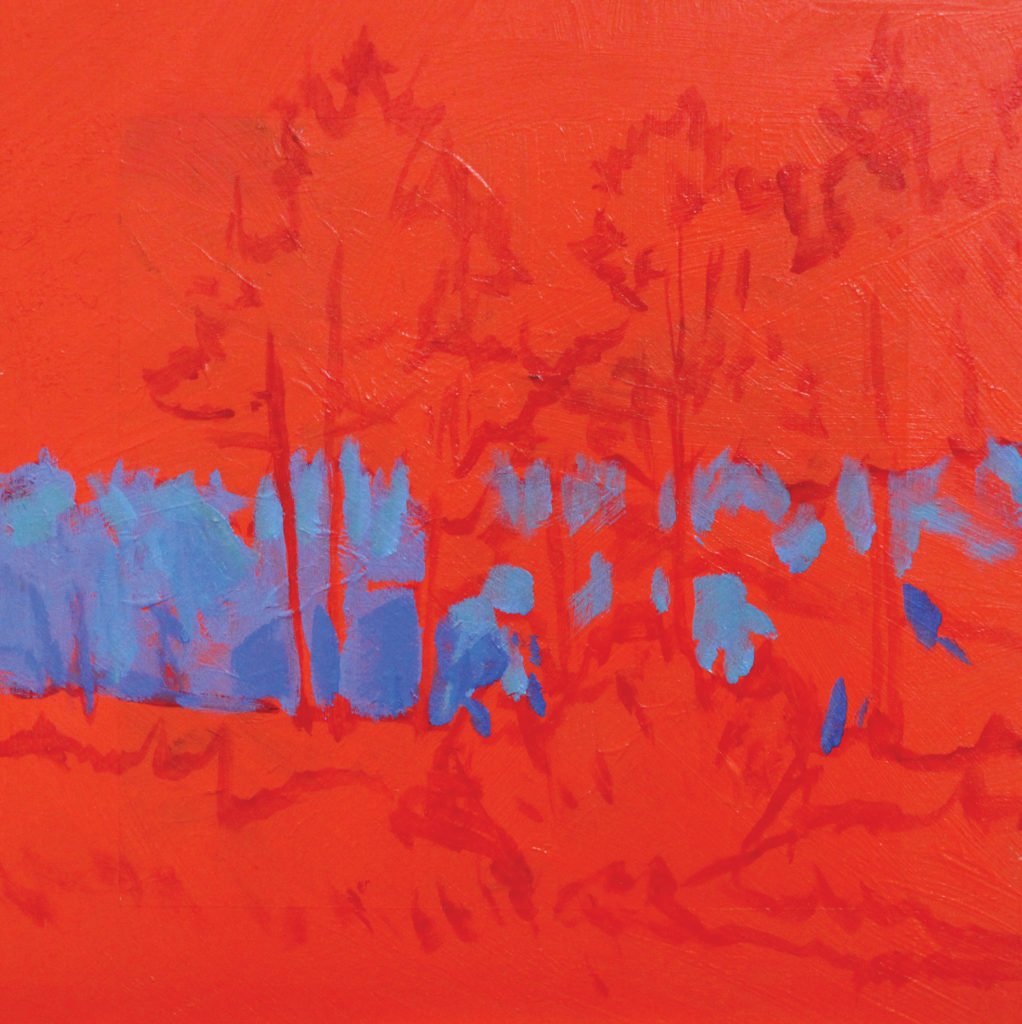
Step 1: For my surface, I selected an 8-inch square birchwood painting panel to which I’d previously applied a ground of cadmium red light. I often use this color as a ground, because it is a middle value straight out of the tube. This means that when I apply a stroke of another color, I can tell if that passage is lighter or darker than a mid-tone. It helps me determine my values. Another advantage is that I can allow some of the warm red to peek out as I paint. If I want my painting to have a warm dominance, I allow more of the cadmium red light to show. If I want my painting to have a cool dominance, I let less cadmium red light show, creating a warm accent to the cool colors.
I sometimes tone my canvases or panels with other colors, either to create the sky before I begin or to create a color scheme more fitting to the scene. I also sometimes begin on the white gessoed surface of a commercially prepared canvas or panel. Just as I do with an oil painting, I often go in first with a wash of a warm neutral color to knock down the white.
Using a size 4 short flat brush, alizarin crimson, and a bit of water, I outline the big shapes to set my composition on my 8 x 8-inch panel.
Step 2: The atmosphere changes the way we see color; as colors recede into the distance, they get both cooler and grayer. I almost always exaggerate atmospheric, or aerial, perspective. This painting will have a warm dominance, and I want the tree line to act as a foil to those warm colors.
Using a size 6 short flat brush, I combine a mixture of cobalt blue, a small amount of alizarin crimson, cadmium yellow light, and titanium white on my palette. I use this mixture (mostly blue) to paint the distant tree line at the horizon.
Step 3: I wipe my brush off with a paper towel. I don’t always clean my brush between color changes because it saves both water and time. When the brush has a little bit of the previous mixture on the bristles, it blends with the next mixture and provides a bit of unity to the whole painting. Some of everything is everywhere.
Using a mixture of cobalt blue, alizarin crimson, a bit of cadmium yellow light, and white, I make a middle value of neutralized violet. I use this mixture to paint the shadow side of the pine trees, the shadow side of the tree trunks, and the top of the weeds in the foreground.
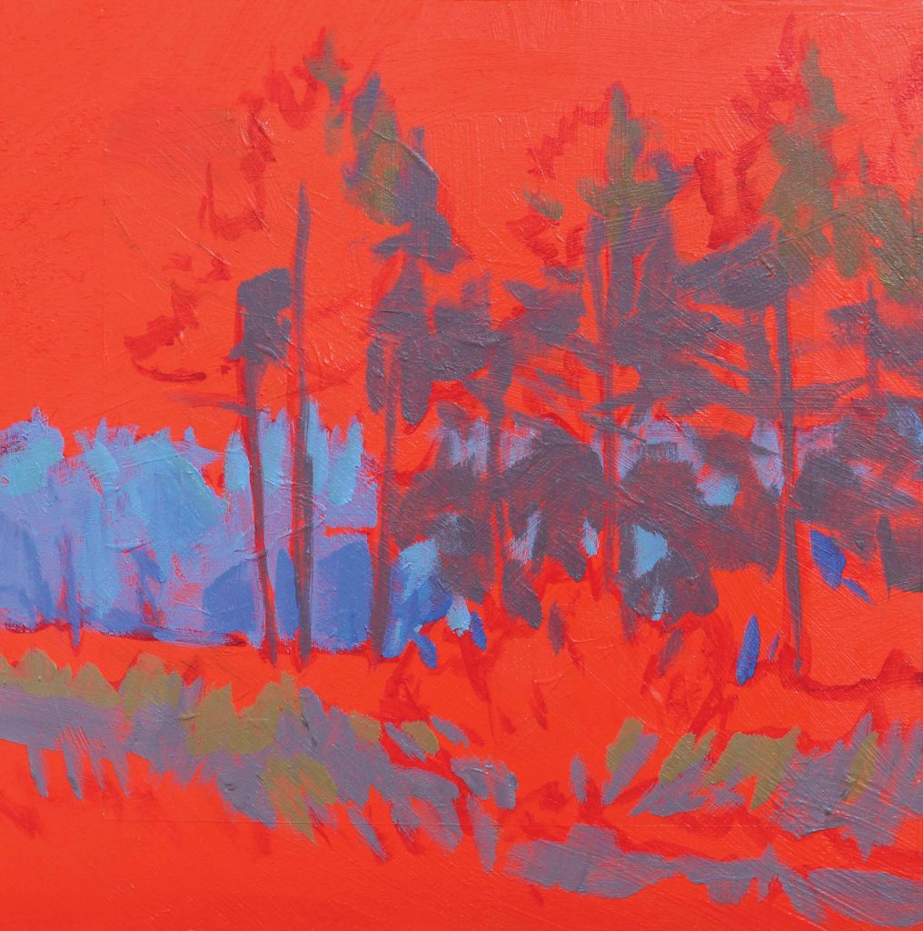
Step 4: I use cobalt blue, ultramarine blue, alizarin crimson, and a bit of cadmium yellow deep to create a dark, neutral violet. Still using my size 6 short flat, I paint this darker mixture (still one value lighter than black) on the lower part of the pines and in the foreground weeds. Both areas are in shadow.
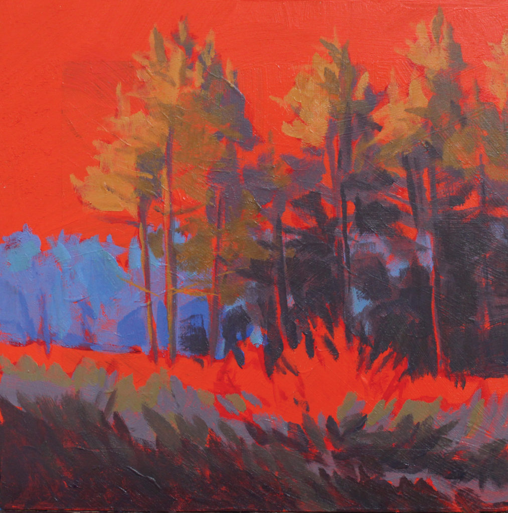
Time to add the light. For the red dogwood bush itself, I use a mixture of cadmium red light, alizarin crimson, a small amount of cadmium yellow deep, and white. I paint the sunlit side of the bush, and as I work my way around to the shadow side, I add more alizarin to the mixture. I use short, quick strokes to create an impression of the light hitting the bush.
I wipe my brush and use a mixture of cadmium red light, cadmium yellow deep, and lots of white to make the color of the light weeds that rake across the entire composition. I paint this passage quickly, almost allowing my brush to skip across, just as the light did.
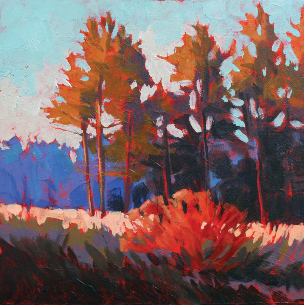
Final Step: I sometimes leave the sky for last. It helps me key the rest of the painting both in terms of value (the lighter the sky, the darker the other shapes appear) and in terms of the dominant temperature of the whole. In this case, I use lots of titanium white with some cadmium yellow light and just a touch of phthalo blue. I apply this mixture starting along the top of the distant tree shapes and in and around the middle ground pines. As I work my way up the panel (the sky usually gets darker as you approach the zenith), I add more phthalo blue into the mix.
To finish, I switch to the smaller size 4 short flat brush and use that with the sky color to depict the gaps in the pine trees. I’m always careful with those sky strokes; a few go a long way.
Temperature Dominance
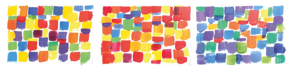
Left: This example shows an equal split between warm and cool colors. There is no clear dominance of temperature, which makes for a confusing composition. The eye bounces all around with no place to rest. Outdoors, this effect can happen if 50 percent is warm earth, and the other 50 percent is cool sky. If this is the way it actually looks, I always change it.
Middle: Warm colors dominate this example. The reds, yellows, and oranges fill most of the rectangle. There are enough cool shapes to counter all that warmth, and those cool shapes draw the eye because of temperature contrast.
Right: This example shows a dominance of cool colors contrasted with just a bit of warmth. The warm shapes balance the overall cool effect and provide interest.
Click here to get your copy of “En Plein Air: Acrylic” by Mark Mehaffey.
Plein Air Today covers artists and products we think you’ll love. Linked products are independently selected and linked to for your convenience. If you buy something using a link on this page, Streamline Publishing may receive a small share of that sale.
The editorial above is part of a series that spotlights the work of an accomplished plein air artist whose art has been featured in PleinAir magazine.
Published bi-monthly, PleinAir magazine is focused on landscape paintings by historical and contemporary artists, art collections, events, and the process of creating plein air paintings. Beautifully designed with rich reproductions on high-quality paper, PleinAir features the top artists and artworks from around the world. Start your subscription here.
Story prepared for the web by Cherie Dawn Haas, Editor of Plein Air Today


