– Bob Bahr reporting, Editor PleinAir Today –
This brown is reportedly considered so ugly, it can stop a citizenry from smoking. But what does that mean for a painter?
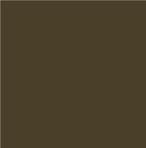
Lead Image: Is this ugly?
According to House Beautiful, the Pantone color 448 C is the ugliest color in the world, a color so off-putting to people that the Australian government, after extensive research into the hue’s wretchedness, mandated that cigarette packaging feature the color to turn people away from smoking.
It looks like umber to us.
“Yes, this is quite the shot at raw umber,” comments Scott Gellatly, product manager for Gamblin Artists Colors. “As painters, though, we don’t necessarily judge a color’s worth solely by its appearance from the tube, but rather its usefulness in our color palettes. Raw umber has served painters well for centuries and is very useful for muting warm colors. But I’d agree with the bigwigs down in Oz … it would certainly give me one more reason not to smoke!”
Adds Kyle Richardson, vice president of Royal Talens North America, “Without ugliness, there can be no beauty. I’m not sure why the Australian government feels the need to pick on little old greenish umber. Perhaps it should pick on an ugly color its own size, such as transparent yellow green!”


