

Color Mixing > By limiting the number of tube colors on the palette to just three primaries, the inherent qualities of color and their place on the color wheel can be more easily understood.
On Color Theory, Mixing Colors, and Using a Limited Palette
Having taught oil painting workshops for more than 30 years, without a doubt the most eye opening and impactful instruction my students received was about color; more specifically, my use of a very limited palette of just three primary colors, plus white. It’s not that the education concerning other areas of painting had little effect, but it seems the color lessons resonated with them more than all others. It generated the most interest. Clearly, color is just a small player in the total act of painting, indeed an important one, and if not used with understanding, it can make or break a painting. In truth, however, I consider concept, composition, drawing, and value structure of a painting more important than color, for we all know, there are wonderful paintings out there that have no color at all.
In my art video workshop, “Limited Palette, Unlimited Color,” I respond to this general interest in color by teaching in a clear, concise, and thorough way why I use a limited palette and why its use, at least for a time, would be so helpful to those struggling with understanding and mixing color. In this video I teach the qualities of color, color bias, how to mix your own color wheel, how to select an appropriate color scheme for your paintings … and much more. The instruction is enhanced with multiple visual aids and paint mixing demonstrations.
As a beginning painter in the fine arts, I typically had 11 to 15 colors on the palette. After a few years of working this way, I found myself taking notice of and being influenced by other artists, one of them being Kevin Macpherson, who limited their palette to just three primaries. I cannot tell you how excited I was to make this discovery. I was all in, spending weeks working into the wee hours of the morning just mixing color. I made charts, color swatches, and small studies, marveling at what could be achieved with such a small number of colors. What also amazed me was that all the colors I had previously used were no longer needed because the colors created by mixing just three primaries was almost limitless. I began studying the color wheel and experimenting with a variety of primaries and color schemes I’d never considered before: complements, triads, quadratics, analogous, even the families of color, all captured my interest.
Collectors and fellow artists began to compliment me on the beautiful color of my paintings. What I came to realize later is that they were, in fact, responding to the color harmony of the work … the relationship of all the colors to one another.
Color Theory: 7 Reasons to Try a Limited Palette
You’re probably wondering why you should try a limited palette. I believe there are at least seven good reasons:
1. It greatly simplifies the process of understanding color.
2. It speeds up learning what colors to mix together to achieve desired mixtures.
3. It forces the intermixing of all the colors on the palette.
4. It automatically creates color harmony.
5. It shows very clearly that color relationships are more important than matching the color seen.
6. It encourages experimentation in using major divisions of the color wheel.
7. Because of increased understanding of color, it will enable you to express yourself more freely, creatively, and confidently when painting.
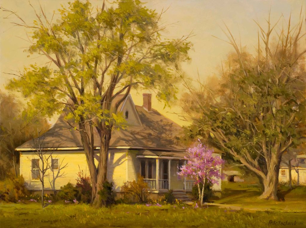
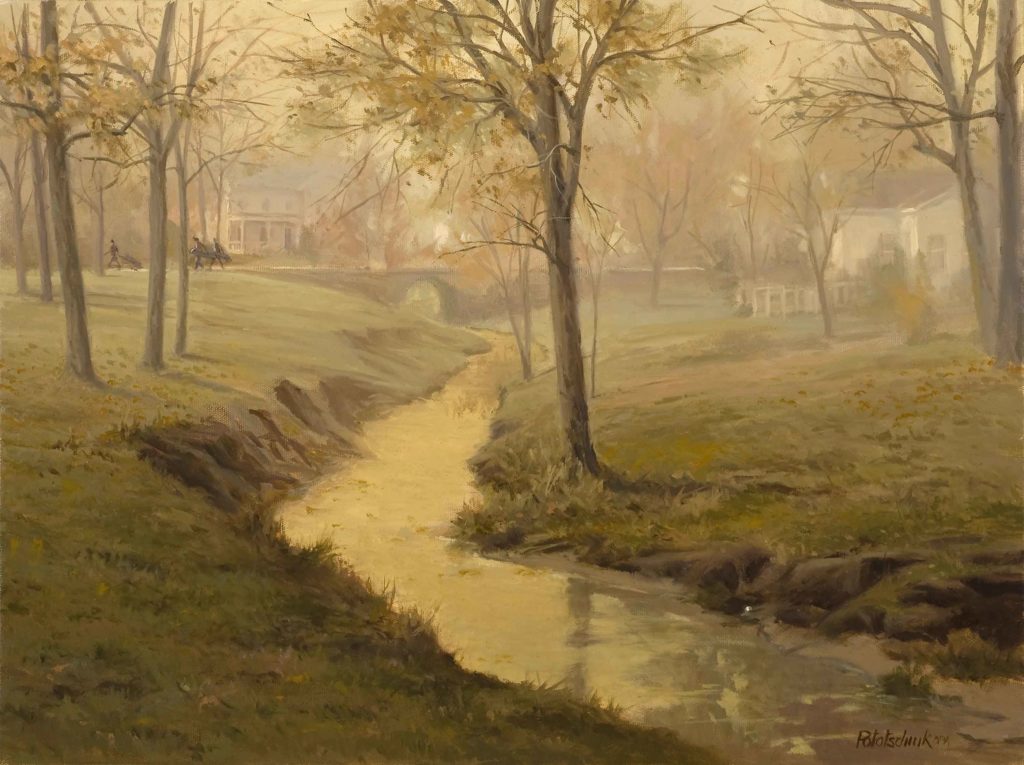
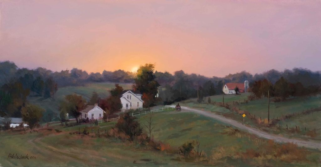
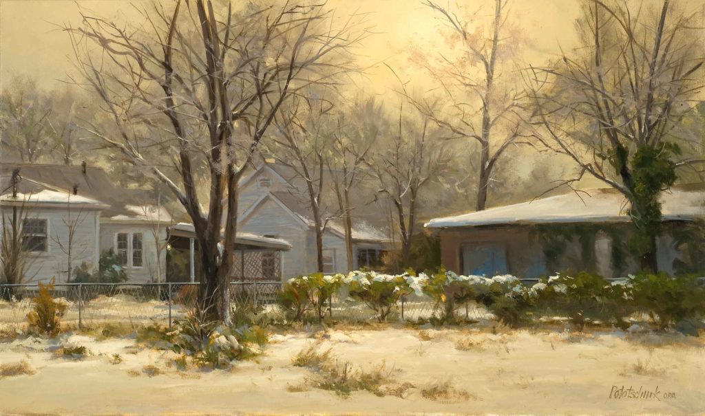
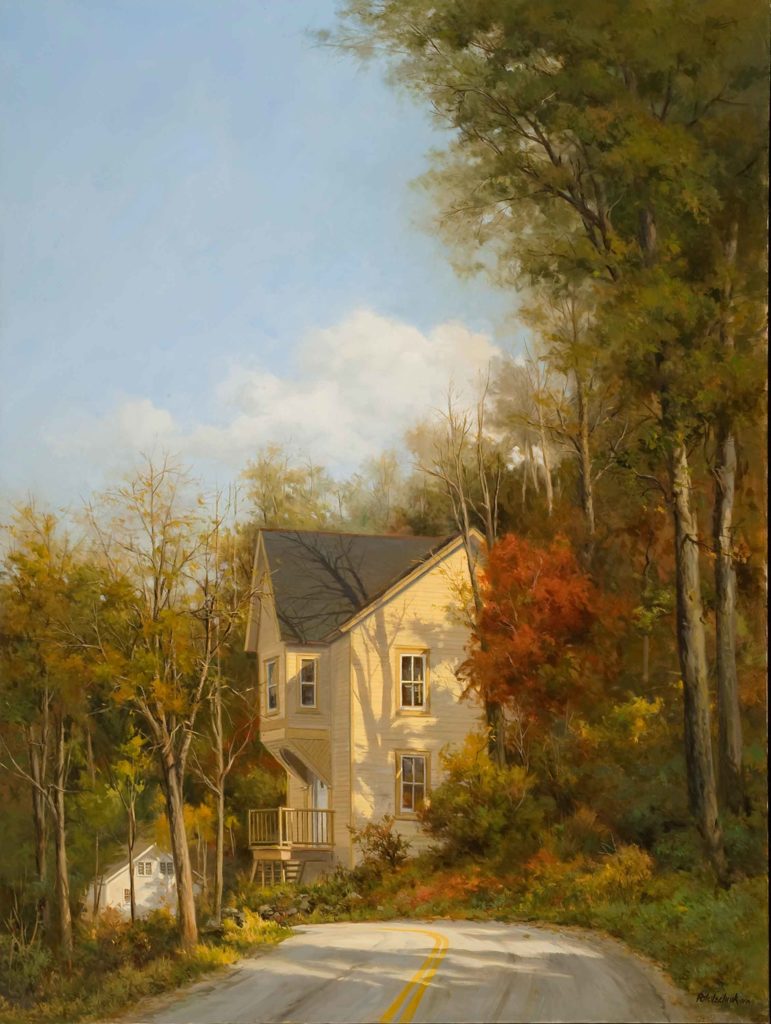
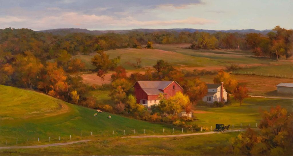
The use of a limited palette works for every style and subject matter. Again, it is color relationships that make a work beautiful and convincing, not the amount of tube colors you use. By limiting the number of tube colors on the palette to just three primaries, the inherent qualities of color and their place on the color wheel can be more easily understood.
Restricting ourselves to color schemes observed only with our eyes can blind us to so many other possible color interpretations we could have of our subject. Nature is certainly the most important source of our understanding of color, but experimentation and imagination will give you some surprising results.
Visit John Pototschnik’s website at www.pototschnik.com.
Facebook: John Pototschnik Fine Art
***
 Never has there been an instructional video or book that teaches a color system that is so effective that it can completely change the way you paint. You can create any mood, harmony, or flow in your artwork by using John’s color system.
The best part is that you can do all of this with just 3 colors + white. Even though you’ll be working with a limited palette, you’ll be painting with unlimited color. LEARN MORE ABOUT PAINTING WITH A LIMITED PALETTE WITH THIS SPECIAL OFFER.


All photographs, including photographs of paintings, are created with the 3 primary colors, plus black on white paper. Before digital, it was called “four color process printing” and is still done that way, but not the pre-press, which is generally done in Photoshop these days. Like many fine artists, I worked in the printing industry for many years, and also made the transition to digital. Even if you start with the 3 primary colors (plus black and white) you still have to mix those into a limited palette of custom colors.
Thanks, Marte. Yes, using a 3-primary palette necessitates the mixing of the complement and tertiary colors, thereby automatically creating a harmonious palette.
Omg gorgeous – I love the color harmony this creates.
Thanks, Corinne.
As a grade schooler, in art class we were only allowed to paint with red, yellow and blue. We learned to create all the colors from the primaries. It was a great experience. I still refuse to buy green.
It’s a great way to learn color, Sue. There are so many red, yellow, and blue colors available from paint manufactures that the ability to mix about any color is limitless.
Loved John’s Time Lapse Painting. Just wonderful.
Glad you liked it, Ann. Thank you. It’s fairly typical of the way I work….except, not quite that rapidly.
This is beautiful! There are so many reds, yellows, and blues–how do you know which ones to choose?
Ann, I determine what colors are important in order to satisfy the concept I have for the painting. If for example, an intense orange is needed, I will select a warm red and a warm yellow (a vermillion or cad red and a cad yellow) Using something like alizarin crimson (cool red) and lemon yellow (cool yellow), will not give an intense orange. I explain all this in great detail in the upcoming DVD on color. It will all make sense when you view it.
Wow! I love the dreaminess….other era look of your paintings. Very relaxing. Also, very much enjoyed the time lapse video.
Thanks, Gloria. Glad you like the work.
Delighted with your statement on a limited pallet to the primaries. I totally endorse your statements
and as a tutor of holiday groups myself i know from feedback that there is the very important matter of cutting the price and quantity of our equipment, Thank you
Thanks for your comments, Michael.
Am interested if you use only one of each of the primary colors, or if you use a warm and cool version of each. Your work is amazing and I love reading your articles.