
By Brenda Swenson
What is Negative Painting?
In transparent watercolor, the white of the paper is precious. I have experimented with using masking fluids and tapes to save the areas I want for my whites and lights, but found the end result harsh-looking or unnatural. Instead, I simply paint around the areas I want to preserve — hence the term “negative painting.” It’s what we don’t paint (the white of the paper) that becomes our glowing lights. Think of it like carving stone, chipping away until only the most precious elements remain.
In this demo, I start simple and work toward the complex, building up shapes with glazes (transparent colors laid over dry, previously painted areas).
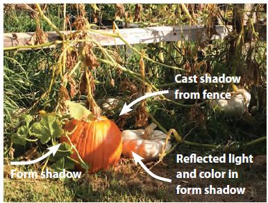
The illuminated area near an object reflects, or bounces, light into the shadows and carries color with it — this is called “reflected light.” The orange pumpkin on the left has form and cast shadows. For my painting, I edit out the cast shadow created by the fence rail that ran across it (yes, I can do that).
On the white pumpkin, the color in the form shadow comes from the light reflected off the orange pumpkin.
Step 1
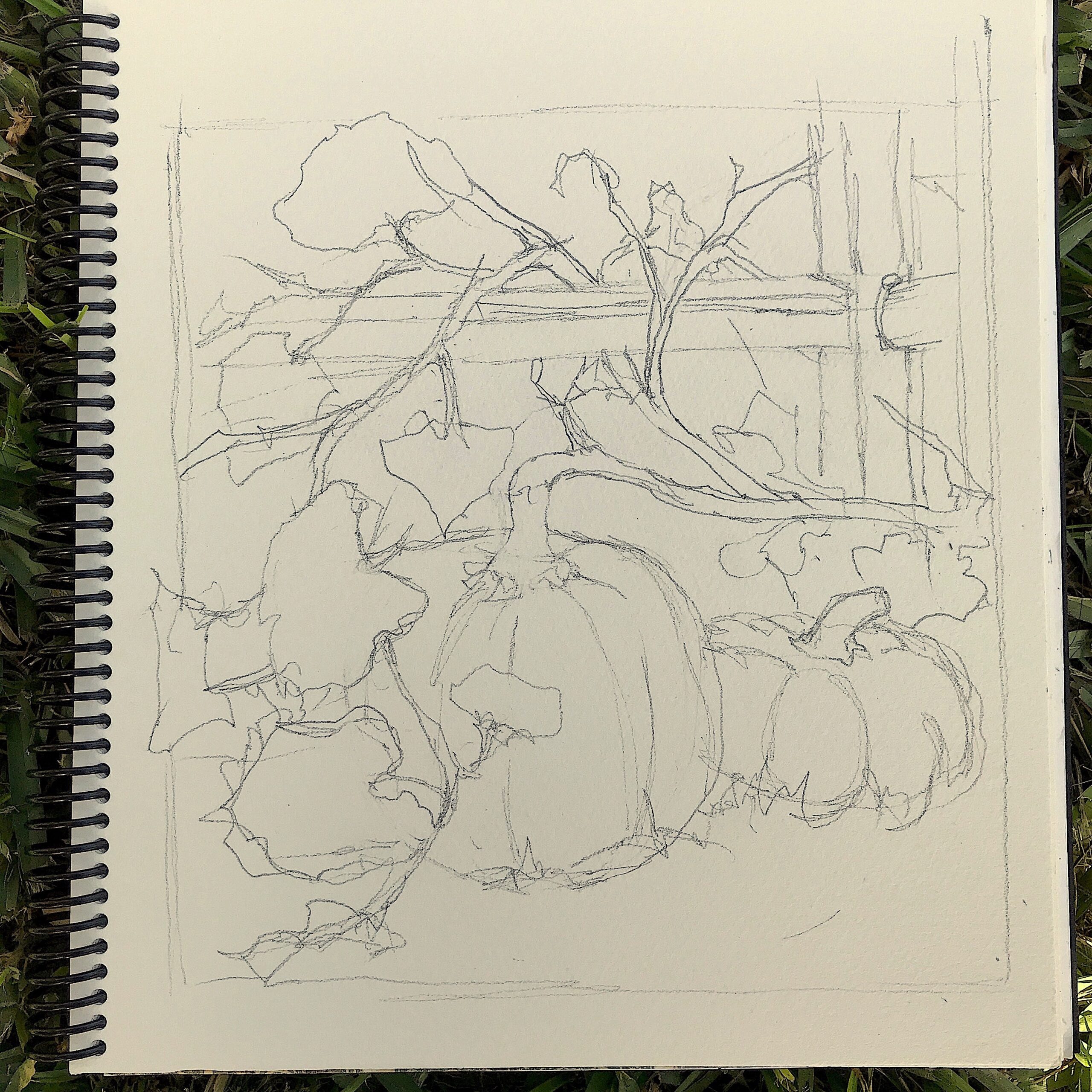
I start by drawing with a 2B pencil on 140-lb. cold-pressed paper. I’m especially aware of the negative spaces between the elements in the scene, particularly around the vines and leaves. Aiming for variety in size and shape, I draw just enough to get the general forms, without overdrawing. I want to leave opportunities for shapes (both positive and negative) to develop during the painting process.
Step 2
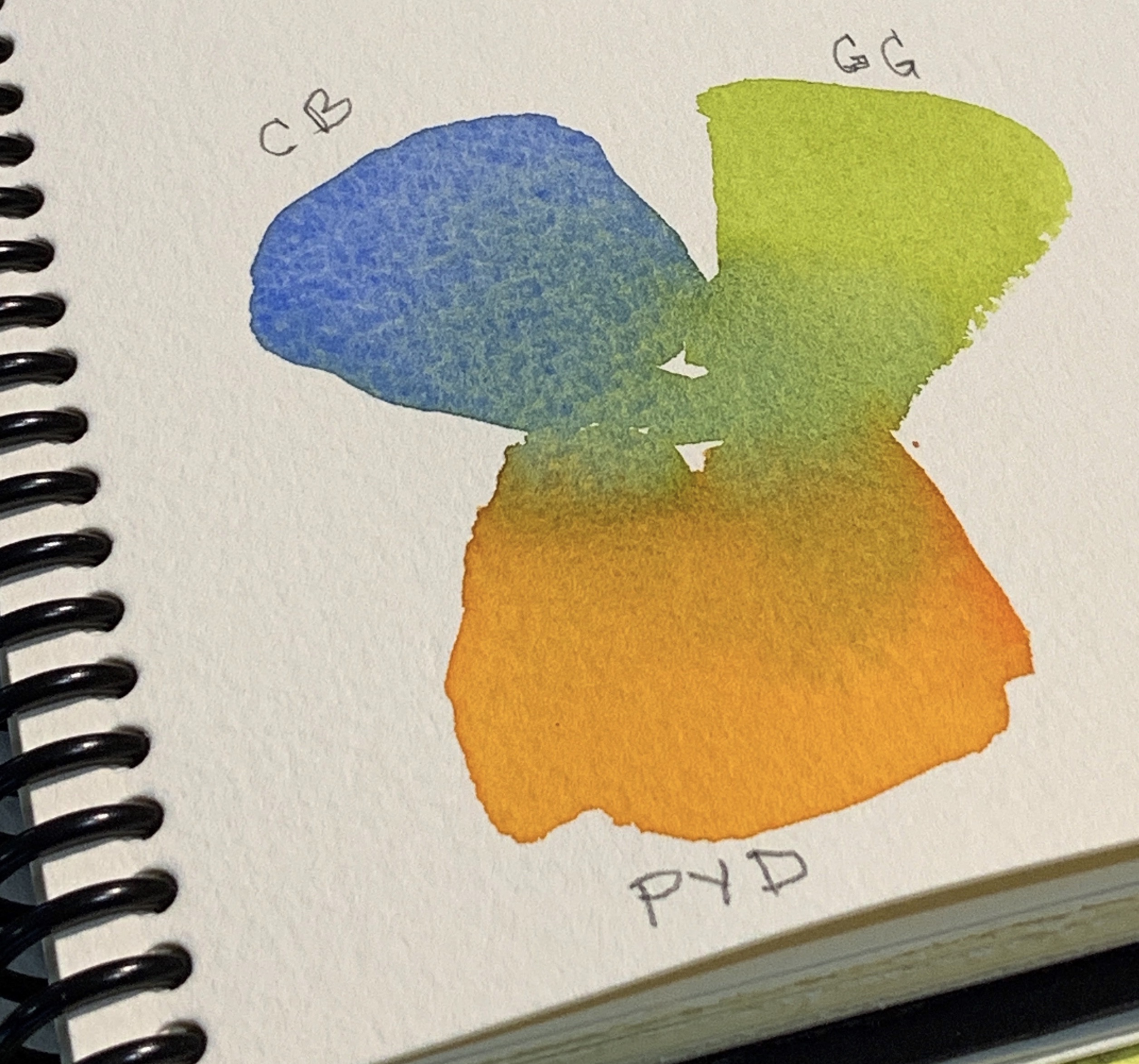
I identify the three colors that dominate the scene. These colors will show through at the end of the painting in the lightest values and give the appearance of reflected light and colors.
I mix small swatches of paint on watercolor paper to see how they will mix and what secondary colors I can use them to create. I call these my “mother colors.” I select cobalt blue, green gold, and permanent yellow deep.
(Related Article: What’s Your Mother Color?)
Step 3
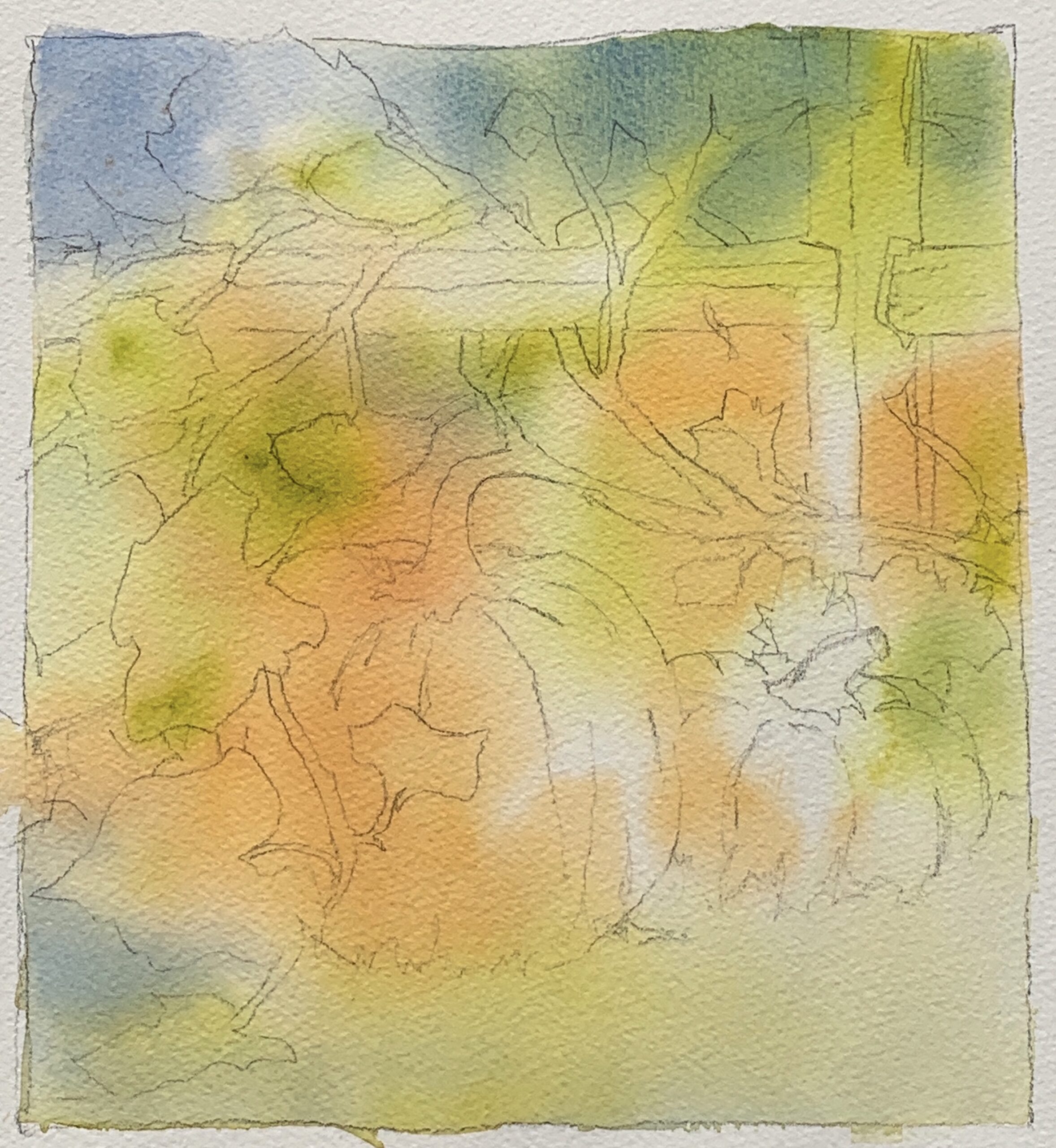
I wet the watercolor paper with clean water. While the surface is still shiny, I introduce the three mother colors separately into the wet surface. I encourage the paint to mix and mingle by tilting or rocking the paper; I don’t overwork the surface with a brush. As the paper dries, the paint will continue to move.
If the paper is drying and the colors aren’t mixing, I can mist the paper with a spray bottle. I want a few areas to remain light and only slightly tinted by color. I let the painting dry thoroughly.
Step 4
I pull green gold (one of the mother colors), quinacridone gold, and French ultramarine into the mixing area of my palette. They mix in the center, but toward the edges, the pigments remain pure. I start at the top of the paper and work my way down, painting around the main shapes.
The edges are hard against the objects, but I soften them with water as I move away from those shapes. With each brush load, I vary my colors slightly by pulling more from one of the three colors listed above.
When I get to the bottom of the paper, I soften and pull the colors into the foreground, particularly in the lower left corner, then let the painting dry completely.
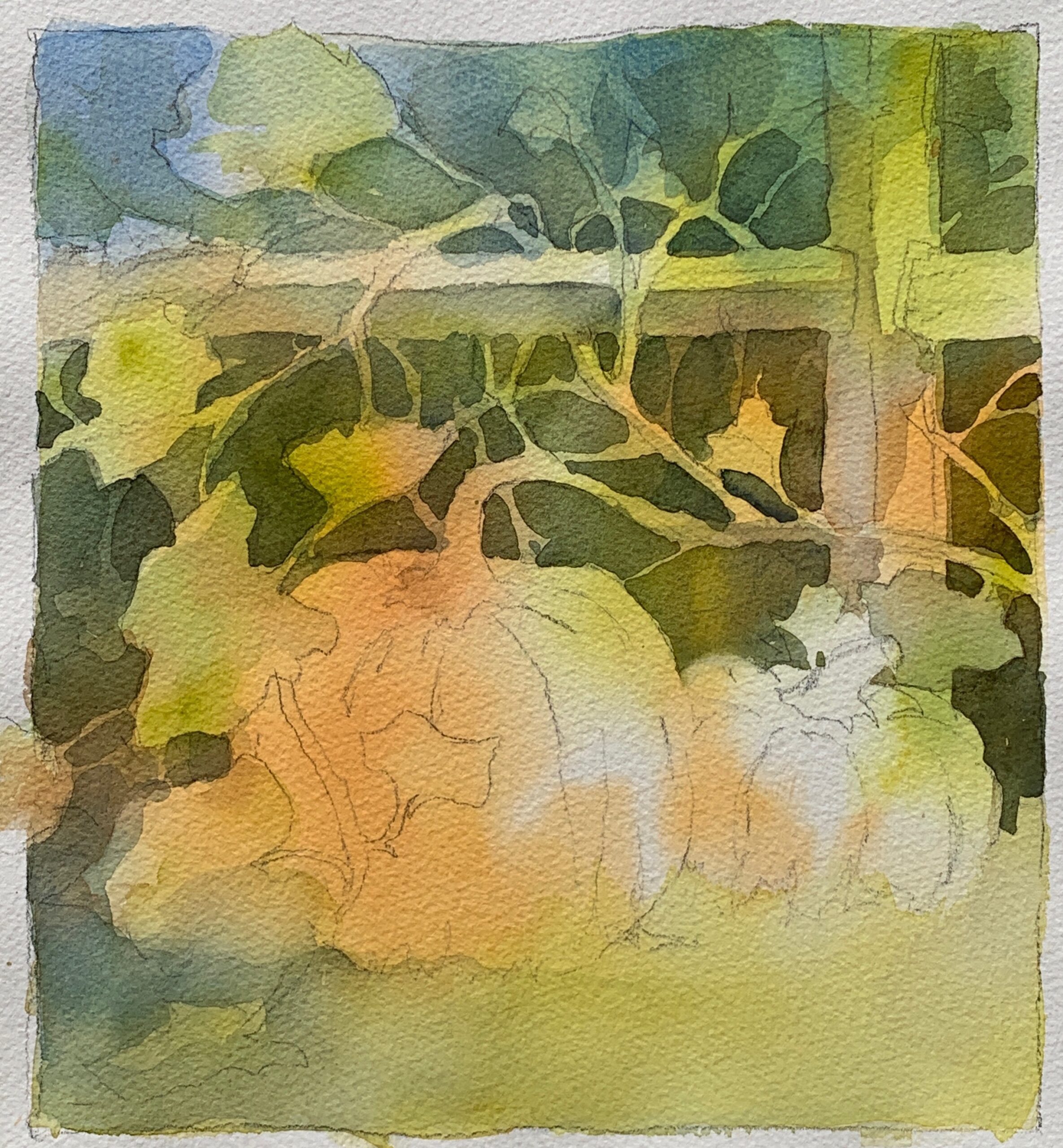
Step 5
At this stage, I want to create depth. I paint into the last glaze using a darker value of green made from burnt sienna, phthalo turquoise, and quinacridone gold. I often drop a little quinacridone rose into the darkest passages of green; the unexpected warmth livens up the area.
I suggest vines and leaves by creating more negative shapes behind the pumpkins. I start at the top of the large pumpkin and move out. My negative shapes look more organic if I create them with a brush, rather than draw them.
At this stage, I also begin to look at positive shapes — the fence post and pumpkins. I paint the shadow side of the pumpkin with permanent yellow deep and quinacridone burnt orange. I don’t stop at the edge of the pumpkin, but pull the color into the area behind. I suggest the shadows on the fence post and the leaves that drape over the pumpkin.
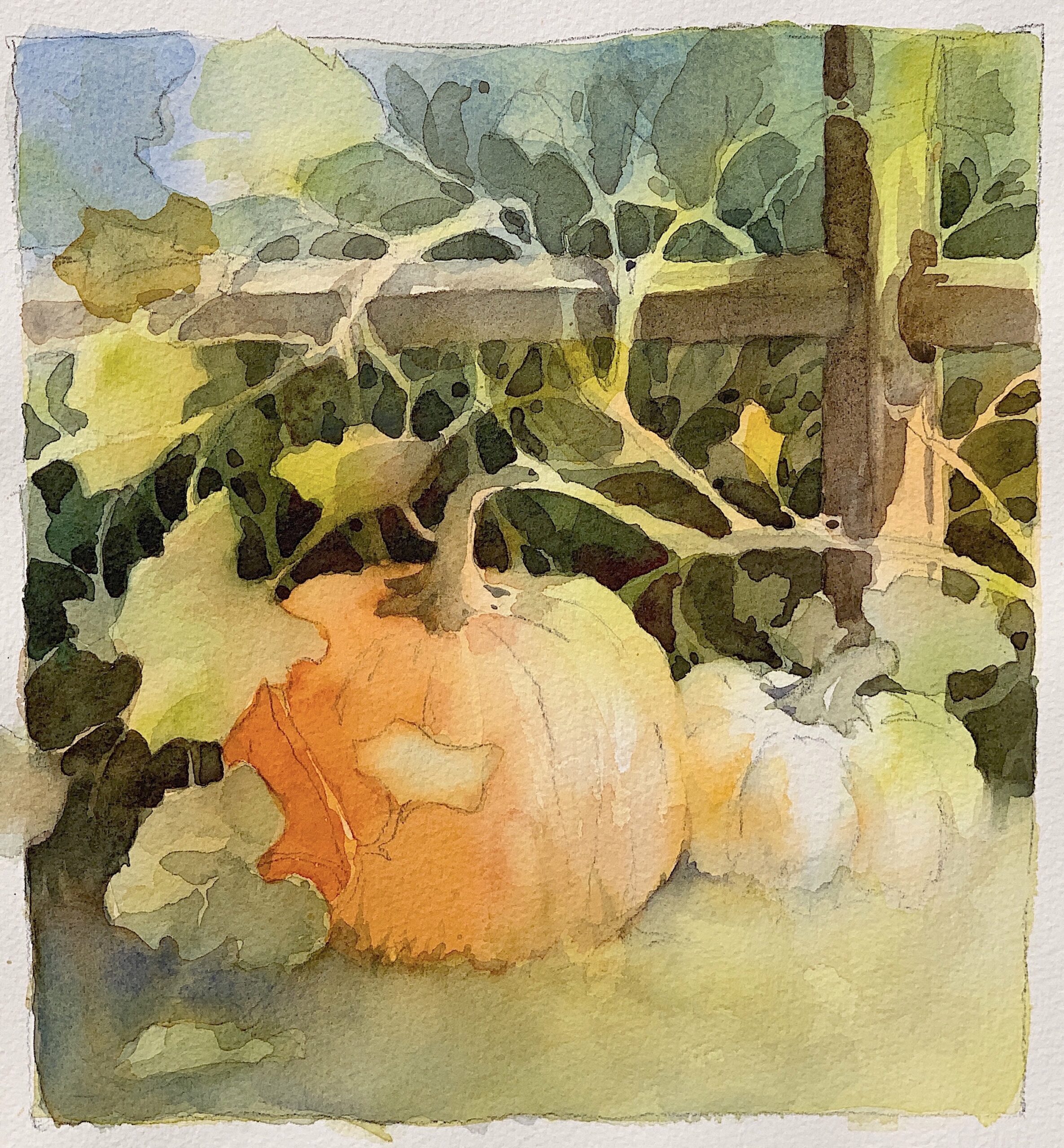
Final Stage
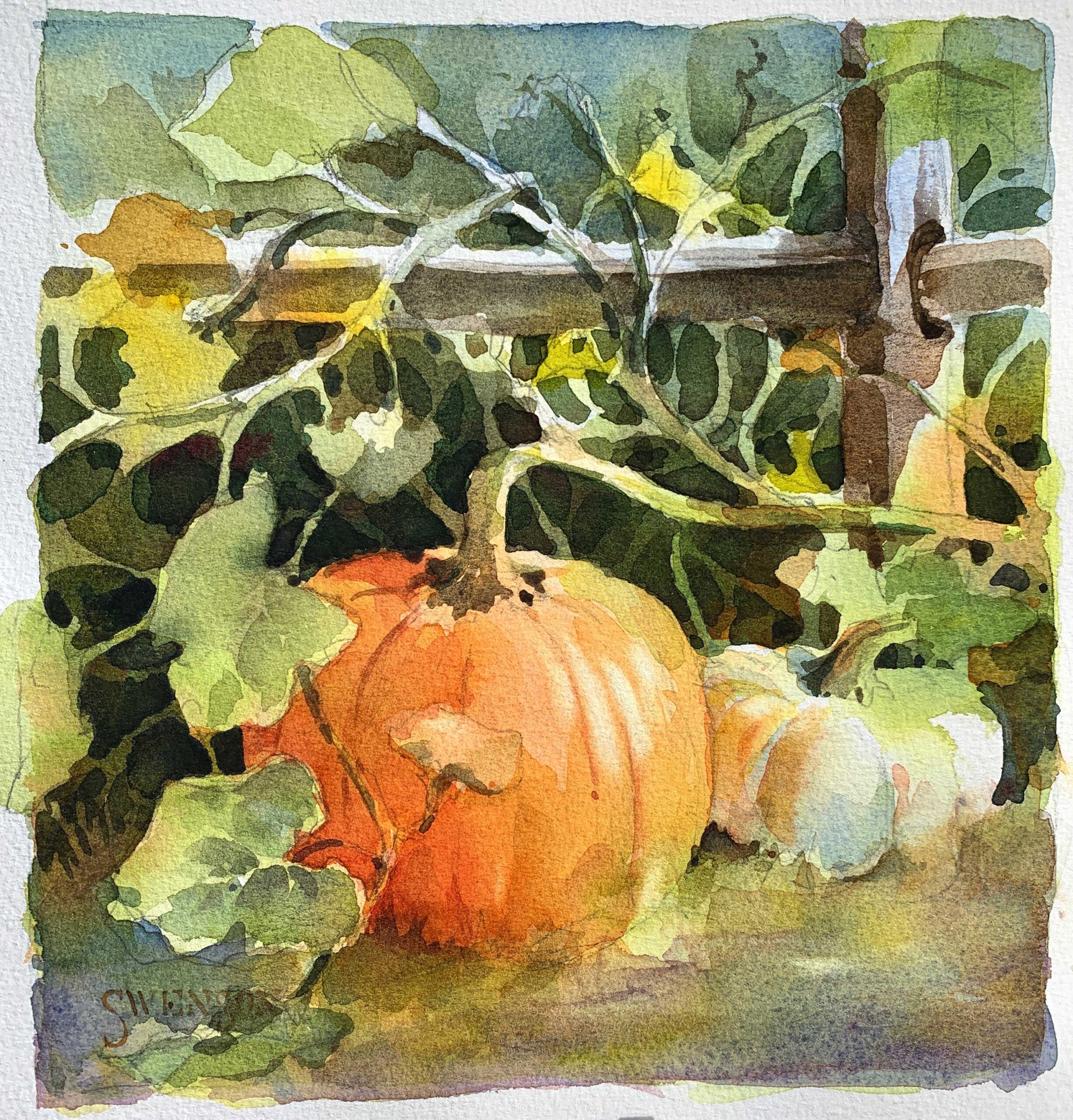
“Don’t paint the fleas before the dog” is a good reminder to get the big shapes down first and save the details for last. In the final stage, I paint the smallest shapes and darkest darks, as well as make any adjustments.
With fresh paint and clean water, I paint the form shadow on the orange pumpkin with permanent yellow deep and quinacridone burnt orange. I liven up the reflected light and color on the white pumpkin with permanent yellow deep. I also see that the yellow foreground needs to be toned down. A glaze of imperial purple does the job.
Finally, I lift a few highlights with a stiff brush and clean water. The impression of reflected color established in the underpainting can be seen throughout the piece — in the orange and green on the white pumpkin, and the orange on the post and parts of the vine.
***
In this art video workshop with Brenda Swenson you’ll learn that paintings benefit from a variety of positive and negative painting. Brenda outlines the tools and materials needed for this approach before entering into a step-by-step demonstration of this process. [Learn more about negative painting with watercolor here!]
Related: Join us for Watercolor Live, a virtual art conference taking place January 21-23, 2026.


Beautiful painting and clear explanations. I look forward to trying this method. I am a self taught watercolor artist so I always appreciate those with more skills and knowledge who are willing to share their methods with others.