

By Christine Graefe Drewyer
As artists, it can be very daunting indeed when we’re faced with the color green. We’ve all heard the phrases like the green-eyed monster, crayon green, poison green, and, my favorite, it’s not easy being green! So, you get the picture. Often the way an artist handles this tricky color can denote rather quickly where they might be in their skill level as a painter.
I’d like to share a few tips I’ve learned along the way without boring you with color theory or the color wheel. Here is a recent picture of me enjoying some plein air work at the Kenilworth Gardens in July. A nice photographer I met while painting was kind enough to snap this pic for me (shown at top).
Now even at a glance, you can see how daunting and challenging it can be to tackle all that green and sunlight! My shirt even got the memo on the shade of the day! Yikes!
It is certainly a great idea to make use of your opposites on the color wheel when tackling green. The red tones will instantly neutralize the flame. I’ve always admired those stalwart artists who arrive on the scene with the three primaries plus maybe a neutral gray or white and maybe a few earth tones. At least as impressive as that is the Zorn palette, which doesn’t even include a real blue or, so I’m told, it’s actually some tone of blue black that when combined with yellow will give you the green and blue shades. Sadly, that’s just not usually me.
Painting with Greens
Here are some pointers that have served me well and tend to look more natural in the finished product, in my humble opinion. The suggestion that “less is more” is a good rule of thumb to keep in the back of your head when tackling greens. I actually do have some greens on my palette. I love the Rembrandt’s greens as they have a gorgeous saturation level and yummy buttery texture. (Green Earth, a Terre Verte, Cinnabar extra pale, and even Granny Smith light — and yes, it’s just what you’d expect — are some staples for me.) A few others that can be safely added and often used as a very reliable base tone are ALL the Vasari greens. Some of my go-to colors include Cedar or Rousseau Green, extra pale.
Now if you’re going to use these greens as a base tone, I like to use neutrals as my mixers for my lightest lights. The ochre and unbleached titanium and pale rosebud by Vasari make a luscious lightest light green when added to these base colors. I can achieve a much richer and warmer color when I use these colors instead of white, which cools everything down way too much for my happiness. Just don’t forget that there are a lot of gray tones in nature too and that’s where “less is more” comes in. Never forget that there’s usually dirt underneath that green and that a tonal approach never hurts. I often will lay in a flesh tone first and just lay a skim of a green tone over it without using death by blending.
A neat discovery I made was that if I use the transparent colors to mix my mid-tone greens, I get this vibrant, almost glowing, finish to the shadows and it keeps them from getting muddy or too opaque. I treated myself to a collection of Ancient Earth Tones by Vasari for Christmas last year (I know, it was certainly an indulgence!) and, to my surprise, discovered that they were ALL transparent colors. The set included some Indian reds, some greens, and lovely Rosso Ercolano Genuine Italian Earth and a glorious Cedar Umber, to name a few.
These transparent colors will tone down the greens and give that rich luster plus a natural vibrancy as a finished tone.
When you just want to play with shadow colors and add some of the more well-known hues easily found in most palettes, then you may want to experiment with rose or purple madder, alizarin crimson, dioxane purple, or a tiny bit of phthalo blue (all transparent tones). Recently a friend introduced me to a hand-made color by artist Debra Huse, which is called Huse Hues, a very versatile shade of blue called Marine Violet. It is now a staple on my palette.
Typically, my darkest dark on my palette is Rembrandt’s sepia, and I mix it with most anything (another transparent, even perfect for glazing straight out of the tube!). But when I am going for a bit more mood, I use that fabulous Marine Violet.
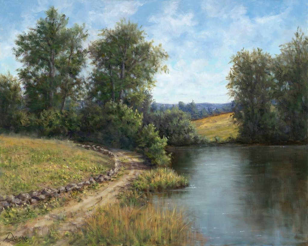
“Around the Bend” (above) is an example of the use of transparent paints mixed in with my stable of greens to achieve luminescent glowing greens in the mid tones that tend to be more natural in appearance without getting muddy.
There are exceptions to every rule, and I surely do not profess to be an expert in color theory or the tried-and-true methods that you well-trained artists practice. These are just a few tips that a self-taught artist wished that someone had shared with her back in the day when she was getting started. Just as sometimes the adage “a cigar is just a cigar” is true, there are moments when it may not be easy being green. But it sometimes is a necessity to just use that “crayon green” right out of the tube because nature sometimes wants what she wants!


EXCITING!! Thanks for sharing!
Living in the mid-Atlantic, the green-on-green-on-green (ad infinitum) is certainly a daunting prospect in summer. Thank you for some great color mix ideas and options to tackle for a more ‘believable’ scene!