

On plein air painting > Why travel and paint on location? It is difficult and cumbersome. It can, however, yield great rewards.
By Kenny Harris
I use location for inspiration. The big question in one’s painting career is how to keep the work fresh both for the artist and for the audience. As an artist, you must be constantly engaged with your work. If you are phoning it in, an astute viewer will sense it.
Working from life will always challenge you, and connect you to your subject. If you have to work from photos after the fact, any work you made on-site will be invaluable as a reference for colors and tones. There is also that intangible feeling of a place that you absorb while working from life on location. This can provide the motivation you need to finish the paintings in the studio.
I wrote this article from a small village in southern Tuscany. I went with my wife, artist Judy Nimtz, to gather inspiration for paintings, for both plein air and studio work.
The Connection Between Painting and Travel
Even before I was an artist I associated painting with travel—perhaps because I discovered my favorite paintings overseas. The two were connected in my mind: Travel and Art. It was once part of a young artist’s path—to come to Italy to study the old masters, or in one’s maturity to interpret “exotic” or foreign experiences in one’s painting. Corot, Sargent, Velasquez, Turner . . . they all came to Italy. It was not just the masters in Rome and Florence, but also that “something different” that opened their eyes. The Orientalists and their audience were obsessed with the “exotic” Middle East.
Follow Your Brain
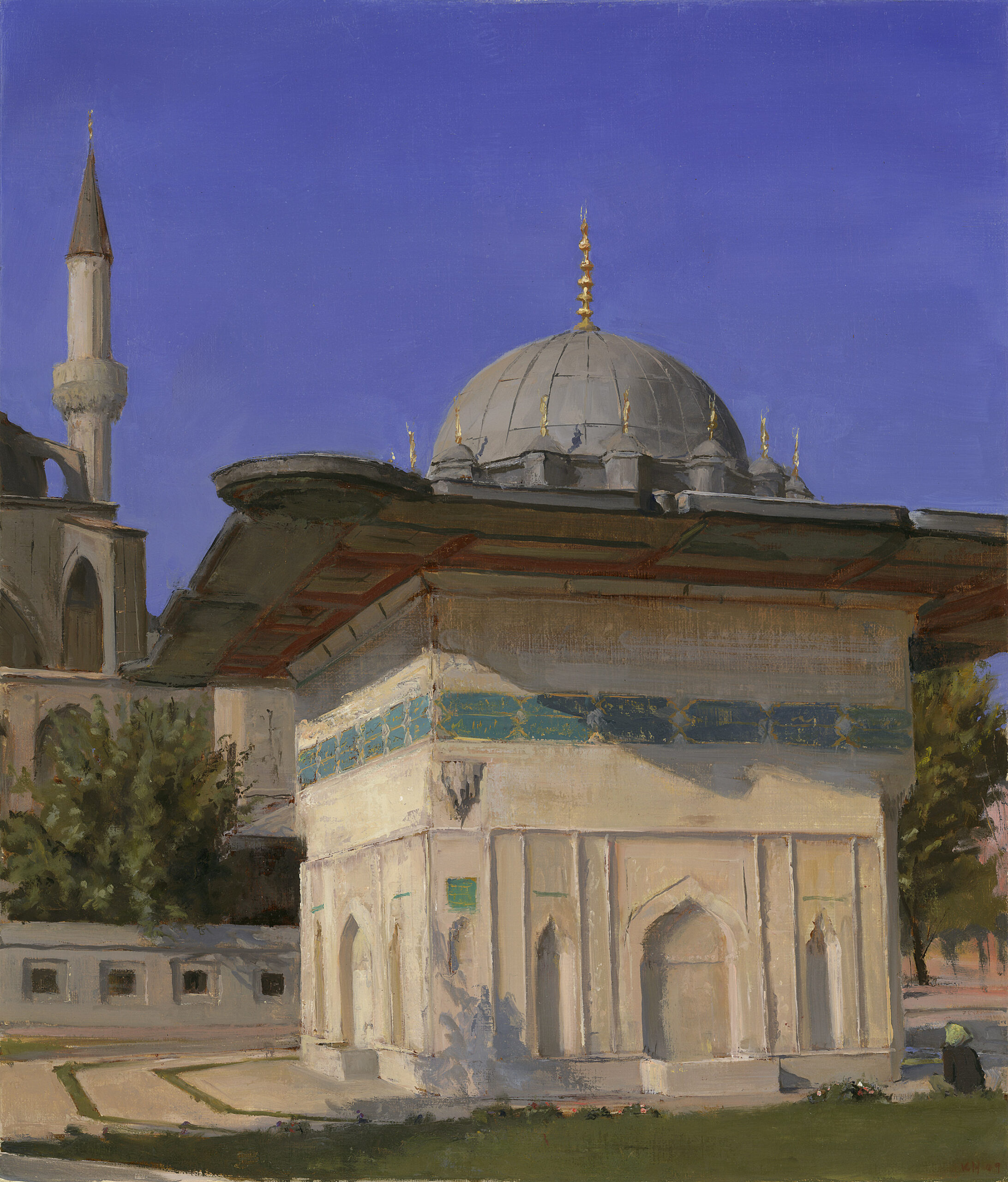
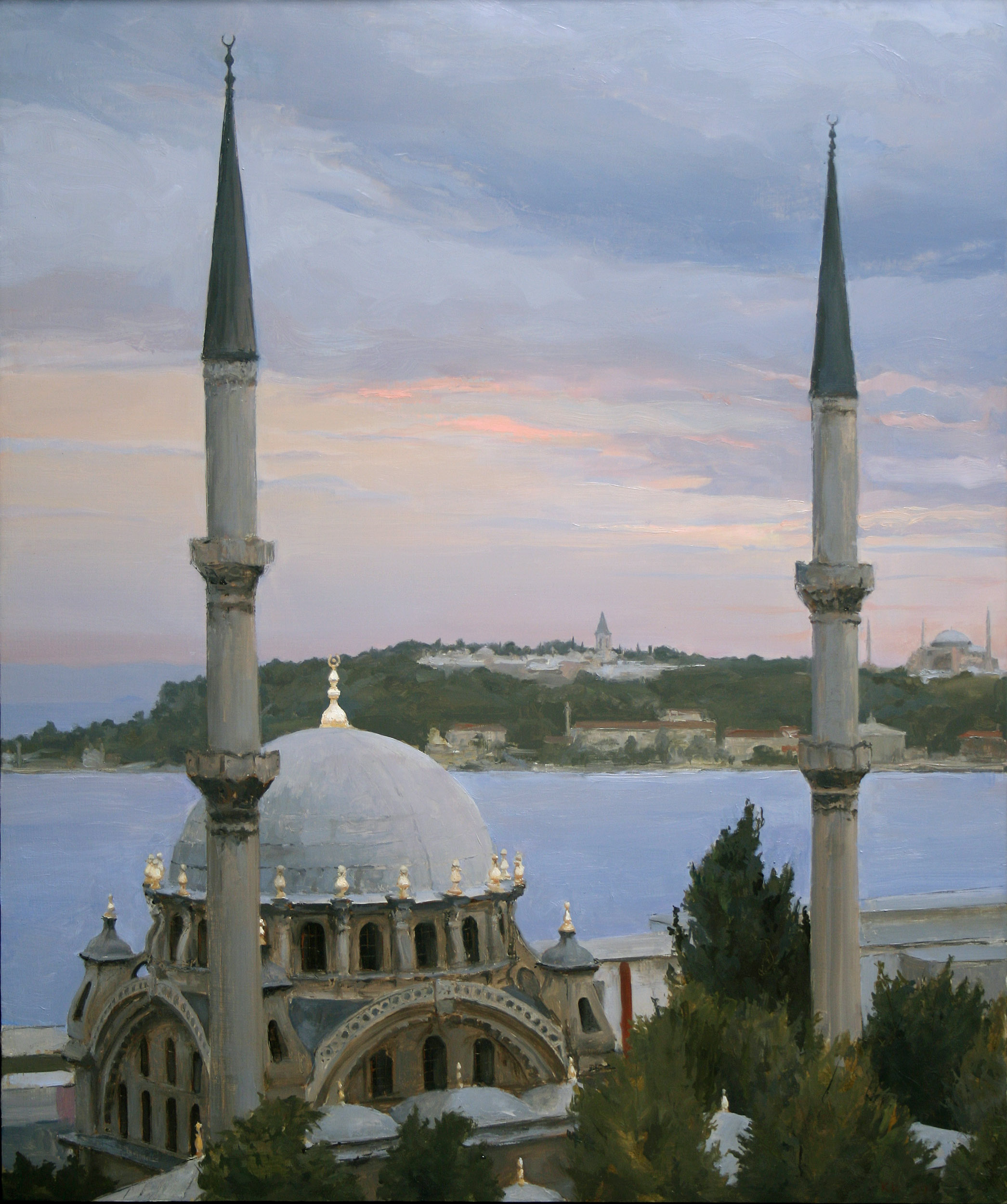
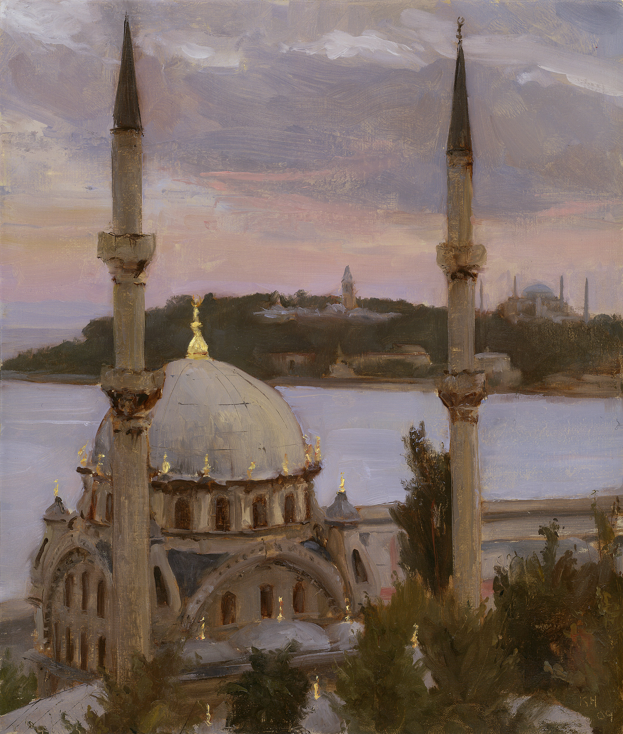
I’m often drawn to locations about which I have an intellectual interest as well as a visual interest. I had a great desire to visit socialist Cuba before Castro died, as well as to paint a crumbling Havana. Plenty of photographers go there to work, but not as many painters. I was drawn to Buenos Aires after the economic collapse, Istanbul as it teeters between European and Middle Eastern interests, and China with its ancient culture and current explosion of mixed socialism and capitalism.
I also return to Italy and France—places of personal artistic awakening. These countries visually inspire, they are places of great artistic learning, and as a painter one feels connected there to a long tradition.
When I moved to New York, my work was mostly about New York. When I moved to LA, I started making work about LA. After a while in one place I start looking for that fresh eye, that certain condition that will result in a good painting. It is sometimes easier to find this away from one’s day-to-day life—hence the plein air painting trips.
Tips for Plein Air Painting While Traveling
So let’s get down to the nitty-gritty—how to travel and work efficiently with good results. All artists have their own tricks and opinions; these, of course, are just mine.
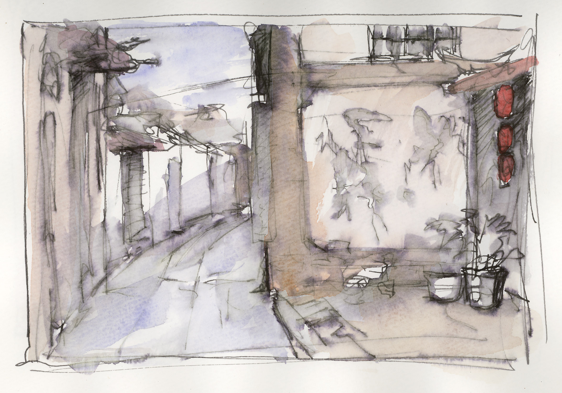
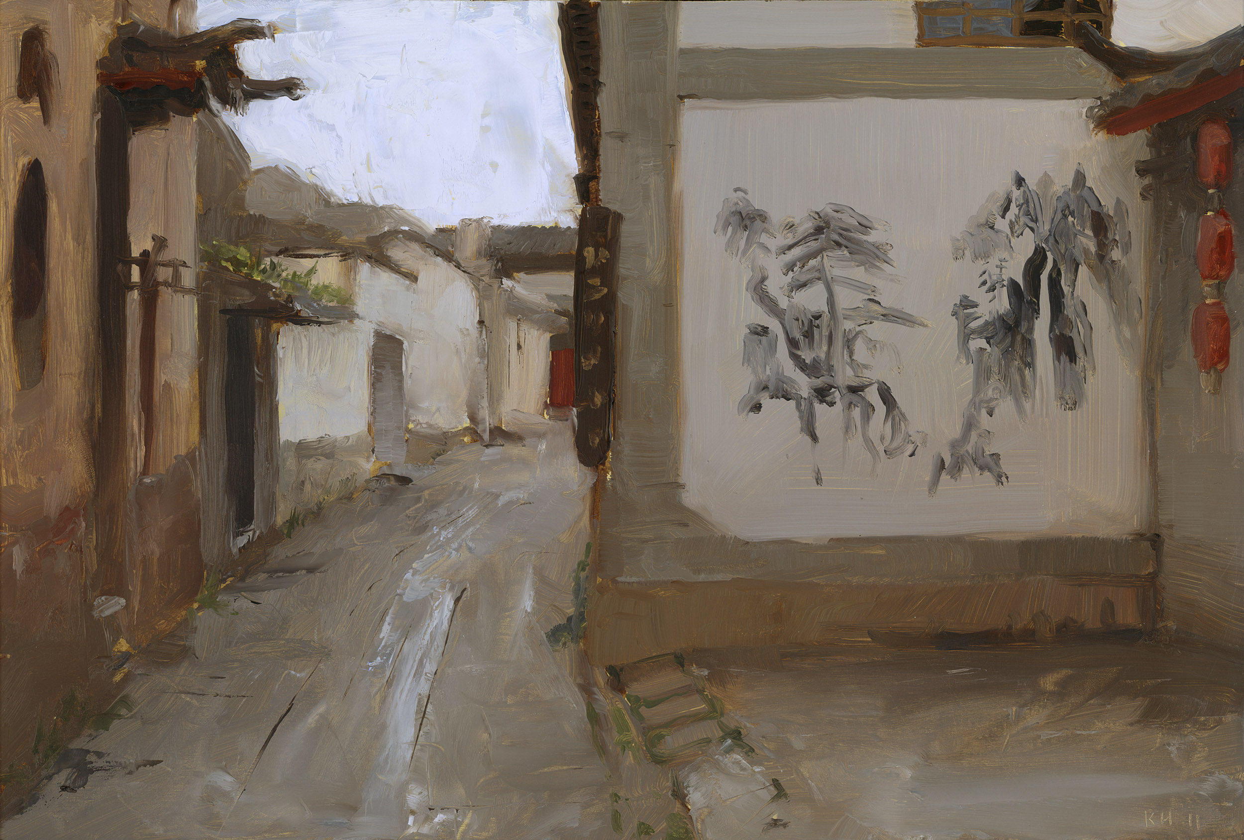
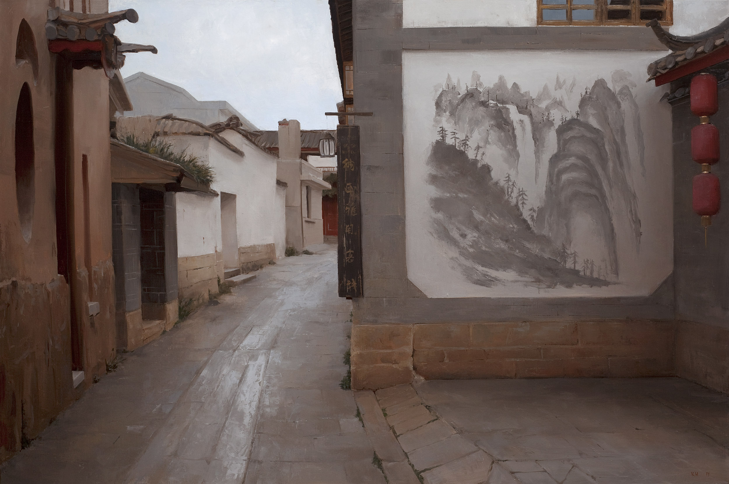
When traveling I make small oil sketches (studies) and also take photos—lots of photos, with bracketing. To work out composition, I sometimes make quick ink drawings as well. I then use these sketches and photos to create larger paintings back at my studio in Venice, California.
If I only have a photo to work from, I will do a small oil study, making decisions as if I were in the field, with urgency and deliberate marks. Obviously, it is easier to get the desired composition and color harmonies resolved in a small painting.
Canvas vs. Panel
An age-old debate. For smaller work I prefer panel.
I make my panels out of birch ply. There are great art panels out there, but I have never found one I like as much as my own. I gesso it with Nova Color acrylic gesso with no fewer than six coats. The first two coats are just white from the container, but for the last few I tint the gesso with a neutral grey/green ground color, and start applying the final coats with a putty spatula, sanding a bit in between. I’m trying to quiet the surface, and with the spatula I can fill depressions.
The last step is to use a wet sanding sponge so I can achieve a very smooth, slippery surface. A sanding sponge can take off quite a bit of gesso—if I see any sign of the original white gesso poking through, I know I can’t sand anymore in that area. As a last step I’ll rub in just a bit of yellow ochre and/or burnt sienna with a touch of turpy medium so it achieves a bit of glow, and will quench some of the thirst of acrylic gesso.
Canvases I stretch over panel and prep with either oil ground or acrylic gesso sanded back to quiet the tooth of the canvas.
It is all labor intensive—this prep work takes time. But I’ve found it cuts my painting time down considerably to have these smooth, richly toned surfaces pre-prepared. For oil sketching on location, time can be very short—light conditions or other time constraints mean your materials have to respond quickly to your needs. With a quiet surface, your paint sits up, and you can easily and effortlessly go from thin transparent paint to juicy impasto in the same panel.
Easels
I still use my Julian French Easel I’ve had for 16 years. It fits my paints, turp, medium, a Guerilla brush holder, brushes, and knives. I like full boxes over half boxes—the half boxes can fit almost nothing inside and are less stable in the wind. I like the convenience of having all the supplies I need in one apparatus, especially if I’m in a city or a private house. The less clutter, the better.
The French easel can be difficult to pack, but I’ve found it can go into a large checked suitcase, padded with bubble wrap, stocked full of paint and knives. You’ll have to buy your turps once you arrive at your destination.
Early on, I used an Italian steel tripod easel as well. It is stable, cheap, and reliable. Most importantly you can raise your painting up to eye-level, which is crucial for sight-size painting. Over time, I switched to a Sienna Plein Air canvas holder and palette box with a tripod – this allows me to raise my canvas to eye level and have a palette on the same rig.
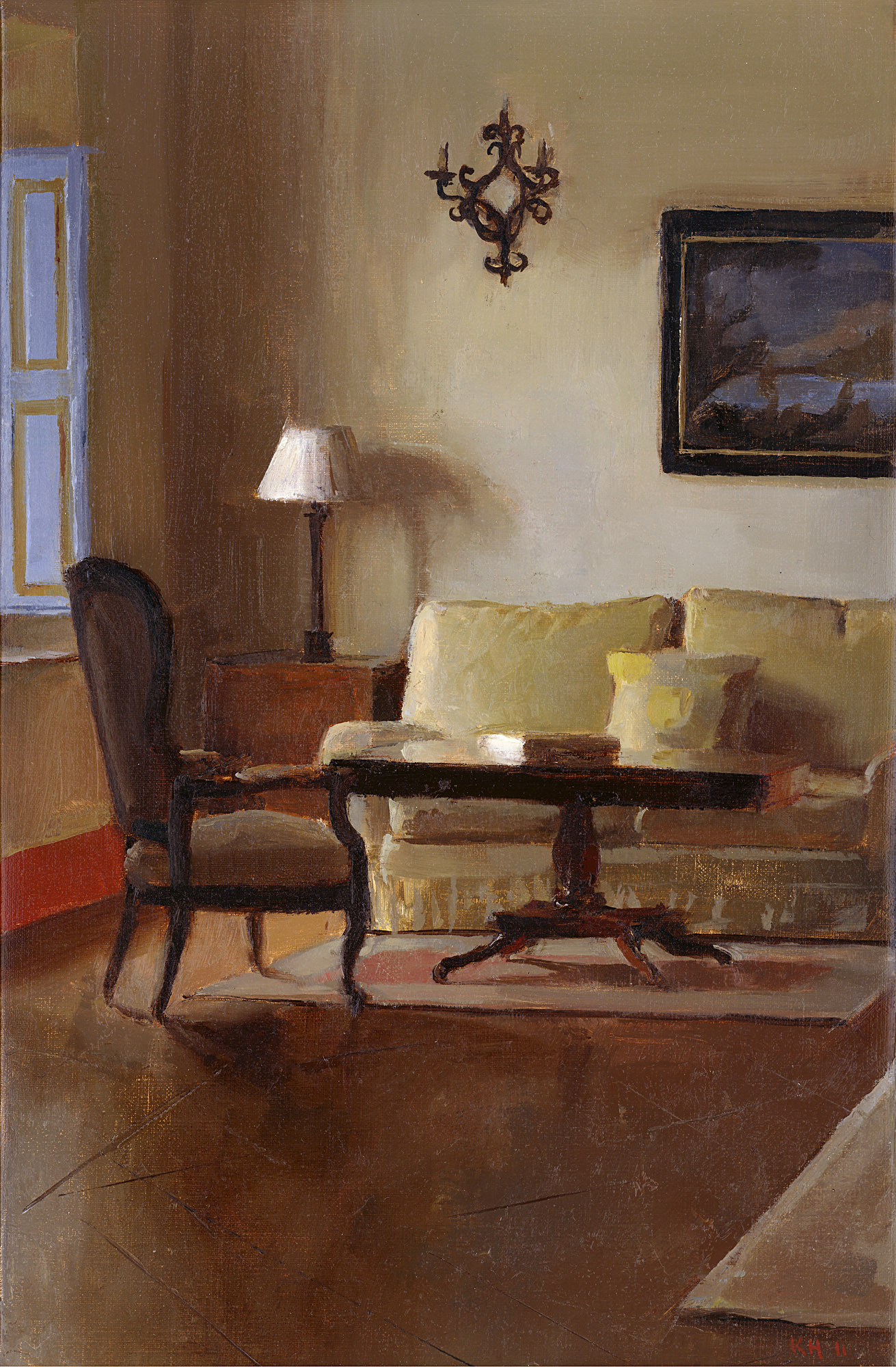
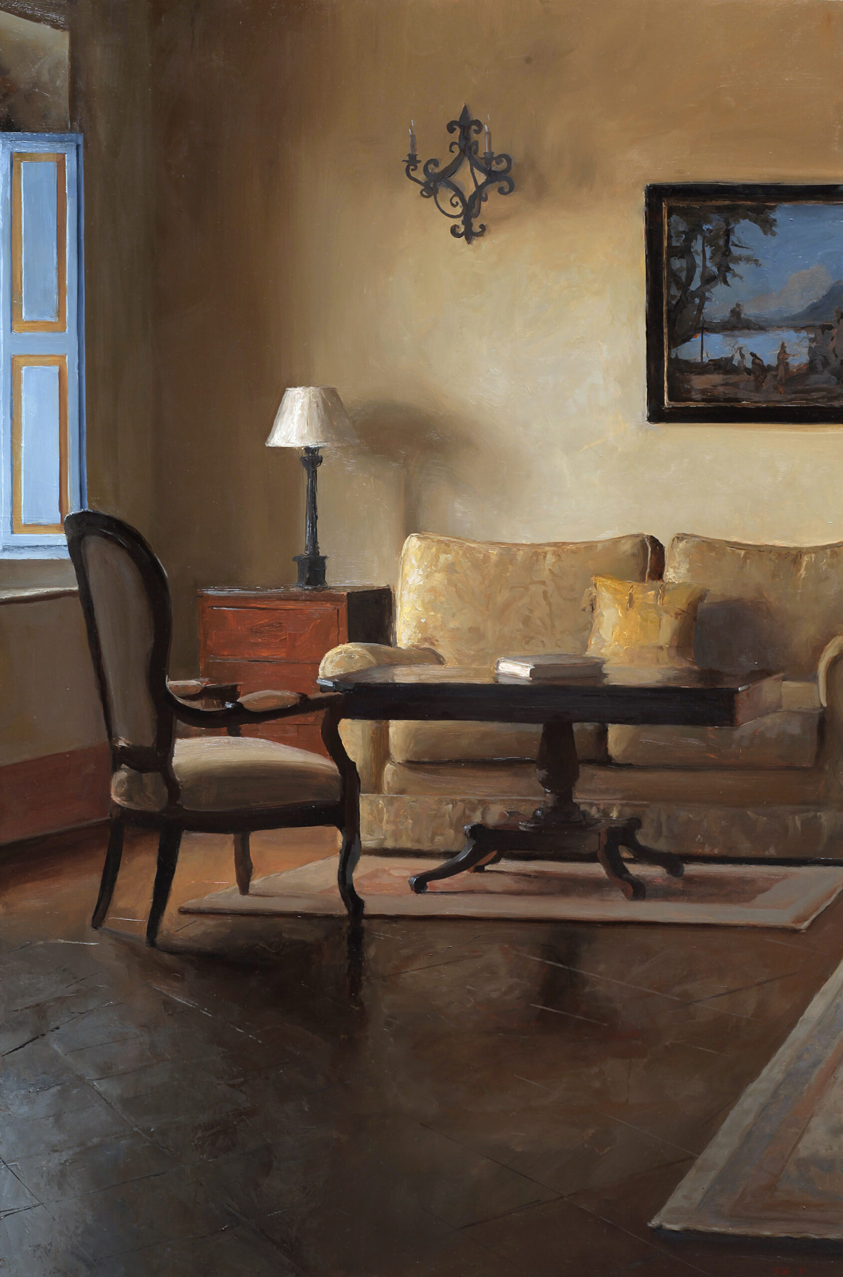
Sight-Size for Studio & Plein Air Painting
A technique I use constantly is sight-size. I learned this at Charles Cecil Studios in Florence. A lot of schools teach this technique as an invaluable tool for portraiture, but I apply it with great success to interiors and landscapes as well. Sight-size is a system of proportion where you view the subject in a one-to-one scale with your painting.
For my on-site interiors I’m often at a house that is not my own, and quick, concise execution is necessary. With sight-size, the drawing issues and color issues are laid out before you.
I also have a small mirror in my kit so I can look at both subject and painting backwards or upside down in order to achieve a fresh eye.
It is also crucial that you have a good source of light for the painting you’re working on in the field. If you see the most gorgeous interior, but you must set yourself up in a dark corner to paint it, you’ll struggle seeing your own canvas and palette. Painting is difficult enough without hindrances.
Steps of Gray
Another necessity for my field and studio work is pre-mixing colors for my palette, especially grays.
When I studied for a short while with Frank Mason at Art Students League in New York I learned a very specific aspect of painting: value control. What was interesting about how he taught value control was that he separated value and color decisions. He had students mix out 12 steps of gray from white to black. Above that you would put out a full range of colors, arranged by value.
In this way, the students could see each color as a value. For example, the light grays corresponded with the cad yellows; mid-tone grays with cad reds and yellow ochres; dark grays with burnt siennas and blues. So, to neutralize a color, one could add grey at the appropriate value, as opposed to adding the complement and white.
This opened a window for me, a sort of moment of clarity. It was an easy way to control temperature in a certain value range. Gray highlights made sense to me in indirect natural light. It was a way to de-saturate colors in the highlights and shadows.
I learned this aspect of value control when I was broke, living in New York, and painting in the living room of my prewar flat. Overcast gray light poured through the flat—the kind of light that held that quiet, frozen quality of the Dutch painters I love. With control of gray I could articulate the temperature shifts in saturated midtones as well as the de-saturated highlights in the reflections. I used the rooms in my flat as a large still life.
These days my palette is limited, and I arrange it by value.
I place a few grays and warm neutrals in with my colors from light to dark. I will also use a few high-key colors—all in the interest of accelerating field work. Speed can be very important when working from life outside the studio—depending on your itinerary, some locations may only be available to you once, and light conditions are fleeting. By premixing grays and neutrals one can eyeball values and establish color relationships very quickly, and get on to the more interesting nuances of oil sketching.
Specifically, I’ve found Gamblin’s Portland Grays to be useful for pre-mixed grays, as well as Old Holland’s Scheveningen Warm Gray for a rich dark gray. As for warm neutrals I
use Old Holland’s Warm Gray, Holbein’s Yellow Gray, and Schmincke Norma Warm Gray. My high key colors are Old Holland Naples Yellow Reddish and Blue Gray, as well as Windsor and Newton’s Jaune Brillant. • K.H.
Have you ever traveled to another country for plein air painting? Tell us about it in the comments below!
Transform your skills at the next Plein Air Live online art conference! Plein Air Live gives you invaluable insights and live demonstrations from some of the world’s best plein air artists. Over the course of 3-4 exciting days, they’ll reveal unparallel techniques to improve your use of color, light and shadow, giving you the confidence and skills to paint outdoors and create more amazing artwork than you ever have before. Learn more at PleinAirLive.com.
Browse more free articles here at OutdoorPainter.com
Blog post prepared for the web by Cherie Dawn Haas, Editor of Plein Air Today


