

By Thomas Jefferson Kitts
(Featured in Artists on Art magazine, Issue 31, September/October 2018)
What Makes a Sorolla a Sorolla?
Was it his incredible draftsmanship? His bold handling of paint? His choice of sympathetic subject matter? Certainly all three contributed to his masterworks. But any time two or more outdoor painters get together to talk about Sorolla they always agree on one thing: his mastery of strong sunlight.
The phrase “Painting the Color of Light” (also the title of my new video on how to paint like Sorolla) is a poetic way to convey the more scientific expression “Painting the Temperature of Light.” Why? Because different sources of light can be quantifiably measured and verified to be either warmer or cooler — and when both temperatures are present in a painting each accentuates the other. Sorolla understood this idea and used it to great effect in his outdoor work.
What is Color Temperature?
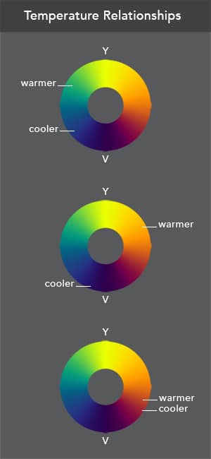
In terms of paint, temperature has nothing to do with an isolated color. A single hue such as yellow, orange, red, violet, blue, or green is not inherently warm or cool. Color temperature is established by the relationship between two (or more) hues. One hue will always appear warmer or cooler than the other when both are viewed in close proximity. To what degree the hues are warmer or cooler depends upon where they on the color wheel. How close they sit to yellow or violet determines how warm or cool they are (see above).
The French Impressionists discovered this principle while painting snow outdoors on a sunny day. They observed the snow in sunlight was heavily influenced by the temperature of the light that illuminated it. They also observed the same snow in the shadows appeared cooler due to the influence of the blue skylight from above. From that one observation they extrapolated the same warm/cool color relationships must exist in everything else they saw and voila, Impressionism was born! It really was that simple.*
(*Of course, the guiding principle of warm lights/cool shadows only applies to painting outdoors on a sunny day. If you are painting on a overcast day the temperature relationship flips. The color of light inverts and you will see cool lights and warm darks instead. But an explanation for how and why this is so will require another article, and another day . . . .)
[Learn more about color temperature in the article “Impressionism, Sorolla, and Painting the Color of Light; Seeing, understanding, and learning how to use color temperature in your work can elevate a so-so painting into a work of art,” by Thomas Jefferson Kitts. Available in Artists on Art magazine, Issue 31, September/October 2018.]
The Color of Light Modifies How We Perceive Local Color
The temperature of the light that illuminates our subject either pushes the local color towards yellow, or toward the violet. This does not mean all local colors become yellow or violet, it means the position a local hue once occupied on the color wheel is changed.
For example: The local color of a red hat in warm sunlight will appear to be slightly pushed towards the orange, and the same local red in a shadow will appear to be slightly pushed towards the violet. The shadows won’t be just darker in value, they will appear to be more violet. This is true for every color we see when we paint outdoors in direct sunlight.
Okay, so how do you apply this principle?
When you examine Sorolla’s plein air work you often find he exaggerated this warm/cool division to achieve a dramatic effect. He pushed the local colors in his lights more towards the yellow than they actually were. You also find he pushed the local colors in his shadows towards the blue or violet more than they were. This temperature exaggeration, coupled with the high contrast between his light and shadow masses, is largely responsible for his ability to create a sense of intense light on his canvas. The temperature division also creates an optical color vibration within our eyes. This vibration is called “Simultaneous Contrast in Hue” (google it!), and it causes us to perceive contrasting hues in close proximity to be more intense than they actually are. In fact, the Law of Simultaneous Contrast in Hue was one of the founding ideas that launched Impressionism.
However, as we continue to study Sorolla’s work we discover numerous exceptions to the warm/cool principle. (Nothing about painting is ever simple, right?) But when you find an exception it turns out to be something easily explained.
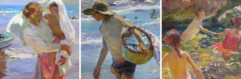
Not all light bouncing into a shadow comes from the sky. Some light bounces into a shadow from a different direction all together. And the color of that light is often modified by the surface it reflects off of.
For example, in the left detail of Sorolla’s painting, sunlight is bouncing up from the beach below, warming the underside of the mother’s arm in the cool shadow. In the middle detail, warm light can be seen bouncing up from the beach again, and reflecting off the inside of a basket on to his forearm. (You can also see cool skylight modifying the top of his arm.) On the right, multiple temperatures of light from many directions are bouncing into the painting: sunlight and skylight from above, light off the faces of the cliffs, and yes, even bouncing up from the sandy bottom below the waterline. In all three of these examples the light bouncing into the shadows is so strong it overwhelms the sun and skylight coming down from above. So exceptions do exist to the warm light/cool shadows principle. And when they occur, in comparison, warm sunlight can appear to be cooler.
Tricky, yes? Well, not really, once you start looking for this principle and any exception in real life. Most warm/cool temperature relationships can be observed within the shadow masses of your subject while you are out painting en plein air. (Don’t bother looking for it in photographs. The camera seldom manages to capture such nuances.) Now that you understand why different color temperature exists you will start seeing them everywhere. And of course, once you see it, and incorporate it into your own work, you will be painting the color of light.
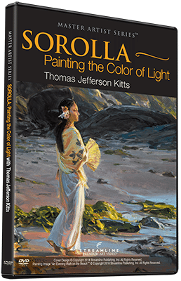
Sorolla: Painting the Color of Light
My Sorolla video is packed with information about how you can learn to paint the color of light. I began working on this DVD set five years ago when I started traveling to see Sorolla’s masterworks and where he painted. This 15-hour video is a stroke-by-stroke demonstration with extensive explanations of what I am about to do, and explanations as I do it. Nothing has been held back, and nothing has been dumbed down. I also cover additional topics in equal detail — such as how Sorolla mixed and applied his paint, how he altered, edited, and simplified his subject matter, how he used his brush at the beginning of a painting, and how he used it at the end.
To learn more about me, my work, and my classes, or read more of my free writings, visit www.thomaskitts.com. I’d love to hear from you.
Preview “Sorolla: Painting the Color of Light” here:
Like this? Click here to subscribe to PleinAir Today,
from the publishers of PleinAir Magazine.


