

“If people start looking for color in the shadow, they will see it,” says Mark Fehlman, one of the featured artists at the Plein Air Convention & Expo. “If they stop and look, compare things, and consider what they want to emphasize most, they will get a lot more out of their observations.” How does Fehlman actually accomplish that?
Find Important Information in the Shadows*
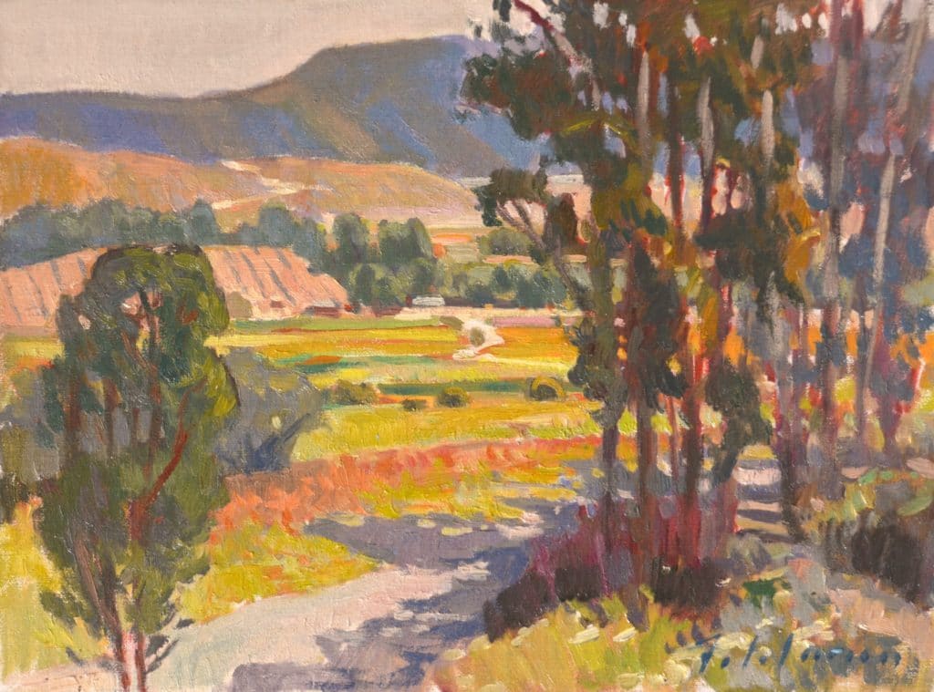
There are two more big factors in Mark Fehlman’s use of color in shaded areas of a scene: his location and his working method. The artist lives in San Diego, and as a result, he doesn’t “deal with overcast skies much.” He anticipates similar lighting conditions in Santa Fe when he participates in the April convention. “The bright and abundant sunshine of Southern California certainly encourages an artist to create high-key paintings that utilize the colors from reflected light,” he says.
Fehlman paints en plein air frequently, even if just for color reference for studio paintings. Cameras have a notoriously difficult time capturing the color in shade, even when one “calibrates” the photo by taking one version slightly overexposed, one version underexposed, and one version normally exposed. On location, the subtle colors are more discernible by the human eye.
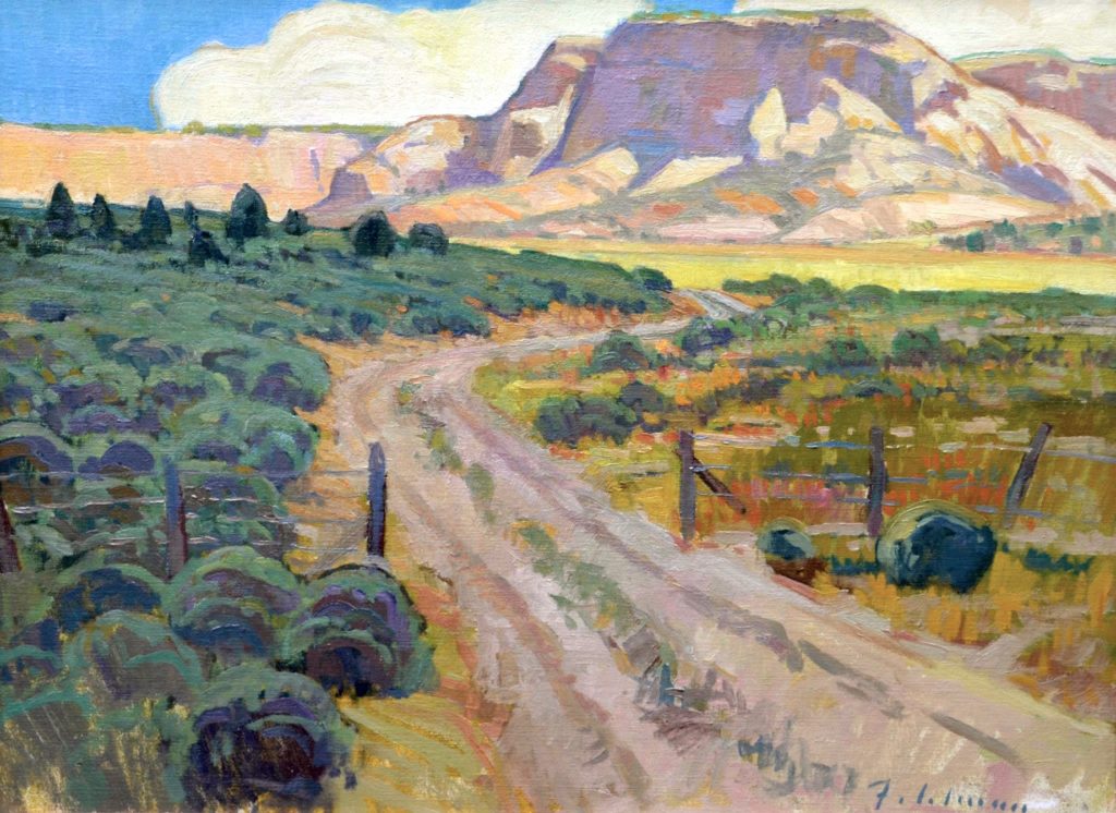
“I am attracted to strong light and dark values,” says Fehlman. “And my training says the approach to shadows should be to pay attention to the tremendous color variations and color temperatures in shadow shapes. You get that most when there is a lot of bright light out — it reflects into the shadows. A white house in shadow gets the reflected green of grass and the blue sky, for example. I think there is the greatest opportunity for color variation in the shadows. Photos can’t capture the information. In photographs the shadows are really dark. You can’t get that wide of a variation in them.”
Fehlman points out that in some locations, the color in shadows is almost the saving grace in the scene. “Most people think of desert as having darks and lights, but what is so fabulous is the reflected light in the darks, in the bushes,” he says. “The shadow side of a vertical cactus has a lot of ground color reflecting at its bottom, and sky color near the top. The reason I paint high-key is to enhance and emphasize these kinds of color temperature in shadows.”
Fehlman explains that an important part of painting a high-key piece is using values effectively to showcase the lightest lights in a scene. “If it is all light, it doesn’t seem very light,” says the artist, “but put a dark shape next to or behind it, and it seems really light. It’s all relative. As long as you put something darker next to it, the comparison shows how bright it is. Try it — paint the lightest light, and see that if you paint the next lightest light next to it, you don’t see the lightest light as that bright.”
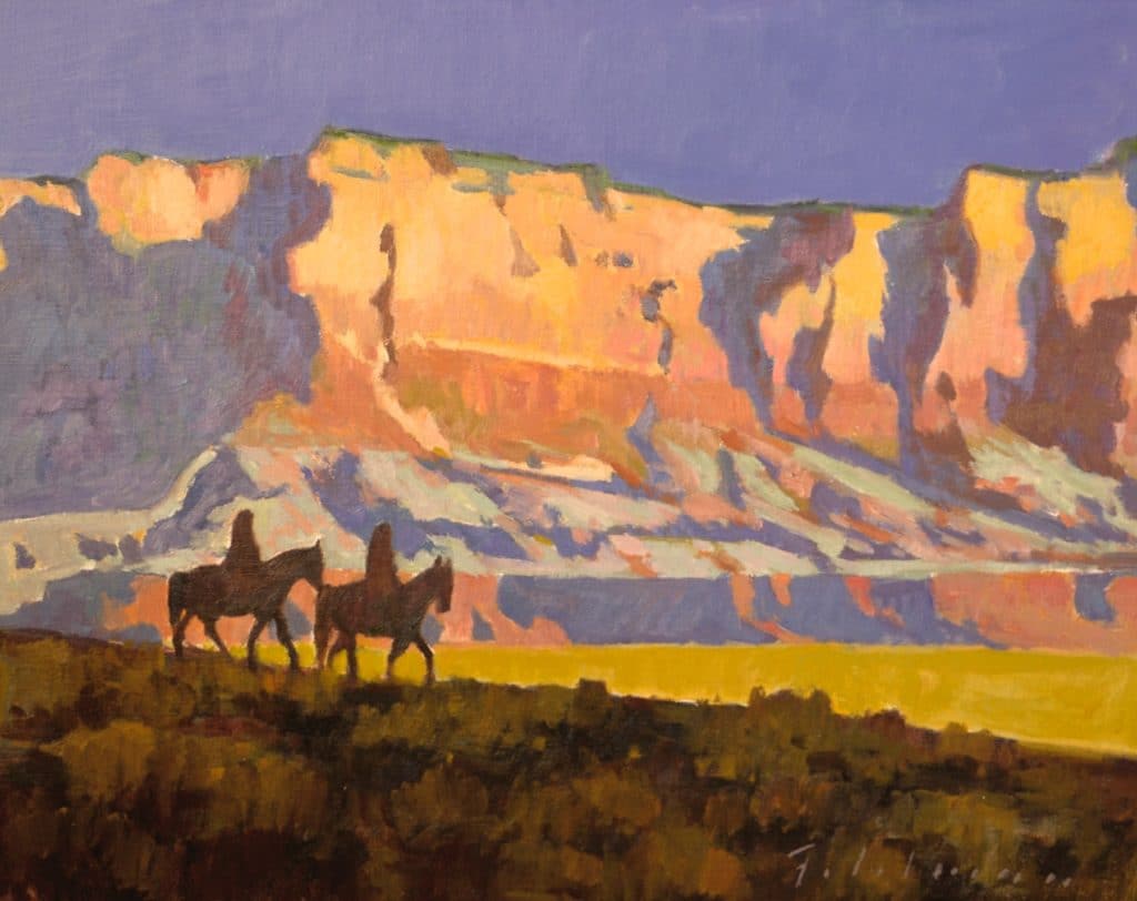
Of course, none of this works if the composition doesn’t have a strong dark-light pattern. There are no colors in the shade to explore in a scene where there is no shade. “So I look for scenes that have strong dark and light patterns,” Fehlman says. “You can’t just go out there and paint. You have to find patterns that allow you to create a strong composition. When painting in a high key, I often I find the darkest dark, and paint that in at about a five value. Then I work from there — it can have more color to it in that key.
“You have to get that dark pattern of shapes down first, then leave room for the light. As you know, you really have to think about where your values are, then stick with them. When a painting has lost its strength, you often have to reestablish the darkest darks. The more you paint on a canvas, the more you pull the values together and narrow the value range.”
Like a building with durability, a painting starts with a strong foundation. For Fehlman, this means thumbnail sketches. “I take a notepad, and rather than use a thin pen, I use big markers so I see shapes rather than lines,” Fehlman says. “I want to see three values — the paper color, and two others. I really try to see it in a three-value system, to visualize it as if it were colored construction paper cut out to see iconic shapes. I’ll try different approaches in several sketches. I’ll move the horizon line higher or lower. I’ll do one with the major element on the right third and one with it on the left third. I’ll try those compositional arrangements in different value relationships. I always feel that if I see it, I can tell which one is the best. It’s harder to simply visualize it without seeing it. Like holding paint samples up to a wall, I can immediately tell which one is best.”
Fehlman knows that sometimes the best way to really see a color is to compare it to another. He paints his high-key paintings on untoned, white canvas to keep them bright. He reminds students that if they compared the darkest dark in a sunlit scene to a piece of black cardboard, they’d see that the darks in the scene are much lighter.
*The text of this story is adapted from a feature article written by Bob Bahr for the May 2017 issue of PleinAir.


