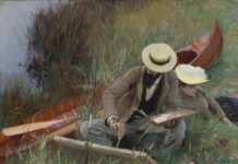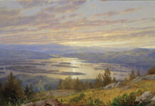
Gayle Levée was making a point in one of her classes, and it inadvertently led to a new style of painting for her, one in which color temperature is paramount in her underpainting, thus enhancing the sense of light.

Setup for “Clover Meadow”
Many artists are familiar with the concept of painting an underpainting in the complement of the local color. When the local color is put on top of the complement, with a little bit peeking through, the picture plane is activated in an interesting way. For example, painting foliage in a reddish tone, then putting the local color of green on top of it, creates an interesting effect. Levée approached this differently, stressing the color temperature of areas, then putting the local color on top of this temperature. For example, a shadow area on a building is simply painted in cerulean, then the local color is scumbled over that cool tone, ensuring a sense of the cool in the shadows. Conversely, areas in sunlight may get painted in cadmium yellow light, with the local color scumbled over this warm, low-value tone. “I put a layer of bright color underneath that shows what’s happening with the light, then I put the local color on top,” she says simply.

“Clover Meadow,” by Gayle Levée, 2013, oil on panel, 11 x 14 in. Collection the artist
The effect is apparent in paintings such as “Open Gate,” where the local color is white. We’ve all been reminded many times that rarely is white in our world true white, tube white. Levée seems particularly thrilled with white elements in a scene, as it gives her a chance to play with color temperature and all the other interesting effects of light. “I enjoy white structures because they reflect the sky and everything around it,” says the artist. In response, Levée does not hold back on the chroma.

“Nature’s Garden,” by Gayle Levée, 2013, oil on panel, 8 x 10 in. Collection the artist
“In ‘Open Gate,’ the building was made of pinkish gray stone,” recalls Levée. “But on the lit side, I first painted it with cadmium red mixed with white. The shaded areas I painted purple — alizarin crimson with a bit of ultramarine blue and white. The chimney on the far end I painted almost pure blue to give atmospheric perspective.” The artist says there are moments when this exaggerated color scheme gets confusing, but all it takes is a bit more concentration to hold it all together. “It looked like I was wrestling a bear to fellow artists witnessing me doing it,” she says with a laugh. “And when I have to go to local color and reflected light, it can be a bit disorienting. But it does get better.” Levée notes that although the color change takes some getting used to, her approach does ensure one thing: She doesn’t chase the light. Putting those unusual color notes down establishes the dark-light pattern and makes it exceedingly unlikely that the artist will move shadows as the sun journeys across the sky.

Underpainting for “Splash”
This new approach to painting came to Levée quite by accident. She was painting demos in her class, showing students how they could push color away from realism, and emphasizing temperature. She soon found herself painting this way outdoors, and then it crept into her studio work. (Levée says it is a lot easier to paint this way indoors, when one has the time to slow down and concentrate.) When the recession put a bit of a crunch on her painting sales, Levée found herself open to some new ideas. Somewhat to her surprise, these paintings of high chroma scumbled over with naturalistic colors sold very well.

“Splash,” by Gayle Levée, 2013, oil on panel, 18 x 24 in. Courtesy Powers Gallery, Acton, MA
Levée says she puts three coats of acrylic gesso on her panels using a wide housepainting brush, and this more absorbent ground helps, as it allows the underpainting to seep in and lie down underneath the local color.


