

For Scott Gellatly, collecting art is about personal connections. Which three paintings did he pull from his burgeoning collection?
“I think that as a collector, when you have a personal connection with the artist, that always heightens the love of a particular painting,” says Gellatly, who is a painter and also the product manager for Gamblin Artists Colors. “That certainly holds true for these three paintings. All three of these represent great connections with the artists who did them, and great stories attached to them.”
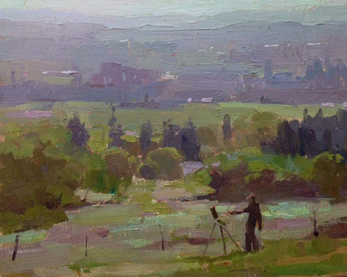
“Rough Day at the Office,” by Aimee Erickson, oil on panel, 8 x 10 in. Collection of Scott Gellatly
First up is a piece by Michael Chesley Johnson. “I bought this in 2009,” says Gellatly. “He was one of the artists I was working with when I was developing the FastMatte Colors with Gamblin. He was an early beta tester for that line and was instrumental in giving early feedback. He did this particular painting solely with the FastMatte colors, and when he posted it on his blog I snatched it up immediately. In particular, one of the things I loved about it was the moodiness — but with a great singularity. That’s one of the things I strive for in my own paintings. This small piece really nailed it for me. It has an interesting color combination, and a nice variety of mark-making. I loved the composition, that leafless tree emerging from the background with this great gesture, with a few hints of cleaner, sharper mark-making.”
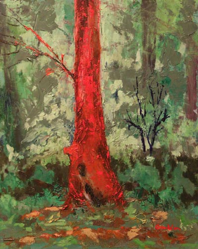
“Lover for Tryon Creek,” by Robert Gamblin, oil on panel, 11 1/2 x 14 1/2 in. Collection of Scott Gellatly
Next is a painting that shows Gellatly painting. It’s by Aimee Erickson. “She and I and other friends in Portland were painting in Oregon’s wine country,” recalls Gellatly. “I was working on a piece for a few hours and Aimee was painting up the hill from me. I had no idea that she was incorporating me into her painting. Usually I think pictures of painters painting other painters are kind of cutesy, but I think she just totally nailed it. She captured the atmosphere of the location perfectly, and although the figure is an inch and a half tall, she captured my pose perfectly. I kind of lean back when I paint. I like the glint of light on the baseball cap, on just an almost stick figure. As Gertrude Stein said about Picasso’s portrait of her, ‘To me, it is I.’ I feel the same way with this painting. I don’t want to see me any bigger in a painting. She really nailed that sense of the atmosphere; she captured that grayness that is violets and yellows without becoming just gray. I walk by that painting every day because it is in our living room, and it stops me dead in my tracks every time.”
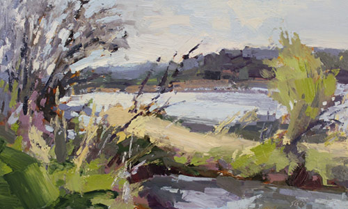
“Wetland in Spring,” by Scott Gellatly, oil on panel, 10 x 15 in.
The last is a painting by his boss, Robert Gamblin. “Robert gave this to me about five years ago,” says Gellatly. “Obviously we have had a really close working relationship for about 11 years. To know him as a painter is to know him as a color man. It comes through so clearly in his paintings. He has lived his whole life thinking and working around color. He puts so much emotional content into his color choices. Thinking of all of that, with the challenge of painting the very dense, green forests that we have here in Oregon, to break the monotony of green in that dense canopy, he applied this kind of emotional resonance to a single tree against that backdrop — I couldn’t see Robert Gamblin paint this scene any other way. He has always had a strong feeling for that warm red. That is the Gamblin red that we use in our logo. Look at the play of complements and the singular quality of the tree in that background. It’s just a great, strong piece. He took one tree and made it visually iconic. It’s like a painting of the Eiffel Tower. Not every painter would think to do it, or would execute it in that powerful of a way. He draws a lot from nature, literally and figuratively, and yet it goes beyond plein air painting.”


I have REALLY enjoyed reading this. Thank you!