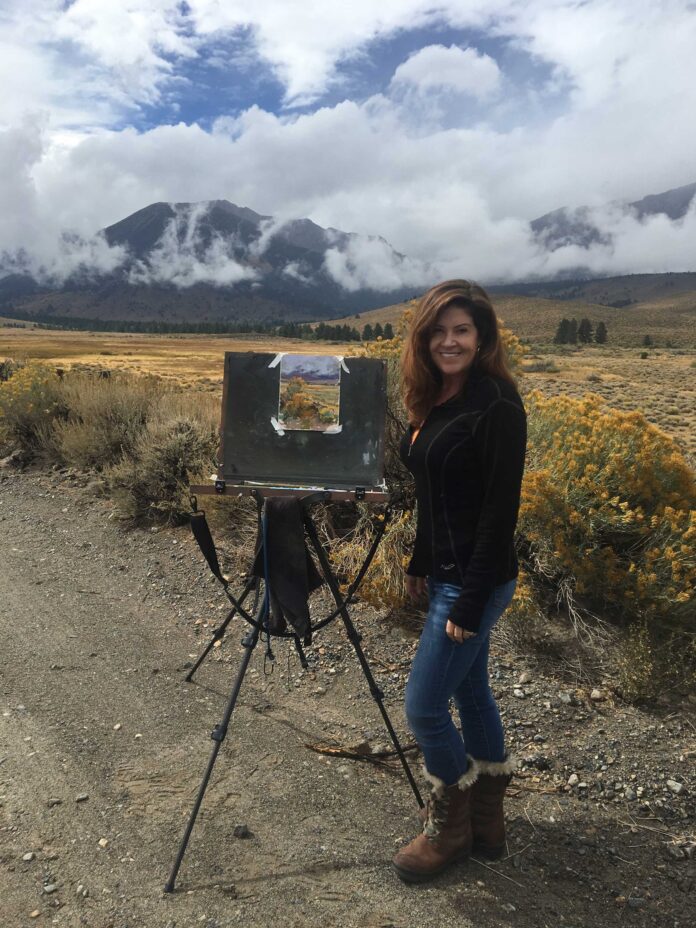
Surrounded by the sights, sounds, and smells of nature, California artist Kim Lordier balances light and dark to create dynamic pastel painting compositions.
Article by Robert K. Carsten
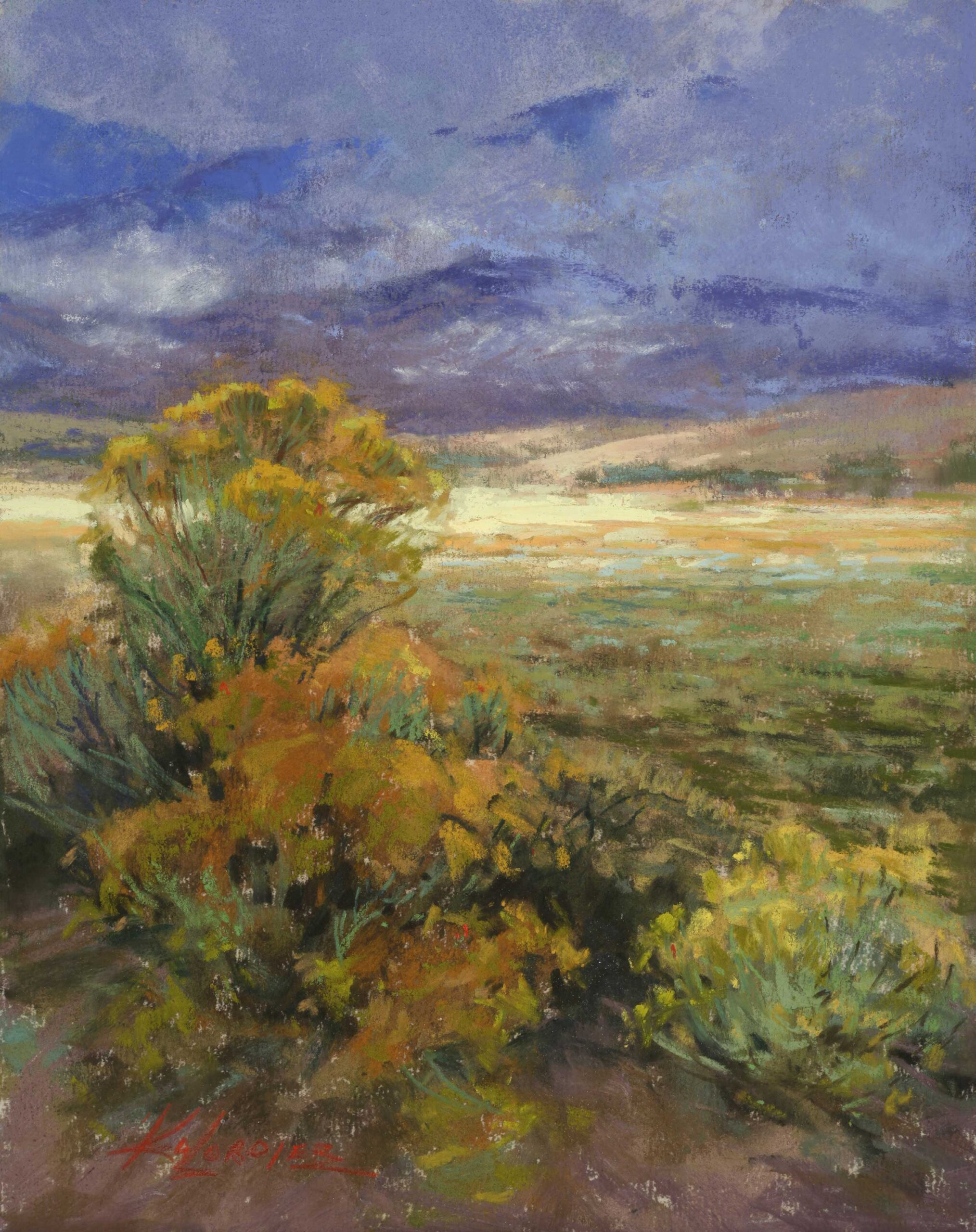
There’s nothing in the world like plein air painting!” says Kim Lordier (kimfancherlordier.com). “I cherish those experiences I have when I’m standing in front of nature and reacting to what I’m seeing. Just being outside and feeling the power of Mother Nature is my greatest inspiration. Since I live in a noisy, busy suburb, I crave the sensation of having my feet firmly planted on the earth, or my toes sunk deep into the sand at a beach and hearing the force of the waves as they crash against the rocks. I’m easily enchanted by the scent of air perfumed by freshly tilled earth, and in autumn, by the smell of tarweed. Experiencing the poetry of life in the great outdoors is what compels me to set up my easel and paint. My muse will forever be the landscape.”
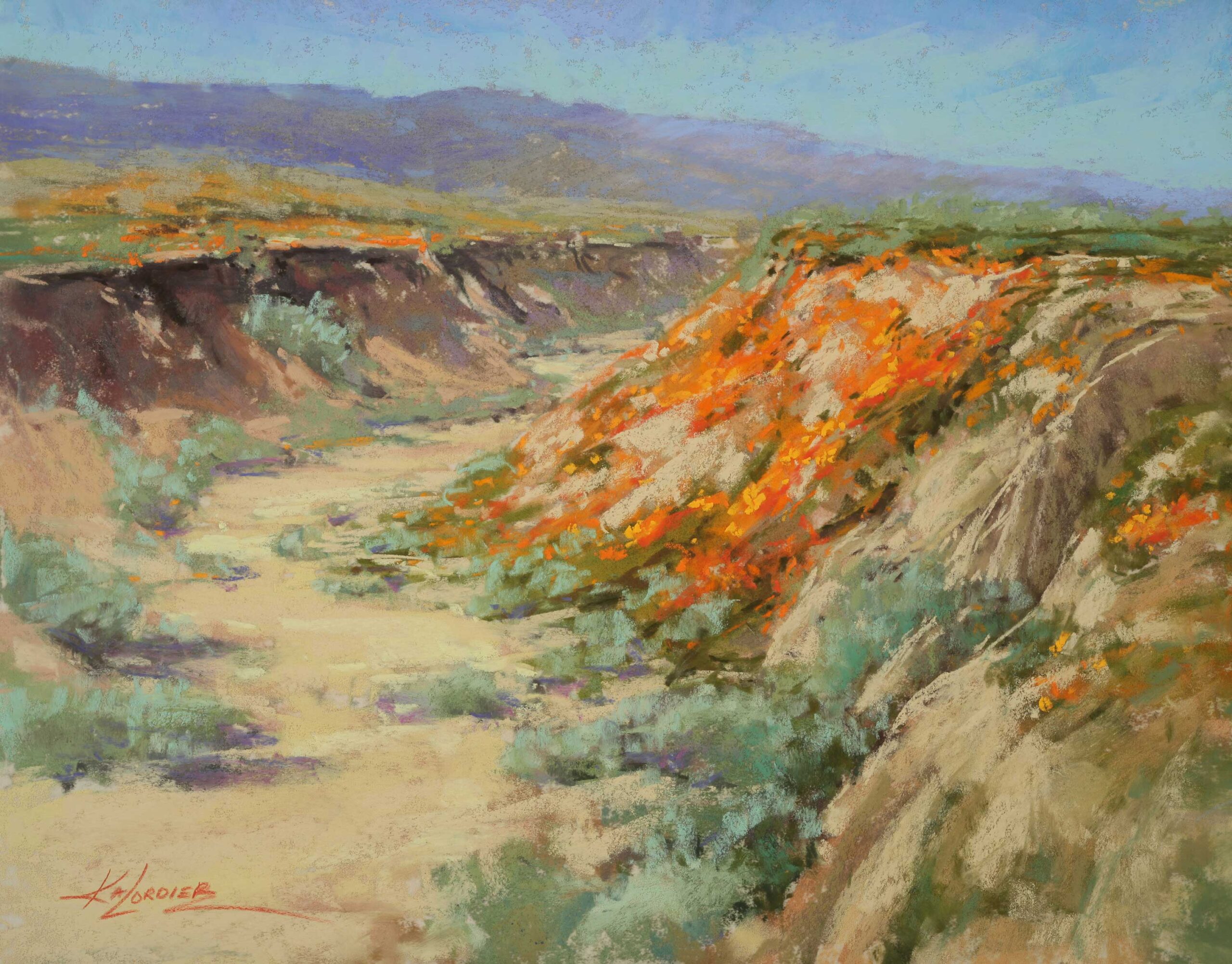
Kim’s Pastel Painting Design and Process
“I used to describe my work by saying it’s the light on the landscape that inspires me,” Lordier says. “Now I’ve come to realize that it’s the balance of light and dark — the power of the notan — along with the challenge of developing beautiful colors and textures within those shapes that intrigues me.”
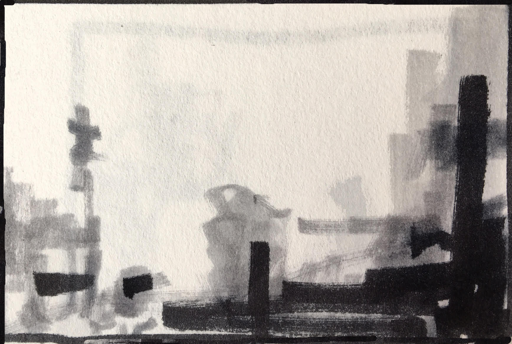
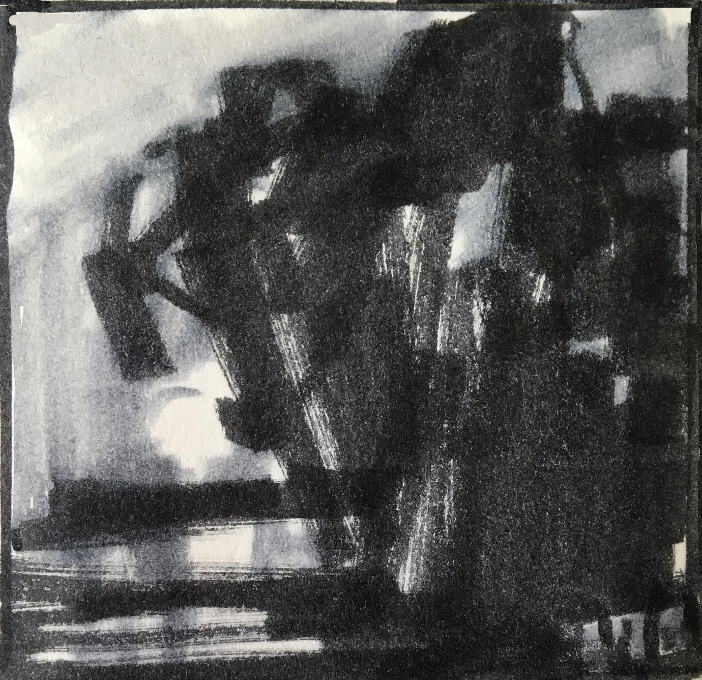
To begin her design process, she often uses three Tombow markers to quickly make small notans of her subject using no more than four values — light, middle, dark, and the white of the paper. “Notans simplify the scene like a poster. They’re roadmaps that enable me to see the main shapes and how to organize the values in support of a dominant one. Once I got hold of this idea through practice, I started seeing the world, painting-wise, in patterns of light and dark shapes.”
Naturally, Lordier’s artistic process has evolved over time. For a while, she began with a monotone underpainting of gray violet #244 NuPastel, washed in with Turpenoid and a large hog bristle brush. “Then I got adventurous,” she quips, “using Prussian blue #395 instead. At one point, I felt that I was relying on underpainting as a crutch, so I painted directly instead. Recently, I’ve been using a color field-type underpainting to introduce a bit more color, especially on larger works. It’s not for color harmony, though — it’s done more to get a value laid down. If I’m painting a bank of green trees, for example, I’ll wash in a blue green of mid-value so I can overpaint with my darks and lights. For the lightest colors, I’ll initially leave the tone of the paper showing through.”
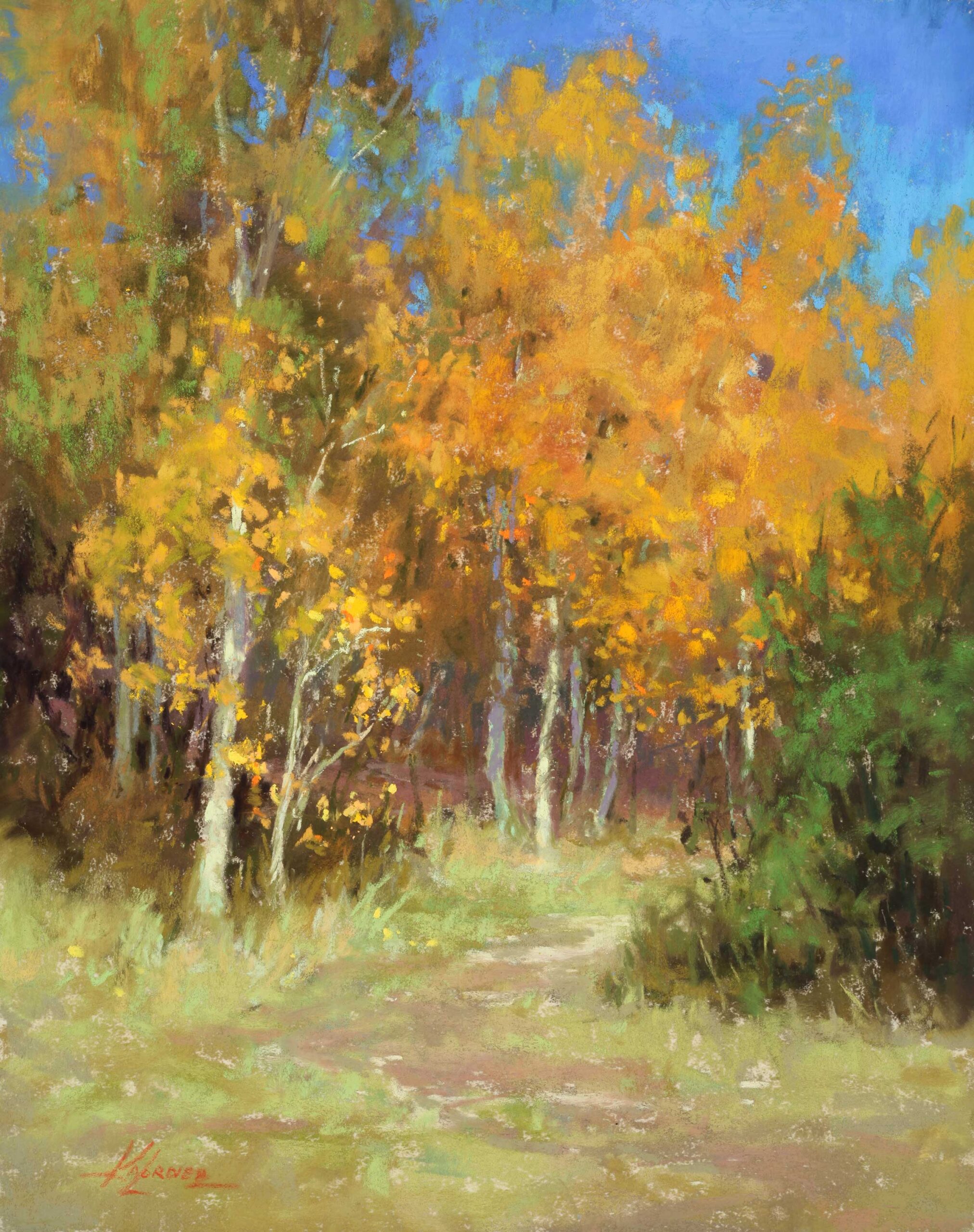
Lordier works on UART 320- or 400-grit sanded paper in sizes 8 x 10 to 16 x 20 inches in the field, and up to 30 x 40 inches in the studio, all of which are first dry-mounted to foamcore or gatorboard. On location, the artist uses an All-in-One easel by Stephen Sauter, which she equips with many brands of pastel, though Terry Ludwig and Unison are her work-horses. The artist prefers to develop a painting by simultaneously working all over the surface rather than in just one area at a time. Other than creating the underpainting in hard pastel, she freely alternates among hard, medium, and soft pastels throughout her process.
***
For more insights with Kim Lordier, watch this episode of Art School Live with Eric Rhoads:
Go from feeling afraid to show off your work to being proud of your pastel painting skills in just three days. Join us at Pastel Live, the world’s largest online art training event, August 17-19, 2023.
And browse more free articles here at OutdoorPainter.com


