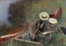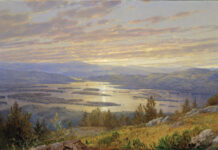
Getting the values correct is key to a strong composition and painting, but seeing the values and mixing the right hue for the local color can be difficult. A teacher at the Art Center College of Design, in Pasadena, California, made two diagrams to help people master the concept. The diagrams have been popping up on Facebook within the art community.

A second diagram from Schaefer delves further into the effect of light and shade on local color.
Alex Schaefer says he has been working for a long time at a “grand unified theory” of color, and these diagrams are part of his effort. “No one taught me this in school, but it came to me over 10 years of studying painting on my own,” he says. “This ‘algebraic’ aspect to how the ‘illusion’ of light is created in representational painting I believe to be one of the most important ideas to have clear in your head. It is the ‘missing link’ that most people who go to a school never get taught because their teacher doesn’t understand it clearly! As Matisse said, in painting there are ‘literary’ ideas and there are ‘pictorial’ ideas. Most art schools today, especially ‘fine art’ schools, are overrun with literary ideas and teachers. The illusion of chiaroscuro created with paint is still a pictorial idea, and I teach it very clearly to students in my painting class at the Art Center College of Design.”


