

Recently on the PleinAir Podcast, Mark Boedges told us about the color charts he uses when painting landscapes en plein air (and much more — listen below!). In this guest blog post, Mark shares his charts so you can be prepared for your next landscape!
The Color Charts — What Are They Good For?
BY MARK BOEDGES
(markboedges.com)
Color theories and the dense language that often seems to go with them are great, but when painting from life, where the subject and all of its colors are there before you, what you really need is a stripped-down, easy, and practical way to identify a color and to find the most efficient way to mix it and match it.
Enter the color charts.
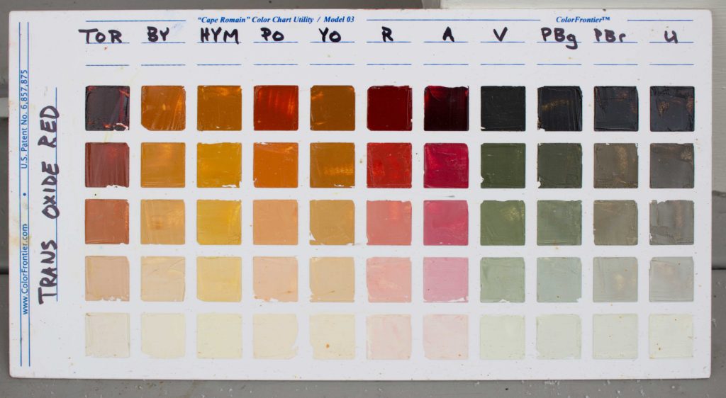
The color charts are not a color theory. While certain notions about color, like color harmony for example, might be gleaned from the charts, their primary benefit is as a guide to all the colors you can make with the pigments on your palette. Keep in mind that they are just a guide: I made 11 charts, each with with 11 columns and 5 rows, for a total of 605 squares. Clearly I can make far more colors than that.
The two most important things about the charts are these: You must make them yourself, and you must use them when they are finished. Let’s start with the first.
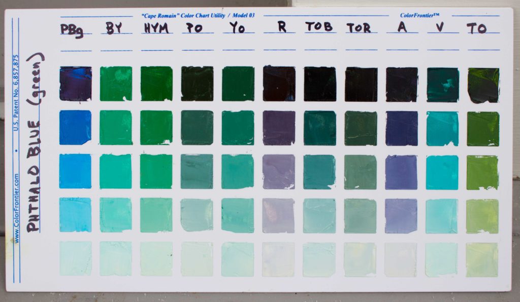
Foremost, these charts are a mixing guide, and the process of making them will teach you how your pigments behave together. Very quickly, for example, you learn that you only need a minuscule amount of Phthalo Blue in most mixtures. And look at that Phthalo Blue chart! Phthalo blue is often seen as an overly intense color, but those are beautiful colors on that chart, and they could easily be used in many paintings, so long as you clearly understand from experience how to handle the mixing — an experience you can gain by doing the charts.
How to Make a Color Chart
Each color on your palette gets a chart. The first column on each chart is simply the color mixed with white for a nice 5-step gradation of value. The top row has no white, the bottom row is mostly white. Each subsequent column is the main color mixed with another color on the palette (and white), such that the main color is 75% visually dominant — meaning, for example, each column on the Phthalo Blue chart clearly leans toward Phthalo Blue.
In practice I have learned that a precise and well-spaced value gradation is NOT the most important thing. Instead, the most important thing is making sure all the columns are weighted, visually, to the main color to the same degree. This produces a nicely harmonized chart that allows you to more easily see how each color changes the main color in its own way.
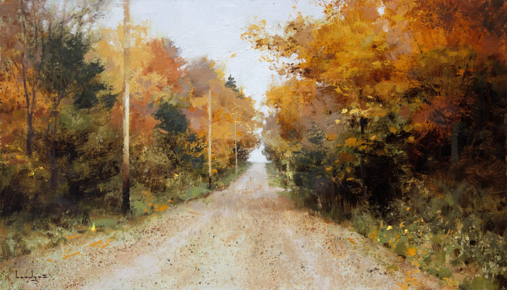
The second thing you must do is use them. When I paint, one of the first things I do is hold up my charts one by one, comparing the three to five main colors in the subject with the squares on the charts. What often results is that one to three charts contain most of the colors in my subject. For instance, in the painting “Country Road” (above) nearly all the colors fell on the Transparent Oxide Red chart. This presented a very clear harmony.
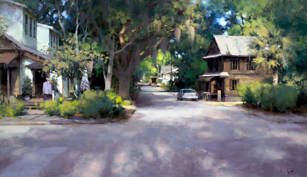
In “Down Lawrence Street,” three charts were needed: Transparent Oxide Brown, Ultramarine Blue, and Hansa Yellow Medium. Then, having identified my primary chart(s) for a painting, I proceed to match colors in the subject to squares on those charts as I go, continually holding up the charts in front of the subject and making a direct comparison.
Color Harmony in a Landscape Painting
Very often a color in the subject does not match a square exactly, on any chart. Remember I only have 605 squares, but I can perceive millions of colors from life. This is where things get interesting. In many cases I may choose to use the color on the chart instead of mixing the color in the subject exactly as it is. It certainly depends on how close the square is to the color in the subject, as well as many other considerations, but doing this can tend to create a stronger harmony in the painting. And what’s nice about doing it this way is that harmony becomes less about some elusive and ill-defined subjective concept and more about simply pushing individual colors toward a color chart that has an inherent harmony that you can leverage to great effect.
In reality, when I paint I rarely take all the charts with me — that would be cumbersome and unnecessary. For instance, in winter in Vermont I can comfortably leave the Viridian chart at home, along with the Hansa Yellow Medium chart and several others. I know ahead of time which ones will be relevant. And despite the last paragraph, I do not use the charts over the course of a whole painting. I use them at the start, for sure, and then as it becomes clear that most of my mixtures will feature one to three of the same pigments in varying proportions I put the charts down and let it rip, occasionally referencing them later in a painting when ambiguity or uncertainty about a color choice arises.
If you use more than 11 pigments and you want to use the colorfrontier.com charts, which have only 11 columns, you must make some decisions about which 11 colors go on each chart. For example, I use Phthalo Blue Green Shade and Phthalo Blue Red Shade and I made a chart for each. But while these colors are different enough to warrant having both on my palette, I couldn’t conceive of a situation where I would need to mix them both together; they are too close for that. So I left each one off of the other’s chart.
The same is true for Transparent Oxide Red and Transparent Oxide Brown. There’s no need to waste a column on a mixture that will likely never be needed.
And finally I should note that my current charts are not that good; you can see the many mistakes: uneven value ranges, individual column colors too dominant, etc. I joke that with our two small children and the ceaseless work of being self-employed, my choice was not between Perfect Charts or Imperfect Charts; my choice was between Imperfect Charts and No Charts At All — there is simply not enough time for anything else. But even my imperfect charts are extraordinarily helpful in ways I have only begun to elucidate here, and I heartily encourage you to, if necessary, make your own imperfect charts.
Keep painting!
Listen to PleinAir Podcast 148: Mark Boedges on Painting Greens and More >
Upcoming travel and art events with Streamline Publishing:


Good Heavens THAT was so helpful! Thank you Mark!
You’re welcome!
The quality of information in this article (along with other features on outdoorpainter.com) is so helpful. Color charts are full of little surprises. Thank you Mark Boedges!
Can you share what all your abbreviations stand for? Thank you!
Hi Roxanne
Check out my materials page, it’s got all my pigments…the charts are a straightforward abbreviation for each pigment. https://www.markboedges.com/wssupply
Confused, the paintings are all oil and you say the charts are made with white paint, not simply dilluting the watercolors to create value changes?
Are these charts watercolor?
Could you show watercolor paintings please? thank you
Facebook post by outdoorpainter .com
says it’s watercolor but I see from the article that’s not correct
Hi Robin! How embarrassing on my part – I’m not sure why I thought at one point that this was watercolor (even looking at them – I must have been on a tight deadline when posting this!), but the references to watercolor are mine. I’ve corrected it throughout the post to reflect that these charts are done in oil. Thank you so much for letting me know!