
On how to paint landscapes > When we’re learning a craft, there are bound to be times that we make mistakes – we know that this is where growth happens. But there’s something to be said for knowing ahead of time how to avoid certain mistakes from the get-go to make painting less painful and more pleasurable.
Today, three masters of landscape painting – John MacDonald, Carl Bretzke, and Joseph McGurl – share their secrets for fixing the most annoying and common mistakes that artists make.
Learn, enjoy, and grow.
~CherieDawn
How to Paint Landscapes > 3 Experts on Fixing Annoying Mistakes
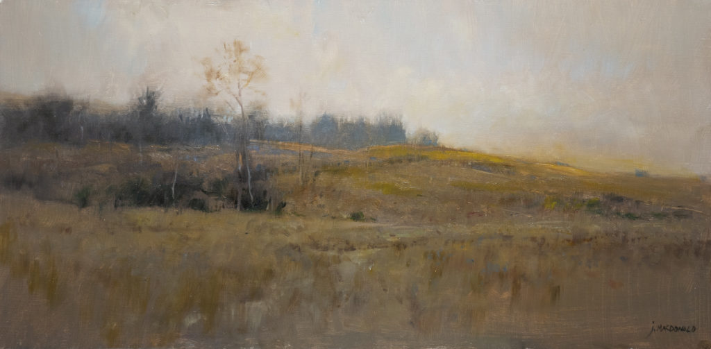
John MacDonald:
The most common mistake I see (besides a general lack of drawing skill) is the tendency to begin a painting by focusing on small things–details–rather than big shapes. Details should be added at the end of the painting process–they’re the icing on the cake. It’s crucial to begin a painting with the composition, which is established by arranging large, flat shapes.
To change the way you see, to move from seeing details and things to abstract shapes, try this:
- Squint. Squinting eliminates the little details and reveals the large shapes.
- Do small tonal studies. Working monochromatically at a small scale forces you to ignore details and see the larger shapes in the scene.
- Begin the painting with the largest brush you have. Work with broad brushstrokes rather than begin a painting by noodling with small brushes.
- If you use reading glasses, wear them while you paint. The canvas will be in focus but the landscape will be blurred–details disappear and large shapes become more obvious.
(Learn more from John in “Poetic Landscapes”)
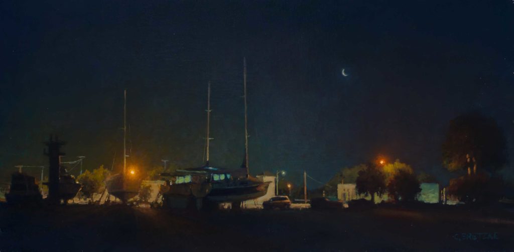
Carl Bretzke:
I still make some of these mistakes even now…
When I first started painting, I would make my darks too light. Mark Boedges once told me something like, if you think you want to make your lights “lighter,” instead try making the darks “darker.” Rich darks in your painting will create improved contrast which attracts the eye and allows for more color in the light areas.
Along those same lines, upright leafy trees are usually darker than you think because you are seeing both the shaded side and lit side of leaves at the same time.
(Learn more from Carl in “Nocturnes: Painting the Night”)
Joseph McGurl:
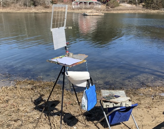
The biggest mistake beginners make is not having the proper plein air painting equipment. I see artists with flimsy easels, tripods, and unworkable paint boxes. This creates frustration, and the painting suffers as a result. The plein air painter must have a good quality panel holder and an all-metal tripod. I’ve found that the plastic parts on a tripod are too flexible and will eventually break. It’s best not to have the paint box attached to the top of the tripod. The weight causes the fittings to loosen, creating an unstable set up. The panel holder should be separate from the paint box. I couldn’t find any products on the market that were exactly what I needed, so I made one to my own design. When an artist knows how the gear will be used, they shouldn’t be afraid to modify or design their own equipment.
Stereotyping color is a common issue when it comes to learning how to paint landscapes. For instance, the trees are green and the ocean is blue. But just how green are those trees? Often the trees are really ochre, gray, purple, etc., depending on the atmosphere and lighting conditions. Consider NOT naming the color. Imagine starting with the color gray, and ask yourself if the color you are trying to paint should be lighter, darker, warmer, or cooler. That’s all there is to it—that one question.
It is vital to have every brushstroke count. I see paintings with brush marks that do nothing— they’re just marks. The marks are either working with you or against you, so think of what that mark is saying about form, texture, and edges and see if it relates to that part of the actual scene.
Landscape painting is often challenging because the artist has to balance form and texture. Too much texture and the form disappears; too much form and the unique surface of the objects disappear. First examine whether the brushstroke is depicting a lighted part or shadow part, and use a color, value, and shape that will help describe the form. Next, determine the shape and edges and apply the paint in such a way that it will help with describing the texture.
(Learn more from Joseph in “Painting Light and Atmosphere”)
Browse OutdoorPainter.com for more advice on how to paint landscapes.


Where can I purchase a grid like the one Joseph McGurl has in his Plein air set up?
Go to his website – $41 + shipping