

On Painting Edges in a Landscape > Edge control is one of several tools which artists use to create quality paintings; but there are 14 governing factors that determine the degree of hardness or softness on the various forms that we paint. These 14 guidelines are the working components of contrast which, after all is said and done, is the one overarching reason for edges in the first place.
The rest of the list are all appendages to number one (contrast):
1 – Contrast
2 – Light
3 – Overlaps
4 – Form
5 – Texture
6 – Moisture
7 – Aerial Perspective
8 – Atmosphere
9 – Local Color and Values
10 – Motion
11 – Peripheral Vision
12 – Highlights and Meniscus
13 – Shadows
14 – Artistic Selection
Let’s take a look at how each of these factors might help you in determining what type of edge to use when depicting objects such as rocks or trees in your next plein air or studio painting.
1. Contrast
I’m going to start off with this idea first because it is one of the grand principles of design and the most important aspect of edges. This is the principle that the rest of the list hangs on. Starting with number two, I cited specific reasons for each of their contrasts, which should be learned in order to help you understand the “why’s” of what you are observing, and help you to identify different edges in nature.
2. Light
Light affects the quality of an edge by how strong or weak the light is, as well as the direction it is coming from. A form which is bathed in very low or diffused light is more apt to present soft and lost edges than that same form in a very strong light. The characteristics of a form will present different edges and edge qualities, as the direction or the quality of the light changes throughout the day, or on different days. An example of how this works can be seen in the photos accompanying the next section.
3. Overlaps
This one is closely related to light, but can stand on its own as well. Light will enhance or subdue overlaps, depending on how strong the light is, but whenever one object overlaps another, an edge of some sort is present, and it can range from hard to lost. We can see in the photo below (image 1) how the edge of the overlap is enhanced by the strong morning light.
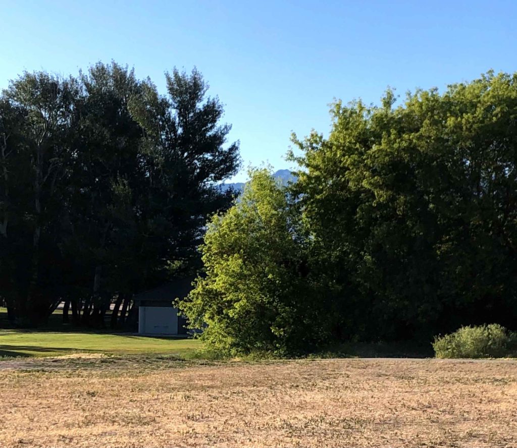
Image 1: The tree in the foreground overlaps the shadow of a more distant group of trees. This results in a hard, but somewhat broken edge. This edge, by the way, is broken because of the nature of the material (the tree leaves). Regardless, it’s still considered a pronounced edge. As you can see, the strong morning light heightens the contrast at the meeting place. There is also the shadow on the right side of the front tree, which is almost as dark as the group in the back (at least in the photo). The transition though is different, it is much softer on this side; why? See the next image and paragraph…
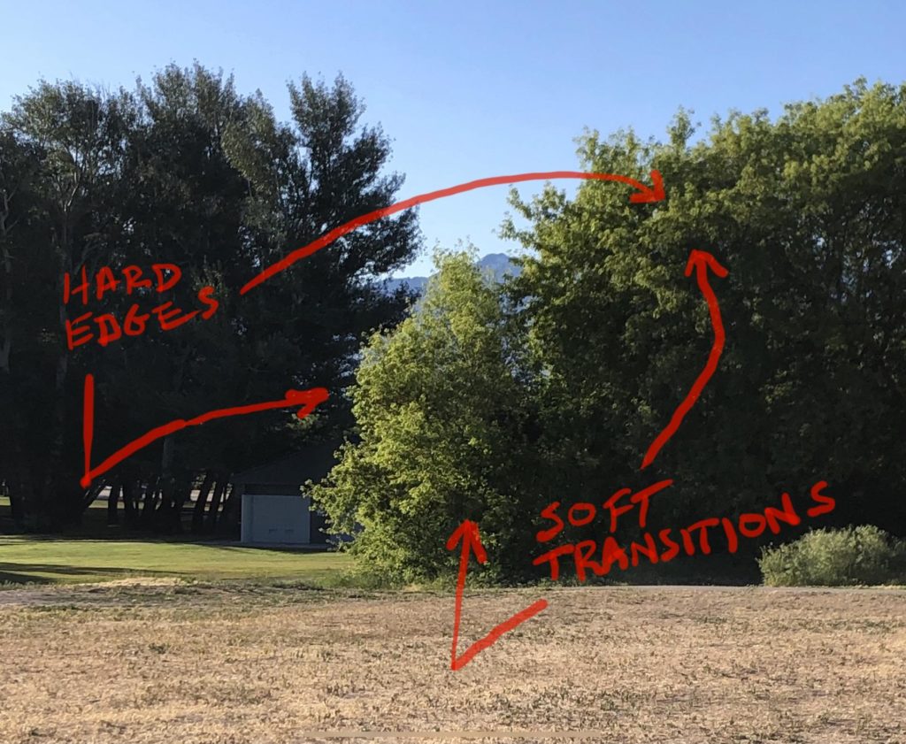
Image 2: The answer lies in the fact that we are now looking at the effect of light on a form shadow, created by an object that turns gradually and transitions from light to dark in a more gentle way. I’ll be talking more about that under the heading of shadows, but just note – while it is often desirable to break things up into neat categories, the truth is that there is rarely just one reason for a particular edge quality. (I could make a pun about overlaps here, but we’ll just leave it at that!) 🙂
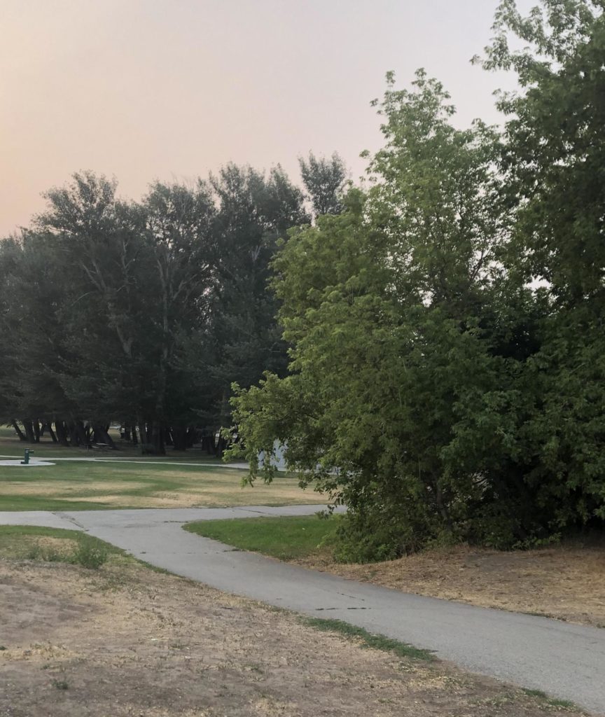
Image 3: Here is the same set of trees in a different lighting situation. Notice that the overlap still produces a marked edge, but more subdued with a less intense skylight on its leading edge.
4. Form
Form has a huge impact when it comes to the type of edges we use in a painting. A rock outcropping in a landscape can provide us with all the proof we need.
Where rocks are rounded, the edges between light and shadow will be gradual, but if the rock takes a sharp turn into shadow, the edge which is created by this sudden value change will be hard, but remember that other factors come into play as well, so I rarely make blanket statements when it comes to the visual world.
One of the best ways I know of to study this subject is to take a walk outdoors. This is a good time just to observe, while you are not caught up in the task of trying to create a painting. We can often get tunnel vision when concentrating on other aspects of the painting process, and let pure observation fly in the wind! By doing this exercise separately, you are also training your eyes and observational skills for the times when you really need them.
Take some time to study edges on natural forms whenever you can, and ask yourself why a particular edge is soft or hard, or any number of variations in-between. This little exercise alone will propel your awareness and understanding to a whole new level. Once this knowledge is in place, then use this newfound information on your next painting excursion into the field.
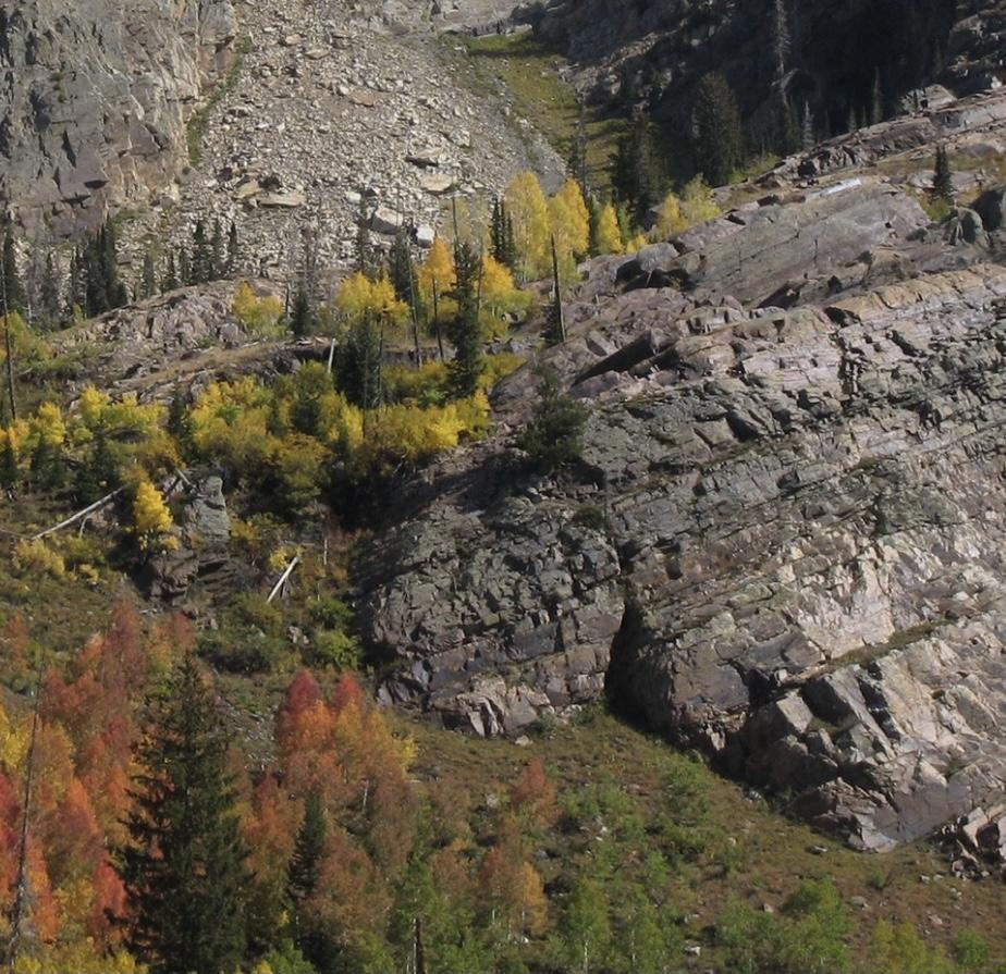
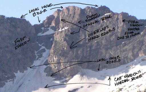
Image 4: In this photo of a rock outcropping, the topography of the cliff is angular in some places and rounded in others. The resulting differences in edge qualities, as these shadowed indentations point out, is that some transitions are abrupt and hard, while others are more gradual and soft.
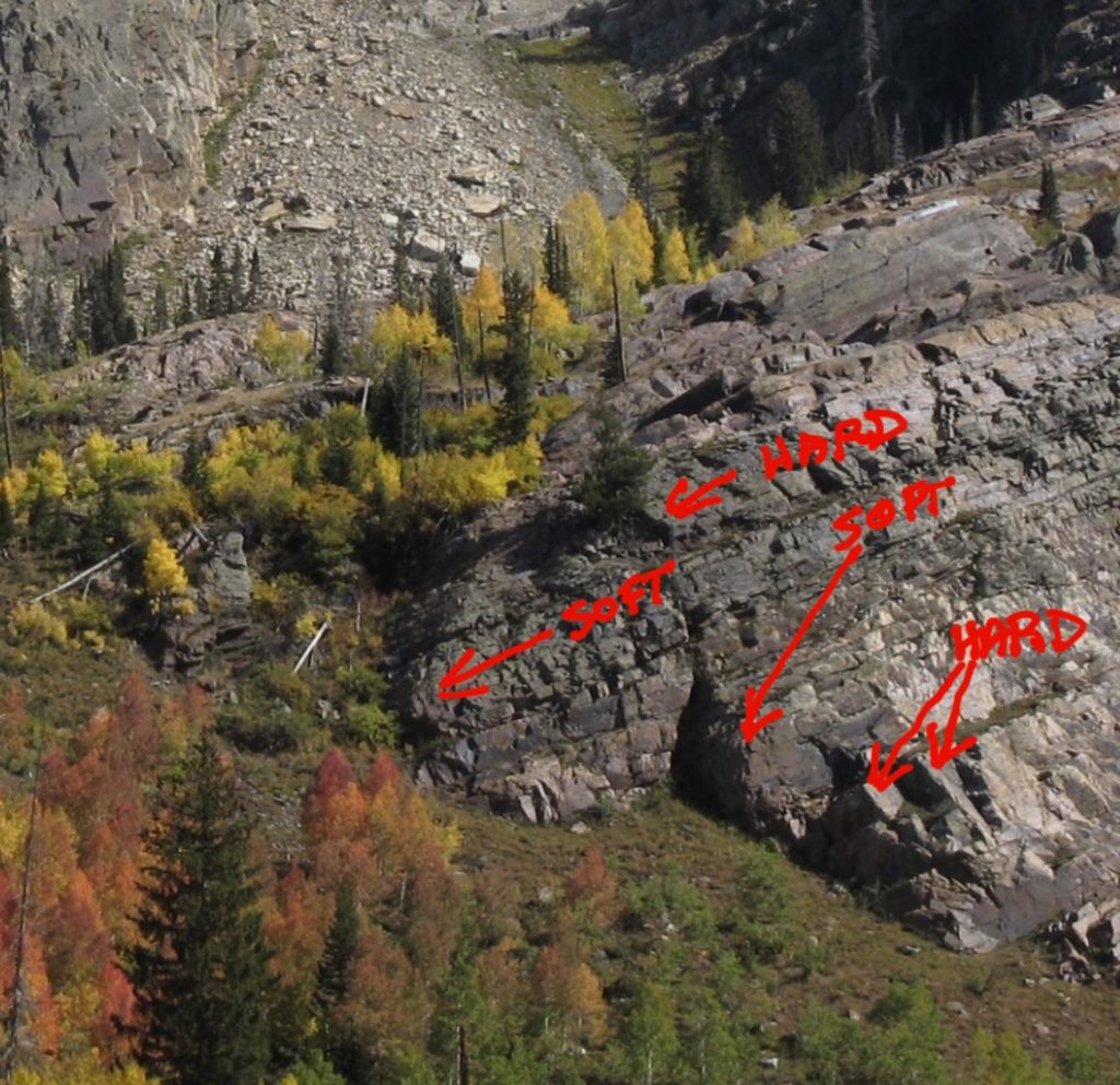
Image 5: Here are some specific examples on this outcropping.
5. Texture
The physical properties which make up various objects in nature have a very marked influence on the types of edges they present. An example of this concept can be found in a field of long grasses, when comparing that surface to the hard surface of a rock.
Imagine for a moment, a tree shadow falling across the surface of a grassy field and at the same time touching down on a rock. Which surface do you think would be most likely to exhibit a hard edge from the tree’s cast shadow? That’s right, the hard surface of the rock as opposed to the diffusing influence of the grasses swaying in the wind. Not only do we have the inherent texture of the grass, but also the motion of the wind. (More on that in the section on motion.)
Now think of any number of surface types in a natural setting and you will get the idea; the texture of any material will affect the way it interacts with other objects and shadows, creating varied edges.
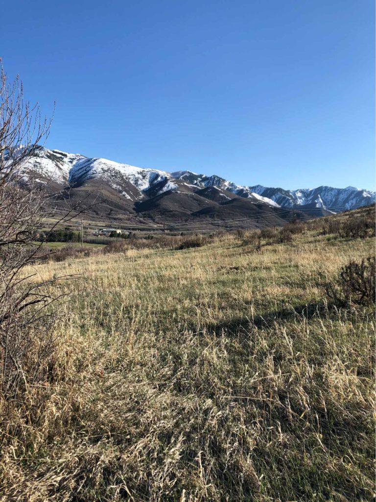
Image 6: Note the texture of grasses next to mountains and sky.
6. Moisture
This one is related to texture, but since it is able to exert its influence on any number of textured objects, I thought it should have its own category. I am also including it with a specific example in mind.
If you walk along a river, lake, stream, or ocean beach that have rocks along the edge, you can plainly see this in action. Where a rock is partly submerged under water, and partly exposed to the air, a value change takes place with the wet part of the rock being darker than the dry part. This sets up two areas on the same object that contrast with each other and create a definite edge, but be careful not to paint them too hard.
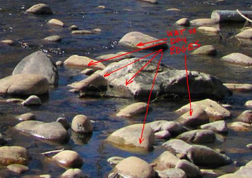
Image 7: Notice the edges where the wet parts meet the dry parts of the rocks.
7. Aerial Perspective
This term has to do with the amount of particles in the air, coupled with the distance of various objects from the viewer. These particles could be anything from dust, smoke, pollution, or moisture in the air.
Most of us who have been painting landscapes out in nature for a while have experienced all of these conditions at one time or another. Due to the veils of particulates in the air, just like on a very atmospheric day, edges will be affected as objects recede into the distance by a general rounding off and softening of forms.
Image 8: In this scene, aerial perspective is heightened by western fires.
8. Atmosphere
Atmosphere shares some basic characteristics with aerial perspective, but mostly by degree and usually in a more profound way. Atmosphere exerts a powerful influence over the type of edges that we choose in our paintings.
On clear sunny days the edges in nature are sure to be more crisp than the edges found on foggy or rainy days. Typically, the more dense the layers of atmosphere are, the softer the edges will be. If your edges don’t align properly with the type of day that you are attempting to paint, it’s less likely that you will create the type of feeling which you are after.
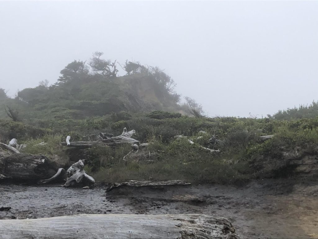
Image 9: Notice the softening of edges on a foggy day, especially as objects recede from where you stand. There are several hard edges in the foreground, but that is more a product of the texture of their materials as well as their closeness to the viewer.
9. Local Color and Values
I could have done these two separately, but they are so closely related, I decided to lump them together instead. Artists usually speak of this as “local color” which really means the same thing, since value is a component of color; not the other way around.
Sometimes when painting a mountain or distant plane, I have run across the interesting situation where the local color and value of a group of pines is hardly distinguishable from a shadow in the same vicinity. This is an example of where local color mimics a lighting effect. In these cases I will often opt for design possibilities over reality, and orchestrate these shapes as a design element, rather than try to spell out for the viewer what each one represents.
Value differences are the epitome of contrast; where two differing values meet, you will have an edge. The more these values contrast, the more pronounced will be that edge as well. That’s pretty straight forward, so now a bit about color’s relationship to edges.
The same thing really goes for colors; variety in local color on the same object or on objects which are side by side, will often dictate the placement of an edge. Just remember, the quality of an edge can work for and against your design, so handle them carefully.
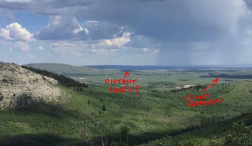
Image 10: Distant pines and cloud shadows
10. Motion
This one, and the next one on the list, both have to do with how we see and perceive edges. Motion is just that, things that move in the landscape. This could include things like water, animals or trees and grasses swaying in the wind. Whatever it is, they all share one common characteristic, and that is an edge which appears to be in motion. Therefore some sort of blurring or broken effect needs to be employed.
Have you ever seen what might be considered an otherwise well painted wildlife scene, where the animals all seem to be pasted on, like cutout figures? How about a bird, which seems like it has been suspended in time? In my humble opinion, as artists we should be taking full advantage of the tools of expression that we have, and incorporate a variety of edges which depict what is really happening in a visual way. If you want a moving object to appear to move, pay close attention to the varied edges of the subject!
11. Peripheral Vision
Our eyes see in a special way, which is different from the camera. The camera has the ability to put everything it photographs into sharp focus, with limited ability when compared to the human eye. Yes there are certain ways to manipulate a photographic image for edge control, but it is still a photographic image in the end, and can’t compare to how we see.
One of the great painting masters of our time, Richard Schmid, had a way of imbuing his work with the type of edges that speak volumes on how to project feeling in a painting. He will be greatly missed, but his legacy lives on in all of us who are students of art and expressive edges!
Instead of inserting a photo here, I’m just going to recommend that you study the paintings of this great artist and teacher.
12. Highlights and Meniscus
Highlights are in a special class, because they usually present a stark contrast to their surroundings, therefore they create an edge which can vary according to the textural qualities of the objects which they are on. For this reason they should be treated with care, so as to integrate them well onto the surfaces that they sit upon.
A meniscus is a sort of highlight that is associated with scenes where water meets land. It has a sort of ribbon-like quality that can provide just enough sparkle to a dull landscape to bring it out of the doldrums. It’s a term that describes a “curved upper surface of a liquid in a tube”.
As an experiment, you can partly fill a glass with water and observe this phenomenon yourself; looking for its upward curvature and characteristic glint of light where the glass and water touch.
13. Shadows
“Only the Shadow knows for sure!” Ok, I’ve heard this my whole life, but was not born yet when this radio term got coined. 🙂 Seems appropriate for this segment though!
Shadows come in two flavors: Form Shadows and Cast Shadows. The reason that shadows are included in an article on edges, is because the type of edge produced by these two are markedly different in several ways. Without going too deep into this subject, let me give you a “typical difference.” Form Shadows have softer edges than Cast Shadows.
Now before anyone gets too excited, let me be clear – there are always exceptions to this, which was covered in the headings under form and texture. Please note though, when we talk about hardness or softness, that is a relative term, and specific to the plane which that edge sits on. A hard edge a mile away may be quite different from that same type edge in the foreground.
14. Artistic Selection
I’ve saved this one for last because it is the wild card in the deck, and possibly the most important factor of the four.
Artistic selection can be arbitrary, or based on the properties of the other guiding factors. Many accomplished artists would suggest that you do not ignore the others, but use that information to temper and inform your artistic whim. By doing so, you will not only create a sense of heightened reality, but imbue your work with a touch of lyrical beauty.
Using physical realities as a guiding standard, artistic selection can play up, or play down hard edges for visual effect and aid in the design possibilities which are not supplied by nature alone. For instance, if you want to keep the viewer’s attention mainly in one area of the painting, as opposed to somewhere in the corners, just soften edges where you don’t want the eye to go and sharpen edges that you want to emphasize.
Let’s take a look at how artistic selection of edges might be put to use on a practical level. In order to do this I have employed the use of technology to illustrate my thoughts when I’m faced with a design/solution, in an everyday painting situation.
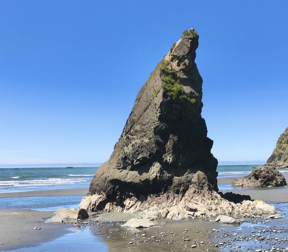
Image A: In this first first photo of the rock formation known to some as “The Wizards Hat” in the state of Washington, I’ve cropped the photo close so we can concentrate on its form.
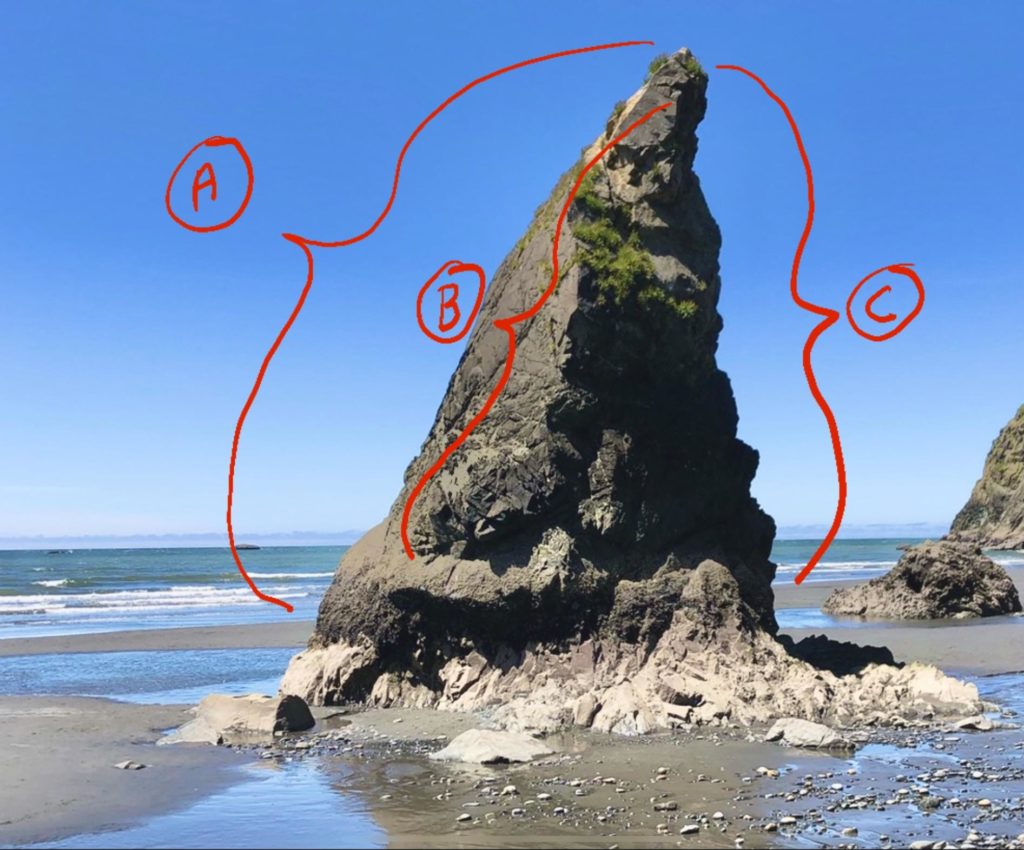
Image B: Here I’ve indicated the three major edges that I would be mostly concerned with if I ever decide to paint this popular attraction. There are the two external edges – (A) & (C), along with the very prominent internal edge – (B). There are also other minor forms which could be adjusted as well; more on that in the next photo.
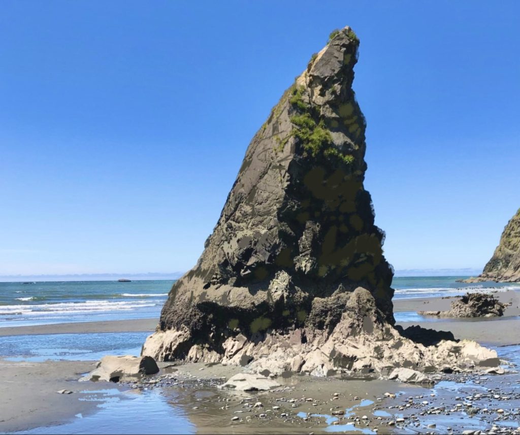
Image C: In this last photo, I have made some digital adjustments to the rock in order to illustrate what I would change for pure art’s sake. I’ve softened a few of the hard edges on the right – (C) in order to make that area go back in space.
On the left – (A) I have emphasized a few darks along the perimeter just to make that side stand out against the sky a bit more.
This left the internal edge – (B), for me to make some subtle adjustments to, in order to satisfy my artistic sensibilities. Some final marks were made to the base of the structure for emphasis and to enhance the form against the sand.
Along with that, I added some subtle reflected light into the large dark shadow on the right side of the form. This is especially crucial when we are painting from a photo, and why plein air work is so essential!
It’s interesting how small value adjustments to the interior of that shadow not only helped to convey a sense of light, but also helped to temper that hard edge against the sky.
Remember, paintings are all about relationships, and if those relationships are not strong enough, in a photo, or for that matter are lacking on location, it’s up to us as artists to supply that in our work.
In our attempts to represent nature, we can’t really copy note for note what’s out there, but we can relay a sense of soul, and artistic flair to the viewer. It’s when we combine reality with the heart, that we produce landscapes which can be considered “art” in the truest sense.
In Conclusion
Well, there you have it. If we take a large subject like painting landscapes and break it down into smaller, relatable chunks, we are more likely to retain that information and actually use it.
In the final analysis, though, skills based on observable visual facts are basically all that we can learn, or teach. Once acquired though, this knowledge inevitably must go through our individual human filters, which can then either impede or accelerate our personal artistic creativity.
Sometimes in the beginning stages when learning a new skill, it’s easy to become overwhelmed and nervous when it comes to performance. I am reminded of a comment made long ago, by a young friend to a group of us high school kids on the subject of, learning to drive. He said that he learned to stay on the road by lining up the hood ornament on his parents old Pontiac with the center line on the road. I remember thinking to myself, even back then – ”Holy cow, are you kidding me!”
Although I eventually learned that what seemed to be an outlandish behavior is not all that uncommon to the human family, myself included! We often start out trying to learn a new skill as though it were a white knuckle ride on a roller coaster! Eventually in order to be successful, we need to loosen up, and as I’ve said in past articles – “Use the force Luke”!!!
You know, it’s most often when we let go, and allow the skills to flow through us, that we get the most satisfaction, and produce at a much higher level than we did before. We all need to learn to trust that we can do what we believe we can. And with that, I close with this: If others can do it, so can you!
Many thanks go to John Poon for taking the time to review this material as a second set of eyes, along with his valuable suggestions!
Until next time,
John

Visit EricRhoads.com to find out all the amazing opportunities for artists through Streamline Publishing, including:
– Online art conferences such as Plein Air Live
– New video workshops for artists
– Incredible art retreats
– Educational and fun art conventions, and much more.

> Subscribe to Plein Air Today, a free newsletter for artists
> Subscribe to PleinAir Magazine so you never miss an issue


Thank you John, very enlightening !
Judith R. Legg
Thanks for commenting Judith, I’m so glad it helped!
Thank you!
🙂 Thank you for your comment!
John, Your article is ever so helpful for both new and experienced painters.
Thank you for sharing your painting wisdom with us!
Gina, I appreciate you taking to time to write me a note! 🙂
Very helpful and clear. Thank you
Thank you Sue!
I am always delighted to read your words of wisdom and to encourage others to do so. You are wonderfully gracious and talented. Thanks for sharing!
Thank you Carol!
As a real novice, I’ve found your articles so informative and have kept all of them. Thank you John!
Thank you Norma!