

Jan Poynter is not afraid of the dark, and she’s not afraid of phthalos. Here’s what that means for her artwork.
Lead Image: Jan Poynter’s setup using gouache on black paper
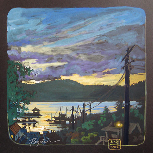
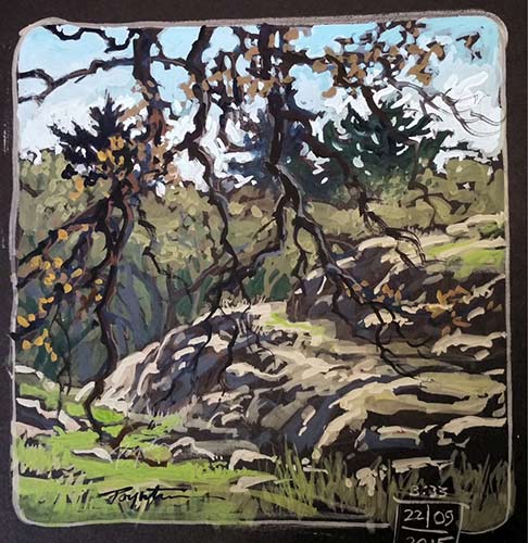
Since the artist was 17, she has painted with gouache on black paper, approaching the painting process in a way almost the opposite of most processes. The surface is already dark, so she begins with the lightest light. Thin applications mean darker shades, while thick applications result in lighter passages.
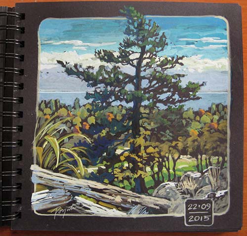
“The gouache just jumps out at you because it is so chalky and so opaque,” says Poynter. “It bops right out of there at you.” The British Columbia artist finds that gouache is an excellent traveling companion, as it dries quickly but one can always go back into it by re-wetting it. The only weather it does not fare well in is rain, and for the same reason, gouache paintings need to be framed behind glass. Poynter occasionally sprays fixative on gouache, but she finds that it darkens the values significantly, so she must paint lighter in anticipation of this effect.
One of the most striking aspects of Poynter’s gouache paintings is her use of unpainted portions of the surface. It is indicative of her training as a printmaker. “Those little marks that I left black are not something I would add in with paint in a normal situation,” says Poynter. “The process of painting gouache on a dark surface gives you little surprises and gaps and spaces that you would have some difficulty rendering. It suggests the freshness of linocut or scratchboard. It gives me little surprises along the way.”
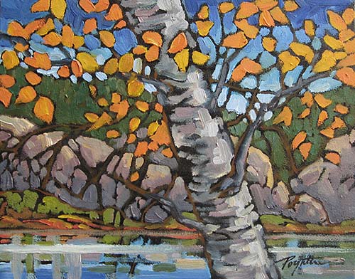
Sometimes the effect is subtle. Other times, Poynter plays up the dark background by leaving an outline around objects, as in the oil study shown here. “If you want bold representation, leaving that black outline silhouettes it and makes it stand out,” Poynter points out. Another sign of her printmaking past is the rounded corners she favors in her sketchbook. Poynter buys sketchbooks made with acid-free paper that are designed to be used as scrapbooks. “The paper is about 200lbs, and it’s quite smooth and a little bit absorbent,” she reports. The artist does a detailed line drawing with graphite, including the rounded corners of the composition that suggest both an etching and a vignette style of painting. She sometimes lets the painted subject matter break the frame she has drawn with a pencil to emphasize the object. After she has finished painting, Poynter erases the graphite lines. She also leaves larger passages blank in her composition, which means black. “I stand back from the piece, and if it is speaking to me well enough, then I stop,” she says.
Poynter has worked in pastel on black paper quite a bit, and now she is turning to oil. The next series of paintings she is tackling will be large — as wide as 48 inches. And yes, she’ll be toning the canvas black, or in shades of black. Poynter likes phthalo blue and strong reds and greens in making her ground color, and she sometimes allows a gradation in the ground from top to bottom.
The artist clearly enjoys the bold look of gouache on black paper, and she says her students are often inspired to give a try. “When I show them these paintings, they say, ‘Oh, yeah, I have some gouache somewhere at home.’ If the gouache is artist-grade, then even if they are dried up, you can peel open the tubes, crack the paint apart, and re-wet it. It will still work.”
In other words, no excuses — give this technique a try.


This way of working seems to energize and harmonize the image. I like that how these pieces are reminiscent of block prints. You make them look so vibrant! This also seems like a good way to try journaling while traveling as often we feel we are “in the dark” till we explore and find that there is a lot of “bright things” to take note of. Thank you for sharing this technique and the nice way in which you have worked it. Bon Voyage!
[…] a few months ago with the publication of an article in the international Plein Air Magazine ” playing on the Dark Side” I hope to offer a workshop later in the year at OPUS and probably before our Gibsons Landing plein […]