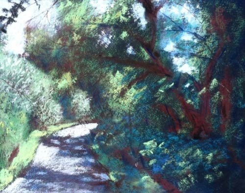
Brian Brigham was not satisfied with the darks in his plein air pastels, so he took a novel approach: He worked on a black background. And he blocked in the darker areas with red.
“I recalled that I had ‘liked’ some posts by someone in the ‘en plein air’ Facebook group that talked about painting in Ireland and lamented about how everything there was green,” says Brigham. “And so he/she talked about doing a red value study first and then painting the various greens on top, allowing bits of the red to show through in the final painting. There were several postings of this nature, if I remember right.”
Brigham was at a plein air event in Corning, Iowa, when his setup experienced “a total breakdown.” He decided to start fresh, and in the process of breaking in his new equipment, he went on his pursuit of darks in a green scene. The Nebraska artist was working on 9″-x-12″ pieces of black foamcore that he was treating with pumice to give them some tooth.
Brigham explains the next steps: “To start a painting, I usually use a light-colored pastel pencil to indicate the key elements. For the picture above, it was the path, the grass area along the path, the shrubs, the sky, and then the major tree trunks on the left.
“And now comes the red. For this initial stage, I started with the darkest red in my set and quickly blocked in the areas I knew would be the darkest. These areas included the tree trunks on the left, where the grass meets the undergrowth, along the edge of the path, and then on the left, those spots where the shrubs are next to each other. Then I used a medium-value red for the areas that would include more of the more common greens that I would be using. The sky and the path got blocked in with a light blue, and some areas of medium green got put in. I have been trying to work without my glasses so that everything blurs out and I don’t get lost too much in the details.

The red underpainting enlivens the shadow area and acts as a complement to the predominant greens.
“At this stage I will smear the colors down into the texture of the board by using my fingertips. I like to use finger cots as they protect your skin and I think they are more efficient and accurate. I define the values in the key areas, blurring them down into the texture. I found that the dark areas of red really stood out and helped me remember to keep the areas dark. There were not a lot of greens quite yet. After repeating this procedure for a while, I end up with a blurry painting that has a sufficient base layer of pastel, and hopefully the value areas are intact. Then I lightly spray a fixative over the surface to ‘lock down’ what has been established.”
Brigham then goes on to finish the piece. “It’s the more thoughtful and careful time now,” he says. “Now is the time to define some edges and focus on the areas that will help the composition do its thing.”
In the end, his shadows are lively and the complementary color helps the greens pop.


